Tree
A tree structure is a hierarchical data structure that consists of nodes connected by edges.
Usage
When to use
Use a tree in the following cases:
- To display hierarchical data, e.g. organization charts, file directories, nested categories, or any data with parent-child relationships.
- To navigate through deeply nested information which cannot be displayed easily in a simple list navigation.
- To maintain a consistent and familiar structure for displaying data across Insights Hub or your app.
Avoid using a tree in the following cases:
- When the data has only 1 or 2 levels of hierarchy use more simple components like a list navigation, a list or a table.
- When your app is built mobile-first, due to potential scrolling and nesting challenges.
Types
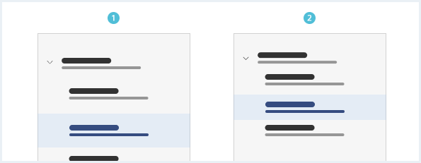
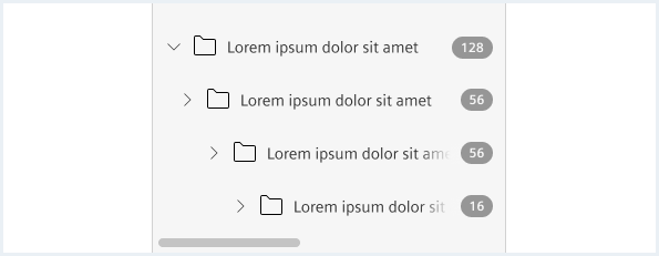
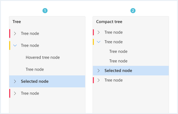
Use a compact tree for very limited space and when a huge number of nodes within a level is expected.
General construction
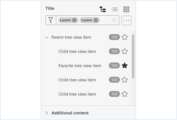
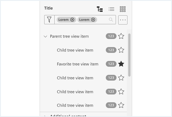
A tree container consists of the following elements:
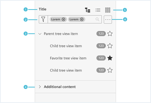
- Title
- Filter
- Search/filter (textual) or create a quick/predefined filter, custom/categorized filters
- Tree list
- Root node
- Favorite
- All nodes
- Additional content
- Can contain meta information like parameters, links and further information
- Toggle view mode
- Possible view modes are tree, list, card, map etc.
- Manipulated list
- Collapse/expand all
- Show/hide icons
- Order/sort tree nodes
- Other manipulation actions
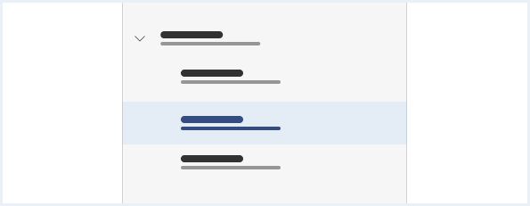
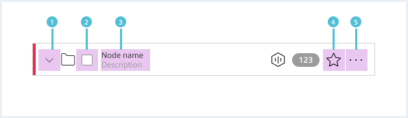
A tree item consists of the following elements:
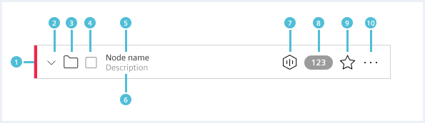
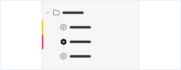
- Status (optional)
- Sets the status for an item.
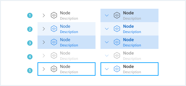
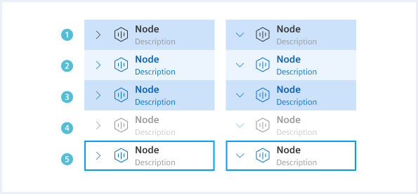
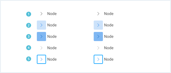
- Expanded or collapsed indicator
- Indicates if a tree is expanded or collapsed.
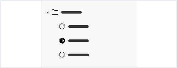
- Supporting visual (optional)
- A supporting visual may be an icon, a pictogram (for example an avatar) or an image.
- Use only one type of visualisation.
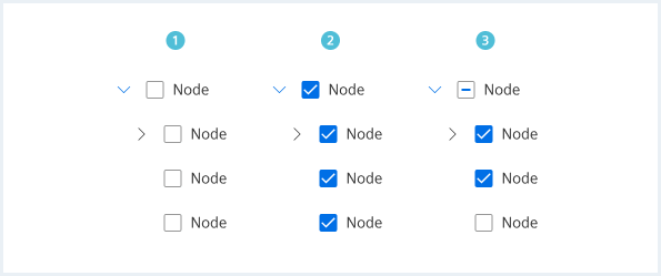
- Checkbox (see details here)
- A checkbox provides the possibility to select a tree item to perform an action on it.
- Node name
- A label is mandatory.
- Description (optional)
- Contains additional information. Can be a description, type name, creator name etc.
- Additional meta data (optional)
- Contains additional content-relevant information; e.g. a text or icon.
- Badge (optional)
- Number of dashboards, child assets etc. (see details here)
- Can have an icon
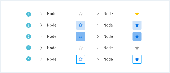
- Favorite (optional)
- To toggle an item as favorite or not favorite.
- If an item is only marked as favorite without toggle action, use the star icon in position 7 instead.
- Additional actions (optional)
- Ghost button (for a ‘more’ menu containing an arbitrary number of actions)
Options
The following tree item options are available:
Text only
Use this option when a tree consists of the same content type and no other item elements than a label, a drill down indicator and an additional description if needed.
Supporting visual
Use this visual to distinguish different content types.
Item status
Checkbox
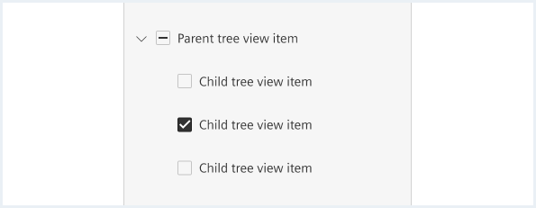
Use for a multi-selection to perform e.g. batch actions like deleting multiple items at once (see behavior).
Badge
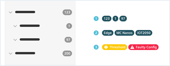
Use a badge to provide additional secondary information that should be scannable:
- Counter: e.g. number of children or number of objects attached to the node.
- Type: e.g. device or asset type.
- Status: if a status indicator on the left is not enough, and it is important to show the cause (keep short, 1-2 words!).
Behavior
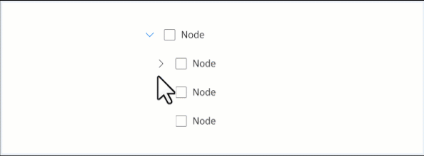
- Expanded or collapsed indicator
- Clicking the drill down button expands or collapses an item that contains child items.
- Checkbox
- Checkbox input has a selected and unselected state.
- An indeterminate state shows partially checked states.
- The parent checkbox will be indeterminate until all its child objects are checked.
- By clicking on the parent checkbox all its child objects will be checked.
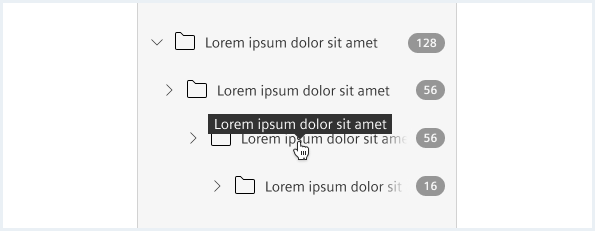
- Node name and description
- Clicking on the node name and description shows the detailed information on the object in the main or item region.
- In case the tree parent item is just a container element without specific detailed information
- the node name and description are either not clickable.
- or the node name and description expand or collapse the item on click.
- Favorite
- It is possible to toggle between favorite and not favorite.
- Additional actions
- An arbitrary number of app-specific actions can be made available.
Multi-selection
By default, a selection or deselection of a parent or its child has some dependency:
- Selecting or deselecting a parent will select or deselect all children (also known as “select all/none”)
- Selecting one or more children will set their parent to intermediate state
Note that this is a general recommendation and might not be applicable for some use cases.
Text overflow
Following options for text overflow are available:
- Truncation with tooltip
- Horizontal scroll
- Resizable leading region
Tooltip
Horizontal scrolling
Resizable leading region
Additional content
Do’s & Don’ts
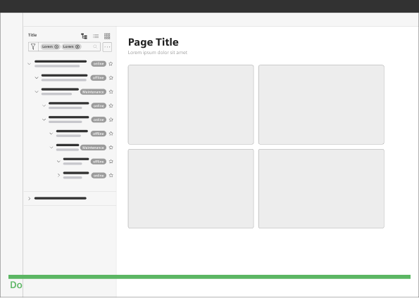
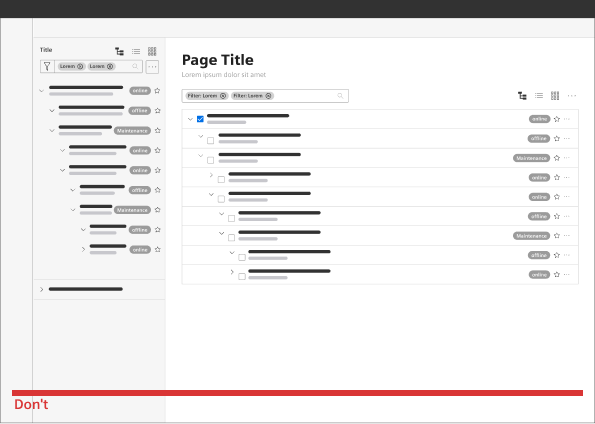
Do not use a tree in both a leading and main region at the same time, as this can be confusing for the user.
Style
This chapter shows several tree styles in the design system.
Overview
States
Examples
Sizing and spacing
Find the full specifications here or on the downloadable Figma file on the Tree page.
To see a detailed explanation of all existing helper classes, please refer to the usage table below.
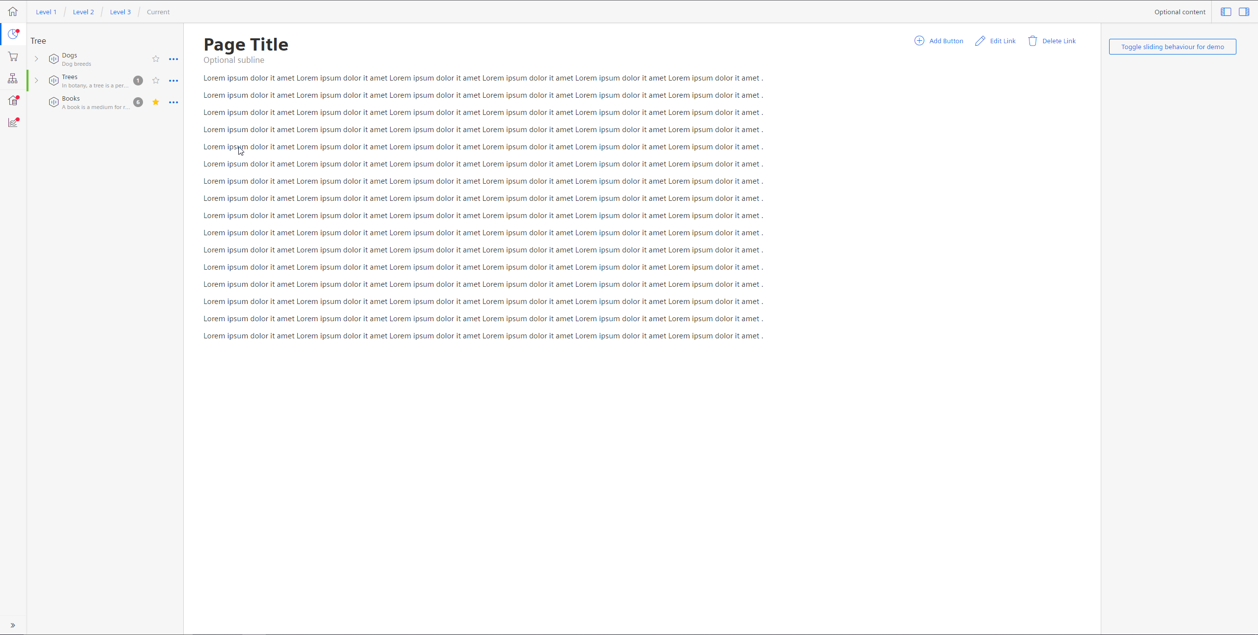
Tree with sample content and functionality
This tree demo shows sample content and functionality.Tree with sample content and functionality
<div class="appWrapper has-appBarAdvanced has-appBarAdvanced-collapsed">
<div class="appWrapper__regions has-appHeader has-contextRegion has-leadingRegion contextRegion-is-expanded leadingRegion-is-expanded appWrapper__regions--pushLayout">
<section class="appHeader">
<div class="appHeader__breadcrumb">
<div class="breadcrumb">
<div class="breadcrumb__item">
<a href="#">Level 1</a>
</div>
<div class="breadcrumb__item">
<a href="#">Level 2</a>
</div>
<div class="breadcrumb__item">
<a href="#">Level 3</a>
</div>
<div class="breadcrumb__item is-current">
<a href="#">Current</a>
</div>
</div>
</div>
<div class="appHeader__content">
Optional content
</div>
<div class="appHeader__viewToggler">
<button class="button button--ghost has-icon-only button--leading" id="toggleLeadingRegionDemo">
<span aria-hidden="true" class="iconUxt"></span>
</button>
<button class="button button--ghost has-icon-only button--context" id="toggleContextRegionDemo">
<span aria-hidden="true" class="iconUxt is-flipped-horizontal"></span>
</button>
</div>
</section>
<section class="leadingRegion">
<h5 style="padding:24px 0 0 8px">Tree</h5>
<div class="tree">
<div class="tree__node is-level0 is-nested is-collapsed">
<button class="button button--ghost has-icon-only node__arrow"></button>
<a href="#" class="node__details">
<span class="details__icon iconUxt asset" aria-hidden="true"></span>
<div class="details__content">
<span class="details__title">Dogs</span>
<span class="details__description">Dog breeds</span>
</div>
</a>
<div class="node__additional">
<button class="button button--ghost has-icon-only node__favorite"></button>
<div class="menu is-bottom is-right-aligned">
<button class="button button--ghost has-icon-only"></button>
<div class="popover__container">
<button class="popover__item">
<span class="iconUxt duplicate" aria-hidden="true"></span>
Copy
</button>
<button class="popover__item">
<span class="iconUxt move" aria-hidden="true"></span>
Move
</button>
<button class="popover__item">
<span class="iconUxt delete" aria-hidden="true"></span>
Delete
</button>
</div>
</div>
</div>
</div>
<div class="tree__node is-level1 is-hidden is-collapsed">
<button class="button button--ghost has-icon-only node__arrow"></button>
<a href="#" class="node__details">
<span class="details__icon iconUxt asset" aria-hidden="true"></span>
<div class="details__content">
<span class="details__title">Beagle</span>
<span class="details__description">The beagle is a breed of small scent hound</span>
</div>
</a>
<div class="node__additional">
<span class="badge badge--dark">
<span>2</span>
</span>
<button class="button button--ghost has-icon-only node__favorite"></button>
<div class="menu is-bottom is-right-aligned">
<button class="button button--ghost has-icon-only"></button>
<div class="popover__container">
<button class="popover__item">
<span class="iconUxt duplicate" aria-hidden="true"></span>
Copy
</button>
<button class="popover__item">
<span class="iconUxt move" aria-hidden="true"></span>
Move
</button>
<button class="popover__item">
<span class="iconUxt delete" aria-hidden="true"></span>
Delete
</button>
</div>
</div>
</div>
</div>
<div class="tree__node is-level0 is-nested is-collapsed is-success">
<button class="button button--ghost has-icon-only node__arrow"></button>
<a href="#" class="node__details">
<span class="details__icon iconUxt asset" aria-hidden="true"></span>
<div class="details__content">
<span class="details__title">Trees</span>
<span class="details__description">In botany, a tree is a perennial plant</span>
</div>
</a>
<div class="node__additional">
<span class="badge badge--dark">
<span>1</span>
</span>
<button class="button button--ghost has-icon-only node__favorite"></button>
<div class="menu is-bottom is-right-aligned">
<button class="button button--ghost has-icon-only"></button>
<div class="popover__container">
<button class="popover__item">
<span class="iconUxt duplicate" aria-hidden="true"></span>
Copy
</button>
<button class="popover__item">
<span class="iconUxt move" aria-hidden="true"></span>
Move
</button>
<button class="popover__item">
<span class="iconUxt delete" aria-hidden="true"></span>
Delete
</button>
</div>
</div>
</div>
</div>
<div class="tree__node is-level1 is-hidden is-collapsed is-error">
<button class="button button--ghost has-icon-only node__arrow"></button>
<a href="#" class="node__details">
<span class="details__icon iconUxt asset" aria-hidden="true"></span>
<div class="details__content">
<span class="details__title">Birch</span>
<span class="details__description">A birch is a thin-leaved deciduous hardwood tree</span>
</div>
</a>
<div class="node__additional">
<button class="button button--ghost has-icon-only node__favorite"></button>
<div class="menu is-bottom is-right-aligned">
<button class="button button--ghost has-icon-only"></button>
<div class="popover__container">
<button class="popover__item">
<span class="iconUxt duplicate" aria-hidden="true"></span>
Copy
</button>
<button class="popover__item">
<span class="iconUxt move" aria-hidden="true"></span>
Move
</button>
<button class="popover__item">
<span class="iconUxt delete" aria-hidden="true"></span>
Delete
</button>
</div>
</div>
</div>
</div>
<div class="tree__node is-level0">
<button class="button button--ghost has-icon-only node__arrow is-selected"></button>
<a href="#" class="node__details">
<span class="details__icon iconUxt asset" aria-hidden="true"></span>
<div class="details__content">
<span class="details__title">Books</span>
<span class="details__description">A book is a medium for recording information in the form of writing or images</span>
</div>
</a>
<div class="node__additional">
<span class="badge badge--dark">
<span>6</span>
</span>
<button class="button button--ghost has-icon-only node__favorite is-selected"></button>
<div class="menu is-bottom is-right-aligned">
<button class="button button--ghost has-icon-only"></button>
<div class="popover__container">
<button class="popover__item">
<span class="iconUxt duplicate" aria-hidden="true"></span>
Copy
</button>
<button class="popover__item">
<span class="iconUxt move" aria-hidden="true"></span>
Move
</button>
<button class="popover__item">
<span class="iconUxt delete" aria-hidden="true"></span>
Delete
</button>
</div>
</div>
</div>
</div>
</div>
</section>
<section class="mainRegion">
<div class="contentHeader">
<div class="contentHeader__header">
<h1 class="header__headline">Page Title</h1>
<div class="header__subline">Optional subline</div>
</div>
<div class="contentHeader__actions">
<button class="button--secondaryContentAction">
<span class="iconUxt addCircle" aria-hidden="true"></span>
Add Button
</button>
<a class="button button--secondaryContentAction" href="#">
<span class="iconUxt edit" aria-hidden="true"></span>
Edit Link
</a>
<a class="button button--secondaryContentAction" href="#">
<span class="iconUxt delete" aria-hidden="true"></span>
Delete Link
</a>
</div>
</div>
<p>Lorem ipsum dolor it amet Lorem ipsum dolor it amet Lorem ipsum dolor it amet Lorem ipsum dolor it amet Lorem ipsum dolor it amet Lorem ipsum dolor it amet .</p>
<p>Lorem ipsum dolor it amet Lorem ipsum dolor it amet Lorem ipsum dolor it amet Lorem ipsum dolor it amet Lorem ipsum dolor it amet Lorem ipsum dolor it amet .</p>
<p>Lorem ipsum dolor it amet Lorem ipsum dolor it amet Lorem ipsum dolor it amet Lorem ipsum dolor it amet Lorem ipsum dolor it amet Lorem ipsum dolor it amet .</p>
<p>Lorem ipsum dolor it amet Lorem ipsum dolor it amet Lorem ipsum dolor it amet Lorem ipsum dolor it amet Lorem ipsum dolor it amet Lorem ipsum dolor it amet .</p>
<p>Lorem ipsum dolor it amet Lorem ipsum dolor it amet Lorem ipsum dolor it amet Lorem ipsum dolor it amet Lorem ipsum dolor it amet Lorem ipsum dolor it amet .</p>
<p>Lorem ipsum dolor it amet Lorem ipsum dolor it amet Lorem ipsum dolor it amet Lorem ipsum dolor it amet Lorem ipsum dolor it amet Lorem ipsum dolor it amet .</p>
<p>Lorem ipsum dolor it amet Lorem ipsum dolor it amet Lorem ipsum dolor it amet Lorem ipsum dolor it amet Lorem ipsum dolor it amet Lorem ipsum dolor it amet .</p>
<p>Lorem ipsum dolor it amet Lorem ipsum dolor it amet Lorem ipsum dolor it amet Lorem ipsum dolor it amet Lorem ipsum dolor it amet Lorem ipsum dolor it amet .</p>
<p>Lorem ipsum dolor it amet Lorem ipsum dolor it amet Lorem ipsum dolor it amet Lorem ipsum dolor it amet Lorem ipsum dolor it amet Lorem ipsum dolor it amet .</p>
<p>Lorem ipsum dolor it amet Lorem ipsum dolor it amet Lorem ipsum dolor it amet Lorem ipsum dolor it amet Lorem ipsum dolor it amet Lorem ipsum dolor it amet .</p>
<p>Lorem ipsum dolor it amet Lorem ipsum dolor it amet Lorem ipsum dolor it amet Lorem ipsum dolor it amet Lorem ipsum dolor it amet Lorem ipsum dolor it amet .</p>
<p>Lorem ipsum dolor it amet Lorem ipsum dolor it amet Lorem ipsum dolor it amet Lorem ipsum dolor it amet Lorem ipsum dolor it amet Lorem ipsum dolor it amet .</p>
<p>Lorem ipsum dolor it amet Lorem ipsum dolor it amet Lorem ipsum dolor it amet Lorem ipsum dolor it amet Lorem ipsum dolor it amet Lorem ipsum dolor it amet .</p>
<p>Lorem ipsum dolor it amet Lorem ipsum dolor it amet Lorem ipsum dolor it amet Lorem ipsum dolor it amet Lorem ipsum dolor it amet Lorem ipsum dolor it amet .</p>
<p>Lorem ipsum dolor it amet Lorem ipsum dolor it amet Lorem ipsum dolor it amet Lorem ipsum dolor it amet Lorem ipsum dolor it amet Lorem ipsum dolor it amet .</p>
<p>Lorem ipsum dolor it amet Lorem ipsum dolor it amet Lorem ipsum dolor it amet Lorem ipsum dolor it amet Lorem ipsum dolor it amet Lorem ipsum dolor it amet .</p>
</section>
<section class="contextRegion">
<button class="button button--secondary" id="toggleSlidingBehaviour">
Toggle sliding behaviour for demo
</button>
</section>
</div>
<nav class="appBarAdvanced">
<div class="appBarAdvanced__inner">
<div class="appBarAdvanced__header">
<!-- optional header -->
</div>
<ul class="appBarAdvanced__content">
<li class="level1 is-home">
<a href="#" class="item__link">
<div class="item__icon">
<i aria-hidden="true" class="iconUxt home"></i>
</div>
<span class="item__title">Home</span>
</a>
</li>
<li class="level1 is-active">
<a href="#" class="item__link">
<div class="item__icon has-notification">
<i aria-hidden="true" class="iconUxt chartPie"></i>
</div>
<span class="item__title">Issues</span>
<span class="badge">31</span>
</a>
<ul class="level2">
<li class="subitem">
<a href="#">Details</a>
</li>
<li class="subitem">
<a href="#">Activity</a>
</li>
</ul>
</li>
<li class="level1">
<a href="#" class="item__link">
<div class="item__icon">
<i aria-hidden="true" class="iconUxt shoppingCart"></i>
</div>
<span class="item__title">Activity</span>
</a>
<ul class="level2">
<li class="subitem">
<a href="#">Details</a>
</li>
<li class="subitem">
<a href="#">Activity</a>
</li>
</ul>
</li>
<li class="level1">
<a href="#" class="item__link">
<div class="item__icon">
<i aria-hidden="true" class="iconUxt hierarchy"></i>
</div>
<span class="item__title">Members</span>
</a>
<ul class="level2">
<li class="subitem">
<a href="#">Details</a>
</li>
<li class="subitem">
<a href="#">Activity</a>
</li>
</ul>
</li>
<li class="level1 has-separator">
<a href="#" class="item__link">
<div class="item__icon has-notification">
<i aria-hidden="true" class="iconUxt subtenant4"></i>
</div>
<span class="item__title">Settings</span>
<span class="badge">12</span>
</a>
<ul class="level2">
<li class="subitem">
<a href="#">Details</a>
</li>
<li class="subitem">
<a href="#">Activity</a>
</li>
</ul>
</li>
<li class="level1">
<a href="#" class="item__link">
<div class="item__icon has-notification">
<i aria-hidden="true" class="iconUxt chartTrend"></i>
</div>
<span class="item__title"> Tools </span>
<span class="badge">4</span>
</a>
<ul class="level2">
<li class="subitem">
<a href="#"> Details </a>
</li>
<li class="subitem">
<a href="#"> Activity </a>
</li>
</ul>
</li>
</ul>
<div class="appBarAdvanced__footer">
<a href="#" id="appBar--expander">
<!-- optional expand / collapse label -->
<span class="item__title">Collapse</span>
</a>
</div>
</div>
</nav>
</div>
<script type="text/javascript" src="https://static.eu1.mindsphere.io/osbar/v4/js/main.min.js"></script>
<script>
_msb.init({
title: "App Layout",
showLegal: true,
polyfills: {
promise: true
}
});
window.onload = function (e) {
// polyfill for closest() - IE11 does not support that out of the box
if (!Element.prototype.matches) {
Element.prototype.matches = Element.prototype.msMatchesSelector ||
Element.prototype.webkitMatchesSelector;
}
if (!Element.prototype.closest) {
Element.prototype.closest = function (s) {
var el = this;
do {
if (Element.prototype.matches.call(el, s)) return el;
el = el.parentElement || el.parentNode;
} while (el !== null && el.nodeType === 1);
return null;
};
}
// toggle expand / collapse feature of sidebar
var toggle = document.querySelector("#appBar--expander");
var appWrapper = document.querySelector(".appWrapper");
toggle.addEventListener("click", function () {
// appBar.classList.toggle("has-appBarAdvanced-collapsed");
appWrapper.classList.toggle("has-appBarAdvanced-collapsed");
var elems = document.querySelectorAll(".appBarAdvanced .level1");
for (var i = 0; i < elems.length; i++) {
elems[i].classList.remove("is-shown");
}
});
// set active state of item on click
var level1links = document.querySelectorAll(".appBarAdvanced .item__link");
for (var i = 0; i < level1links.length; i++) {
level1links[i].addEventListener("click", function (event) {
for (var j = 0; j < level1links.length; j++) {
level1links[j].parentElement.classList.remove("is-active");
}
event.target.closest(".level1").classList.add("is-active");
event.target.blur();
event.target.parentNode.parentNode.blur(); // needed for collapsed mode
event.preventDefault();
});
}
// add class to show app bar submenu on hover
var timerHover;
var collapsedAppBarElements = document.querySelectorAll(
".has-appBarAdvanced-collapsed .appBarAdvanced .level1"
);
var collapsedAppBarLinks = document.querySelectorAll(
".has-appBarAdvanced-collapsed .appBarAdvanced .level1 a"
);
for (var i = 0; i < collapsedAppBarLinks.length; i++) {
collapsedAppBarLinks[i].addEventListener("mouseenter", function (event) {
clearTimeout(timerHover);
for (var j = 0; j < collapsedAppBarElements.length; j++) {
collapsedAppBarElements[j].classList.remove("is-shown");
}
event.target.closest(".level1").classList.add("is-shown");
});
}
// hide all possible open app bar items on mouse-leave, but wait for a split second
// to avoid unintentional mouseleave events
var appBar = document.querySelector(".appBarAdvanced");
appBar.addEventListener("mouseleave", function () {
timerHover = setTimeout(function () {
for (var j = 0; j < collapsedAppBarElements.length; j++) {
collapsedAppBarElements[j].classList.remove("is-shown");
}
}, 100);
});
var regionsWrapper = document.querySelector(".appWrapper__regions");
// functionality to hide context and/or leadimg region through button
var toggleLeading = document.querySelector("#toggleLeadingRegionDemo");
toggleLeading.addEventListener('click', function () {
regionsWrapper.classList.toggle('leadingRegion-is-expanded');
});
var toggleContext = document.querySelector("#toggleContextRegionDemo");
toggleContext.addEventListener('click', function () {
regionsWrapper.classList.toggle('contextRegion-is-expanded');
});
// functionality to toggle sliding behaviour for leading and context region
var switchLayoutType = document.querySelector("#toggleSlidingBehaviour");
switchLayoutType.addEventListener('click', function () {
regionsWrapper.classList.toggle('appWrapper__regions--pushLayout');
});
// Tree function
var treeNode = document.querySelectorAll(".tree__node");
var collapseButton = document.querySelectorAll(".node__arrow");
var nodeDetails = document.querySelectorAll(".node__details");
var favoriteStar = document.querySelectorAll(".node__favorite");
var headerHeadline = document.querySelector(".header__headline");
var headerSubline = document.querySelector(".header__subline");
var nodeDetailsTitle = document.querySelectorAll(".details__title");
var nodeDetailsDescription = document.querySelectorAll(".details__description");
var treeMenu = document.querySelectorAll(".node__additional .menu");
for (i = 0; i < collapseButton.length; i++) {
collapseButton[i].addEventListener("click", function () {
this.parentElement.classList.toggle("is-collapsed");
this.parentNode.nextElementSibling.classList.toggle("is-hidden");
});
}
for (i = 0; i < favoriteStar.length; i++) {
favoriteStar[i].addEventListener("click", function () {
this.classList.toggle("is-selected");
});
}
for (i = 0; i < nodeDetails.length; i++) {
nodeDetails[i].addEventListener("click", function () {
for (j = 0; j < treeNode.length; j++) {
treeNode[j].classList.remove("is-selected");
}
this.parentElement.classList.toggle("is-selected");
headerHeadline.textContent = this.children[1].children[0].textContent;
headerSubline.textContent = this.children[1].children[1].textContent;
});
}
for (i = 0; i < treeMenu.length; i++) {
treeMenu[i].addEventListener("click", function () {
for (j = 0; j < treeMenu.length; j++) {
if (treeMenu[j] !== this) {
treeMenu[j].classList.remove("is-shown");
}
}
this.classList.toggle("is-shown");
});
}
}
</script>
Compact tree with sample content and functionality
<div class="appWrapper has-appBarAdvanced has-appBarAdvanced-collapsed">
<div class="appWrapper__regions has-appHeader has-contextRegion has-leadingRegion contextRegion-is-expanded leadingRegion-is-expanded appWrapper__regions--pushLayout">
<section class="appHeader">
<div class="appHeader__breadcrumb">
<div class="breadcrumb">
<div class="breadcrumb__item">
<a href="#">Level 1</a>
</div>
<div class="breadcrumb__item">
<a href="#">Level 2</a>
</div>
<div class="breadcrumb__item">
<a href="#">Level 3</a>
</div>
<div class="breadcrumb__item is-current">
<a href="#">Current</a>
</div>
</div>
</div>
<div class="appHeader__content">
Optional content
</div>
<div class="appHeader__viewToggler">
<button class="button button--ghost has-icon-only button--leading" id="toggleLeadingRegionDemo">
<span aria-hidden="true" class="iconUxt"></span>
</button>
<button class="button button--ghost has-icon-only button--context" id="toggleContextRegionDemo">
<span aria-hidden="true" class="iconUxt is-flipped-horizontal"></span>
</button>
</div>
</section>
<section class="leadingRegion">
<h5 style="padding:24px 0 0 8px">Tree</h5>
<div class="tree tree--compact">
<div class="tree__node is-level0 is-nested is-collapsed">
<button class="button button--ghost has-icon-only node__arrow"></button>
<a href="#" class="node__details">
<span class="details__icon iconUxt asset" aria-hidden="true"></span>
<div class="details__content">
<span class="details__title">Dogs</span>
<span class="details__description">Dog breeds</span>
</div>
</a>
<div class="node__additional">
<button class="button button--ghost has-icon-only node__favorite"></button>
<div class="menu is-bottom is-right-aligned">
<button class="button button--ghost has-icon-only"></button>
<div class="popover__container">
<button class="popover__item">
<span class="iconUxt duplicate" aria-hidden="true"></span>
Copy
</button>
<button class="popover__item">
<span class="iconUxt move" aria-hidden="true"></span>
Move
</button>
<button class="popover__item">
<span class="iconUxt delete" aria-hidden="true"></span>
Delete
</button>
</div>
</div>
</div>
</div>
<div class="tree__node is-level1 is-hidden is-collapsed">
<button class="button button--ghost has-icon-only node__arrow"></button>
<a href="#" class="node__details">
<span class="details__icon iconUxt asset" aria-hidden="true"></span>
<div class="details__content">
<span class="details__title">Beagle</span>
<span class="details__description">The beagle is a breed of small scent hound</span>
</div>
</a>
<div class="node__additional">
<span class="badge badge--dark">
<span>2</span>
</span>
<button class="button button--ghost has-icon-only node__favorite"></button>
<div class="menu is-bottom is-right-aligned">
<button class="button button--ghost has-icon-only"></button>
<div class="popover__container">
<button class="popover__item">
<span class="iconUxt duplicate" aria-hidden="true"></span>
Copy
</button>
<button class="popover__item">
<span class="iconUxt move" aria-hidden="true"></span>
Move
</button>
<button class="popover__item">
<span class="iconUxt delete" aria-hidden="true"></span>
Delete
</button>
</div>
</div>
</div>
</div>
<div class="tree__node is-level0 is-nested is-collapsed is-success">
<button class="button button--ghost has-icon-only node__arrow"></button>
<a href="#" class="node__details">
<span class="details__icon iconUxt asset" aria-hidden="true"></span>
<div class="details__content">
<span class="details__title">Trees</span>
<span class="details__description">In botany, a tree is a perennial plant</span>
</div>
</a>
<div class="node__additional">
<span class="badge badge--dark">
<span>1</span>
</span>
<button class="button button--ghost has-icon-only node__favorite"></button>
<div class="menu is-bottom is-right-aligned">
<button class="button button--ghost has-icon-only"></button>
<div class="popover__container">
<button class="popover__item">
<span class="iconUxt duplicate" aria-hidden="true"></span>
Copy
</button>
<button class="popover__item">
<span class="iconUxt move" aria-hidden="true"></span>
Move
</button>
<button class="popover__item">
<span class="iconUxt delete" aria-hidden="true"></span>
Delete
</button>
</div>
</div>
</div>
</div>
<div class="tree__node is-level1 is-hidden is-collapsed is-error">
<button class="button button--ghost has-icon-only node__arrow"></button>
<a href="#" class="node__details">
<span class="details__icon iconUxt asset" aria-hidden="true"></span>
<div class="details__content">
<span class="details__title">Birch</span>
<span class="details__description">A birch is a thin-leaved deciduous hardwood tree</span>
</div>
</a>
<div class="node__additional">
<button class="button button--ghost has-icon-only node__favorite"></button>
<div class="menu is-bottom is-right-aligned">
<button class="button button--ghost has-icon-only"></button>
<div class="popover__container">
<button class="popover__item">
<span class="iconUxt duplicate" aria-hidden="true"></span>
Copy
</button>
<button class="popover__item">
<span class="iconUxt move" aria-hidden="true"></span>
Move
</button>
<button class="popover__item">
<span class="iconUxt delete" aria-hidden="true"></span>
Delete
</button>
</div>
</div>
</div>
</div>
<div class="tree__node is-level0">
<button class="button button--ghost has-icon-only node__arrow is-selected"></button>
<a href="#" class="node__details">
<span class="details__icon iconUxt asset" aria-hidden="true"></span>
<div class="details__content">
<span class="details__title">Books</span>
<span class="details__description">A book is a medium for recording information in the form of writing or images</span>
</div>
</a>
<div class="node__additional">
<span class="badge badge--dark">
<span>6</span>
</span>
<button class="button button--ghost has-icon-only node__favorite is-selected"></button>
<div class="menu is-bottom is-right-aligned">
<button class="button button--ghost has-icon-only"></button>
<div class="popover__container">
<button class="popover__item">
<span class="iconUxt duplicate" aria-hidden="true"></span>
Copy
</button>
<button class="popover__item">
<span class="iconUxt move" aria-hidden="true"></span>
Move
</button>
<button class="popover__item">
<span class="iconUxt delete" aria-hidden="true"></span>
Delete
</button>
</div>
</div>
</div>
</div>
</div>
</section>
<section class="mainRegion">
<div class="contentHeader">
<div class="contentHeader__header">
<h1 class="header__headline">Page Title</h1>
<div class="header__subline">Optional subline</div>
</div>
<div class="contentHeader__actions">
<button class="button--secondaryContentAction">
<span class="iconUxt addCircle" aria-hidden="true"></span>
Add Button
</button>
<a class="button button--secondaryContentAction" href="#">
<span class="iconUxt edit" aria-hidden="true"></span>
Edit Link
</a>
<a class="button button--secondaryContentAction" href="#">
<span class="iconUxt delete" aria-hidden="true"></span>
Delete Link
</a>
</div>
</div>
<p>Lorem ipsum dolor it amet Lorem ipsum dolor it amet Lorem ipsum dolor it amet Lorem ipsum dolor it amet Lorem ipsum dolor it amet Lorem ipsum dolor it amet .</p>
<p>Lorem ipsum dolor it amet Lorem ipsum dolor it amet Lorem ipsum dolor it amet Lorem ipsum dolor it amet Lorem ipsum dolor it amet Lorem ipsum dolor it amet .</p>
<p>Lorem ipsum dolor it amet Lorem ipsum dolor it amet Lorem ipsum dolor it amet Lorem ipsum dolor it amet Lorem ipsum dolor it amet Lorem ipsum dolor it amet .</p>
<p>Lorem ipsum dolor it amet Lorem ipsum dolor it amet Lorem ipsum dolor it amet Lorem ipsum dolor it amet Lorem ipsum dolor it amet Lorem ipsum dolor it amet .</p>
<p>Lorem ipsum dolor it amet Lorem ipsum dolor it amet Lorem ipsum dolor it amet Lorem ipsum dolor it amet Lorem ipsum dolor it amet Lorem ipsum dolor it amet .</p>
<p>Lorem ipsum dolor it amet Lorem ipsum dolor it amet Lorem ipsum dolor it amet Lorem ipsum dolor it amet Lorem ipsum dolor it amet Lorem ipsum dolor it amet .</p>
<p>Lorem ipsum dolor it amet Lorem ipsum dolor it amet Lorem ipsum dolor it amet Lorem ipsum dolor it amet Lorem ipsum dolor it amet Lorem ipsum dolor it amet .</p>
<p>Lorem ipsum dolor it amet Lorem ipsum dolor it amet Lorem ipsum dolor it amet Lorem ipsum dolor it amet Lorem ipsum dolor it amet Lorem ipsum dolor it amet .</p>
<p>Lorem ipsum dolor it amet Lorem ipsum dolor it amet Lorem ipsum dolor it amet Lorem ipsum dolor it amet Lorem ipsum dolor it amet Lorem ipsum dolor it amet .</p>
<p>Lorem ipsum dolor it amet Lorem ipsum dolor it amet Lorem ipsum dolor it amet Lorem ipsum dolor it amet Lorem ipsum dolor it amet Lorem ipsum dolor it amet .</p>
<p>Lorem ipsum dolor it amet Lorem ipsum dolor it amet Lorem ipsum dolor it amet Lorem ipsum dolor it amet Lorem ipsum dolor it amet Lorem ipsum dolor it amet .</p>
<p>Lorem ipsum dolor it amet Lorem ipsum dolor it amet Lorem ipsum dolor it amet Lorem ipsum dolor it amet Lorem ipsum dolor it amet Lorem ipsum dolor it amet .</p>
<p>Lorem ipsum dolor it amet Lorem ipsum dolor it amet Lorem ipsum dolor it amet Lorem ipsum dolor it amet Lorem ipsum dolor it amet Lorem ipsum dolor it amet .</p>
<p>Lorem ipsum dolor it amet Lorem ipsum dolor it amet Lorem ipsum dolor it amet Lorem ipsum dolor it amet Lorem ipsum dolor it amet Lorem ipsum dolor it amet .</p>
<p>Lorem ipsum dolor it amet Lorem ipsum dolor it amet Lorem ipsum dolor it amet Lorem ipsum dolor it amet Lorem ipsum dolor it amet Lorem ipsum dolor it amet .</p>
<p>Lorem ipsum dolor it amet Lorem ipsum dolor it amet Lorem ipsum dolor it amet Lorem ipsum dolor it amet Lorem ipsum dolor it amet Lorem ipsum dolor it amet .</p>
</section>
<section class="contextRegion">
<button class="button button--secondary" id="toggleSlidingBehaviour">
Toggle sliding behaviour for demo
</button>
</section>
</div>
<nav class="appBarAdvanced">
<div class="appBarAdvanced__inner">
<div class="appBarAdvanced__header">
<!-- optional header -->
</div>
<ul class="appBarAdvanced__content">
<li class="level1 is-home">
<a href="#" class="item__link">
<div class="item__icon">
<i aria-hidden="true" class="iconUxt home"></i>
</div>
<span class="item__title">Home</span>
</a>
</li>
<li class="level1 is-active">
<a href="#" class="item__link">
<div class="item__icon has-notification">
<i aria-hidden="true" class="iconUxt chartPie"></i>
</div>
<span class="item__title">Issues</span>
<span class="badge">31</span>
</a>
<ul class="level2">
<li class="subitem">
<a href="#">Details</a>
</li>
<li class="subitem">
<a href="#">Activity</a>
</li>
</ul>
</li>
<li class="level1">
<a href="#" class="item__link">
<div class="item__icon">
<i aria-hidden="true" class="iconUxt shoppingCart"></i>
</div>
<span class="item__title">Activity</span>
</a>
<ul class="level2">
<li class="subitem">
<a href="#">Details</a>
</li>
<li class="subitem">
<a href="#">Activity</a>
</li>
</ul>
</li>
<li class="level1">
<a href="#" class="item__link">
<div class="item__icon">
<i aria-hidden="true" class="iconUxt hierarchy"></i>
</div>
<span class="item__title">Members</span>
</a>
<ul class="level2">
<li class="subitem">
<a href="#">Details</a>
</li>
<li class="subitem">
<a href="#">Activity</a>
</li>
</ul>
</li>
<li class="level1 has-separator">
<a href="#" class="item__link">
<div class="item__icon has-notification">
<i aria-hidden="true" class="iconUxt subtenant4"></i>
</div>
<span class="item__title">Settings</span>
<span class="badge">12</span>
</a>
<ul class="level2">
<li class="subitem">
<a href="#">Details</a>
</li>
<li class="subitem">
<a href="#">Activity</a>
</li>
</ul>
</li>
<li class="level1">
<a href="#" class="item__link">
<div class="item__icon has-notification">
<i aria-hidden="true" class="iconUxt chartTrend"></i>
</div>
<span class="item__title"> Tools </span>
<span class="badge">4</span>
</a>
<ul class="level2">
<li class="subitem">
<a href="#"> Details </a>
</li>
<li class="subitem">
<a href="#"> Activity </a>
</li>
</ul>
</li>
</ul>
<div class="appBarAdvanced__footer">
<a href="#" id="appBar--expander">
<!-- optional expand / collapse label -->
<span class="item__title">Collapse</span>
</a>
</div>
</div>
</nav>
</div>
<script type="text/javascript" src="https://static.eu1.mindsphere.io/osbar/v4/js/main.min.js"></script>
<script>
_msb.init({
title: "App Layout",
showLegal: true,
polyfills: {
promise: true
}
});
window.onload = function (e) {
// polyfill for closest() - IE11 does not support that out of the box
if (!Element.prototype.matches) {
Element.prototype.matches = Element.prototype.msMatchesSelector ||
Element.prototype.webkitMatchesSelector;
}
if (!Element.prototype.closest) {
Element.prototype.closest = function (s) {
var el = this;
do {
if (Element.prototype.matches.call(el, s)) return el;
el = el.parentElement || el.parentNode;
} while (el !== null && el.nodeType === 1);
return null;
};
}
// toggle expand / collapse feature of sidebar
var toggle = document.querySelector("#appBar--expander");
var appWrapper = document.querySelector(".appWrapper");
toggle.addEventListener("click", function () {
// appBar.classList.toggle("has-appBarAdvanced-collapsed");
appWrapper.classList.toggle("has-appBarAdvanced-collapsed");
var elems = document.querySelectorAll(".appBarAdvanced .level1");
for (var i = 0; i < elems.length; i++) {
elems[i].classList.remove("is-shown");
}
});
// set active state of item on click
var level1links = document.querySelectorAll(".appBarAdvanced .item__link");
for (var i = 0; i < level1links.length; i++) {
level1links[i].addEventListener("click", function (event) {
for (var j = 0; j < level1links.length; j++) {
level1links[j].parentElement.classList.remove("is-active");
}
event.target.closest(".level1").classList.add("is-active");
event.target.blur();
event.target.parentNode.parentNode.blur(); // needed for collapsed mode
event.preventDefault();
});
}
// add class to show app bar submenu on hover
var timerHover;
var collapsedAppBarElements = document.querySelectorAll(
".has-appBarAdvanced-collapsed .appBarAdvanced .level1"
);
var collapsedAppBarLinks = document.querySelectorAll(
".has-appBarAdvanced-collapsed .appBarAdvanced .level1 a"
);
for (var i = 0; i < collapsedAppBarLinks.length; i++) {
collapsedAppBarLinks[i].addEventListener("mouseenter", function (event) {
clearTimeout(timerHover);
for (var j = 0; j < collapsedAppBarElements.length; j++) {
collapsedAppBarElements[j].classList.remove("is-shown");
}
event.target.closest(".level1").classList.add("is-shown");
});
}
// hide all possible open app bar items on mouse-leave, but wait for a split second
// to avoid unintentional mouseleave events
var appBar = document.querySelector(".appBarAdvanced");
appBar.addEventListener("mouseleave", function () {
timerHover = setTimeout(function () {
for (var j = 0; j < collapsedAppBarElements.length; j++) {
collapsedAppBarElements[j].classList.remove("is-shown");
}
}, 100);
});
var regionsWrapper = document.querySelector(".appWrapper__regions");
// functionality to hide context and/or leadimg region through button
var toggleLeading = document.querySelector("#toggleLeadingRegionDemo");
toggleLeading.addEventListener('click', function () {
regionsWrapper.classList.toggle('leadingRegion-is-expanded');
});
var toggleContext = document.querySelector("#toggleContextRegionDemo");
toggleContext.addEventListener('click', function () {
regionsWrapper.classList.toggle('contextRegion-is-expanded');
});
// functionality to toggle sliding behaviour for leading and context region
var switchLayoutType = document.querySelector("#toggleSlidingBehaviour");
switchLayoutType.addEventListener('click', function () {
regionsWrapper.classList.toggle('appWrapper__regions--pushLayout');
});
// Tree function
var treeNode = document.querySelectorAll(".tree__node");
var collapseButton = document.querySelectorAll(".node__arrow");
var nodeDetails = document.querySelectorAll(".node__details");
var favoriteStar = document.querySelectorAll(".node__favorite");
var headerHeadline = document.querySelector(".header__headline");
var headerSubline = document.querySelector(".header__subline");
var nodeDetailsTitle = document.querySelectorAll(".details__title");
var nodeDetailsDescription = document.querySelectorAll(".details__description");
var treeMenu = document.querySelectorAll(".node__additional .menu");
for (i = 0; i < collapseButton.length; i++) {
collapseButton[i].addEventListener("click", function () {
this.parentElement.classList.toggle("is-collapsed");
this.parentNode.nextElementSibling.classList.toggle("is-hidden");
});
}
for (i = 0; i < favoriteStar.length; i++) {
favoriteStar[i].addEventListener("click", function () {
this.classList.toggle("is-selected");
});
}
for (i = 0; i < nodeDetails.length; i++) {
nodeDetails[i].addEventListener("click", function () {
for (j = 0; j < treeNode.length; j++) {
treeNode[j].classList.remove("is-selected");
}
this.parentElement.classList.toggle("is-selected");
headerHeadline.textContent = this.children[1].children[0].textContent;
headerSubline.textContent = this.children[1].children[1].textContent;
});
}
for (i = 0; i < treeMenu.length; i++) {
treeMenu[i].addEventListener("click", function () {
for (j = 0; j < treeMenu.length; j++) {
if (treeMenu[j] !== this) {
treeMenu[j].classList.remove("is-shown");
}
}
this.classList.toggle("is-shown");
});
}
}
</script>
Tree
<div class="tree">
    <div class="tree__node is-level0 is-nested is-collapsed">
        <button class="button button--ghost has-icon-only node__arrow"></button>
        <a href="#" class="node__details">
            <span class="details__icon iconUxt asset" aria-hidden="true"></span>
            <div class="details__content">
                <span class="details__title">Dogs</span>
                <span class="details__description">Dog breeds</span>
            </div>
        </a>
        <div class="node__additional">
            <button class="button button--ghost has-icon-only node__favorite"></button>
            <div class="menu is-bottom is-right-aligned">
                <button class="button button--ghost has-icon-only"></button>
                <div class="popover__container">
                    <button class="popover__item">
                        <span class="iconUxt duplicate" aria-hidden="true"></span>
                        Copy
                    </button>
                    <button class="popover__item">
                        <span class="iconUxt move" aria-hidden="true"></span>
                        Move
                    </button>
                    <button class="popover__item">
                        <span class="iconUxt delete" aria-hidden="true"></span>
                        Delete
                    </button>
                </div>
            </div>
        </div>
    </div>
    <div class="tree__node is-level1 is-nested">
        <button class="button button--ghost has-icon-only node__arrow"></button>
        <a href="#" class="node__details">
            <span class="details__icon iconUxt asset" aria-hidden="true"></span>
            <div class="details__content">
                <span class="details__title">Beagle</span>
                <span class="details__description">The beagle is a breed of small scent hound</span>
            </div>
        </a>
        <div class="node__additional">
            <span class="badge badge--dark">
                <span>2</span>
            </span>
            <button class="button button--ghost has-icon-only node__favorite"></button>
            <div class="menu is-bottom is-right-aligned">
                <button class="button button--ghost has-icon-only"></button>
                <div class="popover__container">
                    <button class="popover__item">
                        <span class="iconUxt duplicate" aria-hidden="true"></span>
                        Copy
                    </button>
                    <button class="popover__item">
                        <span class="iconUxt move" aria-hidden="true"></span>
                        Move
                    </button>
                    <button class="popover__item">
                        <span class="iconUxt delete" aria-hidden="true"></span>
                        Delete
                    </button>
                </div>
            </div>
        </div>
    </div>
    <div class="tree__node is-level2">
        <button class="button button--ghost has-icon-only node__arrow"></button>
        <a href="#" class="node__details">
            <span class="details__icon iconUxt asset" aria-hidden="true"></span>
            <div class="details__content">
                <span class="details__title">Pocket Beagles</span>
                <span class="details__description">The Kennel Club specified a standard for the Pocket Beagle in 1901</span>
            </div>
        </a>
        <div class="node__additional">
            <span class="badge badge--dark">
                <span>2</span>
            </span>
            <button class="button button--ghost has-icon-only node__favorite"></button>
            <div class="menu is-bottom is-right-aligned">
                <button class="button button--ghost has-icon-only"></button>
                <div class="popover__container">
                    <button class="popover__item">
                        <span class="iconUxt duplicate" aria-hidden="true"></span>
                        Copy
                    </button>
                    <button class="popover__item">
                        <span class="iconUxt move" aria-hidden="true"></span>
                        Move
                    </button>
                    <button class="popover__item">
                        <span class="iconUxt delete" aria-hidden="true"></span>
                        Delete
                    </button>
                </div>
            </div>
        </div>
    </div>
    <div class="tree__node is-level0 is-nested">
        <button class="button button--ghost has-icon-only node__arrow"></button>
        <a href="#" class="node__details">
            <span class="details__icon iconUxt asset" aria-hidden="true"></span>
            <div class="details__content">
                <span class="details__title">Trees</span>
                <span class="details__description">In botany, a tree is a perennial plant</span>
            </div>
        </a>
        <div class="node__additional">
            <span class="badge badge--dark">
                <span>1</span>
            </span>
            <button class="button button--ghost has-icon-only node__favorite"></button>
            <div class="menu is-bottom is-right-aligned">
                <button class="button button--ghost has-icon-only"></button>
                <div class="popover__container">
                    <button class="popover__item">
                        <span class="iconUxt duplicate" aria-hidden="true"></span>
                        Copy
                    </button>
                    <button class="popover__item">
                        <span class="iconUxt move" aria-hidden="true"></span>
                        Move
                    </button>
                    <button class="popover__item">
                        <span class="iconUxt delete" aria-hidden="true"></span>
                        Delete
                    </button>
                </div>
            </div>
        </div>
    </div>
    <div class="tree__node is-level1 is-collapsed">
        <button class="button button--ghost has-icon-only node__arrow"></button>
        <a href="#" class="node__details">
            <span class="details__icon iconUxt asset" aria-hidden="true"></span>
            <div class="details__content">
                <span class="details__title">Birch</span>
                <span class="details__description">A birch is a thin-leaved deciduous hardwood tree</span>
            </div>
        </a>
        <div class="node__additional">
            <button class="button button--ghost has-icon-only node__favorite"></button>
            <div class="menu is-bottom is-right-aligned">
                <button class="button button--ghost has-icon-only"></button>
                <div class="popover__container">
                    <button class="popover__item">
                        <span class="iconUxt duplicate" aria-hidden="true"></span>
                        Copy
                    </button>
                    <button class="popover__item">
                        <span class="iconUxt move" aria-hidden="true"></span>
                        Move
                    </button>
                    <button class="popover__item">
                        <span class="iconUxt delete" aria-hidden="true"></span>
                        Delete
                    </button>
                </div>
            </div>
        </div>
    </div>
    <div class="tree__node is-level0">
        <button class="button button--ghost has-icon-only node__arrow is-selected"></button>
        <a href="#" class="node__details">
            <span class="details__icon iconUxt asset" aria-hidden="true"></span>
            <div class="details__content">
                <span class="details__title">Books</span>
                <span class="details__description">A book is a medium for recording information in the form of writing or images</span>
            </div>
        </a>
        <div class="node__additional">
            <span class="badge badge--dark">
                <span>6</span>
            </span>
            <button class="button button--ghost has-icon-only node__favorite is-selected"></button>
            <div class="menu is-bottom is-right-aligned">
                <button class="button button--ghost has-icon-only"></button>
                <div class="popover__container">
                    <button class="popover__item">
                        <span class="iconUxt duplicate" aria-hidden="true"></span>
                        Copy
                    </button>
                    <button class="popover__item">
                        <span class="iconUxt move" aria-hidden="true"></span>
                        Move
                    </button>
                    <button class="popover__item">
                        <span class="iconUxt delete" aria-hidden="true"></span>
                        Delete
                    </button>
                </div>
            </div>
        </div>
    </div>
</div>
Compact tree
<div class="tree tree--compact">
    <div class="tree__node is-level0 is-nested is-collapsed">
        <button class="button button--ghost has-icon-only node__arrow"></button>
        <a href="#" class="node__details">
            <span class="details__icon iconUxt asset" aria-hidden="true"></span>
            <div class="details__content">
                <span class="details__title">Dogs</span>
                <span class="details__description">Dog breeds</span>
            </div>
        </a>
        <div class="node__additional">
            <button class="button button--ghost has-icon-only node__favorite"></button>
            <div class="menu is-bottom is-right-aligned">
                <button class="button button--ghost has-icon-only"></button>
                <div class="popover__container">
                    <button class="popover__item">
                        <span class="iconUxt duplicate" aria-hidden="true"></span>
                        Copy
                    </button>
                    <button class="popover__item">
                        <span class="iconUxt move" aria-hidden="true"></span>
                        Move
                    </button>
                    <button class="popover__item">
                        <span class="iconUxt delete" aria-hidden="true"></span>
                        Delete
                    </button>
                </div>
            </div>
        </div>
    </div>
    <div class="tree__node is-level1 is-nested">
        <button class="button button--ghost has-icon-only node__arrow"></button>
        <a href="#" class="node__details">
            <span class="details__icon iconUxt asset" aria-hidden="true"></span>
            <div class="details__content">
                <span class="details__title">Beagle</span>
                <span class="details__description">The beagle is a breed of small scent hound</span>
            </div>
        </a>
        <div class="node__additional">
            <span class="badge badge--dark">
                <span>2</span>
            </span>
            <button class="button button--ghost has-icon-only node__favorite"></button>
            <div class="menu is-bottom is-right-aligned">
                <button class="button button--ghost has-icon-only"></button>
                <div class="popover__container">
                    <button class="popover__item">
                        <span class="iconUxt duplicate" aria-hidden="true"></span>
                        Copy
                    </button>
                    <button class="popover__item">
                        <span class="iconUxt move" aria-hidden="true"></span>
                        Move
                    </button>
                    <button class="popover__item">
                        <span class="iconUxt delete" aria-hidden="true"></span>
                        Delete
                    </button>
                </div>
            </div>
        </div>
    </div>
    <div class="tree__node is-level2">
        <button class="button button--ghost has-icon-only node__arrow"></button>
        <a href="#" class="node__details">
            <span class="details__icon iconUxt asset" aria-hidden="true"></span>
            <div class="details__content">
                <span class="details__title">Pocket Beagles</span>
                <span class="details__description">The Kennel Club specified a standard for the Pocket Beagle in 1901</span>
            </div>
        </a>
        <div class="node__additional">
            <span class="badge badge--dark">
                <span>2</span>
            </span>
            <button class="button button--ghost has-icon-only node__favorite"></button>
            <div class="menu is-bottom is-right-aligned">
                <button class="button button--ghost has-icon-only"></button>
                <div class="popover__container">
                    <button class="popover__item">
                        <span class="iconUxt duplicate" aria-hidden="true"></span>
                        Copy
                    </button>
                    <button class="popover__item">
                        <span class="iconUxt move" aria-hidden="true"></span>
                        Move
                    </button>
                    <button class="popover__item">
                        <span class="iconUxt delete" aria-hidden="true"></span>
                        Delete
                    </button>
                </div>
            </div>
        </div>
    </div>
    <div class="tree__node is-level0 is-nested">
        <button class="button button--ghost has-icon-only node__arrow"></button>
        <a href="#" class="node__details">
            <span class="details__icon iconUxt asset" aria-hidden="true"></span>
            <div class="details__content">
                <span class="details__title">Trees</span>
                <span class="details__description">In botany, a tree is a perennial plant</span>
            </div>
        </a>
        <div class="node__additional">
            <span class="badge badge--dark">
                <span>1</span>
            </span>
            <button class="button button--ghost has-icon-only node__favorite"></button>
            <div class="menu is-bottom is-right-aligned">
                <button class="button button--ghost has-icon-only"></button>
                <div class="popover__container">
                    <button class="popover__item">
                        <span class="iconUxt duplicate" aria-hidden="true"></span>
                        Copy
                    </button>
                    <button class="popover__item">
                        <span class="iconUxt move" aria-hidden="true"></span>
                        Move
                    </button>
                    <button class="popover__item">
                        <span class="iconUxt delete" aria-hidden="true"></span>
                        Delete
                    </button>
                </div>
            </div>
        </div>
    </div>
    <div class="tree__node is-level1 is-collapsed">
        <button class="button button--ghost has-icon-only node__arrow"></button>
        <a href="#" class="node__details">
            <span class="details__icon iconUxt asset" aria-hidden="true"></span>
            <div class="details__content">
                <span class="details__title">Birch</span>
                <span class="details__description">A birch is a thin-leaved deciduous hardwood tree</span>
            </div>
        </a>
        <div class="node__additional">
            <button class="button button--ghost has-icon-only node__favorite"></button>
            <div class="menu is-bottom is-right-aligned">
                <button class="button button--ghost has-icon-only"></button>
                <div class="popover__container">
                    <button class="popover__item">
                        <span class="iconUxt duplicate" aria-hidden="true"></span>
                        Copy
                    </button>
                    <button class="popover__item">
                        <span class="iconUxt move" aria-hidden="true"></span>
                        Move
                    </button>
                    <button class="popover__item">
                        <span class="iconUxt delete" aria-hidden="true"></span>
                        Delete
                    </button>
                </div>
            </div>
        </div>
    </div>
    <div class="tree__node is-level0">
        <button class="button button--ghost has-icon-only node__arrow is-selected"></button>
        <a href="#" class="node__details">
            <span class="details__icon iconUxt asset" aria-hidden="true"></span>
            <div class="details__content">
                <span class="details__title">Books</span>
                <span class="details__description">A book is a medium for recording information in the form of writing or images</span>
            </div>
        </a>
        <div class="node__additional">
            <span class="badge badge--dark">
                <span>6</span>
            </span>
            <button class="button button--ghost has-icon-only node__favorite is-selected"></button>
            <div class="menu is-bottom is-right-aligned">
                <button class="button button--ghost has-icon-only"></button>
                <div class="popover__container">
                    <button class="popover__item">
                        <span class="iconUxt duplicate" aria-hidden="true"></span>
                        Copy
                    </button>
                    <button class="popover__item">
                        <span class="iconUxt move" aria-hidden="true"></span>
                        Move
                    </button>
                    <button class="popover__item">
                        <span class="iconUxt delete" aria-hidden="true"></span>
                        Delete
                    </button>
                </div>
            </div>
        </div>
    </div>
</div>
Simple tree
<div class="tree">
    <div class="tree__node is-level0 is-nested is-collapsed">
        <button class="button button--ghost has-icon-only node__arrow"></button>
        <a href="#" class="node__details">
            <span class="details__icon iconUxt asset" aria-hidden="true"></span>
            <div class="details__content">
                <span class="details__title">Dogs</span>
            </div>
        </a>
        <div class="node__additional">
            <button class="button button--ghost has-icon-only node__favorite"></button>
        </div>
    </div>
    <div class="tree__node is-level1 is-nested">
        <button class="button button--ghost has-icon-only node__arrow"></button>
        <a href="#" class="node__details">
            <span class="details__icon iconUxt asset" aria-hidden="true"></span>
            <div class="details__content">
                <span class="details__title">Beagle</span>
            </div>
        </a>
        <div class="node__additional">
            <span class="badge badge--dark">
                <span>2</span>
            </span>
            <button class="button button--ghost has-icon-only node__favorite"></button>
        </div>
    </div>
    <div class="tree__node is-level2">
        <button class="button button--ghost has-icon-only node__arrow"></button>
        <a href="#" class="node__details">
            <span class="details__icon iconUxt asset" aria-hidden="true"></span>
            <div class="details__content">
                <span class="details__title">Pocket Beagles</span>
            </div>
        </a>
        <div class="node__additional">
            <span class="badge badge--dark">
                <span>2</span>
            </span>
            <button class="button button--ghost has-icon-only node__favorite"></button>
        </div>
    </div>
    <div class="tree__node is-level0 is-nested">
        <button class="button button--ghost has-icon-only node__arrow"></button>
        <a href="#" class="node__details">
            <span class="details__icon iconUxt asset" aria-hidden="true"></span>
            <div class="details__content">
                <span class="details__title">Trees</span>
            </div>
        </a>
        <div class="node__additional">
            <span class="badge badge--dark">
                <span>1</span>
            </span>
            <button class="button button--ghost has-icon-only node__favorite"></button>
        </div>
    </div>
    <div class="tree__node is-level1 is-collapsed">
        <button class="button button--ghost has-icon-only node__arrow"></button>
        <a href="#" class="node__details">
            <span class="details__icon iconUxt asset" aria-hidden="true"></span>
            <div class="details__content">
                <span class="details__title">Birch</span>
            </div>
        </a>
        <div class="node__additional">
            <button class="button button--ghost has-icon-only node__favorite"></button>
        </div>
    </div>
    <div class="tree__node is-level0">
        <button class="button button--ghost has-icon-only node__arrow is-selected"></button>
        <a href="#" class="node__details">
            <span class="details__icon iconUxt asset" aria-hidden="true"></span>
            <div class="details__content">
                <span class="details__title">Books</span>
            </div>
        </a>
        <div class="node__additional">
            <span class="badge badge--dark">
                <span>6</span>
            </span>
            <button class="button button--ghost has-icon-only node__favorite is-selected"></button>
        </div>
    </div>
</div>
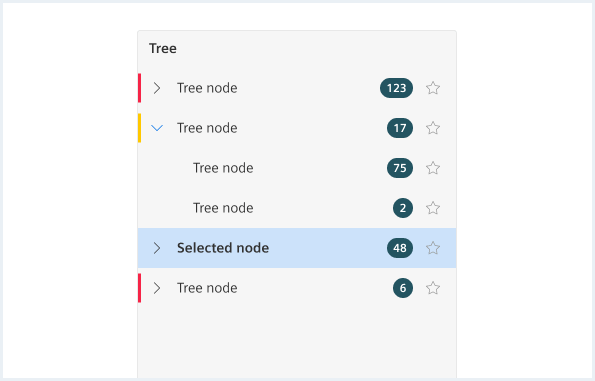
Tree with different states
<div class="tree">
    <div class="tree__node is-level0 is-nested is-selected">
        <button class="button button--ghost has-icon-only node__arrow"></button>
        <a href="#" class="node__details">
            <span class="details__icon iconUxt asset" aria-hidden="true"></span>
            <div class="details__content">
                <span class="details__title">Tree node</span>
                <span class="details__description">Description</span>
            </div>
        </a>
        <div class="node__additional">
            <button class="button button--ghost has-icon-only is-selected node__favorite"></button>
        </div>
    </div>
    <div class="tree__node is-level1 is-collapsed">
        <button class="button button--ghost has-icon-only node__arrow"></button>
        <a href="#" class="node__details">
            <span class="details__icon iconUxt asset" aria-hidden="true"></span>
            <div class="details__content">
                <span class="details__title">Tree node</span>
                <span class="details__description">Description</span>
            </div>
        </a>
        <div class="node__additional">
            <span class="badge badge--dark">
                <span>2</span>
            </span>
            <button class="button button--ghost has-icon-only node__favorite"></button>
        </div>
    </div>
    <div class="tree__node is-level0 is-nested is-collapsed">
        <button class="button button--ghost has-icon-only node__arrow"></button>
        <a href="#" class="node__details">
            <span class="details__icon iconUxt asset" aria-hidden="true"></span>
            <div class="details__content">
                <span class="details__title">Tree node</span>
                <span class="details__description">Description</span>
            </div>
        </a>
        <div class="node__additional">
            <span class="badge badge--dark">
                <span>1</span>
            </span>
            <button class="button button--ghost has-icon-only node__favorite"></button>
        </div>
    </div>
    <div class="tree__node is-level1 is-hidden is-collapsed is-error">
        <button class="button button--ghost has-icon-only node__arrow"></button>
        <a href="#" class="node__details">
            <span class="details__icon iconUxt asset" aria-hidden="true"></span>
            <div class="details__content">
                <span class="details__title">Tree node</span>
                <span class="details__description">Description</span>
            </div>
        </a>
        <div class="node__additional">
            <button class="button button--ghost has-icon-only node__favorite"></button>
        </div>
    </div>
    <div class="tree__node is-level0 is-disabled">
        <button class="button button--ghost has-icon-only node__arrow is-selected"></button>
        <a href="#" class="node__details">
            <span class="details__icon iconUxt asset" aria-hidden="true"></span>
            <div class="details__content">
                <span class="details__title">Tree node</span>
                <span class="details__description">Description</span>
            </div>
        </a>
        <div class="node__additional">
            <span class="badge badge--dark">
                <span>6</span>
            </span>
            <button class="button button--ghost has-icon-only node__favorite is-selected"></button>
        </div>
    </div>
</div>
Tree with indicators
<div class="tree">
    <div class="tree__node is-nested is-error">
        <button class="button button--ghost has-icon-only node__arrow"></button>
        <a href="#" class="node__details">
            <span class="details__icon iconUxt asset" aria-hidden="true"></span>
            <div class="details__content">
                <span class="details__title">Tree node</span>
                <span class="details__description">Description</span>
            </div>
        </a>
        <div class="node__additional">
            <span class="badge badge--dark">
                <span>123</span>
            </span>
            <button class="button button--ghost has-icon-only node__favorite"></button>
        </div>
    </div>
    <div class="tree__node is-level1 is-warning is-nested">
        <button class="button button--ghost has-icon-only node__arrow"></button>
        <a href="#" class="node__details">
            <span class="details__icon iconUxt asset" aria-hidden="true"></span>
            <div class="details__content">
                <span class="details__title">Tree node</span>
                <span class="details__description">Description</span>
            </div>
        </a>
        <div class="node__additional">
            <span class="badge badge--dark">
                <span>123</span>
            </span>
            <button class="button button--ghost has-icon-only node__favorite"></button>
        </div>
    </div>
    <div class="tree__node is-level2 is-collapsed is-error">
        <button class="button button--ghost has-icon-only node__arrow"></button>
        <a href="#" class="node__details">
            <span class="details__icon iconUxt asset" aria-hidden="true"></span>
            <div class="details__content">
                <span class="details__title">Tree node</span>
                <span class="details__description">Description</span>
            </div>
        </a>
        <div class="node__additional">
            <span class="badge badge--dark">
                <span>123</span>
            </span>
            <button class="button button--ghost has-icon-only node__favorite"></button>
        </div>
    </div>
    <div class="tree__node is-nested is-collapsed is-warning">
        <button class="button button--ghost has-icon-only node__arrow"></button>
        <a href="#" class="node__details">
            <span class="details__icon iconUxt asset" aria-hidden="true"></span>
            <div class="details__content">
                <span class="details__title">Tree node</span>
                <span class="details__description">Description</span>
            </div>
        </a>
        <div class="node__additional">
            <span class="badge badge--dark">
                <span>123</span>
            </span>
            <button class="button button--ghost has-icon-only node__favorite"></button>
        </div>
    </div>
    <div class="tree__node is-nested is-collapsed is-success">
        <button class="button button--ghost has-icon-only node__arrow"></button>
        <a href="#" class="node__details">
            <span class="details__icon iconUxt asset" aria-hidden="true"></span>
            <div class="details__content">
                <span class="details__title">Tree node</span>
                <span class="details__description">Description</span>
            </div>
        </a>
        <div class="node__additional">
            <span class="badge badge--dark">
                <span>123</span>
            </span>
            <button class="button button--ghost has-icon-only node__favorite"></button>
        </div>
    </div>
</div>
Tree with checkboxes
<div class="tree">
    <div class="tree__node is-level0 is-nested is-collapsed">
        <button class="button button--ghost has-icon-only node__arrow"></button>
        <div class="checkboxWrapper">
            <input type="checkbox" class="inputGroup__checkbox" id="checkboxTree01" name="checkboxTree01" value="checkboxTree01" checked="checked" />
            <label for="checkboxTree01"></label>
        </div>
        <a href="#" class="node__details">
            <span class="details__icon iconUxt asset" aria-hidden="true"></span>
            <div class="details__content">
                <span class="details__title">Dogs</span>
            </div>
        </a>
        <div class="node__additional">
            <button class="button button--ghost has-icon-only node__favorite"></button>
        </div>
    </div>
    <div class="tree__node is-level0 is-nested is-collapsed">
        <button class="button button--ghost has-icon-only node__arrow"></button>
        <div class="checkboxWrapper">
            <input type="checkbox" class="inputGroup__checkbox" id="checkboxTree02" name="checkboxTree02" value="checkboxTree02" checked="checked" />
            <label for="checkboxTree02"></label>
        </div>
        <a href="#" class="node__details">
            <span class="details__icon iconUxt asset" aria-hidden="true"></span>
            <div class="details__content">
                <span class="details__title">Trees</span>
            </div>
        </a>
        <div class="node__additional">
            <span class="badge badge--dark">
                <span>1</span>
            </span>
            <button class="button button--ghost has-icon-only node__favorite"></button>
        </div>
    </div>
    <div class="tree__node is-level0 is-nested is-collapsed">
        <button class="button button--ghost has-icon-only node__arrow is-selected"></button>
        <div class="checkboxWrapper">
            <input type="checkbox" class="inputGroup__checkbox" id="checkboxTree03" name="checkboxTree03" value="checkboxTree03" checked="checked" />
            <label for="checkboxTree03"></label>
        </div>
        <a href="#" class="node__details">
            <span class="details__icon iconUxt asset" aria-hidden="true"></span>
            <div class="details__content">
                <span class="details__title">Books</span>
            </div>
        </a>
        <div class="node__additional">
            <span class="badge badge--dark">
                <span>6</span>
            </span>
            <button class="button button--ghost has-icon-only node__favorite is-selected"></button>
        </div>
    </div>
</div>
Usage
| Element | Class | Description |
|---|---|---|
.tree | .tree--compact | Compact variant of the tree. |
.tree__node | .is-nested | Sets the visibility of the arrow to visible. The default arrow direction is down. |
.tree__node | .is-collapsed | Sets the direction of the arrow to right. |
.tree__node | .is-level1....is-level5 | Defines the indentation of the individual levels. |
.tree__node | .is-selected | Marks the tree__node as selected. |
.tree__node | .is-disabled | Disable the tree__node. |
.tree__node | .is-info, .is-warning, .is-error, .is-success | Adds different states to the tree node. |
.node__favorite | .is-selected | Marks the favorite button as selected. |