Confirm dialog
A confirm dialog asks a user to verify whether they want to proceed or cancel a requested action. The confirm dialog must be attended before the system executes the command.
Usage
When to use
Use a confirm dialog in the following cases:
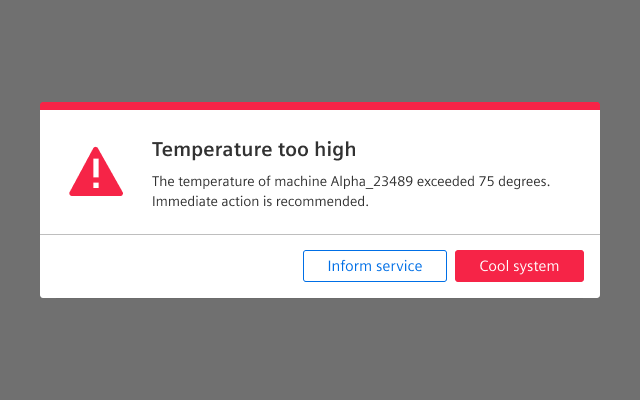
- When important system events occur that require an immediate user action.
- For destructive actions, like deleting something, or consequential actions, like publishing a product.
- Especially for actions that cannot be undone.
Types
There are the following confirm dialog types:
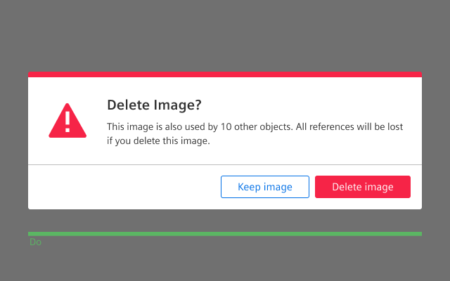
Alert confirm dialog
Use a confirm dialog with the severity state alert to inform and request a decision.
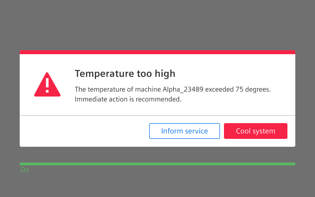
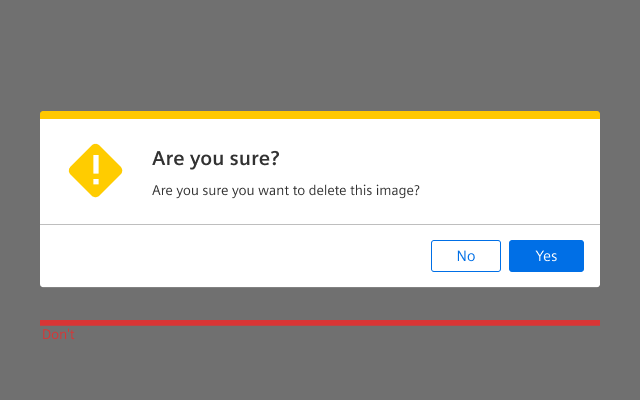
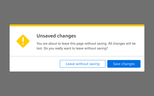
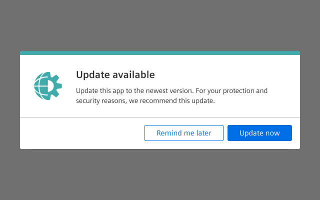
Warning confirm dialog
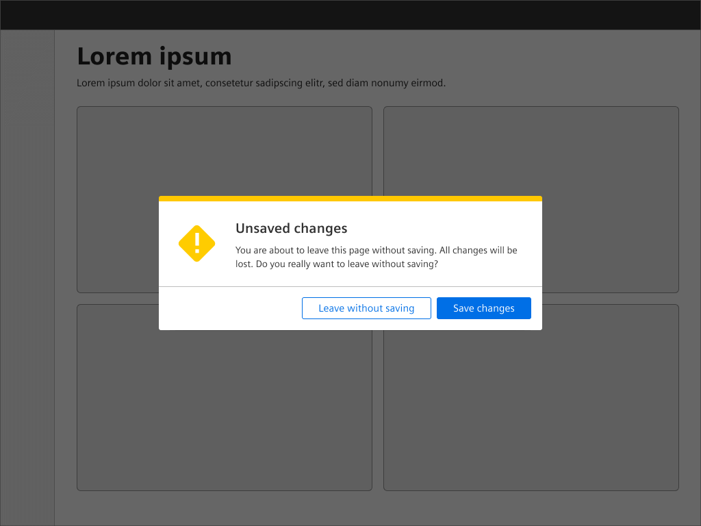
Use a confirm dialog with the severity state warning to inform about possible consequences and request a decision.
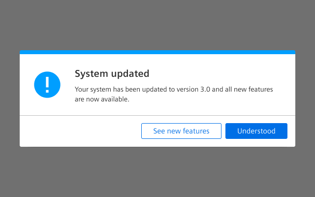
Information confirm dialog
Use a confirm dialog with the state information to inform the user about something.
Custom confirm dialog
Use a custom confirm dialog to inform the user about app specific or system tools related actions and optionally request a decision.
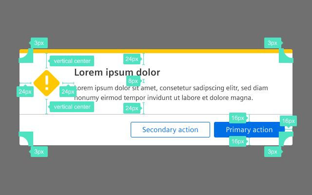
General construction
A confirm dialog consists of the following elements:
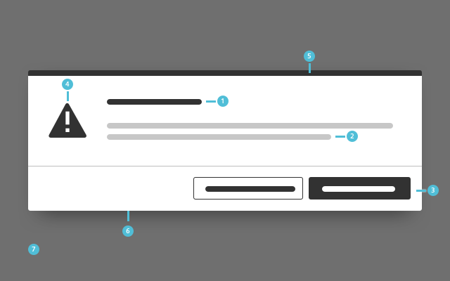
1. Title
- Present the action as a short sentence or question in the title.
2. Text
- Explain the outcome of the action in the confirmation text.
- Inform users about the consequence of their action.
- Keep the text short, simple and focused.
3. Footer bar with buttons
- A footer bar helps to separate the content area from the buttons.
- Restate the action in the confirmation buttons. Instead of generic button labels like Yes/No or OK/Cancel, provide options that summarize what will happen for each possible action.
- In an information confirm dialog the second button is optional.
4. Icon
- Use the icon to emphasize the meaning of the current action.
5. Top border
- Use the top border to emphasize the meaning of the current action.
- Icon and top border must have the same color.
6. Background
- The confirm dialog has a drop shadow.
7. Overlay
- The screen dimming overlay is always located above all other content.
- It lets the user know that the page is currently not active.
Behavior
General behavior
Show only one confirm dialog at a time. When a confirm dialog is opened the submit button should be on focus.
Confirm dialog exit
Closing a confirm dialog is possible in the following ways:
- Submit button
- Quit the confirm dialog by clicking a button that submits the process.
- The submit button should receive focus when the confirm dialog is opened, so hitting enter will submit the process, too.
- Escape key, cancel button
- Leave the confirm dialog by pressing the escape key or a buttons that cancels the process.
Responsive behavior
- A confirm dialog has a fixed width.
- The height of a confirm dialog is determined by the length of its content.
- The footer height is fixed.
- If the viewport becomes less than the fixed width, it will use the full screen size.
Do’s & Don’ts
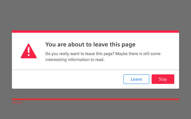
- Only use a confirm dialog for serious consequences.
- Do not use a confirm dialog for routine actions.
- Use a descriptive user-centric body text, which explains clearly what consequences the action will cause.
- Do not use non-descriptive body text.
Style
This chapter shows several confirm dialog styles in the User Experience Toolkit.
Overview
Typography
Please note that the font size and line height of the confirm dialogs’ content is influenced by the font size that is set ‘globally’ in your web application and might differ from the screens.
The following table gives reference to the different font sizes and weights:
| Name | State | Font-family | Font-size | Line-height | Text-align |
|---|---|---|---|---|---|
| Title | all | Siemens Sans Roman | 21px | 29px | left |
| Text | all | Siemens Sans Roman | Pagragraph font-size | Paragraph line-height | left |
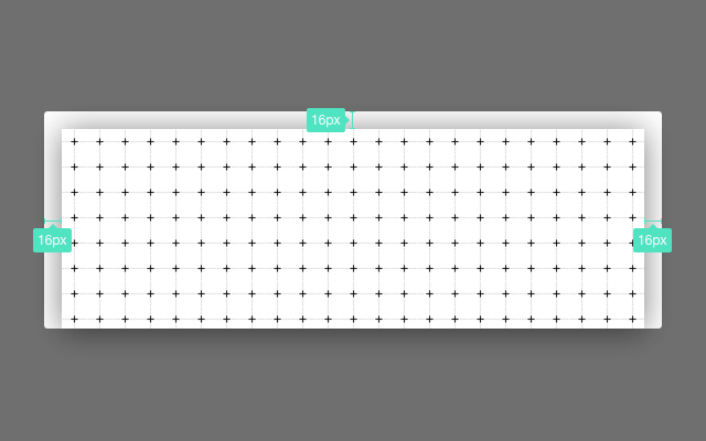
Sizing and spacing
The following measurements show the dimensions for this component:
General
A confirm dialog has a fixed width of 600px.
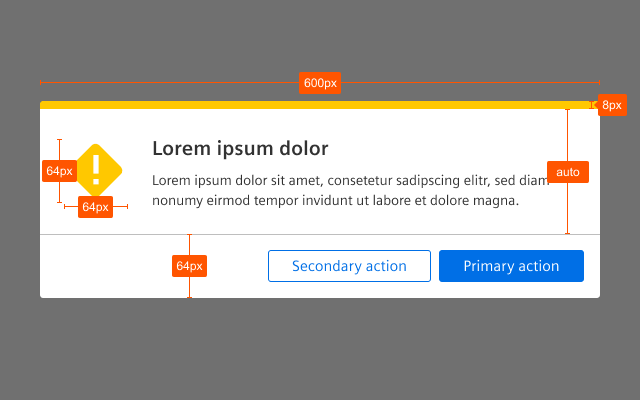
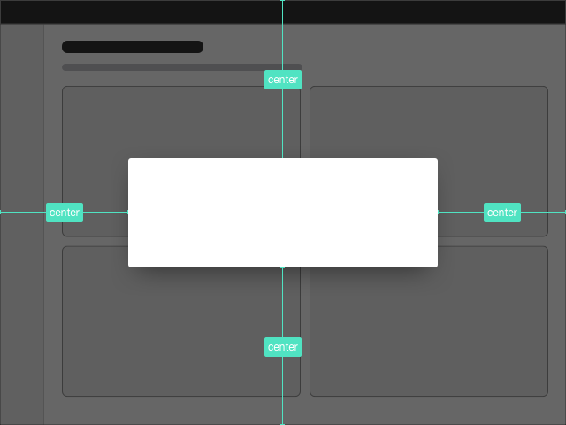
Shadow layer
Position
The confirm dialog is positioned in the center of the screen, that means it is vertically and horizontally centered.
To see a detailed explanation of all existing classes, please refer to the usage table below.
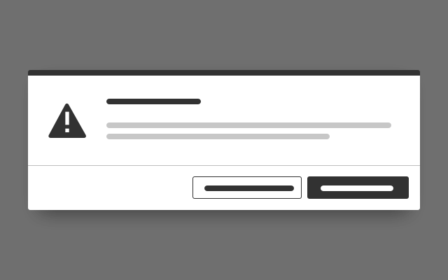
Warning confirm dialog
<div class="dialog is-shown dialog--confirm">
<div class="dialog__overlay"></div>
<div class="dialog__container">
<div class="dialog__background">
<section class="dialog__content">
<h1 class="confirm__headline">Lorem ipsum</h1>
<p>
Quisque tincidunt sodales pretium. Nulla consectetur purus mi, id ultrices nibh mollis sed. Nunc hendrerit massa cursus, vulputate ligula nec, mollis ante. Sed diam purus, auctor nec nulla at, luctus vulputate dui.
</p>
</section>
<footer class="dialog__footer">
<a class="button button--secondary" href="#">Secondary action</a>
<a class="button button--primary" href="#">Primary action</a>
</footer>
</div>
</div>
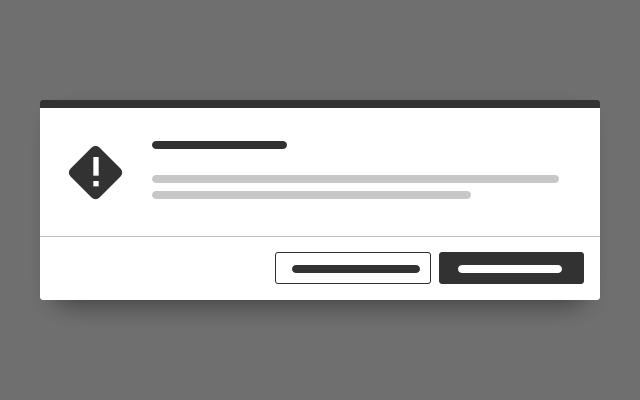
</div>Alert confirm dialog
<div class="dialog is-shown dialog--confirm confirm--alert">
<div class="dialog__overlay"></div>
<div class="dialog__container">
<div class="dialog__background">
<section class="dialog__content">
<h1 class="confirm__headline">Lorem ipsum</h1>
<p>
Quisque tincidunt sodales pretium. Nulla consectetur purus mi, id ultrices nibh mollis sed. Nunc hendrerit massa cursus, vulputate ligula nec, mollis ante. Sed diam purus, auctor nec nulla at, luctus vulputate dui.
</p>
</section>
<footer class="dialog__footer">
<a class="button button--secondary" href="#">Secondary action</a>
<a class="button button--primary is-dangerButton" href="#">Primary action</a>
</footer>
</div>
</div>
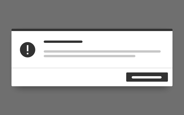
</div>Information confirm dialog
<div class="dialog is-shown dialog--confirm confirm--info">
    <div class="dialog__overlay"></div>
    <div class="dialog__container">
        <div class="dialog__background">
            <section class="dialog__content">
                <h1 class="confirm__headline">Lorem ipsum</h1>
                <p>
                    Quisque tincidunt sodales pretium. Nulla consectetur purus mi, id ultrices nibh mollis sed. Nunc hendrerit massa cursus, vulputate ligula nec, mollis ante. Sed diam purus, auctor nec nulla at, luctus vulputate dui.
                </p>
            </section>
            <footer class="dialog__footer">
                <a class="button button--secondary" href="#">Secondary action</a>
                <a class="button button--primary" href="#">Primary action</a>
            </footer>
        </div>
    </div>
</div>
Custom confirm dialog
<div class="dialog is-shown dialog--confirm confirm--custom">
    <div class="dialog__overlay"></div>
    <div class="dialog__container">
        <div class="dialog__background has-borderColor-forced-charting05">
            <section class="confirm__icon">
                <i aria-hidden="true" class="iconUxt assetNetwork filled has-color-forced-charting05"></i>
            </section>
            <section class="dialog__content">
                <h1 class="confirm__headline">Lorem ipsum</h1>
                <p>
                    Quisque tincidunt sodales pretium. Nulla consectetur purus mi, id ultrices nibh mollis sed. Nunc hendrerit massa cursus, vulputate ligula nec, mollis ante. Sed diam purus, auctor nec nulla at, luctus vulputate dui.
                </p>
            </section>
            <footer class="dialog__footer">
                <a class="button button--secondary" href="#">Secondary action</a>
                <a class="button button--primary" href="#">Primary action</a>
            </footer>
        </div>
    </div>
</div>
Usage
| Element | Class | Description |
|---|---|---|
.dialog.dialog--confirm | .is-shown | Displays the standard warning confirm dialog. |
.dialog.dialog--confirm | .confirm--alert | Applies the styling for an alert confirm dialog. |
.dialog.dialog--confirm | .confirm--info | Applies the styling for a info confirm dialog. |
.dialog.dialog--confirm | .confirm--custom | Enables a developer to use a customizeable dialog style with any available top border color and system icon in any available color:
|