Guided tour
A guided tour is a walkthrough of your web product or software that your users go through to learn its functions and how it is used. This tour is optional and is offered as a helpful tool but can be skipped as well as revisited later on.
Usage
When to use
Use a guided tour in the following cases:
- To guide users and learn the holistic sequence of their workflow steps.
- To let users gain overview of the available apps and their functions.
- To let users understand the potential value for their business by the end of a tour.
General rules
- Tours should be short, clear and convey a specific goal. The ideal complexity of a tour should not exceed 12-15 steps.
- Tours must demonstrate customer value and therefor contain concise descriptions.
- Tours should deliver a logical flow.
- Tours should be designed solely from the users perspective.
- Tours have to motivate users to continue exploring other tours.
- Tours shall be as precise and short as possible but still considering all options a user can chose from.
Content
Use the following information to set up your tour:
Define the first step of the tour
- Which content does the user expect with which goal in mind? Which sections does the user get guided through?
- Which previous tours / actions are necessary to carry out the tour (e.g. creating data)?
Define all steps of the tour
- Which steps does the user take to reach the goal?
- Keep in mind: Each tour should not be longer than ca. 10 minutes / 12-15 steps.
- Start, success and end steps are not counted as steps and therefore do not have to be considered in the step counter.
Which trigger navigates to the next step?
There are two different triggers:
- User clicks the selected element.
- If there is no element to click or the action takes place on a different device, a button is used to navigate forward.
Define success moments within the tour
- Which sections of the tour should be celebrated after reaching it?
- Use celebrations when users have created value or finished performing a step.
- Celebrations help to highlight user achievement and act as incentives.
Define the last step of the tour
- What goal did the user achieve with completing the tour?
- What added value did the user have?
- What tours should be done next to build on what has been learned?
- What added value does the experience create for business in the users own world?
- Where can the user get more detailed information on the topic / tool of the tour?
Have a final check of the tour steps
- Can the number of steps be reduced?
- Are all tour steps aligned with targeted persona needs and communication goals?
- Check that users will remain engaged and recognize value creation.
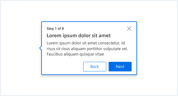
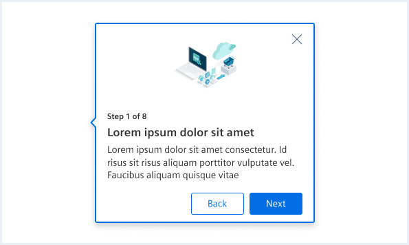
Tour
- Use visuals to support the journey.
- Visuals should simplify background complexity or consolidate information.
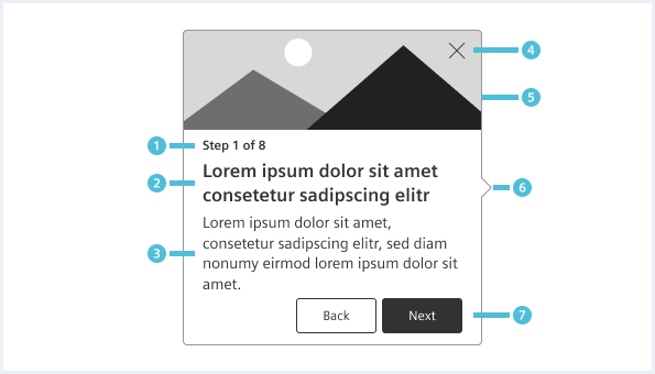
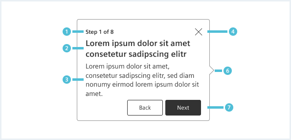
- Show progress (mandatory).
- Key information about impact phrased as call to action (mandatory).
- Define concrete action phrased as call to action or a description of what is shown to the user.
- A maximum of 50 characters is recommended e.g. “Click View your assets”.
- More in-depth information on what to expect or what’s important to know (optional).
- A maximum of 150 characters is recommended e.g. “Find all your assets in the asset overview”.
- Allow the user to exit the tour.
- Header with image (optional)
- Support the message by visualizing the action.
- Arrow indicator shows where the popover is relating to.
- Allow user to navigate.
- A maximum of 15 characters is recommended, e.g. “Next”.
- “Back” moves one step back.
- Don’t use more then two buttons.
- If a task is the desired goal for a step, e.g. clicking a button in the UI, don’t use redundant navigation buttons.
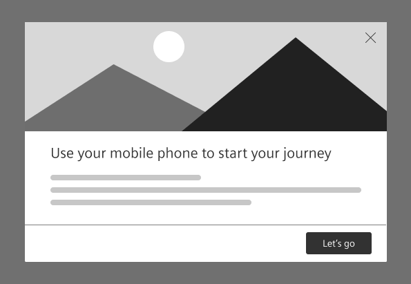
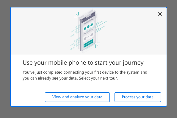
Tour beginning
- An entry screen gives a brief overview of what the user can expect from the tour.
- Previous tours / actions which are necessary to carry out the tour (e.g. creating data) are named on the entry screen and a link to the tours is offered.
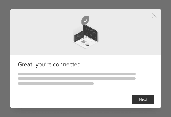
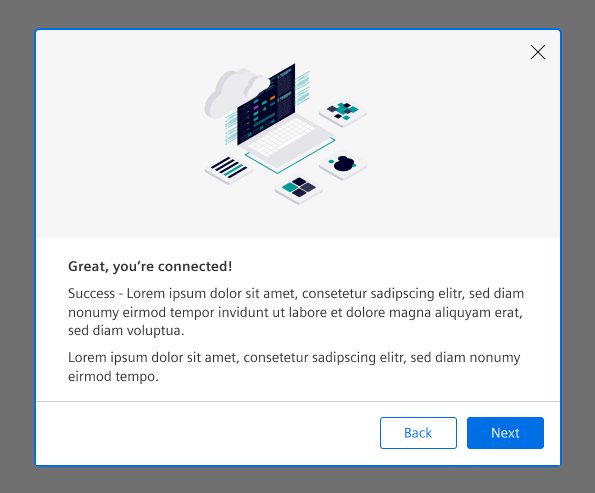
Tour success
- Celebrate after completion of intermediate steps to motivate the user to complete all steps and provide a feeling of progress.
- Celebrate at the end of the tour to give a feeling of achievement.
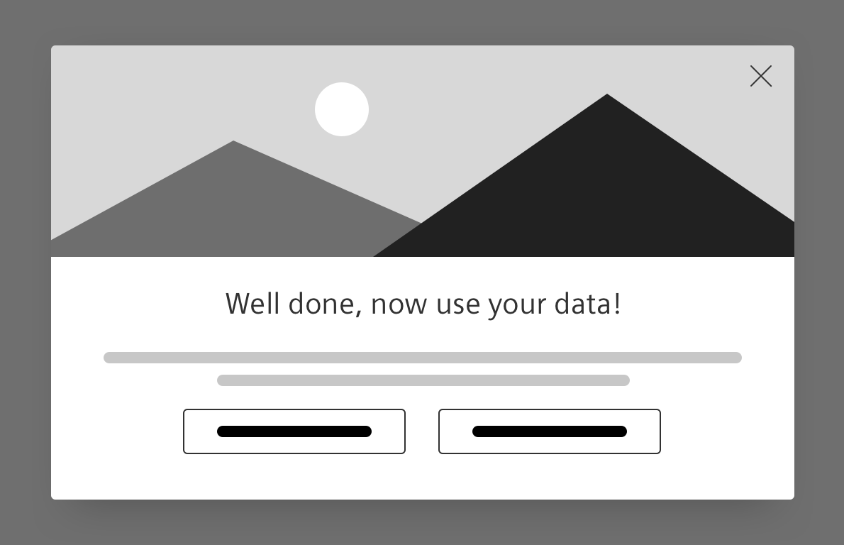
Tour ending
- The end screen defines the end of a tour.
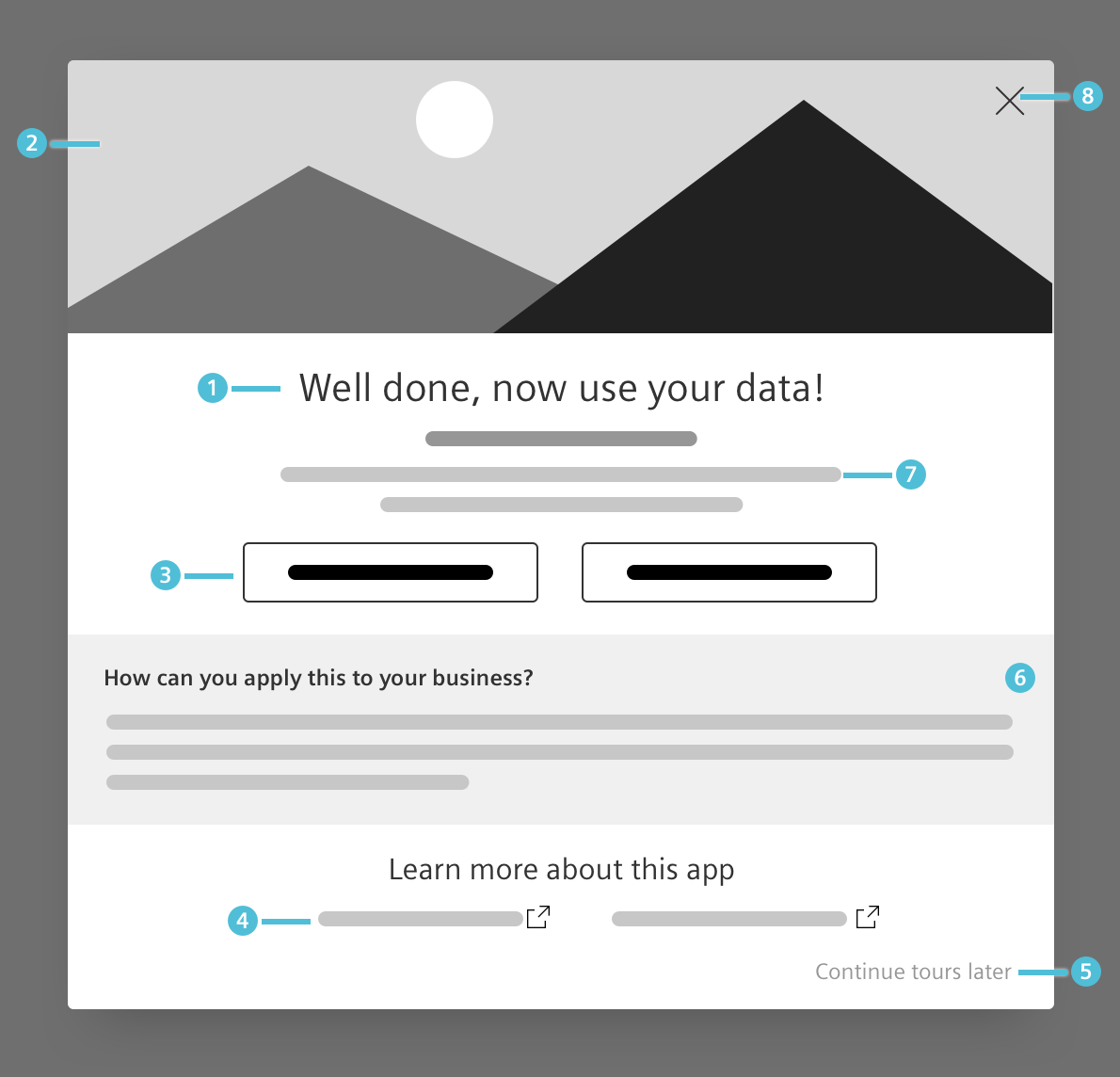
- Textually highlight the tour completion.
- Visually highlight the successful tour completion.
- Offer link(s) to next tour(s).
- Offer links to community and documentation for further information.
- Allow the user to exit the tour.
- Offer additional value to apply in your user’s real world context: “How to apply this to your own business”?
- Give a recap and outlook on the next tour(s).
- Allow your user to exit the tour.
Behavior
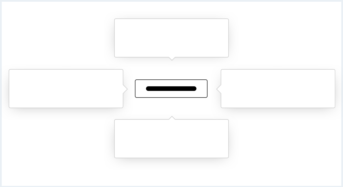
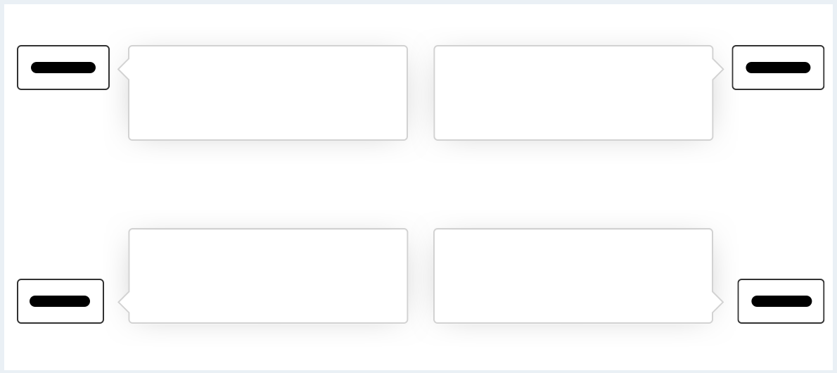
The tour popover can be displayed above, below, left, or right of an element. The position of the tour popover should adjust automatically based on where the element is on the screen.
The arrow can be placed freely along every edge to accommodate optimal positioning of the popover.
Style
This chapter shows several guided tour styles in the User Experience Toolkit:
Typography
The following table gives reference to the different font sizes and weights:
| Name | Font-family | Font-size | Line-height | Text-alignment |
|---|---|---|---|---|
| Tour dialog title | Siemens Sans Roman | 21px | 29px | left |
| Tour dialog paragraph | Siemens Sans Roman | 14px | 20px | left |
| Tour popover key information | Siemens Sans Bold | 14px | 16px | left |
| Tour popover in-depth information | Siemens Sans Roman | 12px | 16px | left |
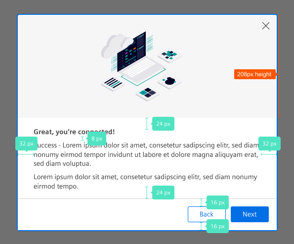
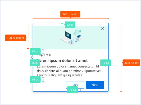
Sizing and spacing