Content header
A content header contains the core information of the current page content.
Usage
When to use
Use a content header in the following cases:
- To introduce the user to the current page.
- To show the page title.
- To provide core description of the page.
General construction
The content header consists of the following elements:
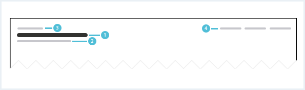
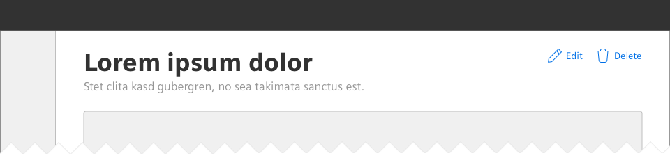
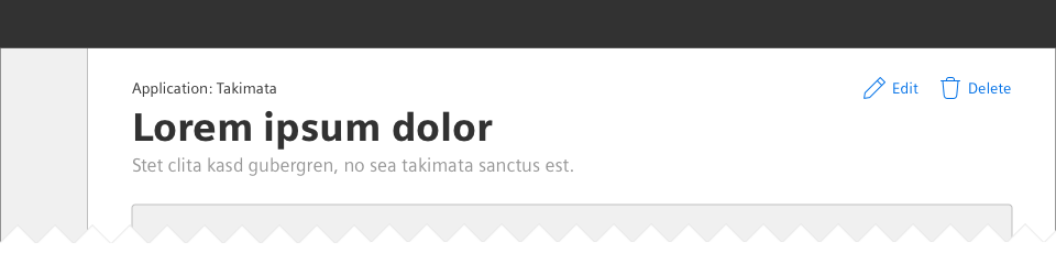
1. Page title
- The page title is short and descriptive. It reflects the content in just a few words.
- Most pages should have a page title. Starting pages or dashboards can be an exception.
2. Subline
- The subline is a secondary headline that elaborates the page title or contains meta information.
- The subline is located below the page title.
- The subline is optional.
3. Context
- Context can be the parent of a page, a classification of a page etc.
3. Secondary content actions
- Secondary content actions are related to the entire page. They are located in the top right corner of the content header.
- For more than four actions use a more menu. Show the main actions on the page and place the additional actions in the menu.
Options
The following content header options are available:
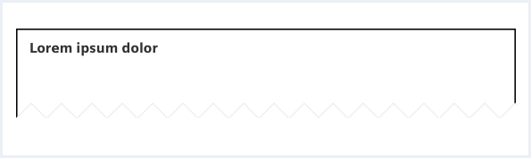
Minimal content header
Most pages need introduction and therefore should have a page title.
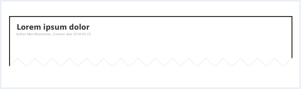
Content header with subline
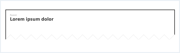
Content header with context
A context can be the parent of the page.
Behavior
Placement
The content header is placed in the main region at the top of the page.
Do’s & Don’ts
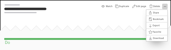
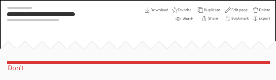
- Show the most relevant content actions and use a more menu to pool the others.
- Don’t show more than four page actions in the content header.
Style
This chapter shows several content header styles in the User Experience Toolkit.
Overview
Typography
The following table gives reference to the different font sizes and weights:
| Name | State | Font-family | Font-size | Line-height | Text-align |
|---|---|---|---|---|---|
| Page title | all | Siemens Sans Black | 36px | 43px | left |
| Subline | all | Siemens Sans Roman | 17px | 25px | left |
| Context | all | Siemens Sans Roman | 14px | 20px | left |
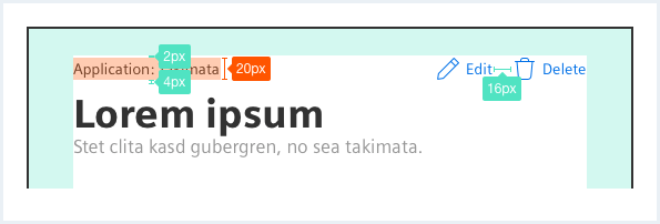
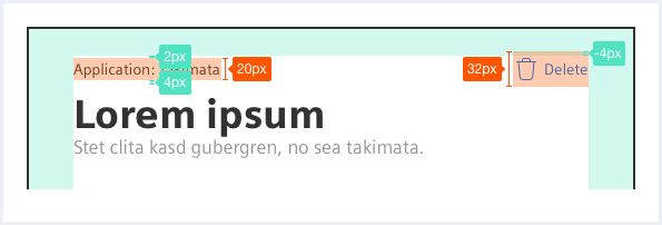
Sizing and spacing
The following measurements show the dimensions for this component:
The bottom spacing is at least 16px. Depending on the following content, it can be increased in steps of 8px.
Content header
Page Title
Lorem ipsum dolor sit amet, consectetur adipiscing elit, sed do eiusmod tempor incididunt ut labore et dolore magna aliqua. Ut enim ad minim veniam, quis nostrud exercitation ullamco laboris nisi ut aliquip ex ea commodo consequat. Duis aute irure dolor in reprehenderit in voluptate velit esse cillum dolore eu fugiat nulla pariatur. Excepteur sint occaecat cupidatat non proident, sunt in culpa qui officia deserunt mollit anim id est laborum.
<div class="contentHeader">
    <div class="contentHeader__header">
        <h1 class="header__headline">Page Title</h1>
        <div class="header__subline">Optional subline</div>
    </div>

    <div class="contentHeader__actions">
        <button class="button button--secondaryContentAction">
            <span class="iconUxt addCircle" aria-hidden="true"></span>Add Button
        </button>

        <button class="button button--secondaryContentAction" href="#">
            <span class="iconUxt edit" aria-hidden="true"></span>Edit Link
        </button>

        <button class="button button--secondaryContentAction" href="#">
            <span class="iconUxt delete" aria-hidden="true"></span>Delete Link
        </button>
    </div>
</div>
<p>
    Lorem ipsum dolor sit amet, consectetur adipiscing elit, sed do eiusmod tempor incididunt ut labore et dolore
    magna aliqua. Ut enim ad minim veniam, quis nostrud exercitation ullamco laboris nisi ut aliquip ex ea commodo
    consequat. Duis aute irure dolor in reprehenderit in voluptate velit esse cillum dolore eu fugiat nulla pariatur. Excepteur
    sint occaecat cupidatat non proident, sunt in culpa qui officia deserunt mollit anim id est laborum.
</p>
Content header with more menu
Page Title
Lorem ipsum dolor sit amet, consectetur adipiscing elit, sed do eiusmod tempor incididunt ut labore et dolore magna aliqua. Ut enim ad minim veniam, quis nostrud exercitation ullamco laboris nisi ut aliquip ex ea commodo consequat. Duis aute irure dolor in reprehenderit in voluptate velit esse cillum dolore eu fugiat nulla pariatur. Excepteur sint occaecat cupidatat non proident, sunt in culpa qui officia deserunt mollit anim id est laborum.
<div class="contentHeader">
    <div class="contentHeader__header">
        <h1 class="header__headline">Page Title</h1>
        <div class="header__subline">Optional subline</div>
    </div>

    <div class="contentHeader__actions">
        <button class="button--secondaryContentAction">
            <span class="iconUxt addCircle" aria-hidden="true"></span>Add Button
        </button>

        <a class="button button--secondaryContentAction" href="#">
            <span class="iconUxt edit" aria-hidden="true"></span>Edit Link
        </a>

        <a class="button button--secondaryContentAction" href="#">
            <span class="iconUxt delete" aria-hidden="true"></span>Delete Link
        </a>
    </div>
</div>
<p>
    Lorem ipsum dolor sit amet, consectetur adipiscing elit, sed do eiusmod tempor incididunt ut labore et dolore
    magna aliqua. Ut enim ad minim veniam, quis nostrud exercitation ullamco laboris nisi ut aliquip ex ea commodo
    consequat. Duis aute irure dolor in reprehenderit in voluptate velit esse cillum dolore eu fugiat nulla pariatur. Excepteur
    sint occaecat cupidatat non proident, sunt in culpa qui officia deserunt mollit anim id est laborum.
</p>
Content header with more menu
Page Title
Lorem ipsum dolor sit amet, consectetur adipiscing elit, sed do eiusmod tempor incididunt ut labore et dolore magna aliqua. Ut enim ad minim veniam, quis nostrud exercitation ullamco laboris nisi ut aliquip ex ea commodo consequat. Duis aute irure dolor in reprehenderit in voluptate velit esse cillum dolore eu fugiat nulla pariatur. Excepteur sint occaecat cupidatat non proident, sunt in culpa qui officia deserunt mollit anim id est laborum.
<div class="contentHeader">
    <div class="contentHeader__header">
        <h1 class="header__headline">Page Title</h1>
        <div class="header__subline">Optional subline</div>
    </div>

    <div class="contentHeader__actions">
        <button class="button--secondaryContentAction">
            <span class="iconUxt addCircle" aria-hidden="true"></span>Add Button
        </button>

        <a class="button button--secondaryContentAction" href="#">
            <span class="iconUxt edit" aria-hidden="true"></span>Edit Link
        </a>

        <div class="menu is-shown is-bottom is-right-aligned">

            <button class="button--secondary has-icon-only">
            </button>
            <div class="popover__container">
                <a class="popover__item" href="#">
                    Test ipsum
                </a>
                <a class="popover__item" href="#">
                    Lorem ipsum dolor sit amet
                </a>
                <a class="popover__item" href="#">
                    Lorem ipsum dolor Lorem ipsum dolor Lorem ipsum dolor
                </a>
            </div>
        </div>

    </div>
</div>
<p>
    Lorem ipsum dolor sit amet, consectetur adipiscing elit, sed do eiusmod tempor incididunt ut labore et dolore
    magna aliqua. Ut enim ad minim veniam, quis nostrud exercitation ullamco laboris nisi ut aliquip ex ea commodo
    consequat. Duis aute irure dolor in reprehenderit in voluptate velit esse cillum dolore eu fugiat nulla pariatur. Excepteur
    sint occaecat cupidatat non proident, sunt in culpa qui officia deserunt mollit anim id est laborum.
</p>
Content header with context
Page Title
Lorem ipsum dolor sit amet, consectetur adipiscing elit, sed do eiusmod tempor incididunt ut labore et dolore magna aliqua. Ut enim ad minim veniam, quis nostrud exercitation ullamco laboris nisi ut aliquip ex ea commodo consequat. Duis aute irure dolor in reprehenderit in voluptate velit esse cillum dolore eu fugiat nulla pariatur. Excepteur sint occaecat cupidatat non proident, sunt in culpa qui officia deserunt mollit anim id est laborum.
<div class="contentHeader">
    <div class="contentHeader__header">
        <div class="header__context">Application: Asset Manager</div>
        <h1 class="header__headline">Page Title</h1>
        <div class="header__subline">Optional subline</div>
    </div>

    <div class="contentHeader__actions">
        <button class="button button--secondaryContentAction">
            <span class="iconUxt addCircle" aria-hidden="true"></span>Add Button
        </button>

        <button class="button button--secondaryContentAction" href="#">
            <span class="iconUxt edit" aria-hidden="true"></span>Edit Link
        </button>

        <button class="button button--secondaryContentAction" href="#">
            <span class="iconUxt delete" aria-hidden="true"></span>Delete Link
        </button>
    </div>
</div>
<p>
    Lorem ipsum dolor sit amet, consectetur adipiscing elit, sed do eiusmod tempor incididunt ut labore et dolore
    magna aliqua. Ut enim ad minim veniam, quis nostrud exercitation ullamco laboris nisi ut aliquip ex ea commodo
    consequat. Duis aute irure dolor in reprehenderit in voluptate velit esse cillum dolore eu fugiat nulla pariatur. Excepteur
    sint occaecat cupidatat non proident, sunt in culpa qui officia deserunt mollit anim id est laborum.
</p>