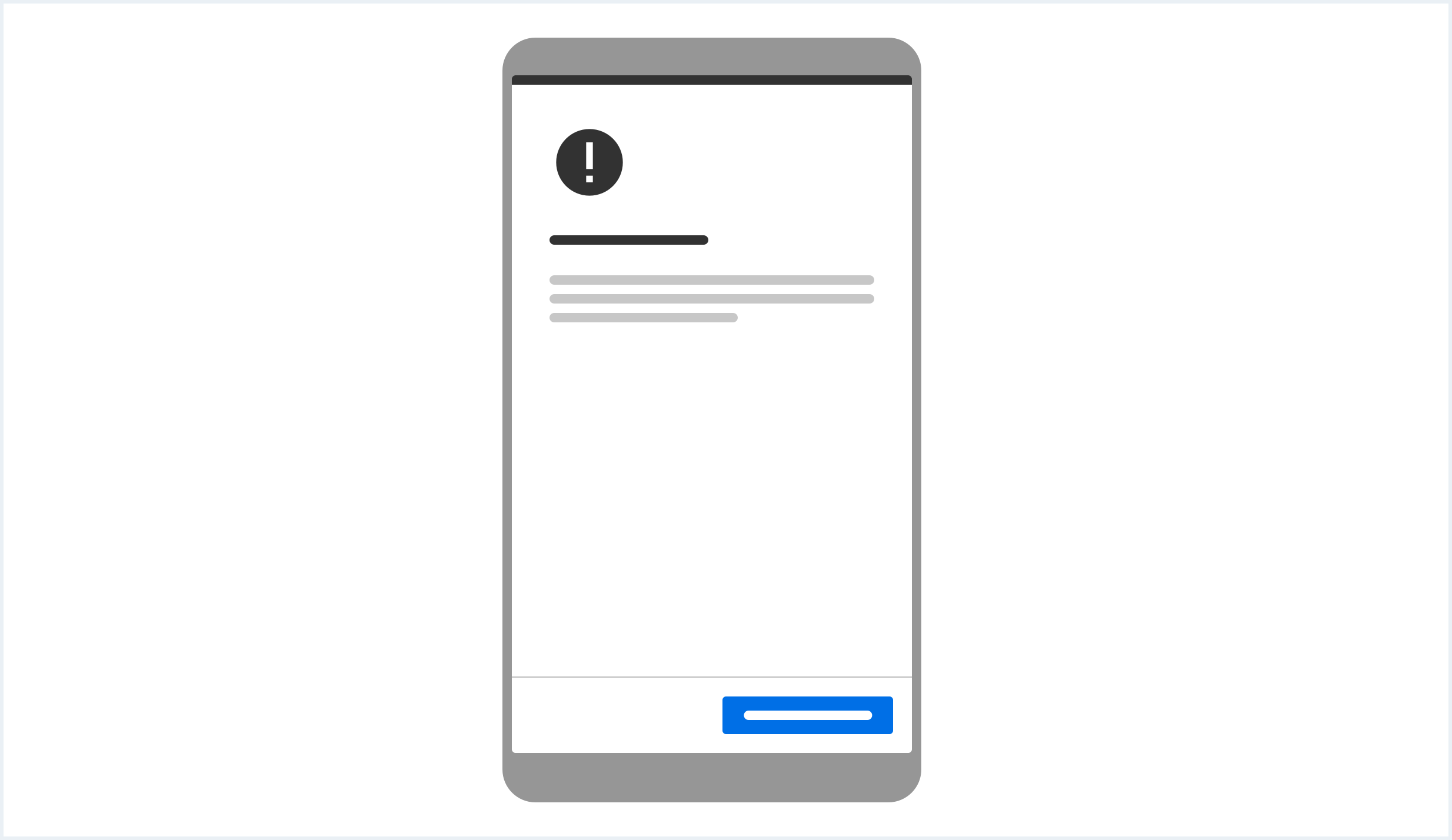
Screen resolution info
Show what resolution your application is optimized (and thought) for
Usage
When to use
Use a screen resolution info in case an application is not intended do be used below a certain screen width (e.g. not on small mobile devices). The user should be informed in case he/she is using such a device or screen resolution to avoid confusion about possible UI glitches or malfunction.
Behavior
The information notice shall appear whenever the app is resized (or loaded) on a not optimized resolution. This notice can be dismissed and the application can be used as usual but with the awareness of possible UI glitches.
The screen resolution info is based on the known styling of Confirm dialog, with the difference to only contain one single primary action to dismiss it.
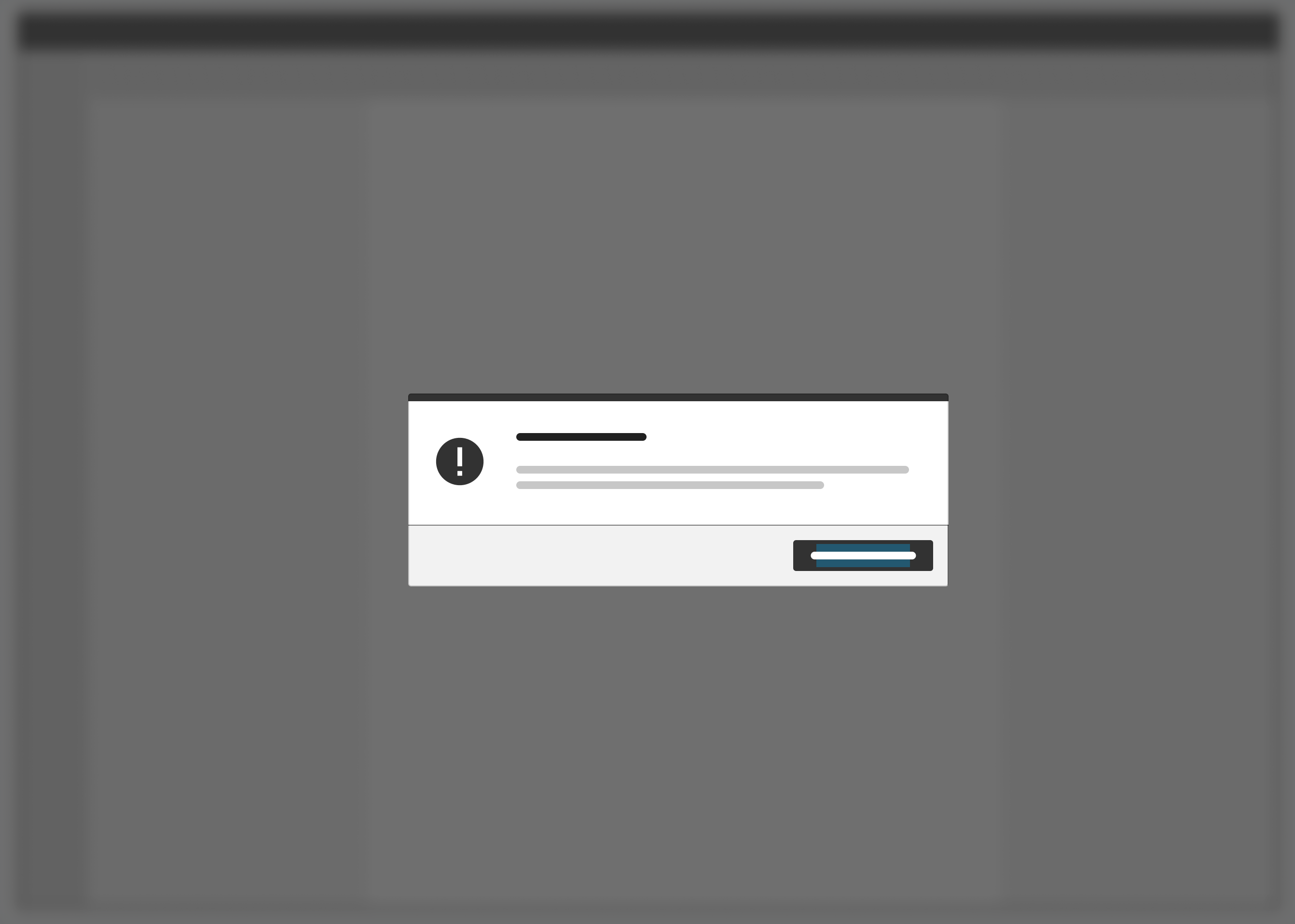
Screen resolution info example for screen widths of >= 1024px
<div class="appWrapper">

    <div class="dialog is-shown dialog--confirm confirm--info" id="reponsiveInfoNotice">
        <div class="dialog__container">
            <div class="dialog__background">
                <section class="dialog__content">
                    <h1 class="confirm__headline">Screen resolution info</h1>
                    <p>
                        This application is not optimized for your current screen resolution (which seems to be lower then <= 1024 pixels).
                    </p>
                    <p>
                        Please use a device with higher screen resolution or increase your window size for optimal use. The UI might break for non-optimal resolutions.
                    </p>
                </section>
                <footer class="dialog__footer">
                    <a class="button button--primary" href="#">Acknowledge & Dismiss</a>
                </footer>
            </div>
        </div>
    </div>

    <style>
        @media (min-width: 1025px) { #reponsiveInfoNotice { display: none; } }
    </style>
    <div class="appWrapper__regions has-appHeader has-contextRegion has-leadingRegion contextRegion-is-expanded leadingRegion-is-expanded appWrapper__regions--pushLayout">

        <section class="appHeader">
            <div class="appHeader__breadcrumb">
            </div>
            <div class="appHeader__content">
            </div>
        </section>

        <section class="leadingRegion">
        </section>

        <section class="mainRegion">
            <h1>Screen resolution info demo</h1>
            <p>
                If you cannot see any confirm dialog, please resize your browser window to be equal or less than 1024px wide.
            </p>
        </section>

        <section class="contextRegion">
        </section>

    </div>

</div>
<script type="text/javascript" src="https://static.eu1.mindsphere.io/osbar/v4/js/main.min.js"></script>
<script>
    _msb.init({
        title: "Responsive Info Notice",
        showLegal: true,
        polyfills: {
            promise: true
        }
    });
    window.onload = function(e){
        var dialog = document.querySelectorAll("#reponsiveInfoNotice");
        if (dialog) {
            document.querySelectorAll("#reponsiveInfoNotice a.button")[0].addEventListener('click', function() {
                dialog[0].classList.remove('is-shown');
            });
        }
    }
</script>
Addition Explanation:
The following adaptions have to be done depending on use case and application:
- Adjust the CSS media query according to your supported device widths / break points; all valid css units are possible:
- The example below hides the notice on all devices that have a smaller screen or window width then 1025 pixels.
@media (min-width: 1025px) { #reponsiveInfoNotice { display: none; }} - The example below hides the notice on all devices that have a smaller screen or window width then 1025 pixels AND screens bigger then 1920 pixels.
@media (min-width: 1025px) and (max-width: 1920px) { #reponsiveInfoNotice { display: none; }}
- The example below hides the notice on all devices that have a smaller screen or window width then 1025 pixels.
- If needed, adjust the identifier for the notice in markup and css.
- Adjust the display/screen properties in your notification, such that the resolution described is correct.
- Make the notification ‘dismissable’ (either just remove the ‘is-shown’ class on click, persist the action for some time etc).