Date time range picker
A date time range picker is a pattern to interact with in order to chose, change and select timestamps and date ranges.
Usage
When to use
Use the date time range picker in the following cases:
- When working with date and time values: It can be used to provide an easy-to-use interface to select times, dates and ranges.
Use the advanced date time range picker in the following cases:
- When a more subtle input prompt is required, for example on dashboards.
- To quickly select and browse pre-defined or personalised time periods.
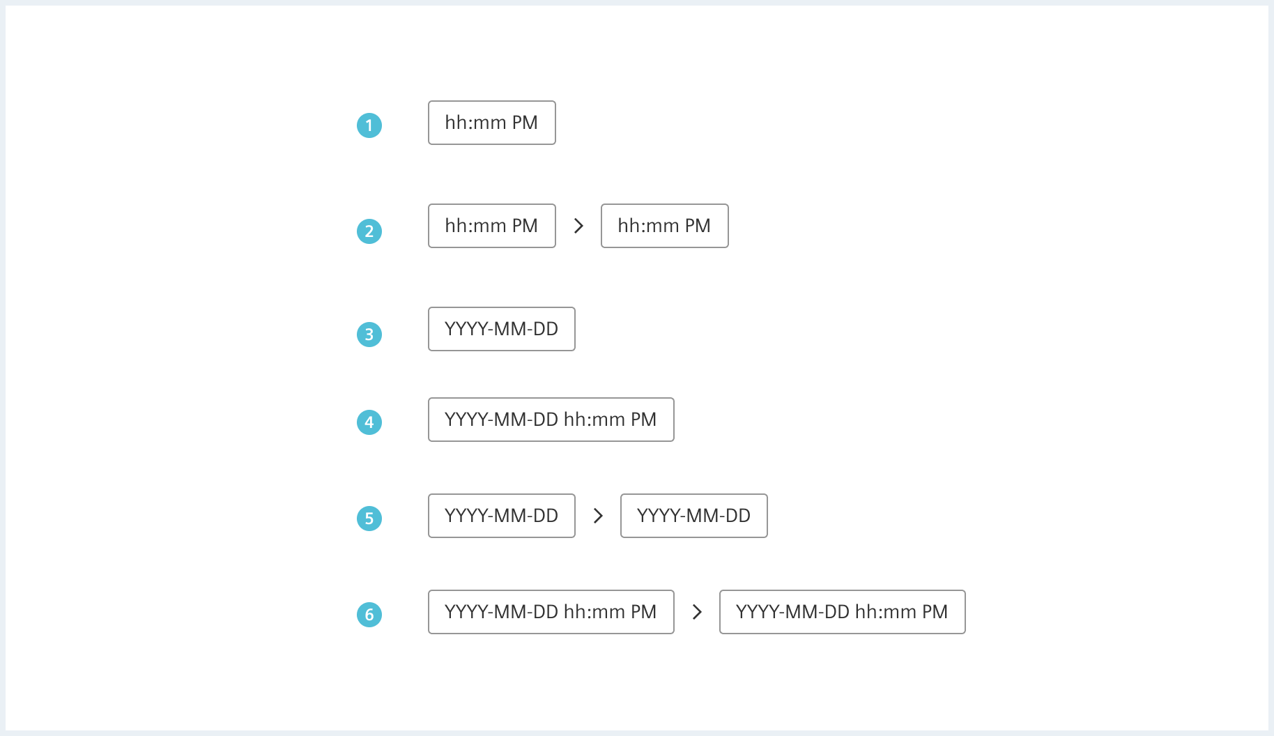
Types
The following types of pickers are available:
General construction
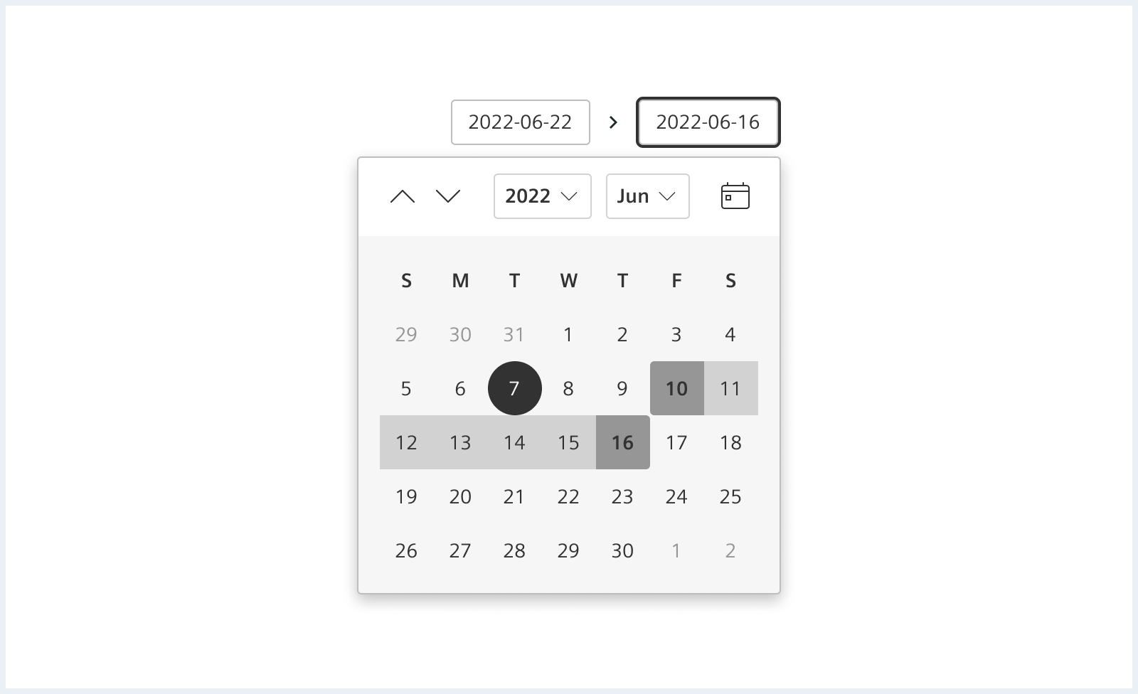
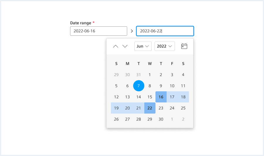
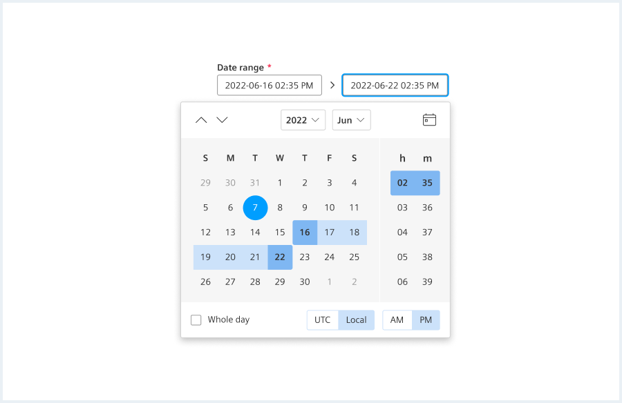
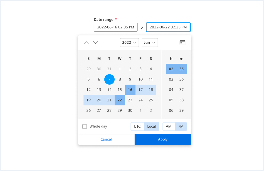
A date time range picker consists of the following elements:
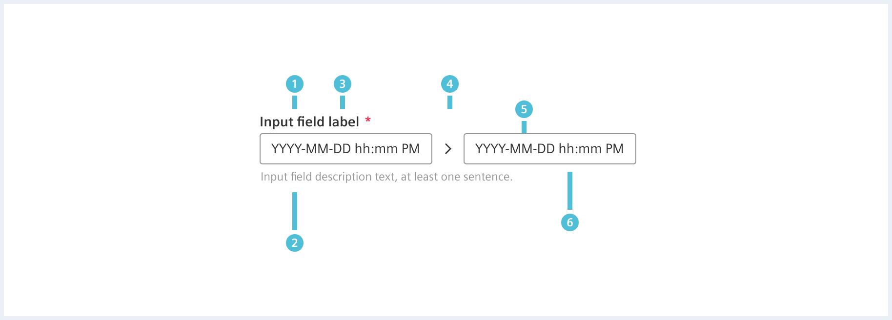
The input field is made up of the following parts:
- Label (optional)
- Description (optional)
- Required field indicator (optional)
- Range indicator
- Date:
- The user enters the date in the date input field.
- Time (optional):
- A time can be entered in the date input field, too.
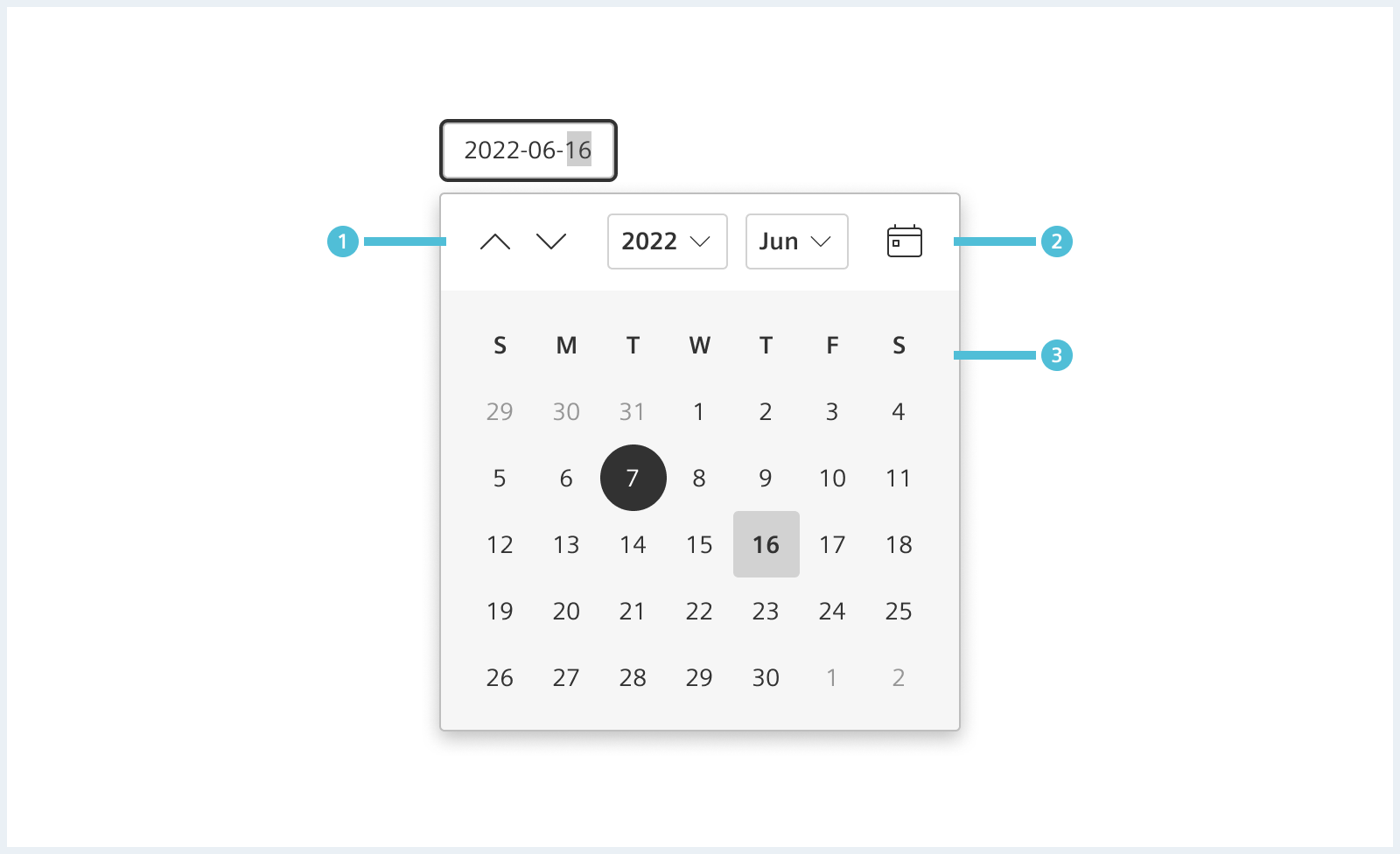
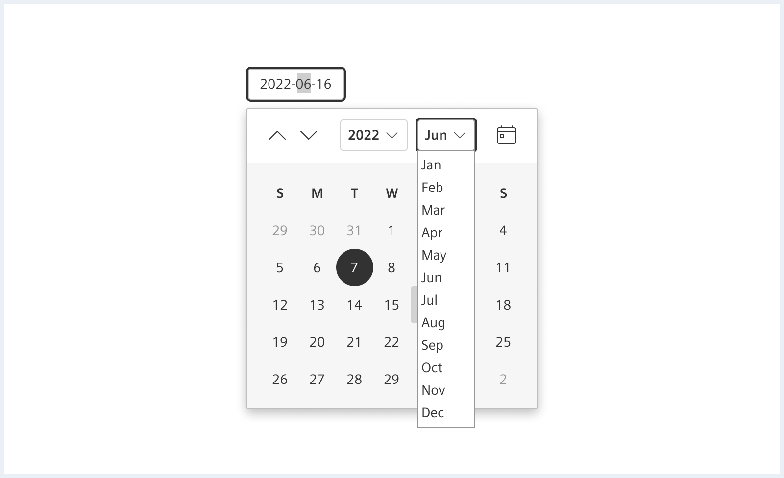
The calendar widget provides an easy-to-use interface to pick times, dates and ranges. A wide range of options are available for the calendar. See section ‘options’ for more information.
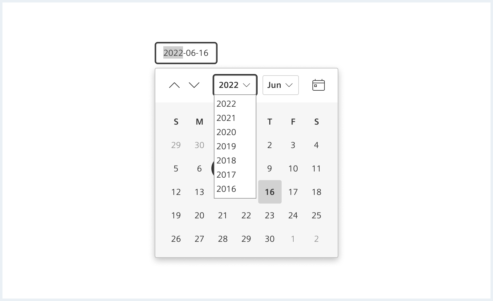
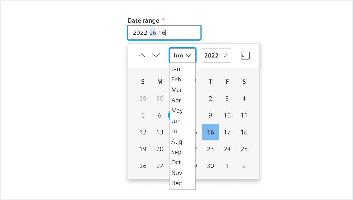
- Year and month controls:
- Allow the user to move forward or backward one month at a time by clicking the arrow buttons.
- Allow the user to navigate through years or months.
- Today:
- Allows the user to jump to the current day.
- Picking area:
- Allows the user to pick dates.
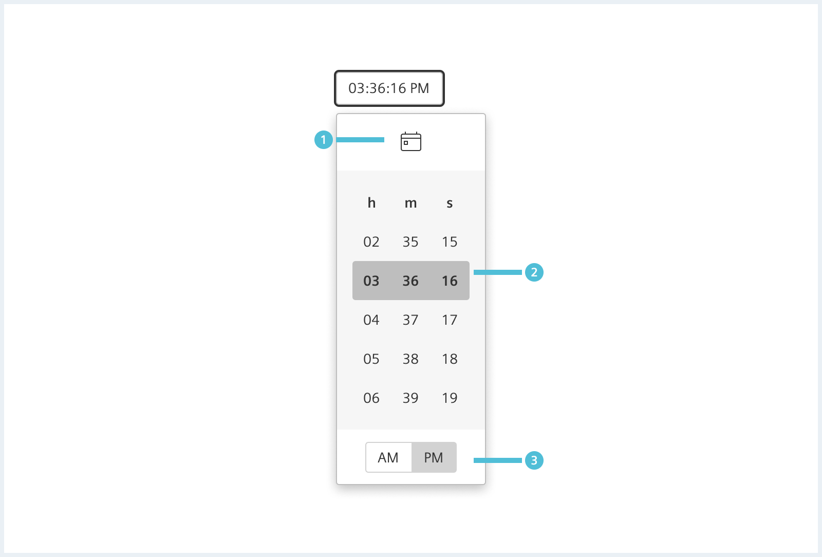
- Now:
- Jump to current time.
- Time selection:
- Hours, minutes and optional seconds.
- 12 hours format:
- AM / PM selection
Options
The following options are available:
Action Buttons
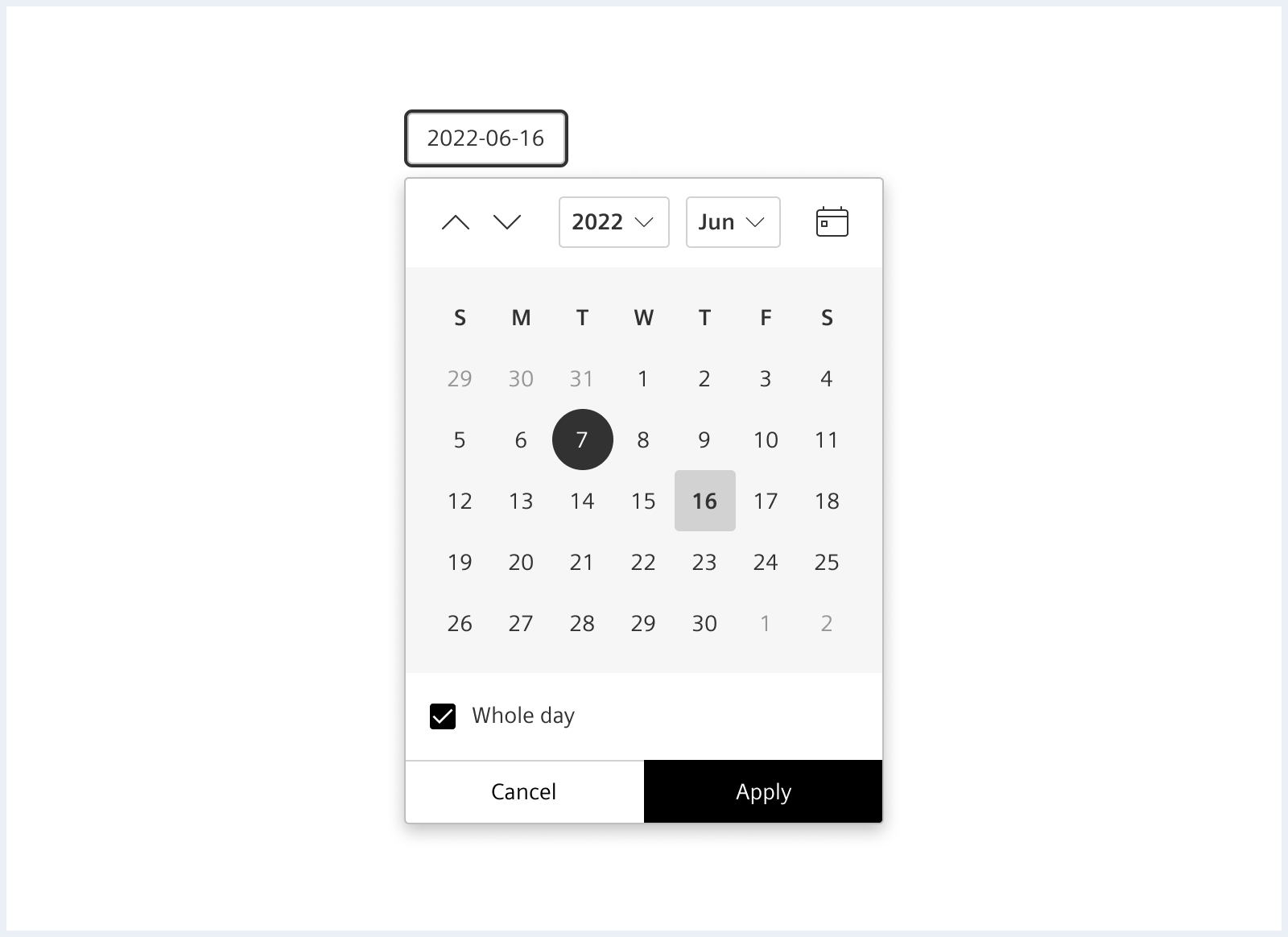
- Apply:
- Submit changes made in the calendar.
- Cancel:
- Dismiss calendar without applying changes.
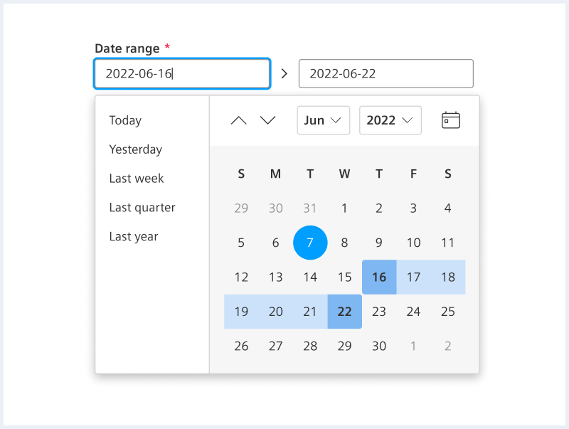
Quickrange
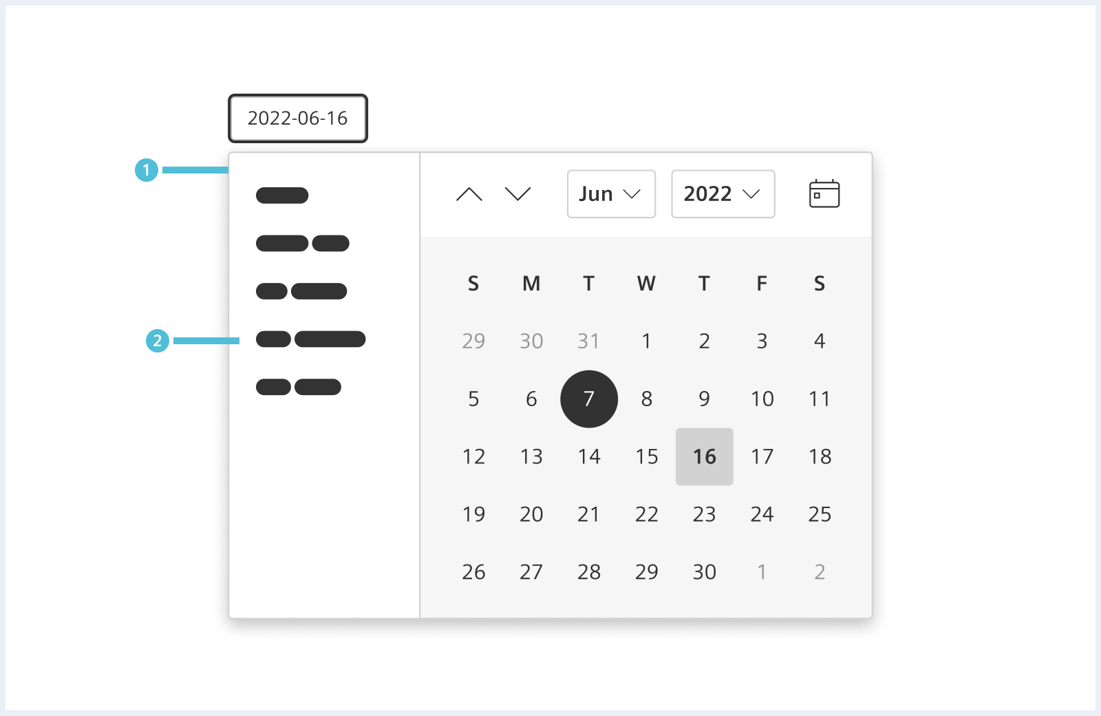
Quickranges provide a selection of often used or predefined time ranges.
Whole day
Timezone
Style
This chapter shows several date time range picker styles in the User Experience Toolkit.
Overview
Native date time picker
<div class="inputGroup dateTimePicker">
    <label class="inputGroup__label" for="dateTimePicker-date">
        Date
    </label>
    <input id="dateTimePicker-date" class="dateTimePicker__textInput" type="date" max="" value="2024-03-04">
</div>

<div class="inputGroup dateTimePicker">
    <label class="inputGroup__label" for="dateTimePicker-time">
        Time
    </label>
    <input id="dateTimePicker-time" class="dateTimePicker__textInput" type="time" value="08:00">
</div>

<hr class="showcase">

<div class="inputGroup dateTimePicker">
    <label class="inputGroup__label" for="dateTimePicker-dateTime-local">
        Date-Time local
    </label>
    <input id="dateTimePicker-dateTime-local" class="dateTimePicker__textInput" type="datetime-local" id="dateTimePicker-dateTime-local" name="meeting-time" value="2024-03-04T08:00" min="2024-03-04T00:00" max="2024-03-18T00:00" />
</div>

<hr class="showcase">

<div class="inputGroup dateTimePicker">
    <label class="inputGroup__label" for="dateTimePicker-disabled">
        Disabled
    </label>
    <input class="dateTimePicker__textInput" type="datetime-local" id="dateTimePicker-disabled" name="meeting-time" value="2024-03-04T08:00" min="2024-03-04T00:00" max="2024-03-18T00:00" disabled />
</div>

<hr class="showcase">

<div class="inputGroup dateTimePicker">
    <label class="inputGroup__label" for="dateTimePicker-readonly">
        Read only
    </label>
    <input class="dateTimePicker__textInput" type="datetime-local" id="dateTimePicker-readonly" name="meeting-time" value="2024-03-04T08:00" min="2024-03-04T00:00" max="2024-03-18T00:00" readonly />
</div>
Usage
To add the disabled or readonly state to the input field, please use the attributes disabled and readonly at the input element. |