Switch
A switch allows the user to pick between two opposite states.
Usage
When to use
Use a switch when there is a binary state that the user should be able to toggle instantly. Examples are “On”/”Off”, “Online”/”Offline” or “Installed”/”Not installed”.
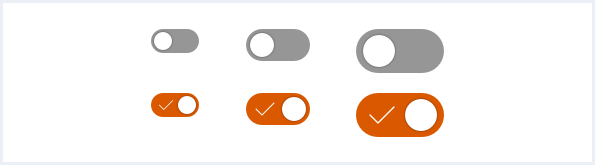
General construction
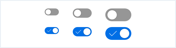
A switch consists of the following elements:
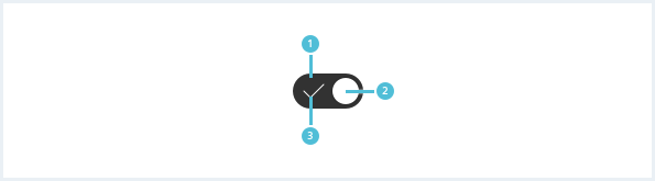
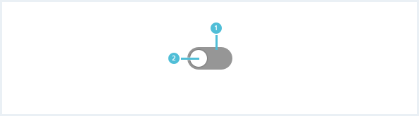
1. Background
- Its appearance depends on the current state of the switch.
2. Switch element
- Shown on the right side for state “On”.
- Shown on the left side for state “Off”.
3. Icon
- The icon is only visible in state “On”.
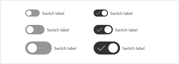
Options
There are the following switch options:
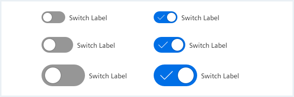
Switch with label
Labels provide more explanation if necessary.
Do’s & Don’ts
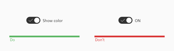
- A label next to the switch must describe the affected property.
- Don’t use the label to describe the states of the switch.
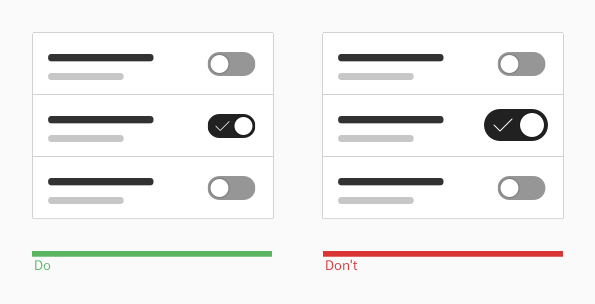
- Use one switch size for the same usage context.
- Don’t mix sizes without apparent reason.
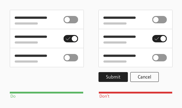
- Switches immediately trigger an effect when being clicked.
- A switch never needs an extra button to submit the selected state.
Style
This chapter shows several switch styles in the User Experience Toolkit.
Overview
To fit the switch to your context, use a custom colored switch.
Typography
The following table gives reference to the different font sizes and weights:
| Name | State | Font-family | Font-size | Line-height | Text-align |
|---|---|---|---|---|---|
| Label (all switch sizes) | all | Siemens Sans Roman | 14px | 16px | left |
Sizing and spacing
The following measurements show the dimensions for this component:
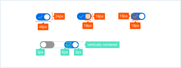
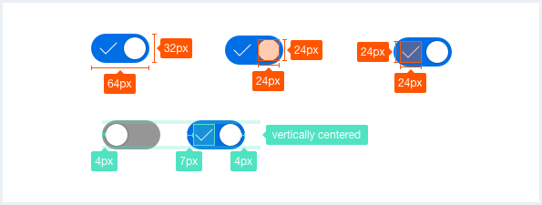
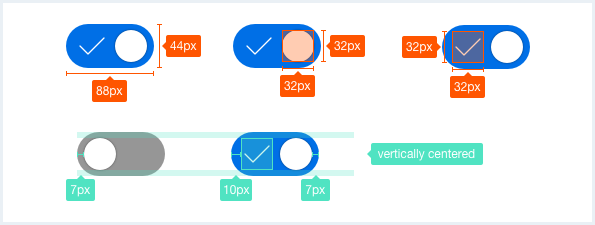
To see a detailed explanation of all existing classes, please refer to the usage table below.
Switch
<div class="inputGroup">
    <div class="switch switch--small">
        <input class="switch__checkbox" type="checkbox" id="input-switch01">
        <label class="switch__handle" for="input-switch01"></label>
    </div>
</div>

<div class="inputGroup">
    <div class="switch">
        <input class="switch__checkbox" type="checkbox" id="input-switch02">
        <label class="switch__handle" for="input-switch02"></label>
    </div>
</div>

<div class="inputGroup">
    <div class="switch switch--large">
        <input class="switch__checkbox" type="checkbox" id="input-switch03">
        <label class="switch__handle" for="input-switch03"></label>
    </div>
</div>

<div class="inputGroup">
    <div class="switch switch--small">
        <input class="switch__checkbox" type="checkbox" id="input-switch04" checked="checked">
        <label class="switch__handle" for="input-switch04">
            <span class="switch__icon"></span>
        </label>
        <label class="switch__label" for="input-switch04">Label and icon are optional</label>
    </div>
</div>

<div class="inputGroup">
    <div class="switch">
        <input class="switch__checkbox" type="checkbox" id="input-switch05" checked="checked">
        <label class="switch__handle" for="input-switch05">
            <span class="switch__icon"></span>
        </label>
        <label class="switch__label" for="input-switch05">Label and icon are optional</label>
    </div>
</div>

<div class="inputGroup">
    <div class="switch switch--large">
        <input class="switch__checkbox" type="checkbox" id="input-switch06" checked="checked">
        <label class="switch__handle" for="input-switch06">
            <span class="switch__icon"></span>
        </label>
        <label class="switch__label" for="input-switch06">Label and icon are optional</label>
    </div>
</div>

<div class="inputGroup">
    <div class="switch switch--small">
        <input class="switch__checkbox" type="checkbox" id="input-switch07" disabled="disabled">
        <label class="switch__handle" for="input-switch07"></label>
        <label class="switch__label" for="input-switch07">Disabled state unchecked</label>
    </div>
</div>

<div class="inputGroup">
    <div class="switch switch--small">
        <input class="switch__checkbox" type="checkbox" id="input-switch08" disabled="disabled" checked="checked">
        <label class="switch__handle" for="input-switch08"></label>
        <label class="switch__label" for="input-switch08">Disabled state checked</label>
    </div>
</div>
Custom switch
<div class="inputGroup">
    <div class="switch switch--small">
        <input class="switch__checkbox" type="checkbox" id="input-switch12" checked="checked">
        <label class="switch__handle has-bgColor-warning" for="input-switch12">
            <span class="switch__icon"></span>
        </label>
        <label class="switch__label" for="input-switch12">Label and icon are optional</label>
    </div>
</div>

<div class="inputGroup">
    <div class="switch">
        <input class="switch__checkbox" type="checkbox" id="input-switch13" checked="checked">
        <label class="switch__handle has-bgColor-success" for="input-switch13">
            <span class="switch__icon"></span>
        </label>
        <label class="switch__label" for="input-switch13">Label and icon are optional</label>
    </div>
</div>

<div class="inputGroup">
    <div class="switch switch--large">
        <input class="switch__checkbox" type="checkbox" id="input-switch14" checked="checked">
        <label class="switch__handle has-bgColor-petrol" for="input-switch14">
            <span class="switch__icon"></span>
        </label>
        <label class="switch__label" for="input-switch14">Label and icon are optional</label>
    </div>
</div>
Usage
| Element | Class | Description |
|---|---|---|
.inputGroup .switch | Sets the size of the switch button to medium (default). | |
.inputGroup .switch | .switch--small | Sets the size of the switch button to small. |
.inputGroup .switch | .switch--large | Sets the size of the switch button to large. |
.inputGroup .switch__handle | .has-bgColor-<color name> | To specify a background color, any Insights Hub and Industrial IoT background color css class can be used. This class assignment is optional, default is primary/blue. |
.inputGroup .switch__handle .switch__icon | The icon is optional and needs to be nested in .switch__handle. | |
.inputGroup .switch .switch__label | The label is optional. |