Dropzone
A dropzone is an pattern that makes file upload easy and pleasant to use.
Usage
When to use
Use a dropzone in the following cases:
- To upload files by dragging and dropping.
- To upload one or more files.
- To show the process of uploading.
Types
There are two types of a dropzone:
- Single file upload
- Multi file upload
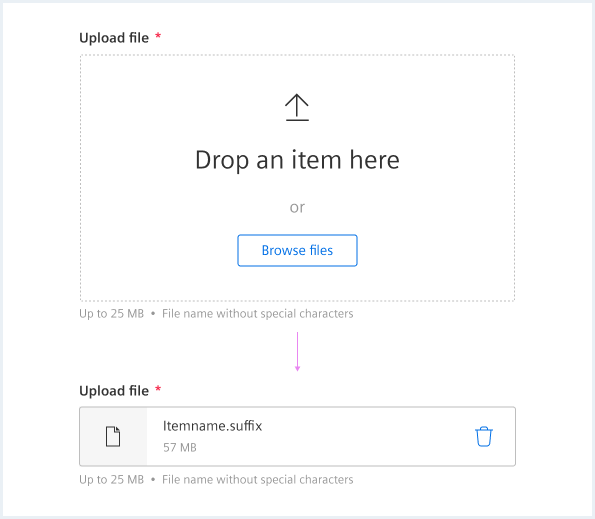
Single file upload
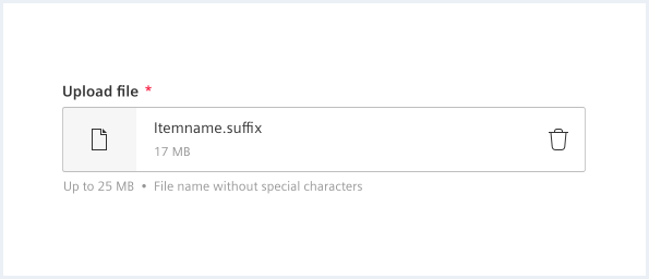
- After the upload, the dropzone will be replaced by the uploaded file.
- The file must be deleted in order to upload a new file.
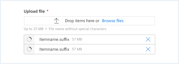
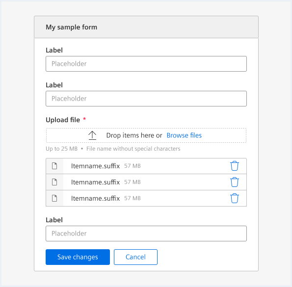
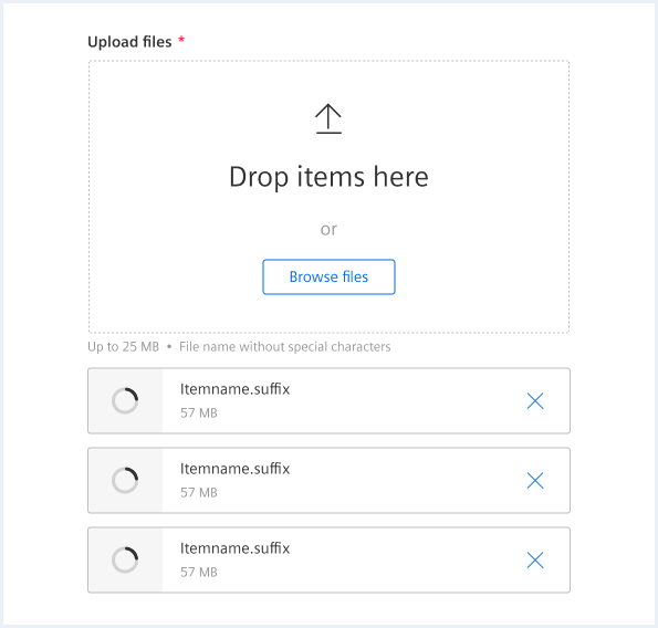
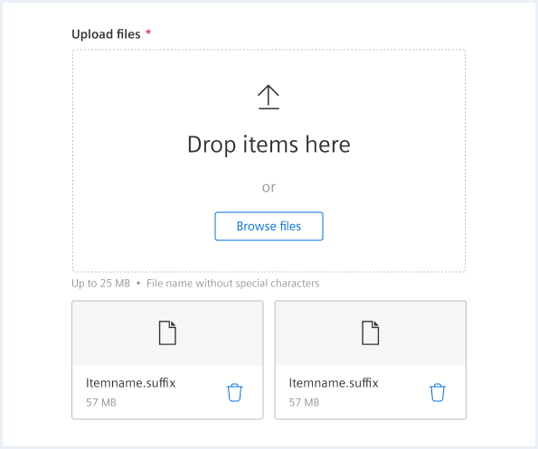
Multi file upload
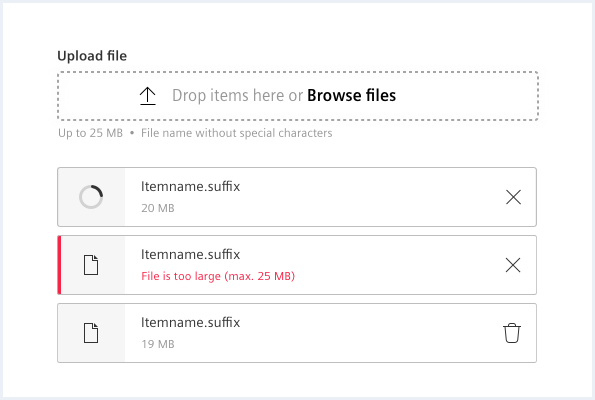
- The dropzone can be used anytime.
- The files will be listed underneath the dropzone.
- Errors should be displayed within the list item.
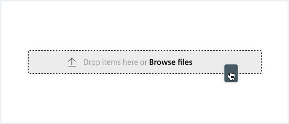
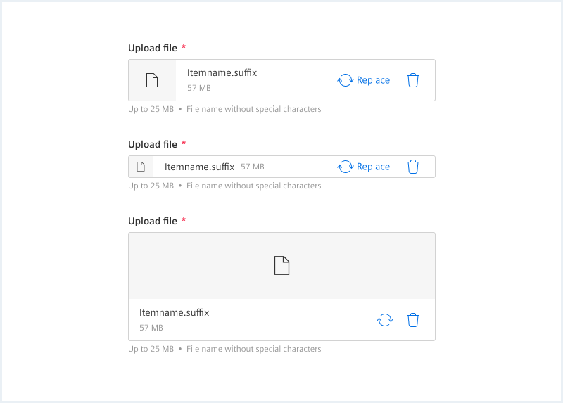
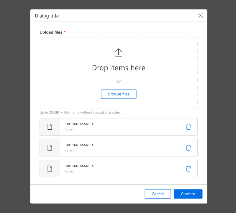
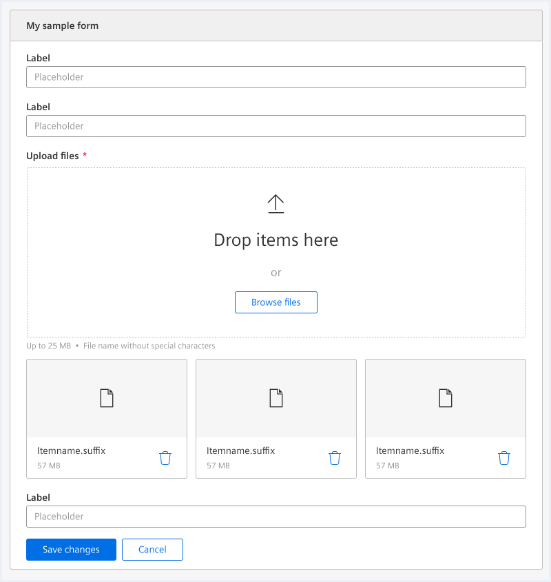
General construction
Dropzone
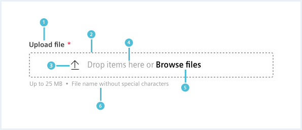
By default, the dropzone is configured as small size and simple upload.
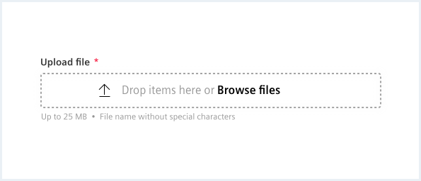
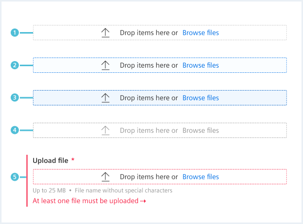
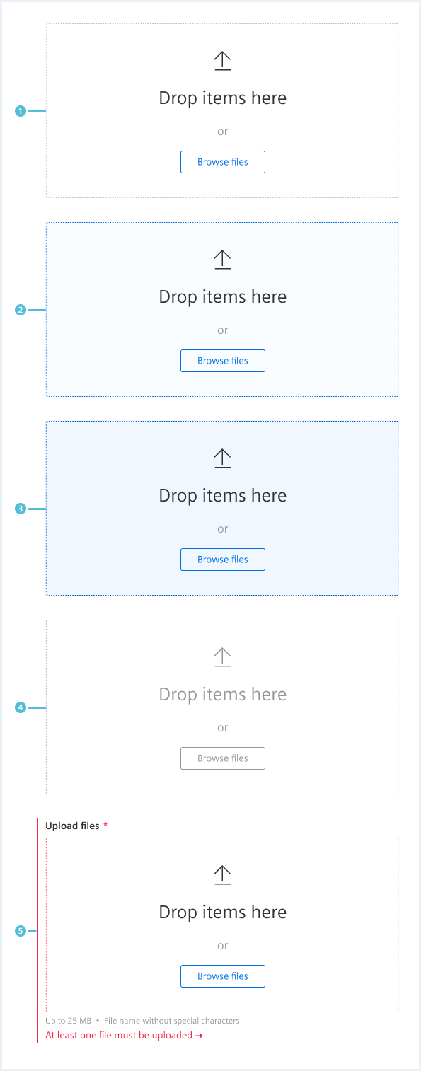
1. Label
- Can show that the field is required.
- The label is optional.
2. Drop area
3. Supporting icon
- Supports the drop target visually.
4. Usage hint
5. Browse files link
- Open file browser to pick file(s).
6. Description text
- The description text is optional but recommended.
Options
The following dropzone options are available:
Large dropzone
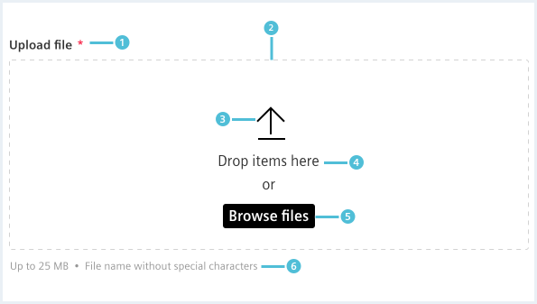
- Label
- Can show that the field is required.
- The label is optional.
- Drop area
- Supporting icon
- Supports the drop target visually.
- Usage hint
- Browse files button
- Open file browser to pick file(s).
Description text
- The description text is optional but recommended.
Actions
Single file upload
Multi file upload
Further actions can be included to the dropzone:
Expand drop target
Behavior
File upload
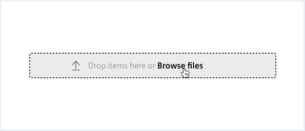
There are two ways in order to upload files
- Upload by dragging and dropping file(s) into the dropzone.
- Browse your system by clicking the “browse files” link/button.
- Dropping files outside the dropzone has no effect on the interface.
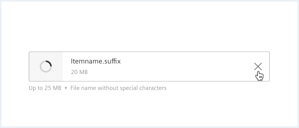
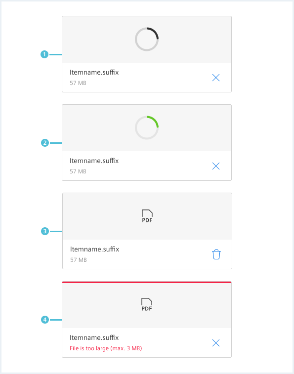
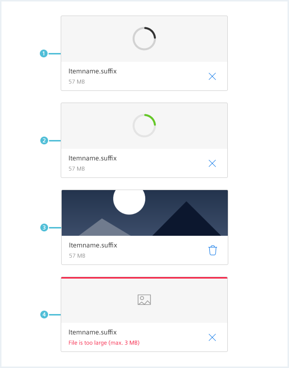
Error messages
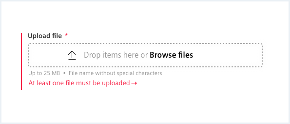
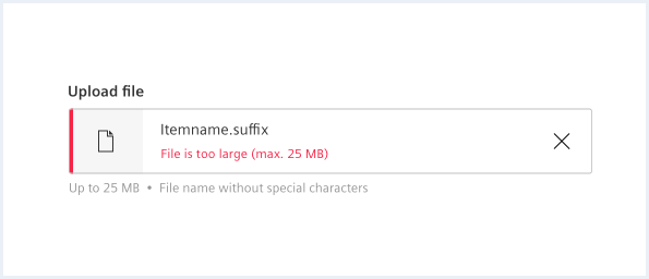
Error messages occur when the upload fails. Reasons can be:
- No file has been selected.
- The filetype is wrong or not allowed.
- The file is too big.
- The file is empty.
- There was a problem and the file was not uploaded.
- There is a limit on how many files the user can select.
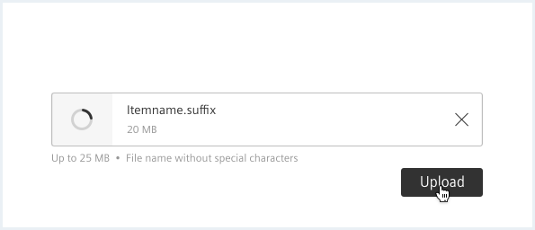
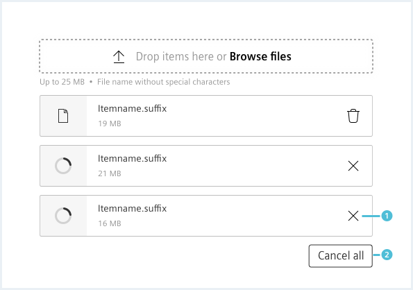
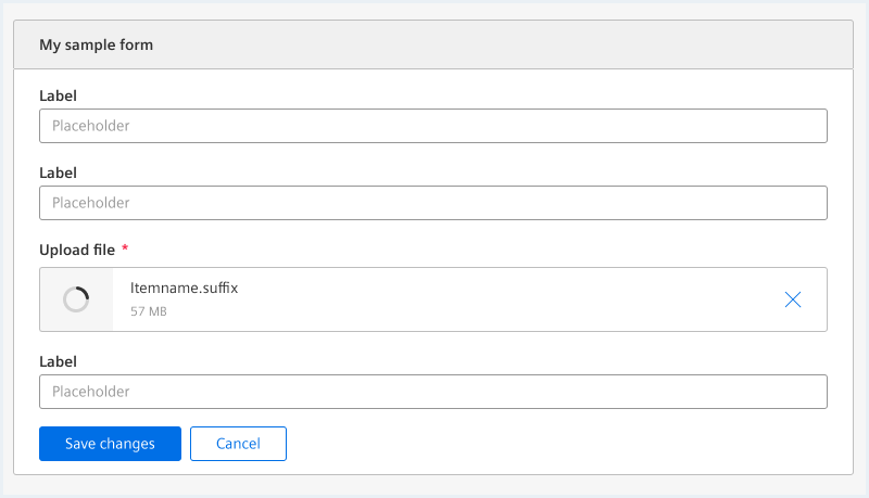
Upload progress
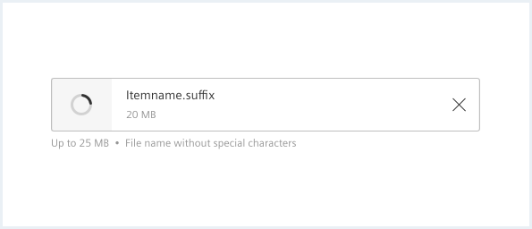
During file upload the icon is replaced by a busy indicator.
Style
This chapter shows several dropzone styles in the User Experience Toolkit.
Overview
Dropzone states
Large dropzone states
Item states
Default
Default with image
Compact
Compact with image
Card
Card with image
List view
Options
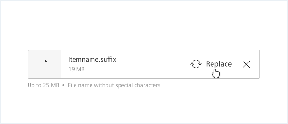
Replace option
General rules of thumbnails
There should be 2-3 elements in one row.
How many elements are in a row depends on:
- Expected file name length.
- Number of expected files.
- Ratio/size of the expected thumbnail.
- Overall width of the dropzone component.
See examples below.
Examples
Drop zone with compact list - multi file upload
Large dropzone with list - multi file upload
Large dropzone - single file upload
Large dropzone with cards/thumbnails
Dropzone
Drop items here
orDrop items here
orDrop items here
or<div class="dropzone__container dragAndDrop__area">
<span aria-hidden='true' class='iconUxt upload'></span>
<h3 class="dropzone__title">Drop items here</h3>
<span class="dropzone__description">or</span>
<label class="button button--secondary" for="dropzone__file1">Browse files</label>
<input type="file" id="dropzone__file1" name="dropzone__file" multiple />
</div>
<p></p>
<div class="dropzone__container dragAndDrop__area has-error">
<span aria-hidden='true' class='iconUxt upload'></span>
<h3 class="dropzone__title">Drop items here</h3>
<span class="dropzone__description">or</span>
<label class="button button--secondary" for="dropzone__file2">Browse files</label>
<input type="file" id="dropzone__file2" name="dropzone__file" multiple />
</div>
<p></p>
<div class="dropzone__container dragAndDrop__area is-disabled">
<span aria-hidden='true' class='iconUxt upload'></span>
<h3 class="dropzone__title">Drop items here</h3>
<span class="dropzone__description">or</span>
<label class="button button--secondary" for="dropzone__file3">Browse files</label>
<input type="file" id="dropzone__file3" name="dropzone__file" multiple disabled />
</div>
Compact dropzone
Drop items here or
Drop items here or
Drop items here or
<div class="dropzone__container dragAndDrop__area dragAndDrop__area--compact">
	<span aria-hidden='true' class='iconUxt upload'></span>
	<span class="dropzone__title">Drop items here or</span>
	<label class="button button--secondaryContentAction" for="dropzone__file4">Browse files</label>
    <input type="file" id="dropzone__file4" name="dropzone__file" multiple />
</div>

<p></p>

<div class="dropzone__container dragAndDrop__area dragAndDrop__area--compact has-error">
	<span aria-hidden='true' class='iconUxt upload'></span>
	<span class="dropzone__title">Drop items here or</span>
	<label class="button button--secondaryContentAction" for="dropzone__file5">Browse files</label>
    <input type="file" id="dropzone__file5" name="dropzone__file" multiple />
</div>

<p></p>

<div class="dropzone__container dragAndDrop__area dragAndDrop__area--compact is-disabled">
	<span aria-hidden='true' class='iconUxt upload'></span>
	<span class="dropzone__title">Drop items here or</span>
	<label class="button button--secondaryContentAction" for="dropzone__file6">Browse files</label>
    <input type="file" id="dropzone__file6" name="dropzone__file" multiple disabled />
</div>
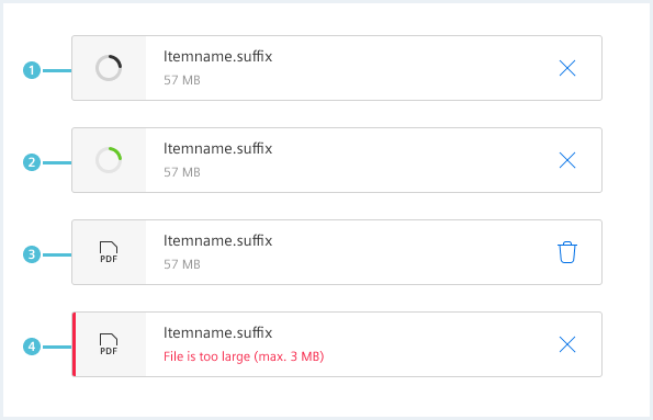
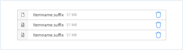
Item states
Itemname.suffix
57 MBItemname.suffix
57 MBItemname.suffix
57 MB
<div class="list dropzone__itemState">
	<ul class="list__list">
		<li class="list__item">
			<div class="item__icon">
				<span class="iconUxt filetypeDefault" aria-hidden="true"></span>
				<div class="busyIndicator">
					<div class="busyIndicator__ring busyIndicator__ring--small"></div>
				</div>
			</div>
			<div class="item__content">
				<div class="content__column content__column--primary">
					<h4 class="item__title">
						Itemname.suffix
					</h4>
					<div class="item__description">
						57 MB
					</div>
				</div>
				<div class="content__column has-alignment-right">
					<button class="button button--ghost has-icon-only"></button>
				</div>
			</div>
		</li>
		<li class="list__item itemState--upload">
			<div class="item__icon">
				<span class="iconUxt filetypeDefault" aria-hidden="true"></span>
				<div class="busyIndicator">
					<div class="busyIndicator__ring busyIndicator__ring--small"></div>
				</div>
			</div>
			<div class="item__content">
				<div class="content__column content__column--primary">
					<h4 class="item__title">
						Itemname.suffix
					</h4>
					<div class="item__description">
						57 MB
					</div>
				</div>
				<div class="content__column has-alignment-right">
					<button class="button button--ghost has-icon-only"></button>
				</div>
			</div>
		</li>
		<li class="list__item itemState--error">
			<div class="item__icon">
				<span class="iconUxt filetypeDefault" aria-hidden="true"></span>
				<div class="busyIndicator">
					<div class="busyIndicator__ring busyIndicator__ring--small"></div>
				</div>
			</div>
			<div class="item__content">
				<div class="content__column content__column--primary">
					<h4 class="item__title">
						Itemname.suffix
					</h4>
					<div class="item__description">
						57 MB
					</div>
				</div>
				<div class="content__column has-alignment-right">
					<button class="button button--ghost has-icon-only"></button>
				</div>
			</div>
		</li>
	</ul>
</div>
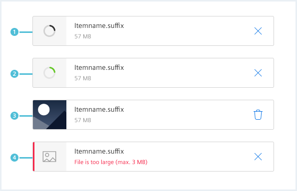
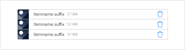
Item states image

Itemname.suffix
57 MBItemname.suffix
57 MBItemname.suffix
57 MB
<div class="list dropzone__itemState">
	<ul class="list__list">
		<li class="list__item">
			<div class="item__image">
				<img src="assets/images/image.png" alt="image placeholder" />
				<div class="busyIndicator">
					<div class="busyIndicator__ring busyIndicator__ring--small"></div>
				</div>
			</div>
			<div class="item__content">
				<div class="content__column content__column--primary">
					<h4 class="item__title">
						Itemname.suffix
					</h4>
					<div class="item__description">
						57 MB
					</div>
				</div>
				<div class="content__column has-alignment-right">
					<button class="button button--ghost has-icon-only"></button>
				</div>
			</div>
		</li>
		<li class="list__item itemState--upload">
			<div class="item__icon">
				<span class="iconUxt filetypeDefault" aria-hidden="true"></span>
				<div class="busyIndicator">
					<div class="busyIndicator__ring busyIndicator__ring--small"></div>
				</div>
			</div>
			<div class="item__content">
				<div class="content__column content__column--primary">
					<h4 class="item__title">
						Itemname.suffix
					</h4>
					<div class="item__description">
						57 MB
					</div>
				</div>
				<div class="content__column has-alignment-right">
					<button class="button button--ghost has-icon-only"></button>
				</div>
			</div>
		</li>
		<li class="list__item itemState--error">
			<div class="item__icon">
				<span class="iconUxt image" aria-hidden="true"></span>
				<div class="busyIndicator">
					<div class="busyIndicator__ring busyIndicator__ring--small"></div>
				</div>
			</div>
			<div class="item__content">
				<div class="content__column content__column--primary">
					<h4 class="item__title">
						Itemname.suffix
					</h4>
					<div class="item__description">
						57 MB
					</div>
				</div>
				<div class="content__column has-alignment-right">
					<button class="button button--ghost has-icon-only"></button>
				</div>
			</div>
		</li>
	</ul>
</div>
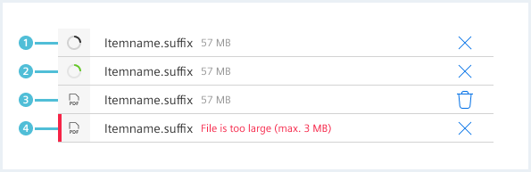
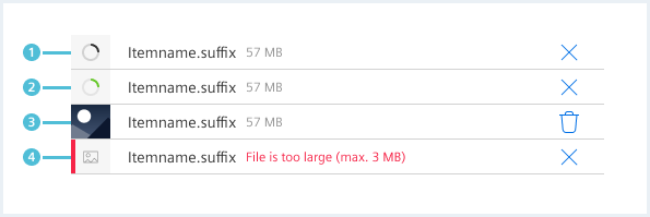
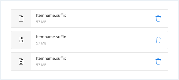
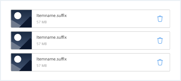
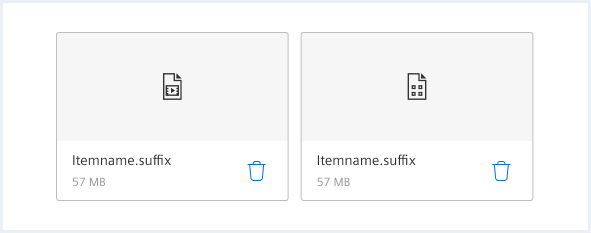
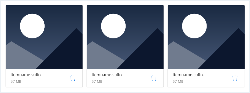
Item states compact
Itemname.suffix
57 MBItemname.suffix
57 MBItemname.suffix
57 MBItemname.suffix
File is too large (max. 3 MB)Itemname.suffix
File is too large (max. 3 MB)
<div class="list dropzone__itemState dropzone__itemState--compact">
	<ul class="list__list">
		<li class="list__item">
			<div class="item__icon">
				<span class="iconUxt filetypeDefault" aria-hidden="true"></span>
				<div class="busyIndicator">
					<div class="busyIndicator__ring busyIndicator__ring--xsmall"></div>
				</div>
			</div>
			<div class="item__content">
				<div class="content__column content__column--primary">
					<h4 class="item__title">
						Itemname.suffix
					</h4>
					<div class="item__description">
						57 MB
					</div>
				</div>
				<div class="content__column has-alignment-right">
					<button class="button button--ghost has-icon-only"></button>
				</div>
			</div>
		</li>
		<li class="list__item itemState--upload">
			<div class="item__icon">
				<span class="iconUxt filetypeDefault" aria-hidden="true"></span>
				<div class="busyIndicator">
					<div class="busyIndicator__ring busyIndicator__ring--xsmall"></div>
				</div>
			</div>
			<div class="item__content">
				<div class="content__column content__column--primary">
					<h4 class="item__title">
						Itemname.suffix
					</h4>
					<div class="item__description">
						57 MB
					</div>
				</div>
				<div class="content__column has-alignment-right">
					<button class="button button--ghost has-icon-only"></button>
				</div>
			</div>
		</li>
		<li class="list__item">
			<div class="item__image">
				<img src="assets/images/image.png" alt="image placeholder" />
				<div class="busyIndicator">
					<div class="busyIndicator__ring busyIndicator__ring--xsmall"></div>
				</div>
			</div>
			<div class="item__content">
				<div class="content__column content__column--primary">
					<h4 class="item__title">
						Itemname.suffix
					</h4>
					<div class="item__description">
						57 MB
					</div>
				</div>
				<div class="content__column has-alignment-right">
					<button class="button button--ghost has-icon-only"></button>
				</div>
			</div>
		</li>
		<li class="list__item itemState--error">
			<div class="item__icon">
				<span class="iconUxt filetypeDefault" aria-hidden="true"></span>
				<div class="busyIndicator">
					<div class="busyIndicator__ring busyIndicator__ring--xsmall"></div>
				</div>
			</div>
			<div class="item__content">
				<div class="content__column content__column--primary">
					<h4 class="item__title">
						Itemname.suffix
					</h4>
					<div class="item__description">
						File is too large (max. 3 MB)
					</div>
				</div>
				<div class="content__column has-alignment-right">
					<button class="button button--ghost has-icon-only"></button>
				</div>
			</div>
		</li>
		<li class="list__item itemState--error">
			<div class="item__icon">
				<span class="iconUxt image" aria-hidden="true"></span>
				<div class="busyIndicator">
					<div class="busyIndicator__ring busyIndicator__ring--xsmall"></div>
				</div>
			</div>
			<div class="item__content">
				<div class="content__column content__column--primary">
					<h4 class="item__title">
						Itemname.suffix
					</h4>
					<div class="item__description">
						File is too large (max. 3 MB)
					</div>
				</div>
				<div class="content__column has-alignment-right">
					<button class="button button--ghost has-icon-only"></button>
				</div>
			</div>
		</li>
	</ul>
</div>
Usage
| Element | Class | Description |
|---|---|---|
.dropzone__container .dragAndDrop__area | .dragAndDrop__area--compact | Enables the compact variant. |
.dropzone__container .dragAndDrop__area | .has-error | Error state for drop zone. |
.list dropzone__itemState | .dropzone__itemState--compact | Enables the compact variant. |
.list__item | .itemState--upload .itemState--error | Upload and error state for drop zone list items. |
.item__image | .item__image--portrait | this class is required to display portrait format graphics correctly. |