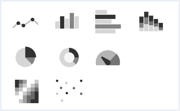
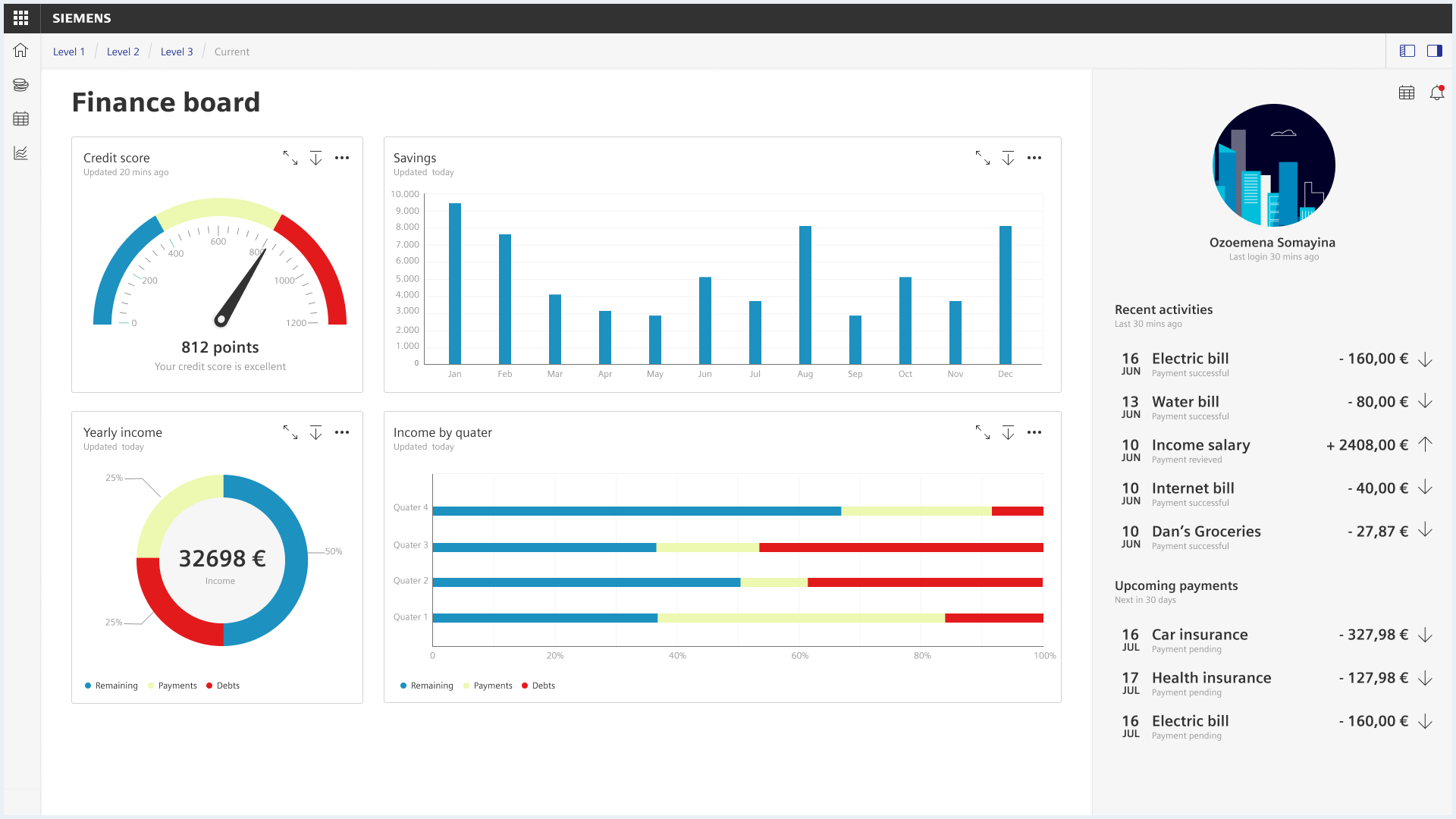
Chart
Charts are used to visualize, compare and analyze data in a clear graphical representation.
Usage
Chart types
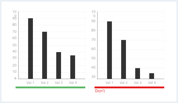
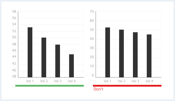
Simplified bar chart
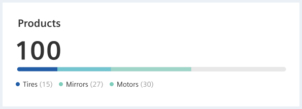
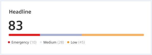
The simplified bar chart displays a single, primary metric (e. g., current year energy consumption), compares that metric to one or more other metrics, and displays it in the context of qualitative performance ranges (e. g., poor, satisfactory, and good).

The simplified bar chart is a simple bar that combines the three visual characteristics of length, color, and position to provide the viewer with a variety of information at a glance. It serves as a replacement for gauges and meters to overcome their basic problems: They usually display too little information, take up a lot of space, and are cluttered with useless and distracting elements.
When to use
Use a chart in the following cases:
- To see what part of the whole my metric represents.
- evaluate my key figure.
- comparing my metric with a reference value.
When not to use
Charts are not intended to be used:
- For datasets with very large numerical differences between the included metrics.
- For datasets with more than 5 different key figures.
Single & stacked values

If the context is clear the legend underneath is obsolete. This may be achieved through a self-explanatory headline or if the overall page content conveys coherence.
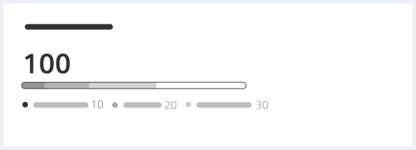
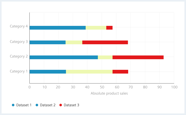
A simplified stacked bar chart displays a total value of the bar (all the segment values added together).
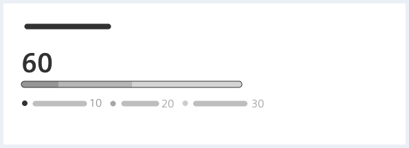
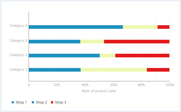
A simplified 100% stacked bar chart displays part to whole relationship.
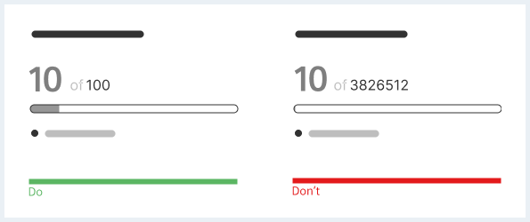
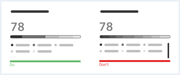
Do’s and don’ts
Line graph
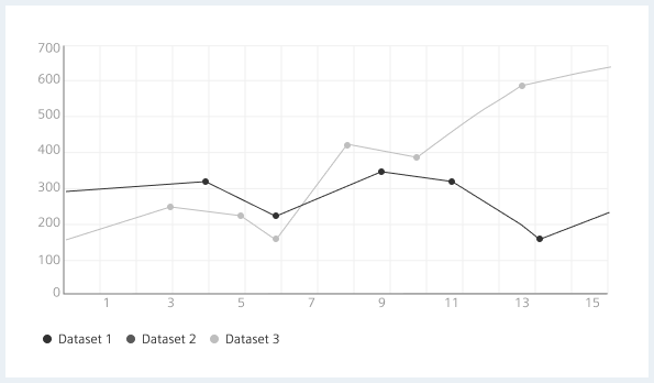
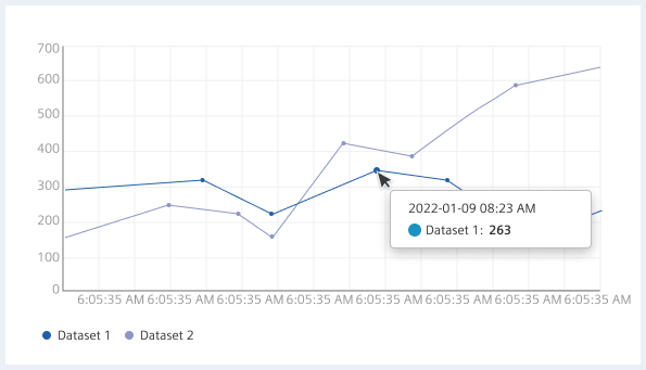
Line graphs display information as a series of data points called ‘markers’ connected by straight line segments.
Line graphs are like scatter plots except the measurement points are ordered (typically by their x-axis value) and joined with straight line segments. Line graphs show how a data changes at equal intervals of time.
When to use
Line graphs are ideal to:
- Visualize trends over time.
- Compare several data sets.
- Show continuous data.
- Show minor deviations in data.
When not to use
Line graphs not the tool of choice when comparing more than 5-7 lines at a time.
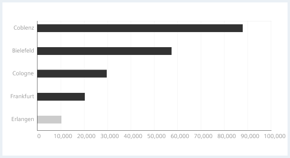
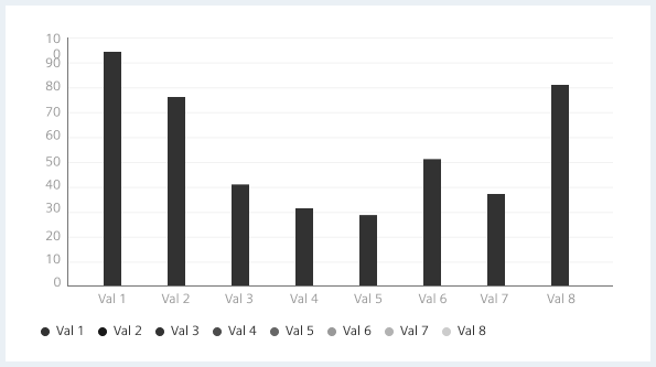
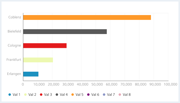
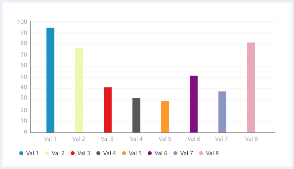
Column chart (vertical) and bar chart (horizontal)
Column charts and bar charts use rectangles known as bars to represent proportional values. One axis of the chart shows the specific categories being compared and the other axis represents a discrete value.
When to use
Use a vertical column chart when:
- Visualizing categories for comparison.
- Showing numerical comparisons, relationships, and trends between categories.
- Tracking changes over time but only when those changes are significant.
The number of bars in a chart depends on the size of the chart area. On charts that fill the entire main region, more bars can be displayed than on a small chart. If the chart area is small and there are many bars, consider following options:
- Split the chart into two or more charts
- Horizontal scrolling
- Zooming or other view options to reduce the amount of shown data
When not to use
Avoid column and bar charts when visualizing metrically continuous data.
Do’s and don’ts
Stacked bar chart
Stacked bar charts display multiple data sets on top of each other (or alongside one another for horizontal orientations,) showing how larger data categories are divided into the smaller segments.
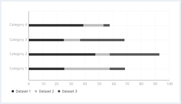
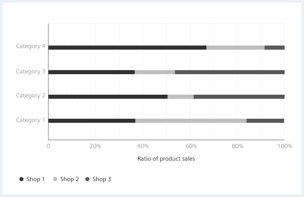
The proximity of the stacked bars emphasizes the bars relations to the total amount, as well as, across segments. Bars on the chart may be arranged in any order. However, the legend items should be placed in the same order as in the chart. This enables a faster visual perception.
When to use
Stacked bar charts are ideal for visualizing a total, however, it can be hard to compare the sizes of individual categories.
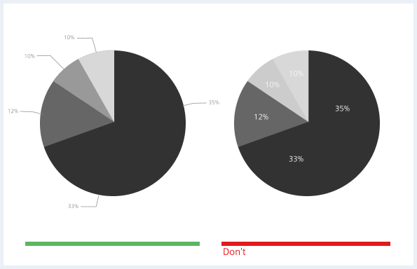
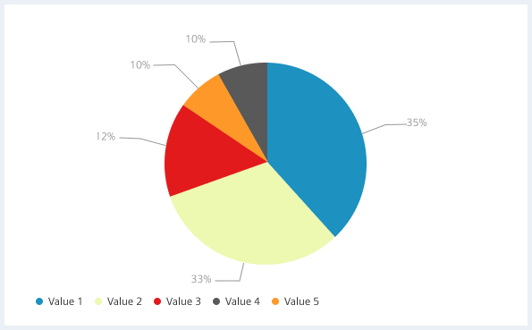
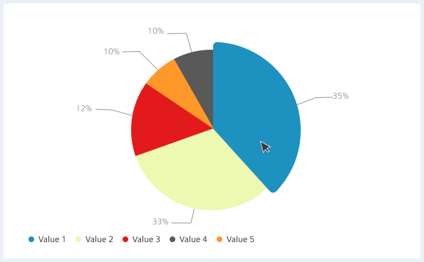
Pie chart
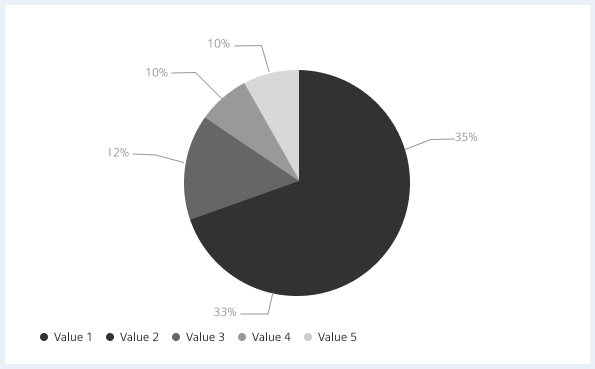
When to use
Pie charts are suitable for:
- Visualizing percentage or proportional data.
- Showing parts of whole.
When not to use
It is not recommended to compare more than 5-6 slices.
Do’s and don’ts
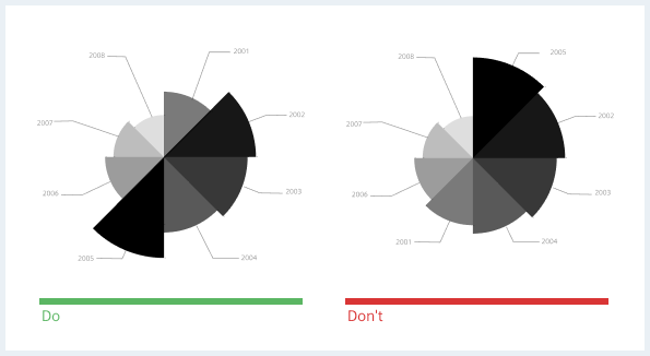
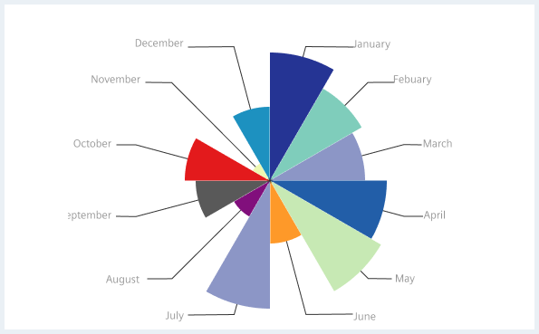
Rose chart (polar area chart)
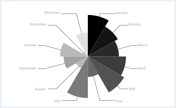
Rose charts or polar area charts are similar to pie charts, but each segment has the same angle - the radius of the segment is different depending on the value. They are a hybrid of pie charts and histograms. Longer sections are highlighted more than they should due to their larger area. As a result, increases in value are shown disproportionately, tempting the reader to exaggerate the differences.
When to use
Rose charts should be used to:
- Visualize and compare cyclic data.
- Show a trend over time.
When not to use
Avoid Rose charts when accurately displaying increases in value use for example a bar chart instead.
Do’s and don’ts
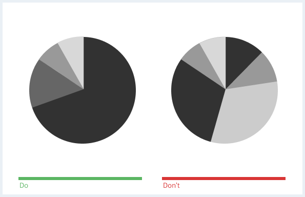
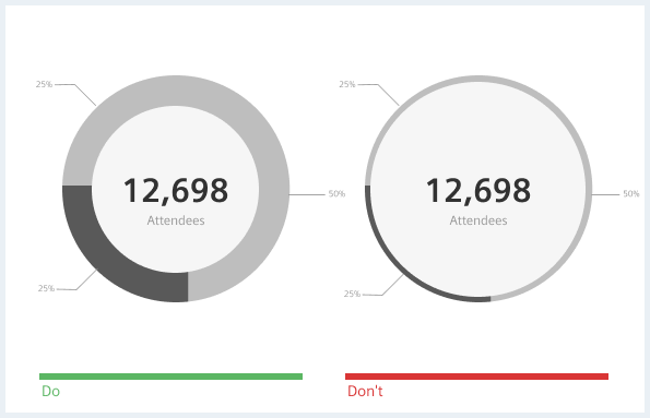
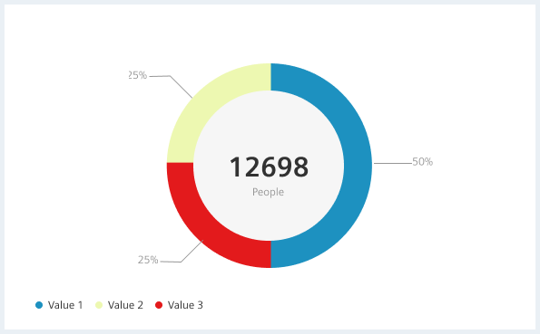
Donut chart
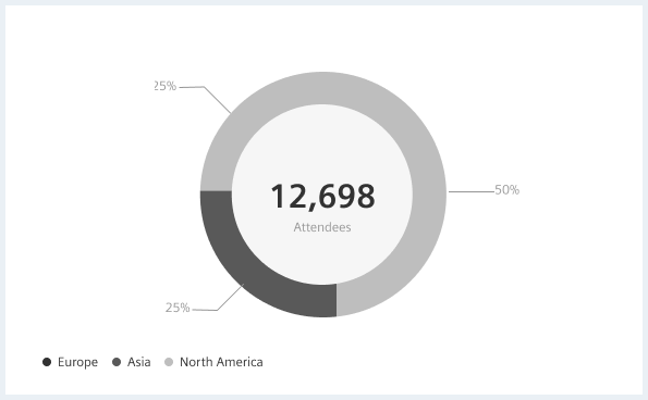
When to use
Donut charts are ideal for:
- Visualizing percentage or proportional data.
- Showing parts of whole.
When not to use
It is not recommended to compare more than 5-6 slices.
Do’s and don’ts
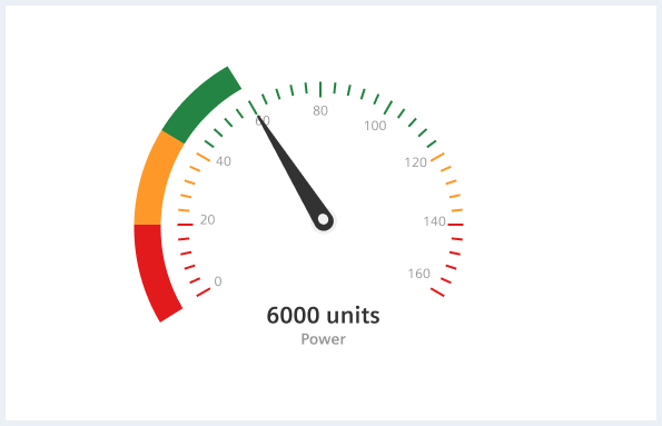
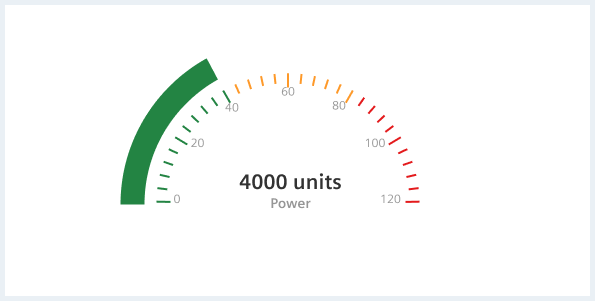
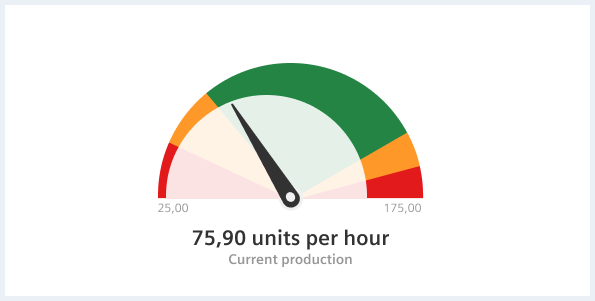
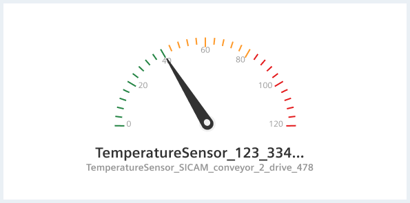
Gauge chart
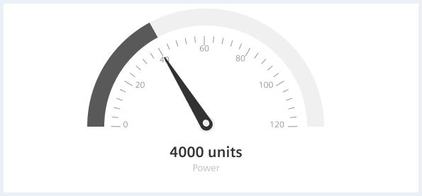
When to use
Gauge charts shall be used for:
- Visualizing speed, satisfaction, volume, temperature etc.
- Projecting progress or deadlines.
- Showing changes for a linear metric.
- Visualizing whether a value is within a valid range (when used together with limits).
When not to use
Avoid using gauge charts to display trends over time.
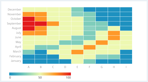
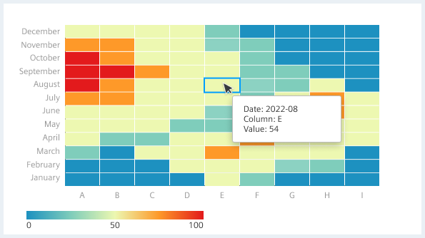
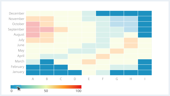
Heat map
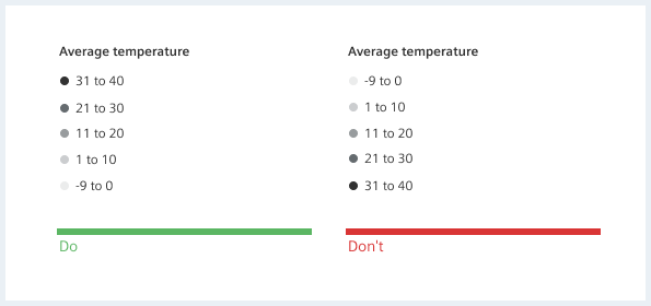
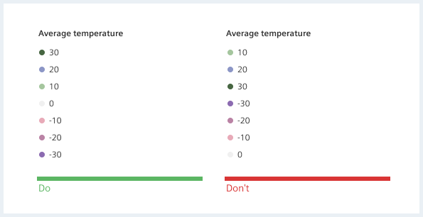
A heat map is a graphical representation of data that uses a color-coding system to represent different values. Typically, darker colours mean greater values and lighter colours represent lower values. However, use cases where a mental model with semantic colors exists should use those instead. Heatmaps are used in various forms of analysis.
With heat maps, the color coding represents a hierarchy within the variables. Heat maps are good for showing comparison, correlation, distribution, and trends over time.
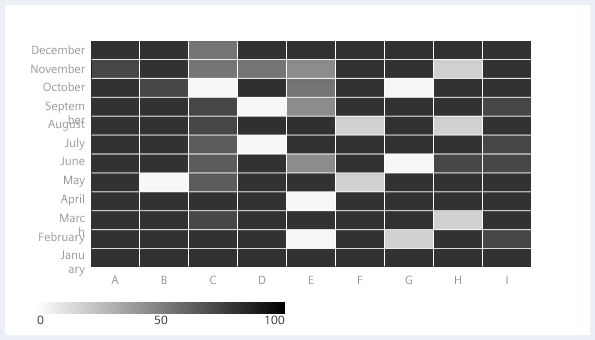
When to use
Heatmaps are suitable for:
- Visualizing variance across multiple variables to display patterns in comparison, correlation,distribution, or trends over time.
- Visualizing complex data.
When not to use
Do not use heatmaps when you need to represent (social, contextual, ..) connections or hierarchies.
Scatter plot
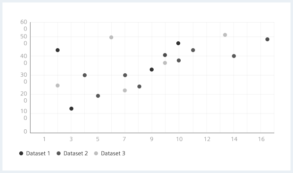
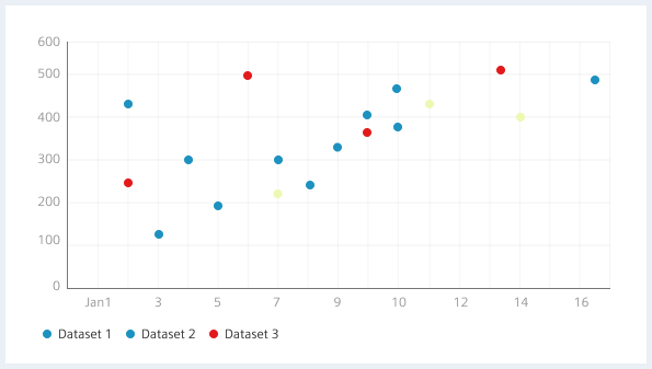
Scatter plots use horizontal and vertical axes to plot data points which shows how much one variable is affected by another. The relationship between two variables is called their correlation.
Scatter plots usually consist of a large body of data. The closer the data points come when plotted to making a straight line, the higher the correlation between the two variables, or the stronger the relationship. If the data points make a straight line going from the origin out to high x- and y-values, then the variables are said to have a positive correlation. If the line goes from a high-value on the y-axis down to a high-value on the x-axis, the variables have a negative correlation.
When to use
Scatter Plots are ideal for:
- Visualizing correlation between two variables.
- Comparing large numbers of data points.
When not to use
Avoid the usage of scatter plots:
- When your data is not at all related.
- When you have too large a set of data that it clogs up the entire graph.
- Comparing too many relationships or trends.
General construction
Rectangular charts
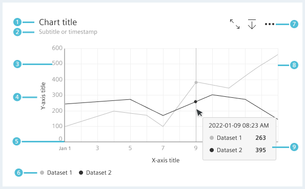
- Chart title (optional), 2. Subtitle or timestamp (optional), 3. Tick label, 4. Axis title (optional), 5. Axes, 6. Legends, 7. Actions (optional), 8. Plot area, 9. Tooltip
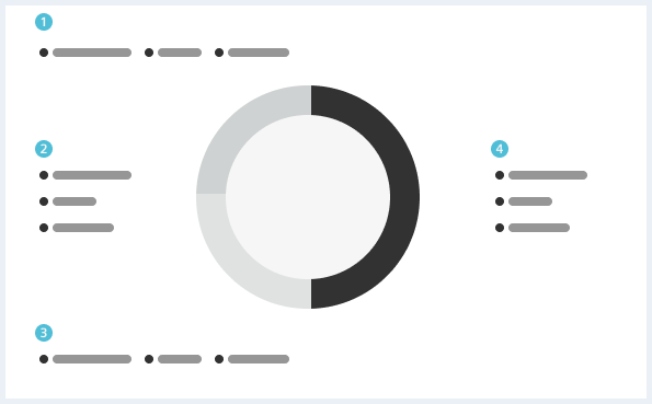
Circular charts
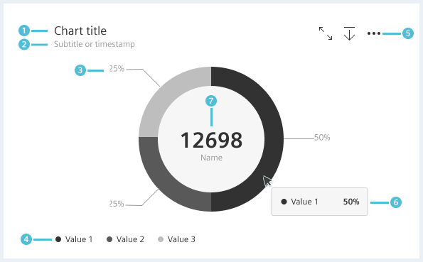
- Chart title (optional), 2. Subtitle or timestamp (optional), 3. Label, 4. Legends, 5. Actions (optional), 6. Tooltip, 7. Big number (optional)
Options
Tick labels
- Tick labels should be placed at (relatively) round numbers.
- We recommend to rotate tick labels on the x axis if they are too long (e. g. by 45 degree as shown above).
Plot area
- Plot areas have by default one horizontal (X-axis ) and one vertical (Y-axis) axis.
- Grid intervals have an equal spacing.
- Grid lines, if present, should stand out from the background but should always be muted.
Multi axis chart
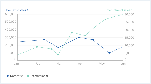
When to use
Use multiple axes in the following cases:
- If you have limited space and want to quickly establish the relationship between two variables.
- To show two data series with the same measure, but different magnitudes. See image above with domestic sales and international sales.
- To show two data series that show the relative and the absolute values of something. For example GDP per capita in comparison to absolute GDP of a country.
- To show two data series for totally different values. For example GDP of a country in comparison to life expectation.
- To show one data series, but the y-axis shows different scales. For example values in Fahrenheit and in Celsius.
Best practice
- Make sure that your Y-axis are related to each other. Charts with two axes should be related in a meaningful way so that the two axes help tell your story effectively.
- Place the primary Y-axis on the left side. The y-axis on the left side is often viewed first. Make sure your most important variable is placed there.
- Try to use contrasting colors so that they can be easily distinguished from each other.
- Use primarily units as axis labels. If a semantic label is shown, add the unit in brackets, and take longer labels into account (e. g. max-width with truncation).
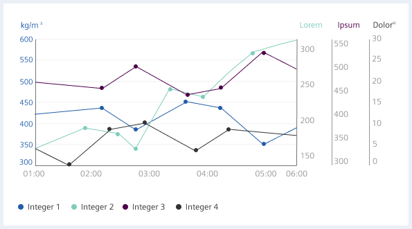
Difficulties with diagrams with two axes
- It is often not immediately clear which data series belongs to which axis.
- Crossing lines can be misleading.
- It may appear that two datasets are moving at the same rate.
- Zero baselines at different heights can be misleading.
Behavior
Optional behavior for highlighting single categories
When you hover over the legend, the corresponding axis is highlighted and the associated grid lines are displayed. When you hover over the tick labels, the axis is highlighted and the associated grid lines are displayed, as well as the corresponding curves.
Tooltip
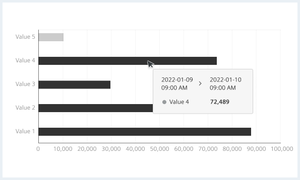
Tooltips are the labels that appear when users hover over data points in the chart. They appear by default on all charts and can display any combination of data values, text, and/or tokens.
Legends
A legend helps the user make the necessary associations so that the diagram makes sense.
When to use
Use tooltips in your visualization in the following cases:
- To help users understand what is being displayed.
- To identify data in visualizations by their color, size, or other distinguishing characteristics.
- Use a legend only if you cannot assume that there is enough space to attach labels directly.
- Legends are usually used in data visualizations when more than one color or line type is used.
- To reduce clutter and make your data visualization more user-friendly.
Legend anatomy

- Legend title (optional), 2. Legend indicator, 3. Legend label, 4. Legend subtext (optional)
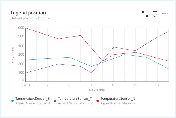
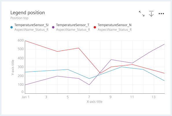
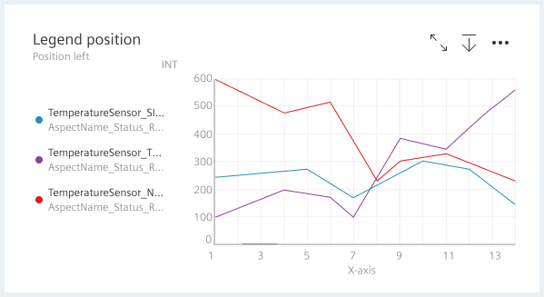
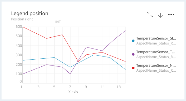
Placement
By default, legends are positioned at the bottom of a chart. Depending on the layout and context of the page, you can position legends at the top, below the chart title/subtitle, to the left, or to the right of the chart in relation to the plot area.
When using sequential or divergent data, make sure that the legend is displayed in a vertical format next to the visualization so that the data can be properly ordered.
- top, 2. left, 3. bottom, 4. right
Long legend labels

Ordering elements
When using sequential data, the highest number should appear at the beginning of the legend and the lowest number at the end.
For divergent data, a vertical legend is recommended, with the most extreme values appearing at opposite ends of the legend.
Interactions
Hover over the legend of a category
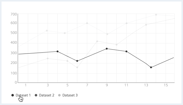
When hovering the mouse pointer over the legend of a category, the opacity of all other categories in the diagram is reduced to 30%.
Click to toggle a value
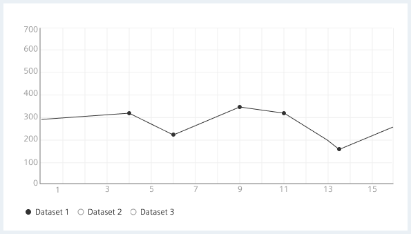
When clicking on the legend of a category, the information is toggles and the category is hidden. The legend changes to a deselected state. Toggling the category again shows the hidden item again and the legend changes to selected state.
Legend overflow
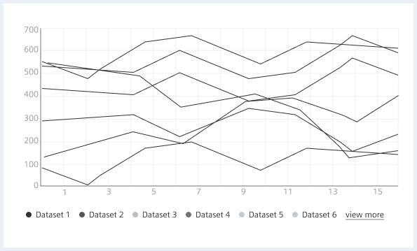
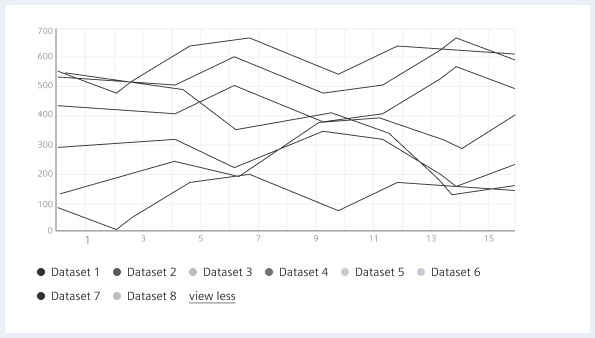
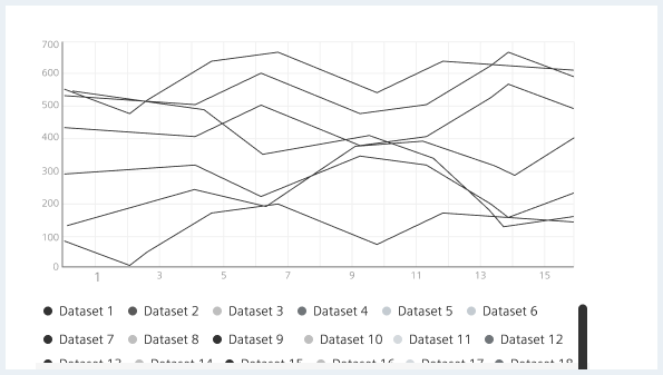
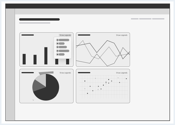
Hidden legend
Hide legends when there is not enough space to show a legend like on small cards. When legends are hidden, a “Show Legends” button is added to allow users to view the legend by tapping on it.
Style
This chapter shows several data visualisation styles in the User Experience Toolkit.
Chart types
Simplified bar chart
Gauge
Long Text
Bar chart
Scatter plot
Line chart
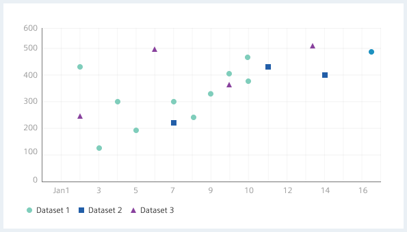
The dot should have a size of 4px by default and should increase to 6px on hover.
Pie chart
Rose chart
Donut chart
Heat map
Additional atoms
This section describes the look and feel of the legend (will be extended in the future).
Legend
The shape has a size of 8px.
| Name | State | Font-weight | Color | Font-size | Line-height | Text-align |
|---|---|---|---|---|---|---|
| Label | all | Roman | color-font | 12px | 16px | left |
| Value | all | Bold | color-font-secondary | 12px | 16px | left |
Example
Tooltip
| Name | State | Font-weight | Color | Font-size | Line-height | Text-align |
|---|---|---|---|---|---|---|
| Timestamp | all | Roman | color-font | 12px | 16px | left |
| Label | all | Roman | color-font | 12px | 16px | left |
| Value | all | Bold | color-font | 12px | 16px | left |
Plot area & other chart-specific
| Name | State | Font-weight | Color | Font-size | Line-height | Text-align |
|---|---|---|---|---|---|---|
| Axis title | all | Roman | color-font-secondary | 12px | 16px | left, right or center |
| Axis values | all | Roman | color-font-secondary | 12px | 16px | left, right or center |
| KPI Label on donut | all | Roman | color-font-secondary | 12px | 16px | center |
As for the grid lines:
- Zero gridlines have color-base600
- Secondary gridlines have color-base900 (equals to color-appbar-border)
General definitions:
- KPI shown on a donut chart equals a Heading 2 (36px font-size, 43px line-height)
- KPI shown on a gauge chart equals a bold Heading 4 (21px font-size, 29px line-height)
- Subtitle shown on a gauge chart equals a paragraph (14px font-size, 22.9px line-height)
Header
General definitions:
- Title equals a Heading 5
- Button action area is still open
| Name | State | Font-weight | Color | Font-size | Line-height | Text-align |
|---|---|---|---|---|---|---|
| Subtitle | all | Roman | color-font-secondary | 12px | 16px | left |
Color palette
The charts and graphs default chart color palette is used for data visualisations that do not show a variable’s status with color.
A chart with age and height as its variables is a good example of a data visualisation that should use the default chart color palette. At the moment there are several charting colors defined that have status colors included. Please find the current color definition in the “Charts colors” section: Color