Card
Cards provide the possibility to display content composed of different elements.
Usage
When to use
Use a card in the following cases:
- To present a summary and link to additional details and information.
- To group information into logical chunks.
- When the card surface itself is an interactive element.
- To create flexible layouts.
- To display information of one topic.
- To create a dashboard or show a variety of content types at the same time.
Types
There are the following card types:
Card
- Unlike a container a card is a summary that leads to additional details and information.
- Use a card as interactive element (clickable as a complete object) when it only has one action.
- The card itself is the interactive element.

Card with additional actions
- Use a card with additional actions when the card has more than one action.
- Unlike a simple card this type of card is not the interactive/clickable element itself.
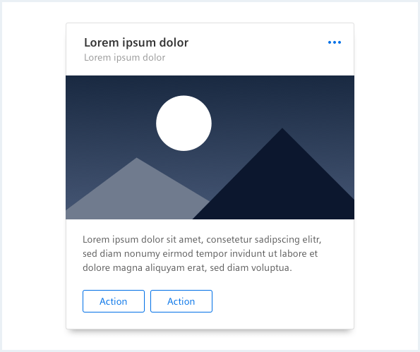
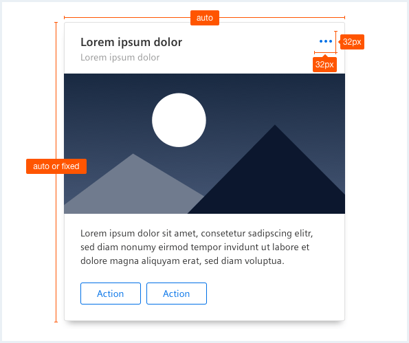
General construction
A card consists of the following elements:
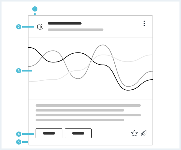
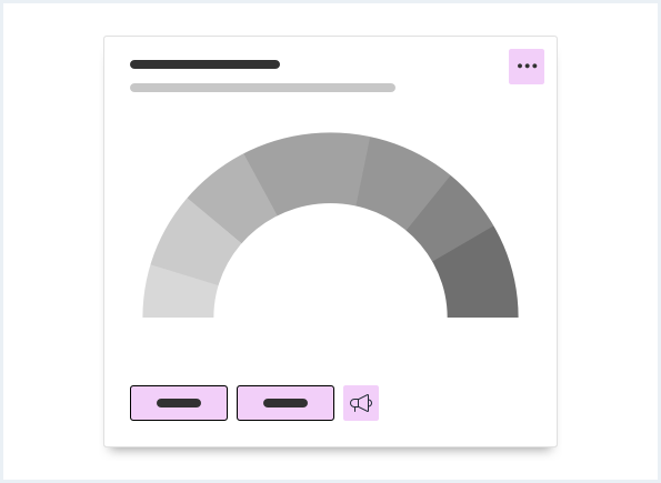
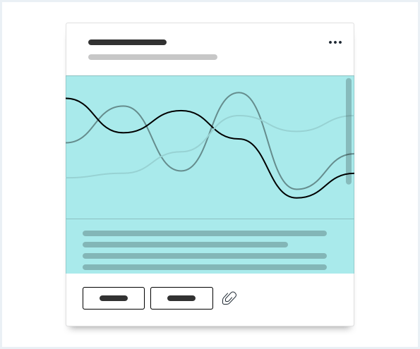
1. Header (optional)
- Can contain a supporting visual, title, subline, icons or actions.
2. Content (optional)
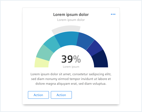
- Can be an image, video, chart, key value pair or any other data visualisation, text, list, table, dividers.
- Mix multiple content types where necessary, to create the card you need.
3. Footer (optional)
- Can contain additional content like buttons, badges, icons, actions or meta information.
4. Background
- The background has several elevation states. These elevation states (shadows) help indicating a card and the interactivity of it.
- The background is required.
Header construction
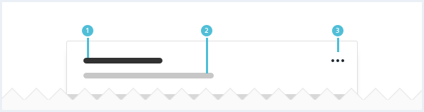
- Use a title (optional) to explain the context of a card.
- Use a subline (optional) to give additional content-related information.
- Use a menu (optional) to place additional actions.
Footer construction
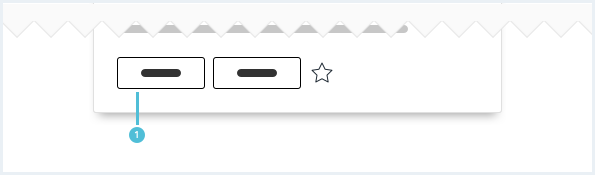
- Card footers (optional) can contain buttons. The type of button depends on the importance of the action. This can be a mix of primary, secondary or ghost buttons. All of these can be icon-only buttons.
- Use primary buttons sparingly on one screen.
Options
The following card options are available:
Card content
Individual cards can be created if the default arrangements don’t fit to create a card you need.
It is recommended to use content like image, video, chart, key value pair or any other data visualisation, list, table, dividers, text.
It is not recommended to put forms or containers into cards.
Card text alignment
Custom background color
By default, all cards have a white background color. It is possible to change the background color to any color needed.

Status highlight indicator
Cards can have a status indicator in case the status should be made more explicit.
Behavior
Card
The whole card is clickable and leads to further information.

Card with additional actions
There has to be at least one action that leads to further information.
Card scrolling
It is possible to individually set the height of the cards. If there is more content then available space the content is scrollable.
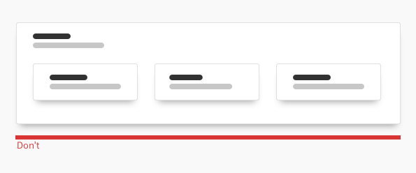
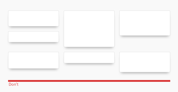
Dos & Don’ts
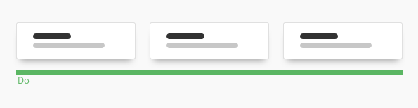
- Show cards next to each other, in a list or in a grid or group them in a container.
- Do not nest cards in cards.
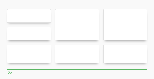
- Try to use equal heights in one row and equal gutter widths over all rows.
- Do not use too many variable heights and gutter widths.
Style
This chapter shows several card styles in the User Experience Toolkit.
Overview
Card states
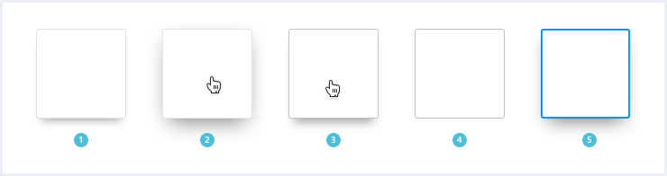
- default, 2. mouseover, 3. pressed, 4. disabled, 5. focused
| | | | |
Typography
The following table gives reference to the different font sizes and weights:
| Name | State | Font-family | Font-size | Line-height | Text-align |
|---|---|---|---|---|---|
| Title | all | Siemens Sans Bold | 17px | 23px | left, center |
| Subline | all | Siemens Sans Roman | 14px | 20px | left, center |
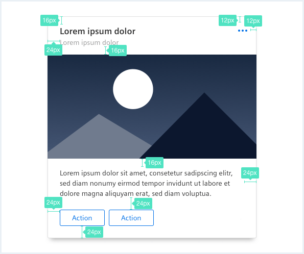
Sizing and spacing
The following measurements show the dimensions for this component:
Sizing
By default, cards have a dynamic height. The card height should be an increment of 8px. Cards should have equal heights when they are used in one row.
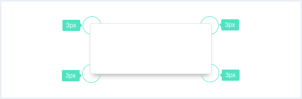
Shadow layer
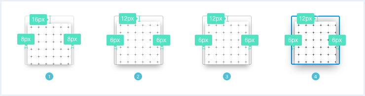
- default, 2. mouseover, 3. pressed, 4. focused
Status indicator
Style and size of a status indicator is described in the Context & status chapter.
The following examples don't showcase a shadow as specified in styles due to technical reasons on the website, however these shadows are implemented in the CSS framework.
To see a detailed explanation of all existing classes, please refer to the usage table below.
Card
Card title, not clickable
A short subline.
of cards Lorem ipsum dolor content of cards.
<div class="card">
    <div class="card__header">
        <h3 class="card__title">
            Card title, not clickable
        </h3>
        <p class="card__subline">
            A short subline.
        </p>
    </div>
    <div class="card__content">
        <p>of cards Lorem ipsum dolor content of cards.</p>
    </div>
</div>
Card centered
(Centered) Card title
Lorem ipsum dolor sit amet, consectetur adipiscing elit, sed do eiusmod tempor inci.
of cards Lorem ipsum dolor content of cards.
<div class="card card--centered">
    <div class="card__header">
        <h3 class="card__title">
            <a href="#">(Centered) Card title</a>
        </h3>
        <p class="card__subline">
            Lorem ipsum dolor sit amet, consectetur adipiscing elit, sed do eiusmod tempor inci.
        </p>
    </div>
    <div class="card__content">
        <p>of cards Lorem ipsum dolor content of cards.</p>
    </div>
</div>
Card clickable
Card title, clickable
A short subline.
of cards Lorem ipsum dolor content of cards.
<div class="card">
    <div class="card__header">
        <h3 class="card__title">
            <a href="#">Card title, clickable</a>
        </h3>
        <p class="card__subline">
            A short subline.
        </p>
    </div>
    <div class="card__content">
        <p>of cards Lorem ipsum dolor content of cards.</p>
    </div>
</div>
Card clickable, without link icon
Card title, clickable, icon suppressed
A short subline.
of cards Lorem ipsum dolor content of cards.
<div class="card">
    <div class="card__header">
        <h3 class="card__title">
            <a href="#" class="link--noIcon">Card title, clickable, icon suppressed</a>
        </h3>
        <p class="card__subline">
            A short subline.
        </p>
    </div>
    <div class="card__content">
        <p>of cards Lorem ipsum dolor content of cards.</p>
    </div>
</div>
Card with menu
Card header with a very long title
Lorem ipsum dolor sit amet, consectetur adipiscing elit, sed do eiusmod tempor incididunt ut labore et dolore magna aliqua. Volutpat blandit aliquam etiam erat. Pretium vulputate sapien nec sagittis. Ut faucibus pulvinar elementum integer.
of cards Lorem ipsum dolor content of cards.
<div class="card">
    <div class="card__header">

        <div class="menu is-bottom is-right-aligned is-shown">
            <button class="button button--ghost has-icon-only">
            </button>
            <div class="popover__container">
                <a class="popover__item" href="#">
                    Lorem ipsum
                </a>
                <a class="popover__item" href="#">
                    Lorem ipsum dolor sit amet
                </a>
                <a class="popover__item" href="#">
                    Lorem ipsum dolor Lorem ipsum dolor Lorem ipsum dolor
                </a>
            </div>
        </div>

        <h3 class="card__title">
            Card header with a very long title
        </h3>
        <p class="card__subline">
            Lorem ipsum dolor sit amet, consectetur adipiscing elit, sed do eiusmod tempor incididunt ut labore et dolore magna aliqua. Volutpat blandit aliquam etiam erat. Pretium vulputate sapien nec sagittis. Ut faucibus pulvinar elementum integer.
        </p>
    </div>
    <div class="card__content">
        <p>of cards Lorem ipsum dolor content of cards.</p>
    </div>
    <div class="card__footer">
        <a class="button button--secondary" href="#">Action 1</a>
        <a class="button button--secondary" href="#">Action 2</a>
        <a href="#" class="button button--secondary has-icon-only">
            <span class="iconUxt edit" aria-hidden="true"></span>
        </a>
        <a href="#" class="button button--ghost has-icon-only">
            <span class="iconUxt locationMarker" aria-hidden="true"></span>
        </a>
    </div>
</div>
Card with buttons in footer
Card title
Lorem ipsum dolor sit amet, consectetur adipiscing elit, sed do eiusmod tempor incididunt ut labore et dolore magna aliqua. Volutpat blandit aliquam etiam erat. Pretium vulputate sapien nec sagittis. Ut faucibus pulvinar elementum integer.
of cards Lorem ipsum dolor content of cards.
<div class="card">
    <div class="card__header">

        <h3 class="card__title">
            Card title
        </h3>
        <p class="card__subline">
            Lorem ipsum dolor sit amet, consectetur adipiscing elit, sed do eiusmod tempor incididunt ut labore et dolore magna aliqua. Volutpat blandit aliquam etiam erat. Pretium vulputate sapien nec sagittis. Ut faucibus pulvinar elementum integer.
        </p>
    </div>
    <div class="card__content">
        <p>of cards Lorem ipsum dolor content of cards.</p>
    </div>
    <div class="card__footer">
        <a class="button button--secondary" href="#">Action 1</a>
        <a class="button button--secondary" href="#">Action 2</a>
        <a href="#" class="button button--secondary has-icon-only">
            <span class="iconUxt edit" aria-hidden="true"></span>
        </a>
        <a href="#" class="button button--ghost has-icon-only">
            <span class="iconUxt locationMarker" aria-hidden="true"></span>
        </a>
    </div>
</div>
Cards with status indicator
Card title, not clickable
A short subline.
of cards Lorem ipsum dolor content of cards.
Card title, not clickable
A short subline.
of cards Lorem ipsum dolor content of cards.
Card title, not clickable
A short subline.
of cards Lorem ipsum dolor content of cards.
Card title, not clickable
A short subline.
of cards Lorem ipsum dolor content of cards.
<div class="card is-success">
    <div class="card__header">
        <h3 class="card__title">
            Card title, not clickable
        </h3>
        <p class="card__subline">
            A short subline.
        </p>
    </div>
    <div class="card__content">
        <p>of cards Lorem ipsum dolor content of cards.</p>
    </div>
</div>

<p></p><!-- Placeholder for some space -->

<div class="card is-info has-indicator-bold">
    <div class="card__header">
        <h3 class="card__title">
            Card title, not clickable
        </h3>
        <p class="card__subline">
            A short subline.
        </p>
    </div>
    <div class="card__content">
        <p>of cards Lorem ipsum dolor content of cards.</p>
    </div>
</div>

<p></p><!-- Placeholder for some space -->

<div class="card is-warning has-indicator-vertical">
    <div class="card__header">
        <h3 class="card__title">
            Card title, not clickable
        </h3>
        <p class="card__subline">
            A short subline.
        </p>
    </div>
    <div class="card__content">
        <p>of cards Lorem ipsum dolor content of cards.</p>
    </div>
</div>

<p></p><!-- Placeholder for some space -->

<div class="card is-error has-indicator-vertical has-indicator-bold">
    <div class="card__header">
        <h3 class="card__title">
            Card title, not clickable
        </h3>
        <p class="card__subline">
            A short subline.
        </p>
    </div>
    <div class="card__content">
        <p>of cards Lorem ipsum dolor content of cards.</p>
    </div>
</div>
Usage
| Element | Class | Description |
|---|---|---|
.card | .card--centered | Center-aligns all the content of the card horizontally: title, content and footer. |
.card | .is-success, .is-warning, .is-error | Adds different states to the container. |
.card | has-indicator-bold | Changes the indicator to a bold variant. |
.card | has-indicator-vertical | Changes the indicator to a vertical variant. |
.card__title | If this element contains a link, e.g. <a href="...">...</a> the card is clickable as a whole; should only be used when there is only 1 action connected to a card. | |
.card__title | a.link--noIcon | Removes/Hides the default "in app" link icon next to a card's title. |