Call to action
Use the call to action pattern to draw a user's attention to something specific in your user interface.
Usage
When to use
Use a call to action in the following cases:
- To encourage a user to navigate to a new location, context or even application.
- To promote a campaign, advertisements, events etc.
- To encourage a user to perform a desireable action, such as e.g. upgrade, sign in, download, feedback.
General construction
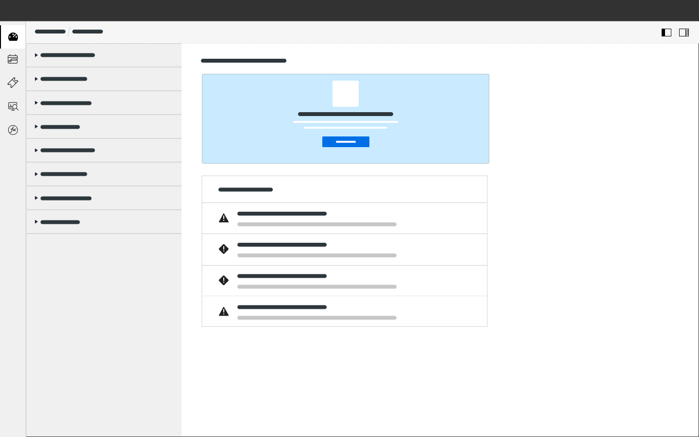
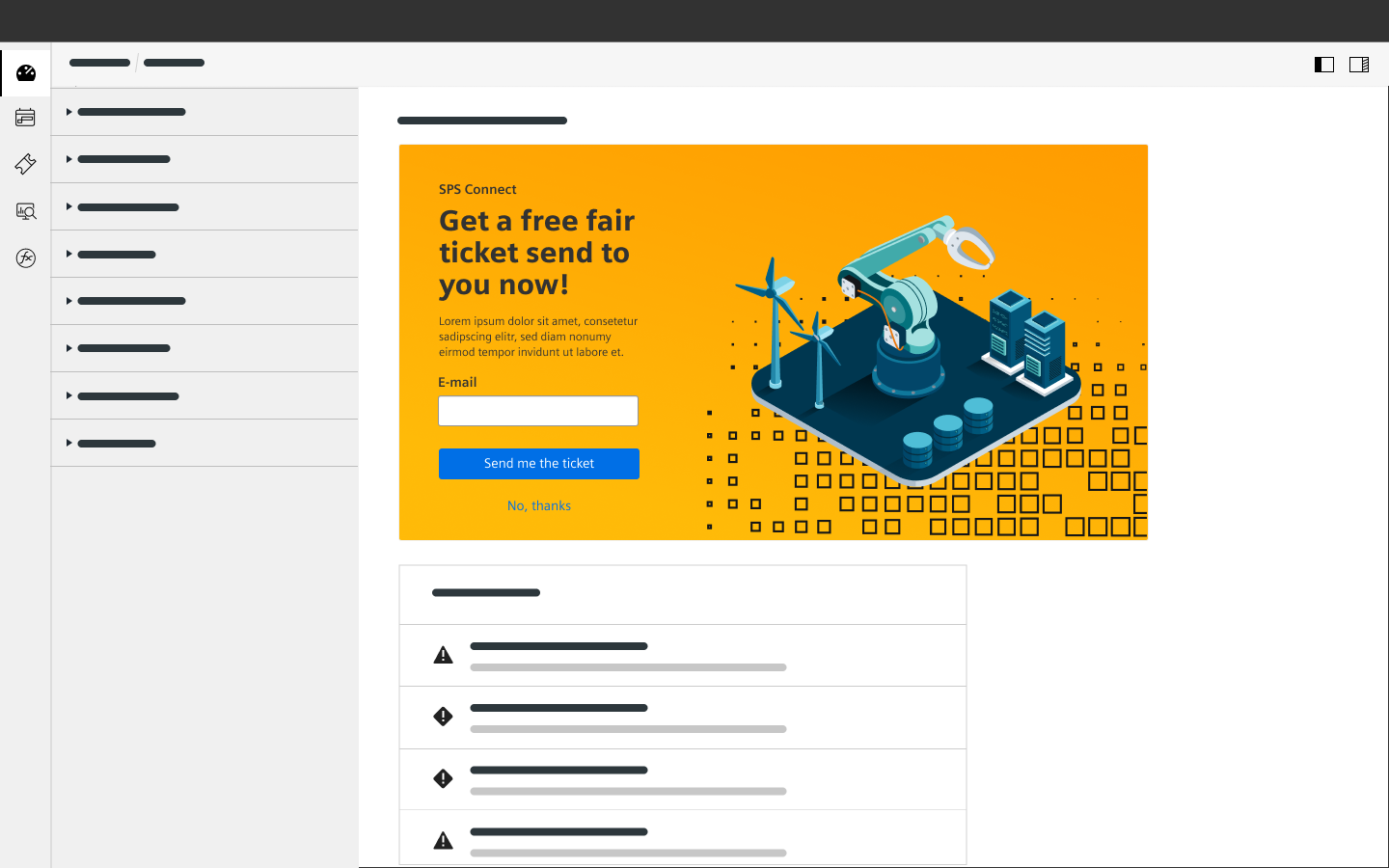
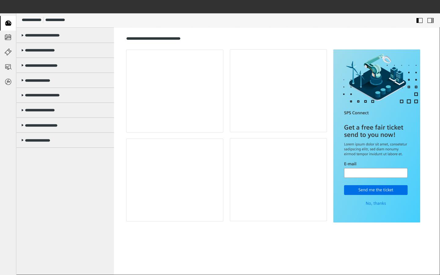
A call to action consists of the following elements:
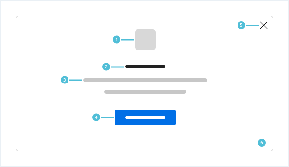
1. Icon or image (optional)
- An image or illustration that visually supports your call to action.
2. Title (optional)
- Provide a compelling and descriptive title that attracts your client’s attention.
3. Helper text (optional)
- A summary of benefits for your client, can be a paragraph or/and bullet points.
- The body text can contain input fields.
4. Call to action
- Provides the user with a hint for a next step.
- Can be a link or a primary button to interact with, describing what the client will receive when following along.
- It may contain more actions like “OK, understood” and “dismiss”; only one primary action intotal, though.
5. Close/Dismiss (optional)
- Closes a call to action in case the client does not want to proceed.
6. Background (optional)
- Should help the call to action visually stand out of the user interface.
- It is recommended to use a similar styling for call to action patterns throughout an application.
Call to action in context
The screen should not be cluttered with multiple call to actions at once; try to avoid overwhelming the user.
Example use-cases
- Getting started: Mostly used on landing pages.
- Join us: Suggests to your users that they can become a part of something exclusive.
- Learn more: To give your customers a little more information so they’re willing to buy or do something.
- Sign up: This type of call to action invites the user to sign up for a trial, a future event or a software product.
- Subscribe: This call to action invites the user to receive updates.
- Try for free: This call to action allows people to try a product before deciding if they want to buy it.
- Upgrade: This call to action allows people to upgrade to another package.
Delimitation
Do not use a call to action but other patterns in the following cases:
Do’s & Don’ts
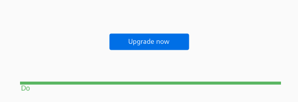
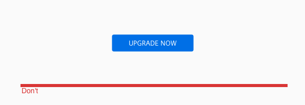
- Do not use all-caps for your call to action.
- Do not use a screen blocking call to action if the context of the parent page is crucial for decision making.
Style
This chapter shows several exemplary call to action styles in the User Experience Toolkit.
Overview
To see a detailed explanation of all existing helper and size classes, please refer to the usage table below. The gradients used in the samples are only examplary implementations and can be customized to any needs through CSS as described below.
Call to action

<style>
    /* sample background gradient */
    .uxt-defaults .callToAction.callToAction--demoBg1 {
        background: linear-gradient(90deg, rgba(var(--color-charting15), 1) 37%, rgba(var(--color-charting16), 1) 100%);
    }

    .uxt-defaults .callToAction.callToAction--demoBg2 {
        background: linear-gradient(180deg, rgba(var(--color-charting02), 1) 0%, rgba(var(--color-charting04), 0.5) 100%);
    }
</style>

<div class="callToAction callToAction--demoBg2">
    <a class="callToAction__dismiss" href="#" title="Dismiss"></a>

    <div class="callToAction__visual">
        <img src="assets/images/plant.svg" alt="image placeholder" />
    </div>

    <h2 class="callToAction__title">
        Win a free device!
    </h2>
    <div class="callToAction__description">
        Answer our short survey and win one out of 5 free virtual devices!
    </div>
    <div class="callToAction__callToAction">
        <form class="form">
            <input class="inputGroup__textInput" type="text" placeholder="Some additional input to capture" id="text-calltoaction01">
        </form>
        <a class="button button--primary" href="#"><span class="iconUxt comment" aria-hidden="true"></span>Answer our survey</a><br />
        <a class="" href="#">No, thanks - not interested.</a>
    </div>
</div>

<div class="callToAction callToAction--demoBg1 callToAction--defaultBgBright">
    <a class="callToAction__dismiss" href="#" title="Dismiss"></a>

    <div class="callToAction__visual">
        <img src="assets/images/plant.svg" alt="image placeholder" />
    </div>

    <h2 class="callToAction__title">
        Win a free device!
    </h2>
    <div class="callToAction__description">
        Answer our short survey and win one out of 5 free virtual devices!
    </div>
    <div class="callToAction__callToAction">
        <form class="form">
            <input class="inputGroup__textInput" type="text" placeholder="Some additional input to capture" id="text-calltoaction02">
        </form>
        <a class="button button--primary" href="#"><span class="iconUxt comment" aria-hidden="true"></span>Answer our survey</a><br />
        <a class="button button--secondary" href="#">No, thanks - not interested.</a>
    </div>
</div>
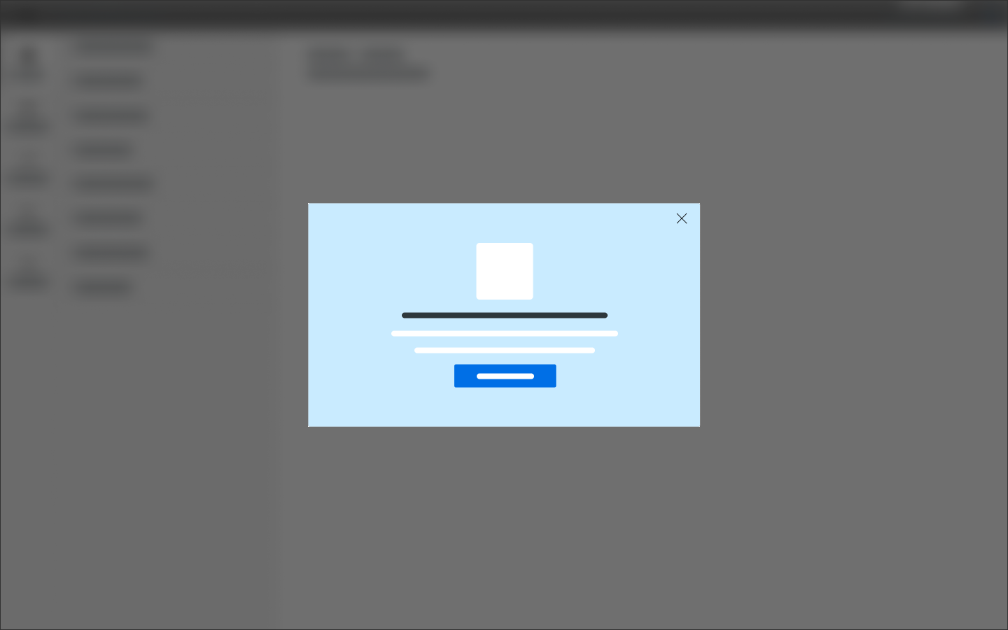
Call to action in dialog
<style>
    /* sample background gradient */
    .uxt-defaults .callToAction.callToAction--demoBg1 { background: linear-gradient(90deg, rgba(var(--color-charting15), 1) 37%, rgba(var(--color-charting16), 1) 100%); }
</style>

<div class="dialog is-shown dialog--frameless">
    <div class="dialog__overlay"></div>
    <div class="dialog__container">
        <div class="dialog__background">
            <section class="dialog__content">
                <div class="callToAction callToAction--demoBg1 callToAction--defaultBgBright">
                    <a class="callToAction__dismiss" href="#" title="Dismiss"></a>

                    <div class="callToAction__visual">
                        <img src="assets/images/plant.svg" alt="image placeholder" />
                    </div>

                    <h2 class="callToAction__title">
                        Win a free device!
                    </h2>
                    <div class="callToAction__description">
                        Answer our short survey and win one out of 5 free virtual IOT devices!
                    </div>
                    <div class="callToAction__callToAction">
                        <form class="form">
                            <input class="inputGroup__textInput" type="text" placeholder="Some additional input to capture" id="text-input01">
                        </form>
                        <a class="button button--primary" href="#"><span class="iconUxt comment" aria-hidden="true"></span>Answer our survey</a><br />
                        <a class="button button--secondary" href="#">No, thanks - not interested.</a>
                    </div>
                </div>
            </section>
        </div>
    </div>
</div>
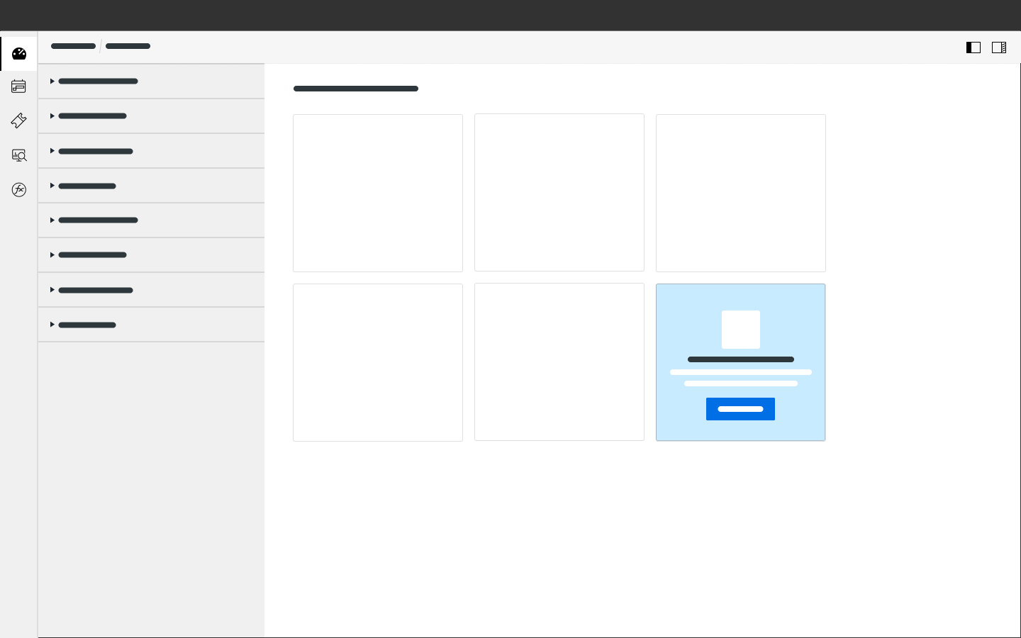
Call to action in card (grid)
<style>
    /* sample background gradient */
    .uxt-defaults .callToAction.callToAction--demoBg1 { background: linear-gradient(90deg, rgba(var(--color-charting15), 1) 37%, rgba(var(--color-charting16), 1) 100%); }
    .uxt-defaults .callToAction.callToAction--demoBg2 { background: linear-gradient(180deg, rgba(var(--color-charting02), 1) 0%, rgba(var(--color-charting04), 1) 100%); }
</style>

<div class="cards cards--simpleGrid">
    <div class="cards__row">
        <div class="cards__col">

            <div class="card">

                <div class="card__content">

                    <div class="callToAction callToAction--demoBg2 ">
                        <a class="callToAction__dismiss" href="#" title="Dismiss"></a>

                        <div class="callToAction__visual">
                            <img src="assets/images/plant.svg" alt="image placeholder" />
                        </div>

                        <h2 class="callToAction__title">
                            Win a free device!
                        </h2>
                        <div class="callToAction__description">
                            Answer our short survey and win one out of 5 free virtual devices!
                        </div>
                        <div class="callToAction__callToAction">
                            <form class="form">
                                <input class="inputGroup__textInput" type="text" placeholder="Some additional input to capture" id="text-calltoaction01">
                            </form>
                            <a class="button button--primary" href="#"><span class="iconUxt comment" aria-hidden="true"></span>Answer our survey</a><br />
                            <a class="" href="#">No, thanks - not interested.</a>
                        </div>
                    </div>

                </div>
            </div>

        </div>
        <div class="cards__col">
            <div class="card">
                <div class="card__header">
                </div>
                <div class="card__content">
                </div>
                <div class="card__footer">
                </div>
            </div>
        </div>
    </div>

    <div class="cards__row">
        <div class="cards__col">
            <div class="card">
                <div class="card__content">

                </div>
            </div>
        </div>
        <div class="cards__col">
            <div class="card">
                <div class="card__header">
                </div>
                <div class="card__content">
                </div>
                <div class="card__footer">
                </div>
            </div>
        </div>
        <div class="cards__col">

            <div class="card ">
                <div class="card__content card__content--autogrow">

                    <div class="callToAction callToAction--demoBg1 callToAction--defaultBgBright">
                        <a class="callToAction__dismiss" href="#" title="Dismiss"></a>

                        <div class="callToAction__visual">
                            <img src="assets/images/plant.svg" alt="image placeholder" />
                        </div>

                        <h2 class="callToAction__title">
                            Win a free device!
                        </h2>
                        <div class="callToAction__description">
                            Answer our short survey and win one out of 5 free virtual devices!
                        </div>
                        <div class="callToAction__callToAction">
                            <form class="form">
                                <input class="inputGroup__textInput" type="text" placeholder="Some additional input to capture" id="text-calltoaction02">
                            </form>
                            <a class="button button--primary" href="#"><span class="iconUxt comment" aria-hidden="true"></span>Answer our survey</a><br />
                            <a class="button button--secondary" href="#">No, thanks - not interested.</a>
                        </div>
                    </div>

                </div>
            </div>

        </div>
    </div>

</div>
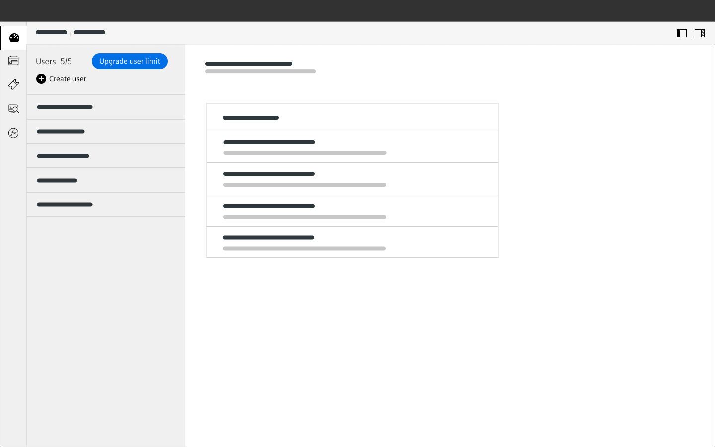
Call to action, small
Users: 5/5Users: 5/5
Users: 5/5
<div class="callToAction callToAction--small">
    <a class="callToAction__dismiss" href="#" title="Dismiss"></a>
    <div class="callToAction__visual">
    </div>
    <h2 class="callToAction__title">
    </h2>
    <div class="callToAction__description">
    </div>
    <div class="callToAction__callToAction">
        <a class="button button--primary" href="#"><span class="iconUxt shoppingCart" aria-hidden="true"></span>Buy additional credits</a>
    </div>
</div>

Users: 5/5
<div class="callToAction callToAction--small">
    <div class="callToAction__callToAction">
        <button class="button button--primary"><span class="iconUxt shoppingCart" aria-hidden="true"></span>Buy additional credits</button>
    </div>
</div>
Usage
| Element | Class | Description |
|---|---|---|
.callToAction | .callToAction--defaultBgBright .callToAction--defaultBgDark | Call to action patterns don't have a background texture by default. By using one of these classes the default background texture will be displayed in dark or bright variant (should be chosen to work with the background gradient used). |
.callToAction | .callToAction--small | Hides dismiss, title, description and visual; only the call to action button itself will be displayed - if using a primary button, the appearance will be adapted accordingly. |
.callToAction | | background: linear-gradient(90deg, rgba(var(--color-colorA), 1) 33%, rgba(var(--color-colorB), 1) 100%); } The gradient angle, color stops, number of colors etc can be set with CSS by modifying the CSS background property. |