Badge
A badge indicates a status information from the system. It is used to highlight a numerical characteristic or mark an item.
Usage
When to use
Use a badge in the following cases:
- When an element needs to be highlighted.
- When items need to be differentiated from each other.
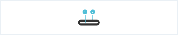
General construction
A badge consists of the following elements:
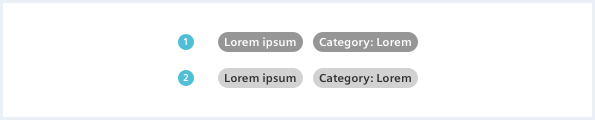
1. Label
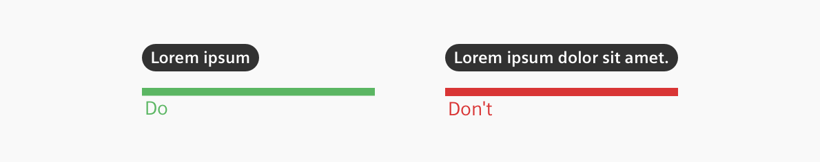
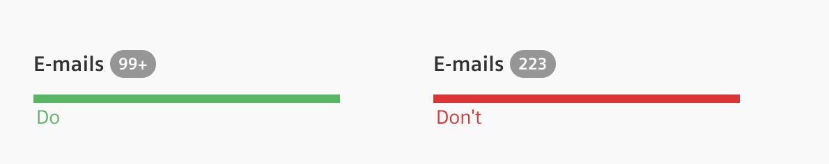
- If possible, try not to use more than three words, extremely long labels should be truncated.
- Only the first word of the label should be capitalized.
- A badge label can have additional information such as the category or type of a badge.
2. Background
- The background color is contextual.
- The background color can be used to emphasize a status, to inform or to associate information.
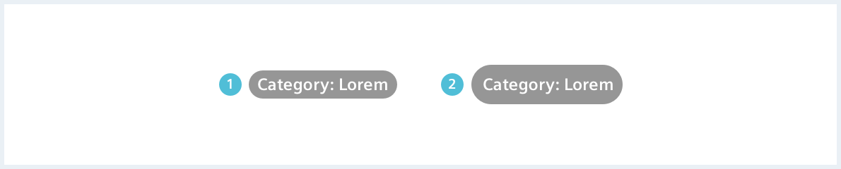
Sizes
There are two possible sizes for a badge: Regular (‘small’) and large.
Options
The following badge options are available:
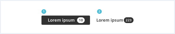
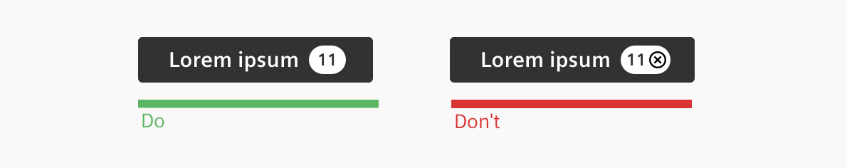
Badge as counter
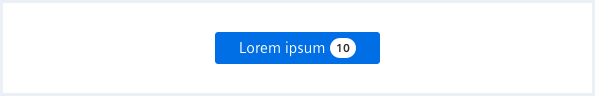
A badge can be placed within a button or other items to be used as a counter.
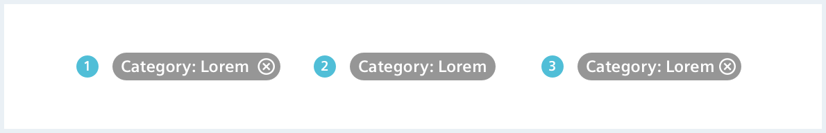
Interactive badge
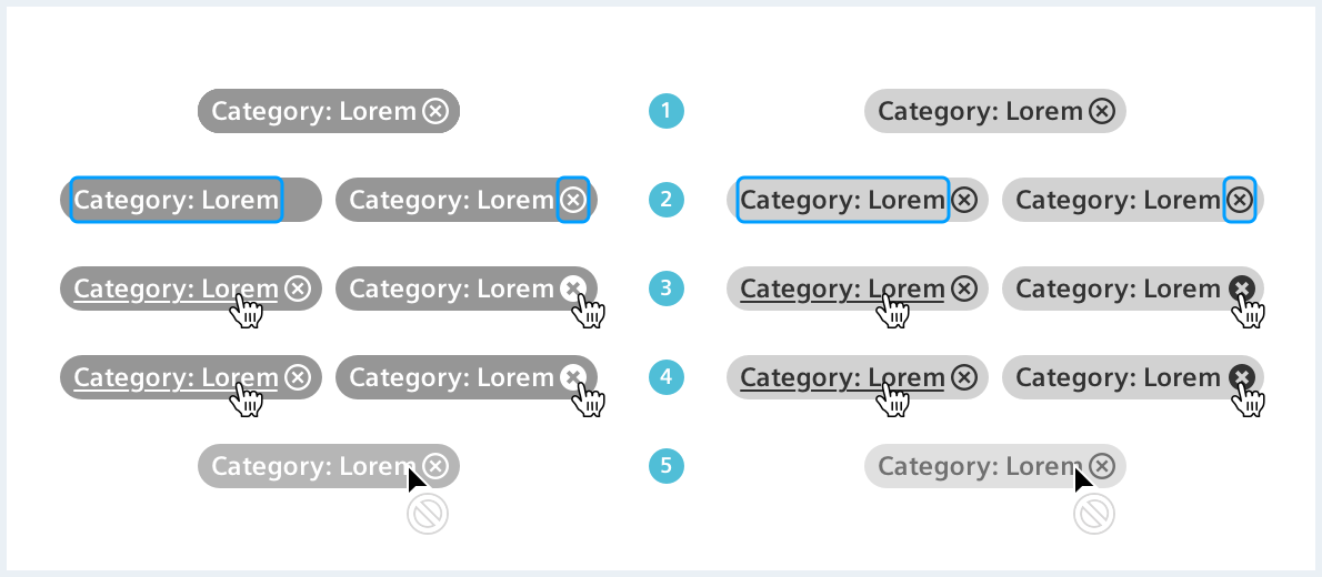
An interactive badge can be either a:
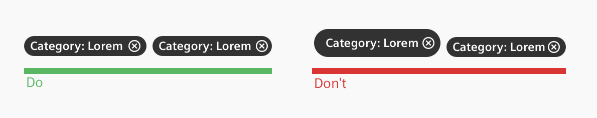
- Removeable badge: Clicking the X removes the whole badge.
- Clickable badge: Clicking anywhere in the badge initiates an action.
- Clickable and removeable badge: a combination of both.
The clickable part of the badge shall; never be used to remove the badge, use the removeable badge instead.
Badge with icon
A large badge can have an icon in any variant - normal badge as well as interactive badge.
Behavior
A normal badge does not feature interaction. It is not clickable or removable. An interactive badge can have two interactions:
- Clicking the badge can e.g. filter objects by badge label.
- Removing the badge from a given set of badges.
Do’s & Don’ts
Style
This chapter shows several badge styles in the User Experience Toolkit.
Overview
A badge can have a light or a dark label.
Interactive badge states
Color
A badge can have every background color. For better contrast and visibility, use a dark label on brighter backgrounds and a light label on darker backgrounds.
A functional color as background color emphasizes the severity of a badge. For more information see chapter Color and Context & Status.
Typography
The following table gives reference to the different font sizes and weights:
| Name | State | Font-family | Font-size | Line-height | Text-align |
|---|---|---|---|---|---|
| Label | all | Siemens Sans Bold | 12px | 16px | center |
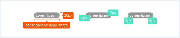
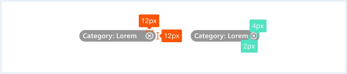
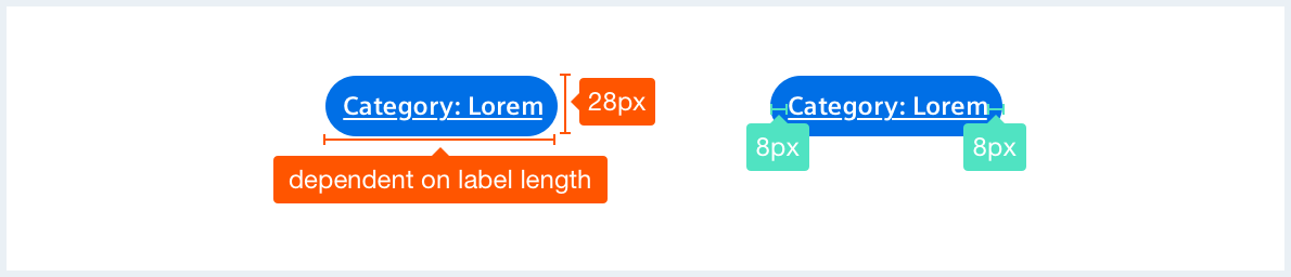
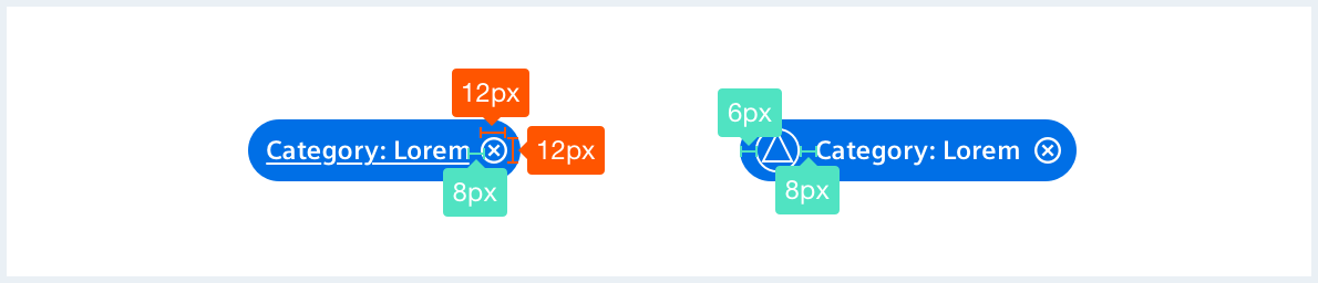
Sizing and spacing
The following measurements show the dimensions for this component:
Badges have two default styles and can be customized with the available CSS helper classes.
Badge, small/default
Usergroupwithaverylonglabelwhichisreallytoolong Usergroupwithaverylonglabelwhichisreallytoolong
<span class="badge badge--dark">
    <span>Usergroup: Simple</span>
</span>

<span class="badge badge--outline">
    <span>Usergroup: Simple</span>
</span>

<span class="badge badge--light">
    <span>User type: Global User</span>
</span>

<span class="badge badge--dark">
    <span>Usergroupwithaverylonglabelwhichisreallytoolong</span>
</span>

<span class="badge badge--dark has-bgColor-primary-light has-color-base1000">
    <span>Usergroupwithaverylonglabelwhichisreallytoolong</span>
</span>
Badge, large
Usergroupwithaverylonglabelwhichisreallytoolong Usergroupwithaverylonglabelwhichisreallytoolong
<span class="badge badge--large badge--dark">
    <span>Usergroup: Simple</span>
</span>

<span class="badge badge--outline badge--large">
    <span>Usergroup: Simple</span>
</span>

<span class="badge badge--large badge--light">
    <span>User type: Global User</span>
</span>

<span class="badge badge--large badge--dark">
    <span>Usergroupwithaverylonglabelwhichisreallytoolong</span>
</span>

<span class="badge badge--large badge--dark has-bgColor-primary-light has-color-base1000">
    <span>Usergroupwithaverylonglabelwhichisreallytoolong</span>
</span>
Badge, large with icon
<span class="badge badge--dark badge--large">
    <span aria-hidden='true' class='iconUxt asset bold'></span><span>Usergroup: Simple</span>
</span>

<span class="badge badge--outline badge--large">
    <span aria-hidden='true' class='iconUxt asset bold'></span><span>Usergroup: Simple</span>
</span>

<span class="badge badge--light badge--large">
    <span aria-hidden='true' class='iconUxt asset bold'></span><span>Usergroup: Simple</span><a href="#" class="badge__close"></a>
</span>
Badge on button
<button class="button button--primary">
    Primary button
    <span class="badge badge--dark">
        <span>123</span>
    </span>
</button>

<button class="button button--primary">
    Primary button
    <span class="badge badge--outline has-color-base1000 has-borderColor-base800">
        <span>123</span>
    </span>
</button>

<a class="button button--primary is-disabled" href="#">
    Primary link button, disabled
    <span class="badge has-bgColor-warning">
        <span>321</span>
    </span>
</a>

<button class="button button--secondary">
    Secondary button
    <span class="badge has-bgColor-primary has-color-base1000">
        <span>Category</span>
    </span>
</button>

<button class="button button--secondary">
    Secondary button
    <span class="badge badge--outline has-borderColor-primary has-color-primary">
        <span>Category</span>
    </span>
</button>
Interactive badge, small/default
User type: Global User Usergroupwithaverylonglabelwhichisreallytoolong Usergroupwithaverylonglabelwhichisreallytoolong
<span class="badge badge--dark">
    <a href="#">Usergroup: Simple</a>
</span>

<span class="badge badge--outline">
    <a href="#">Usergroup: Simple</a>
</span>

<span class="badge badge--light">
    <a href="#">User type: Global User</a>
</span>

<span class="badge badge--light">
    <a href="#">User type: Global User</a><a href="#" class="badge__close"></a>
</span>

<span class="badge badge--dark">
    <a href="#" title="Usergroupwithaverylonglabelwhichisreallytoolong">Usergroupwithaverylonglabelwhichisreallytoolong</a><a href="#" class="badge__close"></a>
</span>

<span class="badge badge--dark has-bgColor-primary-light has-color-base1000">
    <a href="#" title="Usergroupwithaverylonglabelwhichisreallytoolong">Usergroupwithaverylonglabelwhichisreallytoolong</a><a href="#" class="badge__close"></a>
</span>
Interactive badge, large
User type: Global User Usergroupwithaverylonglabelwhichisreallytoolong
<span class="badge badge--large badge--dark">
    <a href="#">Usergroup: Simple</a>
</span>

<span class="badge badge--outline badge--large">
    <a href="#">Usergroup: Simple</a>
</span>

<span class="badge badge--large badge--light">
    <a href="#">User type: Global User</a>
</span>

<span class="badge badge--large badge--light">
    <a href="#">User type: Global User</a><a href="#" class="badge__close"></a>
</span>

<span class="badge badge--large badge--dark">
    <a href="#" title="Usergroupwithaverylonglabelwhichisreallytoolong">Usergroupwithaverylonglabelwhichisreallytoolong</a><a href="#" class="badge__close"></a>
</span>
Interactive badge, no ellipsis/truncation
Usergroupwithaverylonglabelwhichisreallytoolong Usergroupwithaverylonglabelwhichisreallytoolong
<span class="badge badge--dark badge--noEllipsis">
    <a href="#" title="Usergroupwithaverylonglabelwhichisreallytoolong">Usergroupwithaverylonglabelwhichisreallytoolong</a><a href="#" class="badge__close"></a>
</span>

<span class="badge badge--outline badge--noEllipsis">
    <a href="#" title="Usergroupwithaverylonglabelwhichisreallytoolong">Usergroupwithaverylonglabelwhichisreallytoolong</a><a href="#" class="badge__close"></a>
</span>

<span class="badge badge--large badge--dark badge--noEllipsis">
    <a href="#" title="Usergroupwithaverylonglabelwhichisreallytoolong">Usergroupwithaverylonglabelwhichisreallytoolong</a><a href="#" class="badge__close"></a>
</span>

<span class="badge badge--outline badge--large badge--noEllipsis">
    <a href="#" title="Usergroupwithaverylonglabelwhichisreallytoolong">Usergroupwithaverylonglabelwhichisreallytoolong</a><a href="#" class="badge__close"></a>
</span>
Interactive badge, disabled
<span class="badge badge--dark is-disabled">
    <a href="#">Usergroup: Simple</a>
</span>

<span class="badge badge--outline is-disabled">
    <a href="#">Usergroup: Simple</a>
</span>

<span class="badge badge--large badge--light is-disabled">
    <a href="#">User type: Global User</a>
</span>
Usage
| Element | Class | Description |
|---|---|---|
.badge | .badge--dark | Default styling for badge element: background color in dark gray with white foreground color. |
.badge | .badge--light | Alternative styling for badge element: background color in light gray with gray foreground color. |
.badge | .badge--outline | Alternative styling for badge element: Adds a outline to the badge and removes the background color. |
.badge | .has-color-<color name> | Applies a customized foreground color to the badge element for special requirements. Any of the foreground color helper classes can be used. |
.badge | .has-bgColor-<color name> | Applies a customized background color to the badge element for special requirements. Any of the background color helper classes can be used. Avoid setting border colors for badges since their height would increase and they might not line up properly anymore. |
.badge | .is-disabled | Disables all links and clickable elements within badges, hovering the elements will show a forbidden sign. |
.badge | .badge--noEllipsis | Disables the default max-width for a badge and the shortening of the badge label with an ellipsis / … - use with caution since extremely long labels wont wrap and might visually break the UI. |