Menu
A menu displays a list of multiple actions on a temporary surface. It appears when the user interacts with a button, tab or other control.
Usage
When to use
Use menus in the following cases:
- To display a preconfigured list of actions.
- If there are multiple actions in a limited space.
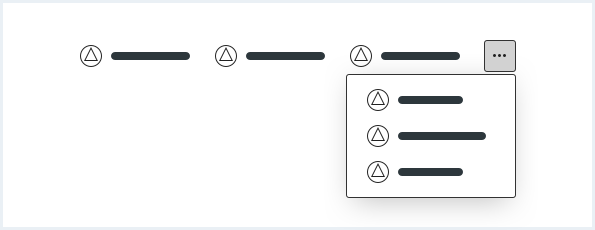
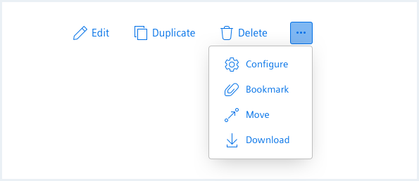
General construction
A menu consists of the following elements:
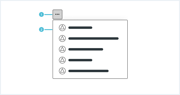
1. Menu control
- A menu control can be a button, tab or other control which has more than one action to choose from.
2. Menu
- The menu appears when a user interacts with a menu control.
- It contains the menu items.
3. Menu item
- The menu item includes a label and optionally an icon.
4. Icon
- The icon emphasizes the label and matches the action.
- The icon is optional.
5. Label
- The label is mandatory.
Behavior
Position and elevation
A menu appears in front of all other permanent UI elements and typically below the menu control. It behaves according to the window bounding. Make sure that it is placed in the visible area of the screen.
If it is in a position to be cut off by the browser or screen’s edge, the menu can instead appear to the left, right, or above the menu control.
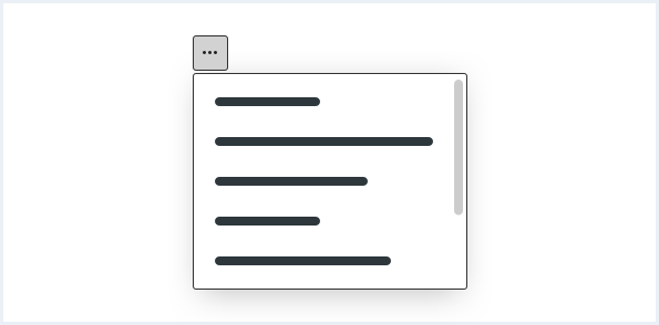
Scrolling
If not all menu items fit into the visible area, a menu can be scrollable.
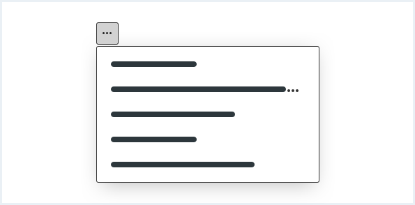
Label ellipsis
Use an ellipsis, if a label exceeds the maximum width of the menu.
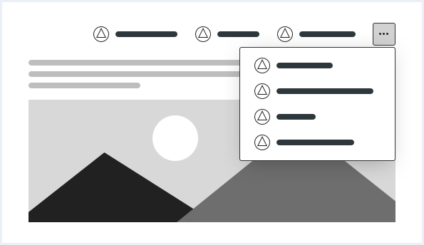
Overflowing behavior
Use the overflowing behavior if there is a space restriction, for example in the content header.
Do’s & Don’ts
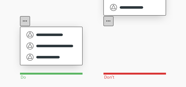
- Always place the menu next to the menu control in the visible area of the screen.
- Do not position and align the menu to be truncated or invisible.
Style
This chapter shows several menu styles in the User Experience Toolkit.
Overview
Typography
The following table gives reference to the different font sizes and weights:
| Name | State | Font-family | Font-size | Line-height | Text-align |
|---|---|---|---|---|---|
| Label | all | Siemens Sans Roman | 14px | 20px | left |
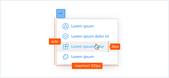
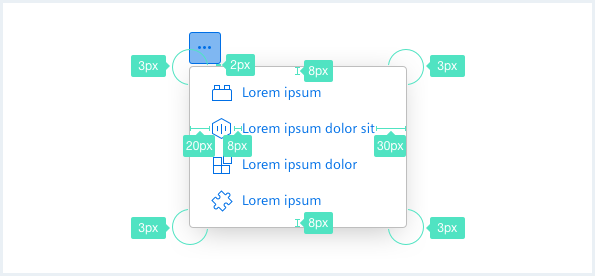
Sizing and spacing
The following measurements show the dimensions for this component:
The label length of the longest menu item determines the width of the menu. If the menu item exceeds the maximum width it will be truncated.
The maximum height of a menu should be at least one item less than the height of the app’s UI.
To see a detailed explanation of all existing helper and size classes, please refer to the usage table below.
Menu, not expanded
Faucibus vitae aliquet nec ullamcorper sit amet risus. In vitae turpis massa sed elementum tempus egestas sed.
Dolor sed viverra ipsum nunc aliquet bibendum enim facilisis.
Eu augue ut lectus arcu bibendum.
<div class="menu is-bottom">
    <button class="button button--secondary has-icon-only"></button>
    <div class="popover__container">
        <a class="popover__item" href="#">
            Lorem ipsum
        </a>
        <a class="popover__item" href="#">
            Lorem ipsum dolor sit amet
        </a>
        <a class="popover__item is-disabled" href="#">
            Lorem ipsum dolor Lorem ipsum dolor Lorem ipsum dolor
        </a>
        <a class="popover__item" href="#">
            Lorem ipsum dolor Lorem ipsum dolor Lorem ipsum dolor
        </a>
    </div>
</div>

<!-- placeholder text / paragraph -->
<p>
    Faucibus vitae aliquet nec ullamcorper sit amet risus. In vitae turpis massa sed elementum tempus egestas sed. <br />Dolor sed viverra ipsum nunc aliquet bibendum enim facilisis. <br />Eu augue ut lectus arcu bibendum.
</p>
Menu, expanded
Purus faucibus ornare suspendisse sed nisi lacus sed viverra. Orci nulla pellentesque dignissim enim sit amet.
Id velit ut tortor pretium. Adipiscing commodo elit at imperdiet dui accumsan sit amet.
Eget nullam non nisi est.
Sit amet purus gravida quis blandit turpis cursus in. Arcu bibendum at varius vel pharetra vel turpis nunc.
rhoncus urna neque viverra justo nec. Sem fringilla ut morbi tincidunt augue interdum velit euismod.
Nibh venenatis cras sed felis eget velit aliquet sagittis.
Cillum reprehenderit ut ut consectetur minim incididunt consectetur ut culpa aliquip et eiusmod.
Ad sunt cupidatat adipisicing esse pariatur ullamco ea nostrud consectetur Lorem aliqua nisi.
Magna nostrud commodo dolore proident sunt do quis commodo. Velit nostrud est proident sint veniam.
<div class="menu is-shown is-bottom">
    <button class="button button--secondary has-icon-only"></button>
    <div class="popover__container">
        <a class="popover__item" href="#">
            Lorem ipsum
        </a>
        <a class="popover__item" href="#">
            Lorem ipsum dolor sit amet
        </a>
        <a class="popover__item" href="#">
            Lorem ipsum dolor Lorem ipsum dolor Lorem ipsum dolor
        </a>
    </div>
</div>

<!-- placeholder text / paragraph -->
<p>
    Purus faucibus ornare suspendisse sed nisi lacus sed viverra. Orci nulla pellentesque dignissim enim sit amet.<br /> Id velit ut tortor pretium. Adipiscing commodo elit at imperdiet dui accumsan sit amet.<br />Eget nullam non nisi est.<br />Sit amet purus gravida quis blandit turpis cursus in. Arcu bibendum at varius vel pharetra vel turpis nunc.<br /> rhoncus urna neque viverra justo nec. Sem fringilla ut morbi tincidunt augue interdum velit euismod.<br />Nibh venenatis cras sed felis eget velit aliquet sagittis.<br />Cillum reprehenderit ut ut consectetur minim incididunt consectetur ut culpa aliquip et eiusmod.<br />Ad sunt cupidatat adipisicing esse pariatur ullamco ea nostrud consectetur Lorem aliqua nisi.<br /> Magna nostrud commodo dolore proident sunt do quis commodo. Velit nostrud est proident sint veniam.<br />
</p>
Menu with icons and sample states
Purus faucibus ornare suspendisse sed nisi lacus sed viverra. Orci nulla pellentesque dignissim enim sit amet.
Id velit ut tortor pretium. Adipiscing commodo elit at imperdiet dui accumsan sit amet.
Eget nullam non nisi est.
Sit amet purus gravida quis blandit turpis cursus in. Arcu bibendum at varius vel pharetra vel turpis nunc.
rhoncus urna neque viverra justo nec. Sem fringilla ut morbi tincidunt augue interdum velit euismod.
Nibh venenatis cras sed felis eget velit aliquet sagittis.
Cillum reprehenderit ut ut consectetur minim incididunt consectetur ut culpa aliquip et eiusmod.
Ad sunt cupidatat adipisicing esse pariatur ullamco ea nostrud consectetur Lorem aliqua nisi.
Magna nostrud commodo dolore proident sunt do quis commodo. Velit nostrud est proident sint veniam.
<div class="menu is-shown is-bottom">
    <button class="button button--secondary has-icon-only"></button>
    <div class="popover__container">
        <a class="popover__item" href="#">
            <i aria-hidden="true" class="iconUxt analysis"></i>Lorem ipsum
        </a>
        <a class="popover__item is-pressed" href="#">
            <i aria-hidden="true" class="iconUxt audit"></i>Lorem ipsum dolor sit amet
        </a>
        <a class="popover__item" href="#">
            <i aria-hidden="true" class="iconUxt calendar"></i>Lorem ipsum dolor Lorem ipsum dolor Lorem ipsum dolor
        </a>
        <a class="popover__item is-disabled" href="#">
            <i aria-hidden="true" class="iconUxt maintenance"></i>Lorem ipsum dolor Lorem ipsum dolor Lorem ipsum dolor
        </a>
        <a class="popover__item" href="#">
            <i aria-hidden="true" class="iconUxt settings"></i>Lorem ipsum
        </a>
    </div>
</div>

<!-- placeholder text / paragraph -->
<p>
    Purus faucibus ornare suspendisse sed nisi lacus sed viverra. Orci nulla pellentesque dignissim enim sit amet.<br /> Id velit ut tortor pretium. Adipiscing commodo elit at imperdiet dui accumsan sit amet.<br />Eget nullam non nisi est.<br />Sit amet purus gravida quis blandit turpis cursus in. Arcu bibendum at varius vel pharetra vel turpis nunc.<br /> rhoncus urna neque viverra justo nec. Sem fringilla ut morbi tincidunt augue interdum velit euismod.<br />Nibh venenatis cras sed felis eget velit aliquet sagittis.<br />Cillum reprehenderit ut ut consectetur minim incididunt consectetur ut culpa aliquip et eiusmod.<br />Ad sunt cupidatat adipisicing esse pariatur ullamco ea nostrud consectetur Lorem aliqua nisi.<br /> Magna nostrud commodo dolore proident sunt do quis commodo. Velit nostrud est proident sint veniam.<br />
</p>
Menu, default alignment
Purus faucibus ornare suspendisse sed nisi lacus sed viverra. Orci nulla pellentesque dignissim enim sit amet.
Id velit ut tortor pretium. Adipiscing commodo elit at imperdiet dui accumsan sit amet.
Eget nullam non nisi est.
Sit amet purus gravida quis blandit turpis cursus in. Arcu bibendum at varius vel pharetra vel turpis nunc.
rhoncus urna neque viverra justo nec. Sem fringilla ut morbi tincidunt augue interdum velit euismod.
Nibh venenatis cras sed felis eget velit aliquet sagittis.
<div class="menu is-shown">
    <button class="button button--secondary has-icon-only"></button>
    <div class="popover__container">
        <a class="popover__item" href="#">
            Lorem ipsum
        </a>
        <a class="popover__item" href="#">
            Lorem ipsum dolor sit amet
        </a>
        <a class="popover__item" href="#">
            Lorem ipsum dolor Lorem ipsum dolor Lorem ipsum dolor
        </a>
    </div>
</div>

<!-- placeholder text / paragraph -->
<p>
    Purus faucibus ornare suspendisse sed nisi lacus sed viverra. Orci nulla pellentesque dignissim enim sit amet.<br /> Id velit ut tortor pretium. Adipiscing commodo elit at imperdiet dui accumsan sit amet.<br />Eget nullam non nisi est.<br />Sit amet purus gravida quis blandit turpis cursus in. Arcu bibendum at varius vel pharetra vel turpis nunc.<br /> rhoncus urna neque viverra justo nec. Sem fringilla ut morbi tincidunt augue interdum velit euismod.<br />Nibh venenatis cras sed felis eget velit aliquet sagittis.
</p>
Menu, bottom right alignment
Purus faucibus ornare suspendisse sed nisi lacus sed viverra. Orci nulla pellentesque dignissim enim sit amet.
Id velit ut tortor pretium. Adipiscing commodo elit at imperdiet dui accumsan sit amet.
Eget nullam non nisi est.
Sit amet purus gravida quis blandit turpis cursus in. Arcu bibendum at varius vel pharetra vel turpis nunc.
rhoncus urna neque viverra justo nec. Sem fringilla ut morbi tincidunt augue interdum velit euismod.
<a class="button button--secondary" href="#">Some very long button to push the menu to the right side</a>
<div class="menu is-shown is-bottom is-right-aligned">
    <button class="button button--secondary has-icon-only"></button>
    <div class="popover__container">
        <a class="popover__item" href="#">
            Lorem ipsum
        </a>
        <a class="popover__item" href="#">
            Lorem ipsum dolor sit amet
        </a>
        <a class="popover__item" href="#">
            Lorem ipsum dolor Lorem ipsum dolor Lorem ipsum dolor
        </a>
    </div>
</div>

<!-- placeholder text / paragraph -->
<p>
    Purus faucibus ornare suspendisse sed nisi lacus sed viverra. Orci nulla pellentesque dignissim enim sit amet.<br /> Id velit ut tortor pretium. Adipiscing commodo elit at imperdiet dui accumsan sit amet.<br />Eget nullam non nisi est.<br />Sit amet purus gravida quis blandit turpis cursus in. Arcu bibendum at varius vel pharetra vel turpis nunc.<br /> rhoncus urna neque viverra justo nec. Sem fringilla ut morbi tincidunt augue interdum velit euismod.
</p>
Menu, top right alignment
Purus faucibus ornare suspendisse sed nisi lacus sed viverra. Orci nulla pellentesque dignissim enim sit amet.
Id velit ut tortor pretium. Adipiscing commodo elit at imperdiet dui accumsan sit amet.
Eget nullam non nisi est.
Sit amet purus gravida quis blandit turpis cursus in. Arcu bibendum at varius vel pharetra vel turpis nunc.
rhoncus urna neque viverra justo nec. Sem fringilla ut morbi tincidunt augue interdum velit euismod.
<!-- placeholder text / paragraph -->
<p>
    Purus faucibus ornare suspendisse sed nisi lacus sed viverra. Orci nulla pellentesque dignissim enim sit amet.<br /> Id velit ut tortor pretium. Adipiscing commodo elit at imperdiet dui accumsan sit amet.<br />Eget nullam non nisi est.<br />Sit amet purus gravida quis blandit turpis cursus in. Arcu bibendum at varius vel pharetra vel turpis nunc.<br /> rhoncus urna neque viverra justo nec. Sem fringilla ut morbi tincidunt augue interdum velit euismod.
</p>

<a class="button button--secondary" href="#">Some very long button to push the menu to the right side</a>
<div class="menu is-shown is-top is-right-aligned">
    <button class="button button--secondary has-icon-only"></button>
    <div class="popover__container">
        <a class="popover__item" href="#">
            Lorem ipsum
        </a>
        <a class="popover__item" href="#">
            Lorem ipsum dolor sit amet
        </a>
        <a class="popover__item" href="#">
            Lorem ipsum dolor Lorem ipsum dolor Lorem ipsum dolor
        </a>
    </div>
</div>
Menu, top left alignment
Purus faucibus ornare suspendisse sed nisi lacus sed viverra. Orci nulla pellentesque dignissim enim sit amet.
Id velit ut tortor pretium. Adipiscing commodo elit at imperdiet dui accumsan sit amet.
Eget nullam non nisi est.
Sit amet purus gravida quis blandit turpis cursus in. Arcu bibendum at varius vel pharetra vel turpis nunc.
rhoncus urna neque viverra justo nec. Sem fringilla ut morbi tincidunt augue interdum velit euismod.
<!-- placeholder text / paragraph -->
<p>
    Purus faucibus ornare suspendisse sed nisi lacus sed viverra. Orci nulla pellentesque dignissim enim sit amet.<br /> Id velit ut tortor pretium. Adipiscing commodo elit at imperdiet dui accumsan sit amet.<br />Eget nullam non nisi est.<br />Sit amet purus gravida quis blandit turpis cursus in. Arcu bibendum at varius vel pharetra vel turpis nunc.<br /> rhoncus urna neque viverra justo nec. Sem fringilla ut morbi tincidunt augue interdum velit euismod.
</p>

<a class="button button--secondary" href="#">Some button</a>
<div class="menu is-shown is-top">
    <button class="button button--secondary has-icon-only"></button>
    <div class="popover__container">
        <a class="popover__item" href="#">
            Lorem ipsum
        </a>
        <a class="popover__item" href="#">
            Lorem ipsum dolor sit amet
        </a>
        <a class="popover__item" href="#">
            Lorem ipsum dolor Lorem ipsum dolor Lorem ipsum dolor
        </a>
    </div>
</div>
Usage
| Element | Class | Description |
|---|---|---|
.menu | .is-expanded | Shows the menu / the items of the menu, also sets the visual state of the menu control. |
.menu__item | .is-pressed | Highlights the active menu item. |
.menu__item | .is-disabled | Disabled the menu item visually and for mouse events. |
.menu | .is-top .is-bottom .is-left .is-right | Defines the orientation of the popover. |
.menu | .is-right-aligned .is-left-aligned .is-top-aligned .is-bottom-aligned | Aligns the menu in relation to the menu control. Classes can be combined to acchieve different alignments. For more information about the popover component look at Popover. |