Progress bar
A progress bar is a graphical representation of a (task) completion status.
Usage
When to use
Use a progress bar in the following cases:
- To visually represent the completion of a task or operation.
- For a process or procedure that may take a significant or unknown amount of time to complete.
- To visually represent the sequence of a system operation, e.g. downloading, uploading, loading data.
- To show that data is being requested, transmitted or processed.
- When a user needs to track a specific task or process.
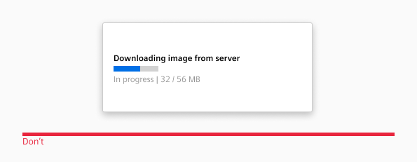
Avoid using a progress bar in the following cases:
- When it is meant to guide the user through an interactive process, e.g. a multi-step form (better use a stepper).
- When the process is too fast to be actually perceived (better use a message, a badge or a similar component to convey a successfully finished process).
Types
The following progress bar types are available:
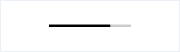
Horizontal progress bar
A progress bar displays progress in a linear horizontal direction or along a line to indicate that the application is progressing.
Determinate and indeterminate progress bars
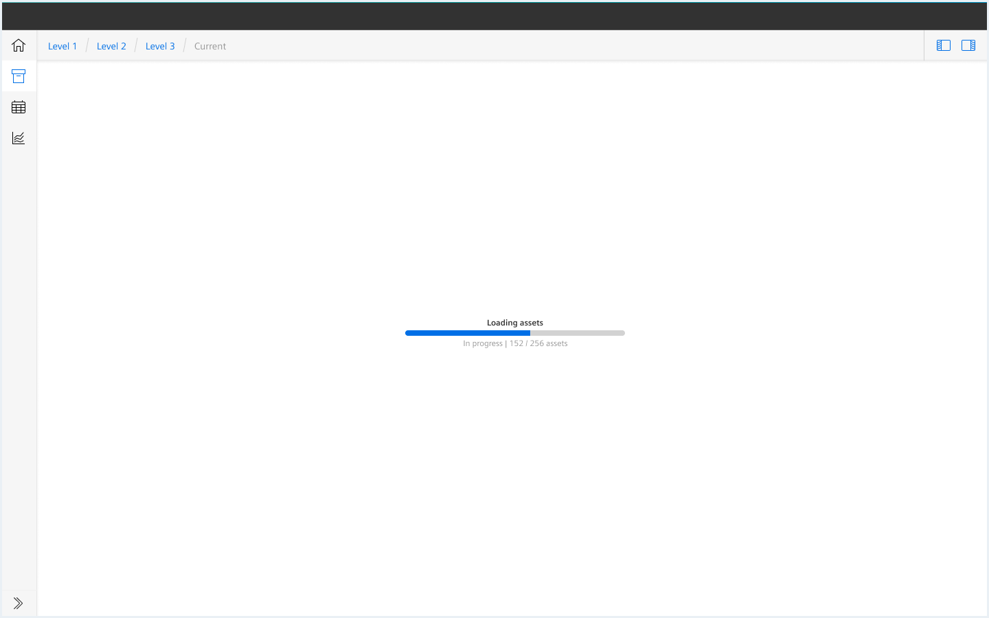
Use a determinate progress indicator when the information about the progress is clear. The progress can be tracked and translated into an indicator which fills the track or circle from 0% to 100% and never decreases in value or resets.
Use an indeterminate progress indicator when the information about the progress is unclear, the loading progress is unknown or the amount of waiting time can’t be calculated.

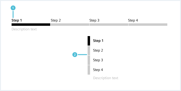
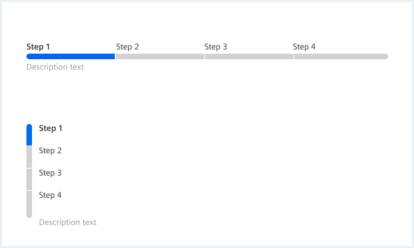
Segmented progress bar
A segmented progress indicator is a visual representation of a user’s progress through a series of steps leading to the completion of a particular process. It is best suited for clear and distinct stages or steps that the system is completing. In situations where the user needs to complete specific steps through explicit interaction, use the Stepper component instead.
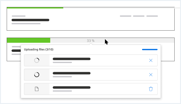
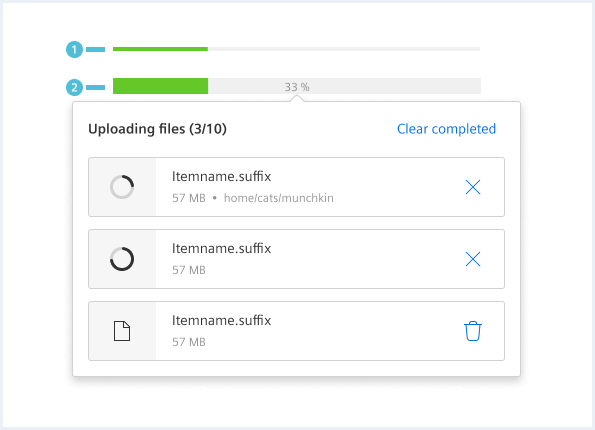
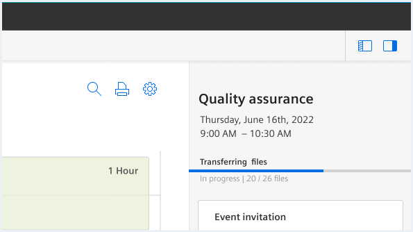
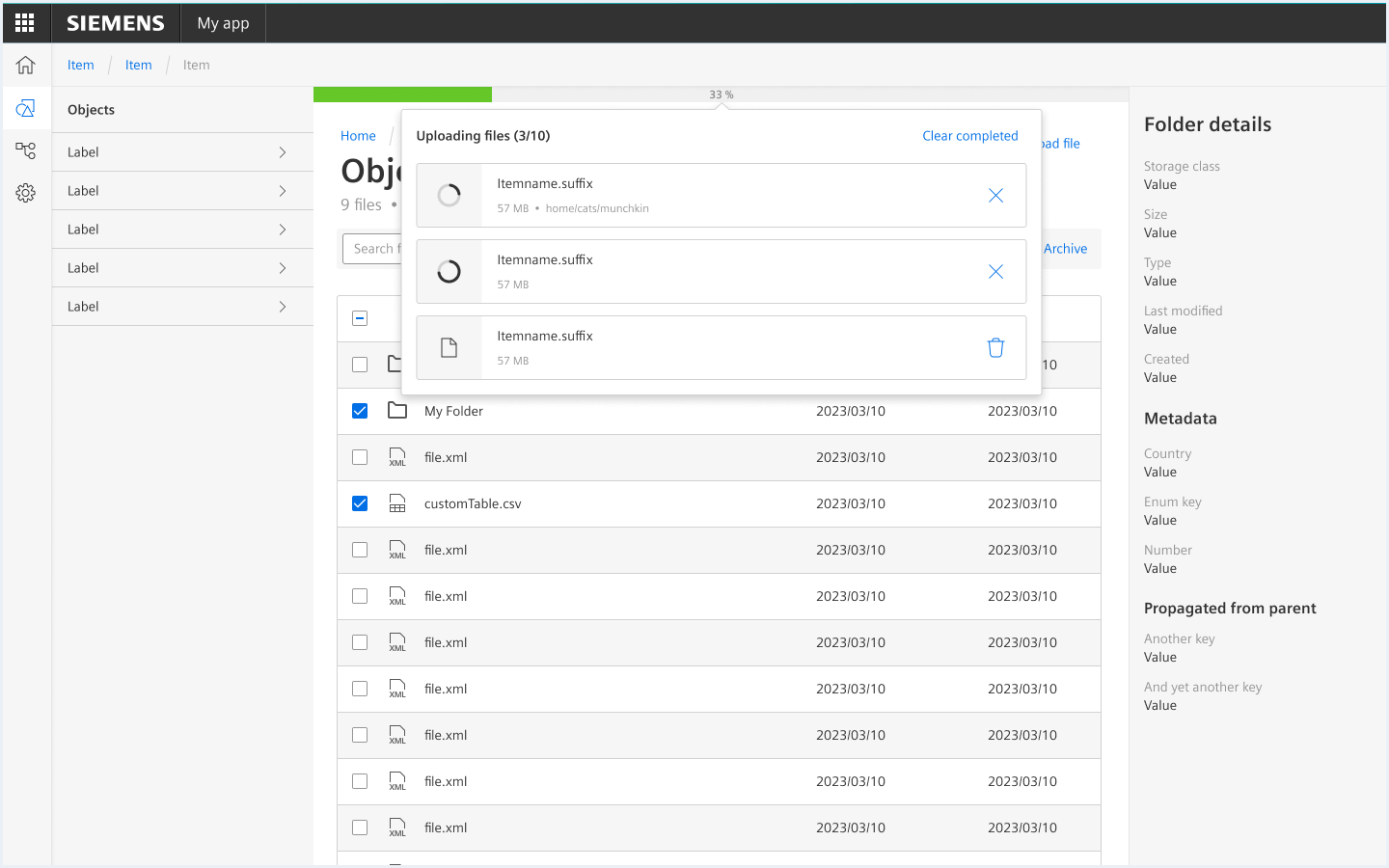
Global progress bar
A global progress bar is an element that stays at the top of the main region of the screen and is used to display the status of lengthy processes such as extensive file uploads. It is particularly useful when users needs to continue using other parts of the app without being blocked by the ongoing process. It should be used sparingly to avoid cluttering the interface, but can be a valuable addition to an app that involves long-running background processes.
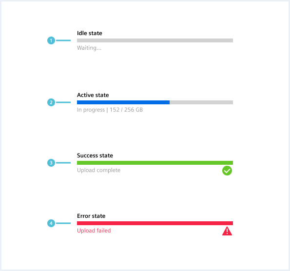
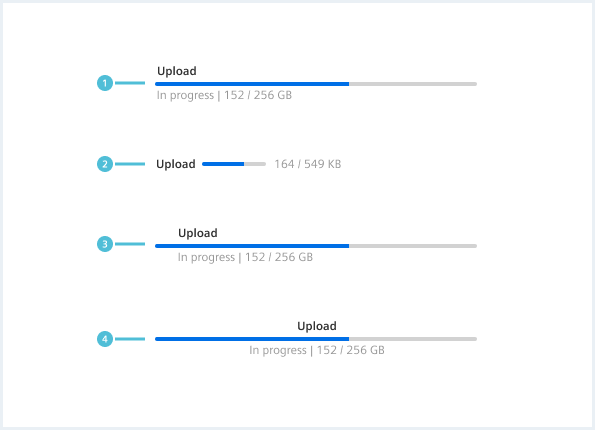
General construction
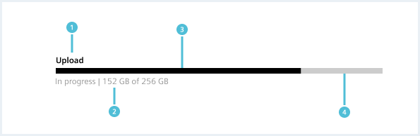
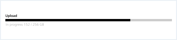
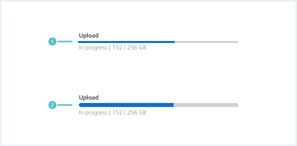
1. Label
- The label text describes the process the progress bar refers to.
2. Description (optional)
- The description displays additional information about the process.
3. Indicator
- The indicator shows how far the process has progressed.
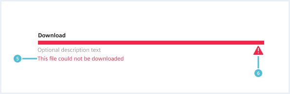
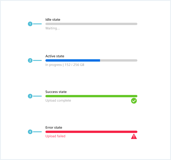
- In case of an error, the indicator turns into a full-width red bar.
- In case of success, the indicator turns into a full-width green bar.
4. Background track
- The background track is a static area that serves as a visual reference for the entire length and duration of the process.
5. Error message
- If an error occurs, an error message and/or error handling appears.
6. Status icon (optional)
- The status icon indicates the status of the progress bar after an error has occurred or after a task has successfully been completed.
Options
The following progress bar options are available:
Sizes
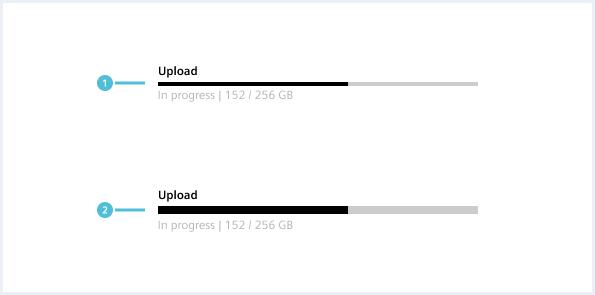
- Small: Used when space is limited like in data table cells or side panels.
- Large: Usually used when there is a lot of space on a page.
The width of a progress bar can vary based on its content. A progress bar should not be less than 64px wide.
Text alignment
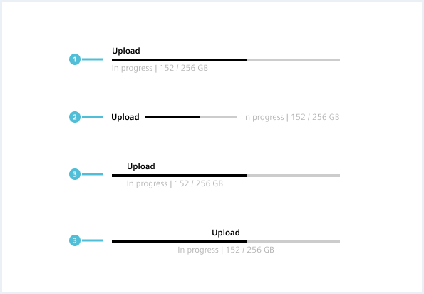
The text alignment depends on the context and the space available. The indent style should only be used inside containers or side panels where the progress bar extends to the container’s edges.
Behavior
There are four states for the progress bar: idle, active, success, and error. After successful or unsuccessful completion of the process, a progress bar can either remain for confirmation or validation, or be automatically hidden, depending on what is most suitable for the particular use case.
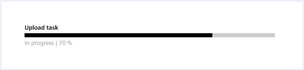
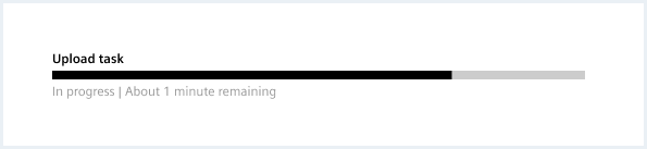
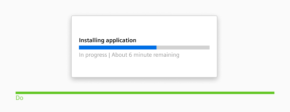
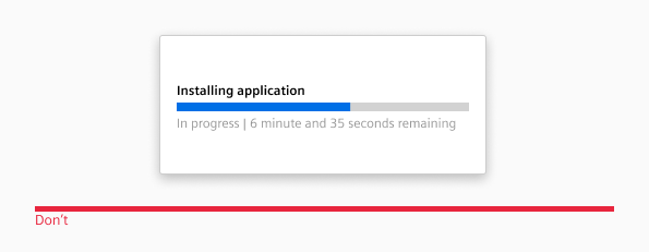
Percent or time-based labels
Dos & Don’ts
Style
This chapter shows different progress bar styles in the User Experience Toolkit
Overview


Text alignment
Examples
Progress bar
<div class="progressbar">
    <label class="progressbar__label" for="progress1">Upload</label>
    <progress class="progress" id="progress1" value="32" max="100"></progress>
    <div class="progressbar__status">
        <div class="progressbar__description">In progress | 152/256 GB</div>
    </div>
</div>

<div class="progressbar progressbar--bold">
    <label class="progressbar__label" for="progress2">Upload</label>
    <progress class="progress" id="progress2" value="32" max="100"></progress>
    <div class="progressbar__status">
        <div class="progressbar__description">In progress | 152/256 GB</div>
    </div>
</div>

<div class="progressbar progressbar__indeterminate">
    <label class="progressbar__label">Upload</label>
    <div class="progress">
        <div class="progress__value"></div>
    </div>
    <div class="progressbar__status">
        <div class="progressbar__description">In progress | 152/256 GB</div>
    </div>
</div>
Progress bar states
<div class="progressbar is-idle">
    <label class="progressbar__label" for="progress3">Upload</label>
    <progress class="progress" id="progress3" value="0" max="100"></progress>
    <div class="progressbar__status">
        <div class="progressbar__description">Waiting...</div>
    </div>
</div>

<div class="progressbar is-success">
    <label class="progressbar__label" for="progress4">Upload</label>
    <progress class="progress" id="progress4" value="100" max="100"></progress>
    <div class="progressbar__status">
        <div class="progressbar__description">Upload complete</div>
    </div>
</div>

<div class="progressbar is-error">
    <label class="progressbar__label" for="progress5">Upload</label>
    <progress class="progress" id="progress5" value="100" max="100"></progress>
    <div class="progressbar__status">
        <div class="progressbar__description">Upload failed</div>
    </div>
</div>
Segmented progress bar
<div class="progressbar">
    <div class="progressbar__segments">
        <div class="progressbar__segment is-finished">
            <div class="progressbar__label">Step1</div>
            <div class="progress"></div>
        </div>
        <div class="progressbar__segment  is-finished">
            <div class="progressbar__label">Step2</div>
            <div class="progress"></div>
        </div>
        <div class="progressbar__segment">
            <div class="progressbar__label">Step3</div>
            <div class="progress"></div>
        </div>
    </div>
    <div class="progressbar__status">
        <div class="progressbar__description">In progress | 152/256 GB</div>
    </div>
</div>

<div style="height: 300px;"><!-- Only for this showcase-->

    <div class="progressbar">
        <div class="progressbar__segments progressbar__segments--vertical">
            <div class="progressbar__segment is-finished">
                <div class="progressbar__label">Step1</div>
                <div class="progress"></div>
            </div>
            <div class="progressbar__segment  is-finished">
                <div class="progressbar__label">Step2</div>
                <div class="progress"></div>
            </div>
            <div class="progressbar__segment">
                <div class="progressbar__label">Step3</div>
                <div class="progress"></div>
            </div>
        </div>
        <div class="progressbar__status">
            <div class="progressbar__description">In progress | 152/256 GB</div>
        </div>
    </div>

</div><!-- Only for this showcase-->
Progress bar text alignment option
<div class="progressbar progressbar--center">
    <label class="progressbar__label" for="progress6">Upload</label>
    <progress class="progress" id="progress6" value="32" max="100"></progress>
    <div class="progressbar__status">
        <div class="progressbar__description">In progress | 152/256 GB</div>
    </div>
</div>

<div class="progressbar progressbar--indent">
    <label class="progressbar__label" for="progress7">Upload</label>
    <progress class="progress" id="progress7" value="32" max="100"></progress>
    <div class="progressbar__status">
        <div class="progressbar__description">In progress | 152/256 GB</div>
    </div>
</div>

<div class="progressbar progressbar--inline">
    <label class="progressbar__label" for="progress8">Upload</label>
    <progress class="progress" id="progress8" value="32" max="100"></progress>
    <div class="progressbar__status">
        <div class="progressbar__description">In progress | 152/256 GB</div>
    </div>
</div>
Progress bar top
<div class="progressbar progressbar__top">
    <label class="progressbar__label" for="progress1">32%</label>
    <progress class="progress" id="progressTop3" value="32" max="100"></progress>
    <div class="popover has-arrow is-bottom is-center-aligned is-shown">
        <div class="popover__container ">
            <div class="popover__content">
                <div class="popover__title">
                    Uploading files (3/10)
                    <a class="button button--ghost" href="#">Clear completed</a>
                </div>
                <div class="list dropzone__itemState">
                    <ul class="list__list">
                        <li class="list__item">
                            <div class="item__image">
                                <img src="assets/images/image.png" alt="image placeholder" />
                                <div class="busyIndicator">
                                    <div class="busyIndicator__ring busyIndicator__ring--small"></div>
                                </div>
                            </div>
                            <div class="item__content">
                                <div class="content__column content__column--primary">
                                    <h4 class="item__title">
                                        Itemname.suffix
                                    </h4>
                                    <div class="item__description">
                                        57 MB
                                    </div>
                                </div>
                                <div class="content__column has-alignment-right">
                                    <button class="button button--ghost has-icon-only"></button>
                                </div>
                            </div>
                        </li>
                        <li class="list__item itemState--upload">
                            <div class="item__icon">
                                <span class="iconUxt filetypeDefault" aria-hidden="true"></span>
                                <div class="busyIndicator">
                                    <div class="busyIndicator__ring busyIndicator__ring--small"></div>
                                </div>
                            </div>
                            <div class="item__content">
                                <div class="content__column content__column--primary">
                                    <h4 class="item__title">
                                        Itemname.suffix
                                    </h4>
                                    <div class="item__description">
                                        57 MB
                                    </div>
                                </div>
                                <div class="content__column has-alignment-right">
                                    <button class="button button--ghost has-icon-only"></button>
                                </div>
                            </div>
                        </li>
                        <li class="list__item itemState--error">
                            <div class="item__icon">
                                <span class="iconUxt image" aria-hidden="true"></span>
                                <div class="busyIndicator">
                                    <div class="busyIndicator__ring busyIndicator__ring--small"></div>
                                </div>
                            </div>
                            <div class="item__content">
                                <div class="content__column content__column--primary">
                                    <h4 class="item__title">
                                        Itemname.suffix
                                    </h4>
                                    <div class="item__description">
                                        57 MB
                                    </div>
                                </div>
                                <div class="content__column has-alignment-right">
                                    <button class="button button--ghost has-icon-only"></button>
                                </div>
                            </div>
                        </li>
                    </ul>
                </div>
            </div>
        </div>
    </div>
</div>
<div style="height: 200px;"></div>
Progress bar top with app example
<div class="appWrapper has-appBarAdvanced has-appBarAdvanced-collapsed">
<div class="appWrapper__regions has-appHeader has-contextRegion has-leadingRegion contextRegion-is-expanded appWrapper__regions--pushLayout">
<section class="appHeader">
<div class="appHeader__breadcrumb">
<div class="breadcrumb">
<div class="breadcrumb__item">
<a href="#">Level 1</a>
</div>
<div class="breadcrumb__item">
<a href="#">Level 2</a>
</div>
<div class="breadcrumb__item">
<a href="#">Level 3</a>
</div>
<div class="breadcrumb__item is-current">
<a href="#">Current</a>
</div>
</div>
</div>
<div class="appHeader__content">
Optional content
</div>
<div class="appHeader__viewToggler">
<button class="button button--ghost has-icon-only button--leading" id="toggleLeadingRegionDemo">
<span aria-hidden="true" class="iconUxt"></span>
</button>
<button class="button button--ghost has-icon-only button--context" id="toggleContextRegionDemo">
<span aria-hidden="true" class="iconUxt is-flipped-horizontal"></span>
</button>
</div>
</section>
<section class="leadingRegion">
</section>
<section class="mainRegion">
<div class="progressbar progressbar__top">
<label class="progressbar__label" for="progress1">32%</label>
<progress class="progress" id="progressTop1" value="32" max="100"></progress>
<div class="popover has-arrow is-bottom is-center-aligned is-shown">
<div class="popover__container ">
<div class="popover__content">
<div class="popover__title">
Uploading files (3/10)
<a class="button button--ghost" href="#">Clear completed</a>
</div>
<div class="list dropzone__itemState">
<ul class="list__list">
<li class="list__item">
<div class="item__image">
<img src="assets/images/image.png" alt="image placeholder" />
<div class="busyIndicator">
<div class="busyIndicator__ring busyIndicator__ring--small"></div>
</div>
</div>
<div class="item__content">
<div class="content__column content__column--primary">
<h4 class="item__title">
Itemname.suffix
</h4>
<div class="item__description">
57 MB
</div>
</div>
<div class="content__column has-alignment-right">
<button class="button button--ghost has-icon-only"></button>
</div>
</div>
</li>
<li class="list__item itemState--upload">
<div class="item__icon">
<span class="iconUxt filetypeDefault" aria-hidden="true"></span>
<div class="busyIndicator">
<div class="busyIndicator__ring busyIndicator__ring--small"></div>
</div>
</div>
<div class="item__content">
<div class="content__column content__column--primary">
<h4 class="item__title">
Itemname.suffix
</h4>
<div class="item__description">
57 MB
</div>
</div>
<div class="content__column has-alignment-right">
<button class="button button--ghost has-icon-only"></button>
</div>
</div>
</li>
<li class="list__item itemState--error">
<div class="item__icon">
<span class="iconUxt image" aria-hidden="true"></span>
<div class="busyIndicator">
<div class="busyIndicator__ring busyIndicator__ring--small"></div>
</div>
</div>
<div class="item__content">
<div class="content__column content__column--primary">
<h4 class="item__title">
Itemname.suffix
</h4>
<div class="item__description">
57 MB
</div>
</div>
<div class="content__column has-alignment-right">
<button class="button button--ghost has-icon-only"></button>
</div>
</div>
</li>
</ul>
</div>
</div>
</div>
</div>
</div>
<div class="contentHeader">
<div class="contentHeader__header">
<h1 class="header__headline">Page Title</h1>
<div class="header__subline">Optional subline</div>
</div>
<div class="contentHeader__actions">
<button class="button button--secondaryContentAction">
<span class="iconUxt addCircle" aria-hidden="true"></span>
Add Button
</button>
<a class="button button--secondaryContentAction" href="#">
<span class="iconUxt edit" aria-hidden="true"></span>
Edit Link
</a>
<a class="button button--secondaryContentAction" href="#">
<span class="iconUxt delete" aria-hidden="true"></span>
Delete Link
</a>
</div>
</div>
</section>
<section class="contextRegion">
<button class="button button--secondary" id="toggleSlidingBehaviour">
Toggle sliding behaviour for demo
</button>
</section>
</div>
<nav class="appBarAdvanced">
<div class="appBarAdvanced__inner">
<div class="appBarAdvanced__header">
<!-- optional header -->
</div>
<ul class="appBarAdvanced__content">
<li class="level1 is-home">
<a href="#" class="item__link">
<div class="item__icon">
<i aria-hidden="true" class="iconUxt home"></i>
</div>
<span class="item__title">Home</span>
</a>
</li>
<li class="level1 is-active">
<a href="#" class="item__link">
<div class="item__icon has-notification">
<i aria-hidden="true" class="iconUxt chartPie"></i>
</div>
<span class="item__title">Issues</span>
<span class="badge">31</span>
</a>
<ul class="level2">
<li class="subitem">
<a href="#">Details</a>
</li>
<li class="subitem">
<a href="#">Activity</a>
</li>
</ul>
</li>
<li class="level1">
<a href="#" class="item__link">
<div class="item__icon">
<i aria-hidden="true" class="iconUxt shoppingCart"></i>
</div>
<span class="item__title">Activity</span>
</a>
<ul class="level2">
<li class="subitem">
<a href="#">Details</a>
</li>
<li class="subitem">
<a href="#">Activity</a>
</li>
</ul>
</li>
<li class="level1">
<a href="#" class="item__link">
<div class="item__icon">
<i aria-hidden="true" class="iconUxt hierarchy"></i>
</div>
<span class="item__title">Members</span>
</a>
<ul class="level2">
<li class="subitem">
<a href="#">Details</a>
</li>
<li class="subitem">
<a href="#">Activity</a>
</li>
</ul>
</li>
<li class="level1 has-separator">
<a href="#" class="item__link">
<div class="item__icon has-notification">
<i aria-hidden="true" class="iconUxt subtenant4"></i>
</div>
<span class="item__title">Settings</span>
<span class="badge">12</span>
</a>
<ul class="level2">
<li class="subitem">
<a href="#">Details</a>
</li>
<li class="subitem">
<a href="#">Activity</a>
</li>
</ul>
</li>
<li class="level1">
<a href="#" class="item__link">
<div class="item__icon has-notification">
<i aria-hidden="true" class="iconUxt chartTrend"></i>
</div>
<span class="item__title"> Tools </span>
<span class="badge">4</span>
</a>
<ul class="level2">
<li class="subitem">
<a href="#"> Details </a>
</li>
<li class="subitem">
<a href="#"> Activity </a>
</li>
</ul>
</li>
</ul>
<div class="appBarAdvanced__footer">
<a href="#" id="appBar--expander">
<!-- optional expand / collapse label -->
<span class="item__title">Collapse</span>
</a>
</div>
</div>
</nav>
</div>
<script type="text/javascript" src="https://static.eu1.mindsphere.io/osbar/v4/js/main.min.js"></script>
<script>
window.onload = function (e) {
// polyfill for closest() - IE11 does not support that out of the box
if (!Element.prototype.matches) {
Element.prototype.matches = Element.prototype.msMatchesSelector ||
Element.prototype.webkitMatchesSelector;
}
if (!Element.prototype.closest) {
Element.prototype.closest = function (s) {
var el = this;
do {
if (Element.prototype.matches.call(el, s)) return el;
el = el.parentElement || el.parentNode;
} while (el !== null && el.nodeType === 1);
return null;
};
}
// toggle expand / collapse feature of sidebar
var toggle = document.querySelector("#appBar--expander");
var appWrapper = document.querySelector(".appWrapper");
toggle.addEventListener("click", function () {
// appBar.classList.toggle("has-appBarAdvanced-collapsed");
appWrapper.classList.toggle("has-appBarAdvanced-collapsed");
var elems = document.querySelectorAll(".appBarAdvanced .level1");
for (var i = 0; i < elems.length; i++) {
elems[i].classList.remove("is-shown");
}
});
// set active state of item on click
var level1links = document.querySelectorAll(".appBarAdvanced .item__link");
for (var i = 0; i < level1links.length; i++) {
level1links[i].addEventListener("click", function (event) {
for (var j = 0; j < level1links.length; j++) {
level1links[j].parentElement.classList.remove("is-active");
}
event.target.closest(".level1").classList.add("is-active");
event.target.blur();
event.target.parentNode.parentNode.blur(); // needed for collapsed mode
event.preventDefault();
});
}
// add class to show app bar submenu on hover
var timerHover;
var collapsedAppBarElements = document.querySelectorAll(
".has-appBarAdvanced-collapsed .appBarAdvanced .level1"
);
var collapsedAppBarLinks = document.querySelectorAll(
".has-appBarAdvanced-collapsed .appBarAdvanced .level1 a"
);
for (var i = 0; i < collapsedAppBarLinks.length; i++) {
collapsedAppBarLinks[i].addEventListener("mouseenter", function (event) {
clearTimeout(timerHover);
for (var j = 0; j < collapsedAppBarElements.length; j++) {
collapsedAppBarElements[j].classList.remove("is-shown");
}
event.target.closest(".level1").classList.add("is-shown");
});
}
// hide all possible open app bar items on mouse-leave, but wait for a split second
// to avoid unintentional mouseleave events
var appBar = document.querySelector(".appBarAdvanced");
appBar.addEventListener("mouseleave", function () {
timerHover = setTimeout(function () {
for (var j = 0; j < collapsedAppBarElements.length; j++) {
collapsedAppBarElements[j].classList.remove("is-shown");
}
}, 100);
});
var regionsWrapper = document.querySelector(".appWrapper__regions");
// functionality to hide context and/or leadimg region through button
var toggleLeading = document.querySelector("#toggleLeadingRegionDemo");
toggleLeading.addEventListener('click', function () {
regionsWrapper.classList.toggle('leadingRegion-is-expanded');
});
var toggleContext = document.querySelector("#toggleContextRegionDemo");
toggleContext.addEventListener('click', function () {
regionsWrapper.classList.toggle('contextRegion-is-expanded');
});
// functionality to toggle sliding behaviour for leading and context region
var switchLayoutType = document.querySelector("#toggleSlidingBehaviour");
switchLayoutType.addEventListener('click', function () {
regionsWrapper.classList.toggle('appWrapper__regions--pushLayout');
});
}
</script>
Progress bar top on a card

Itemname.suffix
57 MBItemname.suffix
57 MBItemname.suffix
57 MB
Card title, not clickable
A short subline.
of cards Lorem ipsum dolor content of cards.
<div class="card">
    <div class="progressbar progressbar__top">
        <label class="progressbar__label" for="progress1">32%</label>
        <progress class="progress" id="progressTop4" value="32" max="100"></progress>
        <div class="popover has-arrow is-bottom is-center-aligned is-shown">
            <div class="popover__container ">
                <div class="popover__content">
                    <div class="popover__title">
                        Uploading files (3/10)
                        <a class="button button--ghost" href="#">Clear completed</a>
                    </div>
                    <div class="list dropzone__itemState">
                        <ul class="list__list">
                            <li class="list__item">
                                <div class="item__image">
                                    <img src="assets/images/image.png" alt="image placeholder" />
                                    <div class="busyIndicator">
                                        <div class="busyIndicator__ring busyIndicator__ring--small"></div>
                                    </div>
                                </div>
                                <div class="item__content">
                                    <div class="content__column content__column--primary">
                                        <h4 class="item__title">
                                            Itemname.suffix
                                        </h4>
                                        <div class="item__description">
                                            57 MB
                                        </div>
                                    </div>
                                    <div class="content__column has-alignment-right">
                                        <button class="button button--ghost has-icon-only"></button>
                                    </div>
                                </div>
                            </li>
                            <li class="list__item itemState--upload">
                                <div class="item__icon">
                                    <span class="iconUxt filetypeDefault" aria-hidden="true"></span>
                                    <div class="busyIndicator">
                                        <div class="busyIndicator__ring busyIndicator__ring--small"></div>
                                    </div>
                                </div>
                                <div class="item__content">
                                    <div class="content__column content__column--primary">
                                        <h4 class="item__title">
                                            Itemname.suffix
                                        </h4>
                                        <div class="item__description">
                                            57 MB
                                        </div>
                                    </div>
                                    <div class="content__column has-alignment-right">
                                        <button class="button button--ghost has-icon-only"></button>
                                    </div>
                                </div>
                            </li>
                            <li class="list__item itemState--error">
                                <div class="item__icon">
                                    <span class="iconUxt image" aria-hidden="true"></span>
                                    <div class="busyIndicator">
                                        <div class="busyIndicator__ring busyIndicator__ring--small"></div>
                                    </div>
                                </div>
                                <div class="item__content">
                                    <div class="content__column content__column--primary">
                                        <h4 class="item__title">
                                            Itemname.suffix
                                        </h4>
                                        <div class="item__description">
                                            57 MB
                                        </div>
                                    </div>
                                    <div class="content__column has-alignment-right">
                                        <button class="button button--ghost has-icon-only"></button>
                                    </div>
                                </div>
                            </li>
                        </ul>
                    </div>
                </div>
            </div>
        </div>
    </div>
    <div class="card__header">
        <h3 class="card__title">
            Card title, not clickable
        </h3>
        <p class="card__subline">
            A short subline.
        </p>
    </div>
    <div class="card__content">
        <p>of cards Lorem ipsum dolor content of cards.</p>
    </div>
</div>
Usage
| Element | Class | Description |
|---|---|---|
.progressbar | .progressbar--bold | Changes the progress bar to a bold variant. |
.progressbar | .progressbar__indeterminate | Enables the indeterminate progress bar. |
.progressbar | .is-idle, .is-success, .is-error | Changes the state of the progress bar. |
.progressbar__segments | .progressbar__segments--vertical | Switch to the vertical variant. |
.progressbar__segment | .is-finished | Finish the whole segment. |
.progressbar | .progressbar--center, .progressbar--indent, .progressbar--inline | Applies different text alignments. |
.progressbar | .progressbar__top | A progress bar that is placed on top of a container, with a popover that appears on hover. |
.progressbar__top | .is-expanded | Popover is displayed permanently. |