Context & status
Communicate state of an application, component or object through status.
Importance of status
It is important to convey the state of an application, component or asset to the user in a consistent and clear manner.
General construction
A status describes the condition of an item at a particular time. Common status are for example warnings, errors or form validation.
Status indicators highlight page elements and communicate severity. They are an important visual tool to help users identify the condition of events, assets or processes and decide on their course of action. Status indicators use different elements (colors, symbols, shapes and labels) and combine them to help users identify the states they represent.
1. Color
Use signal colors only where important information takes place.
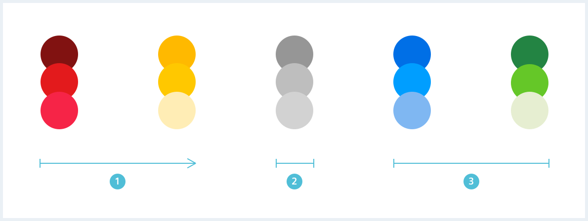
Color evaluation
The used range can vary depending on the use case, therefore the highest value / escalation level is always assigned to red.
Color assignment example
| Color mapping |  |  |  |  |  |  |
|---|---|---|---|---|---|---|
| Priority | highest | high | medium | low | ||
| Severity | catastrophic | critical | moderate | marginal | ||
| Frequency | frequent / common | probable | occasionally | rarely / improbable | ||
| Time | currenty | will be / predicted | elapsed | |||
| Feedback | required | recommended | neglectable | desired | positively reinforcing |
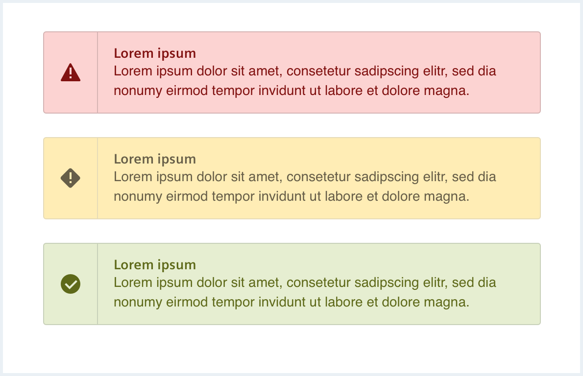
Color usage example
See also: Message and notification
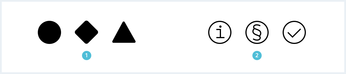
2. Shape
States can additionally be represented by easily distinguishable shapes. The different states shall be distinguishable, the more reasonable it is to mark them with very different forms. This makes recognition easier, especially for visually impaired users.
Circular shapes are general and flexible to use, square / diamond shapes indicate a warning, whereas triangular shapes are used to indicate danger and a critical state.
| Importance | Shape | |
|---|---|---|
| mayor ↔ minor | = | different ↔ alike |
Shape examples

3. Symbol
Status is indicated by commonly used symbols which should make them recognizeable through different use cases and apps.
| Symbols | Description | Use for | Priority |
|---|---|---|---|
 | The exclamation mark emphasizes something as important, that demands immediate attention. | Warning, danger, alert, order (“must do”) | high |
 | The x represents a negation. It is most often seen in the context of misuse (wrong use or input) and the concept of “don’t” (cancel, close) | Wrong, Error, Failure, No (don’t do), Unavailability, Cancel, Close | medium |
 | The checkmark represents a positive confirmation. It is most often seen in the context of correct use (right use or input) and the concept of “acceptance” | Correct, Success, Yes (do), Availability, Confirm, Create, Accept | medium-low |
 | The info-i indicates available information. It does not carry any other meaning or concept. | Information | low |
There are three different icon styles: Regular, bold and filled. The filled icon style should be used as the default for status because it attracts maximum attention.

See also: System icons
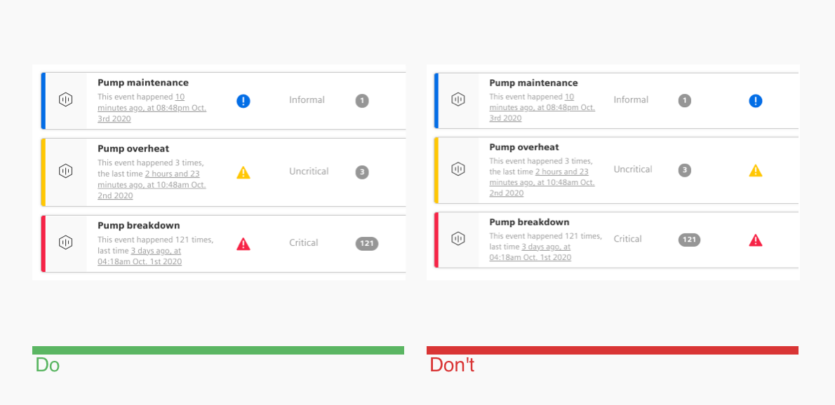
4. Position & reference
The positioning of information in the visible area should also be deliberately structured, based on the reading direction of the target audience. In Europe (and English-speaking countries) this means from left to right and from top to bottom.
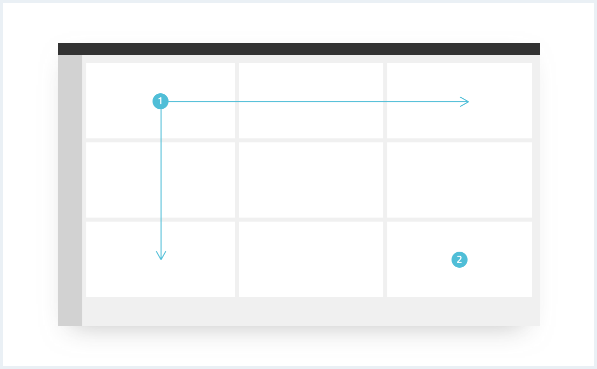
The position context in content hierarchy and proximity of status and item are the main factors to understand the relationship between them.
- Place the status at the top (e.g. close to the title) if the status applies to a complete page or component.
- Place the status at the left-hand side if the status applies to a single line of content (e.g. table row).
- If a status applies to a specific element, place it in direct proximity.
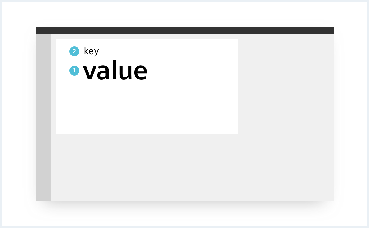
5. Size
Important information should be given more space. The order in which content is consumed can be controlled by changing its size.
Size examples
See also: Empty state
6. Label, semantic & consistency
The terms and labels chosen for states should be used consistently. Labels are textual descriptions of the respective status. They should be used whenever there is enough space available or when additional clarification is necessary.
- Always use the same icon, color and text in combination.
- Avoid using different terms for already assigned icon/text combinations.
- Avoid combining low priority symbols with high priority shapes (or vice versa).
- Choose colors with matching priority level.
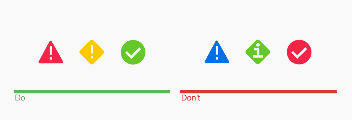
Combine appropriate colors with matching shape and avoid combining low priority symbols with high priority shapes.
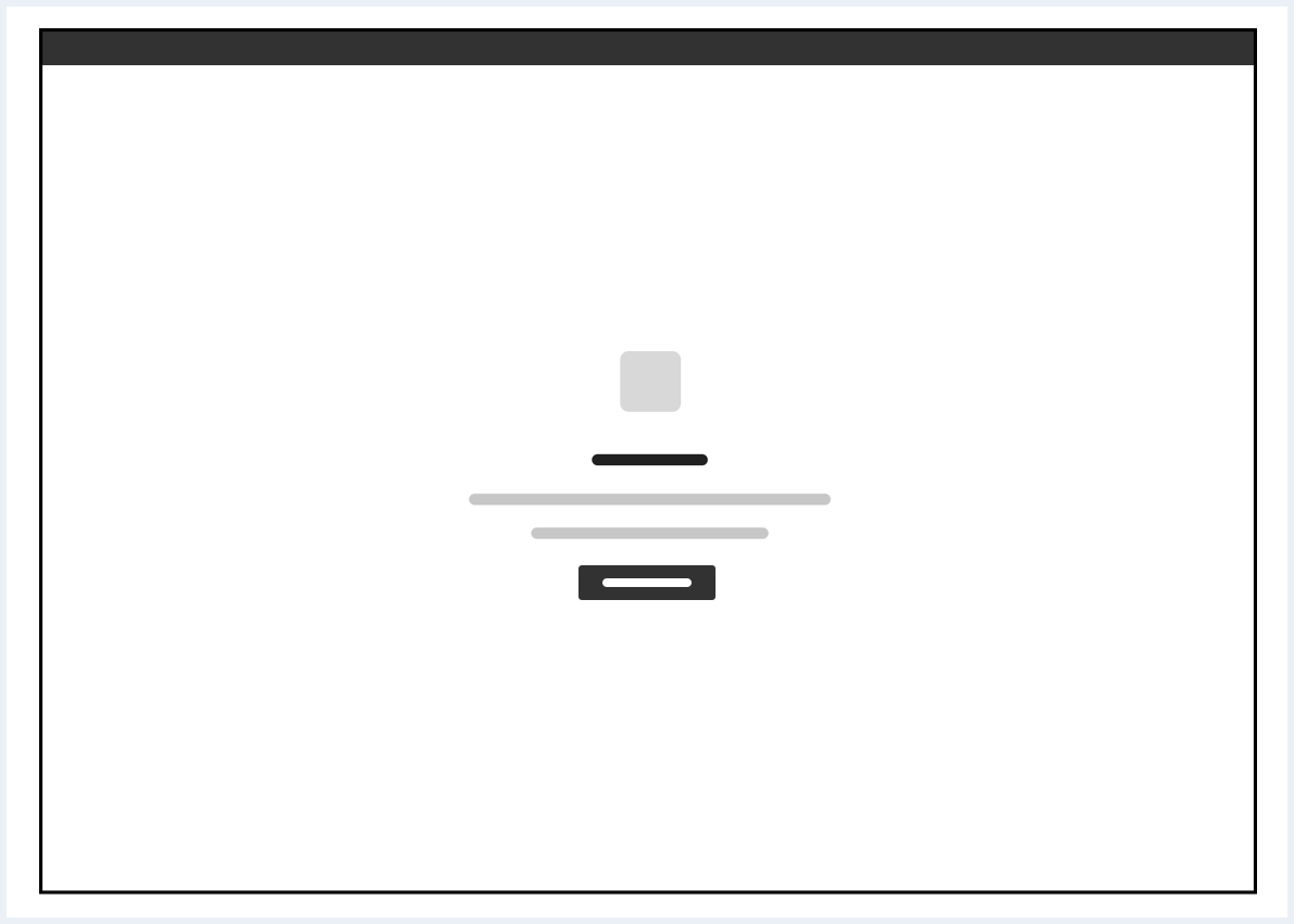
7. Animation
Animations are time-bound changes of graphic variables. Movement is perceived preferentially because the recognition of movements is particularly well-developed.
Animation is well suited to generate attention, to visualise current processes, to make objects/groupings recognisable and to support areal perception.
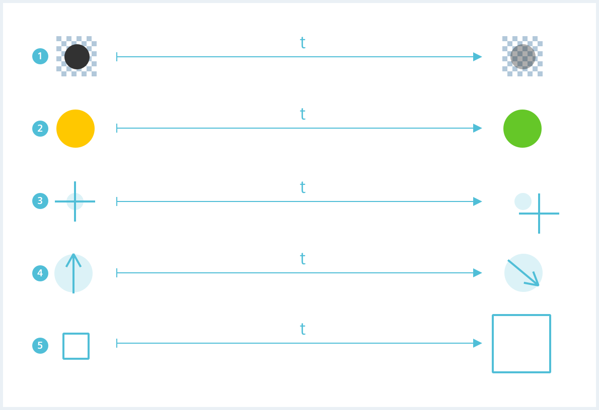
Example animation: rotation

See also: Busy indicator
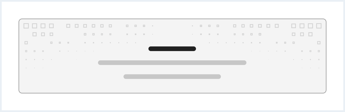
Example animation: visibility
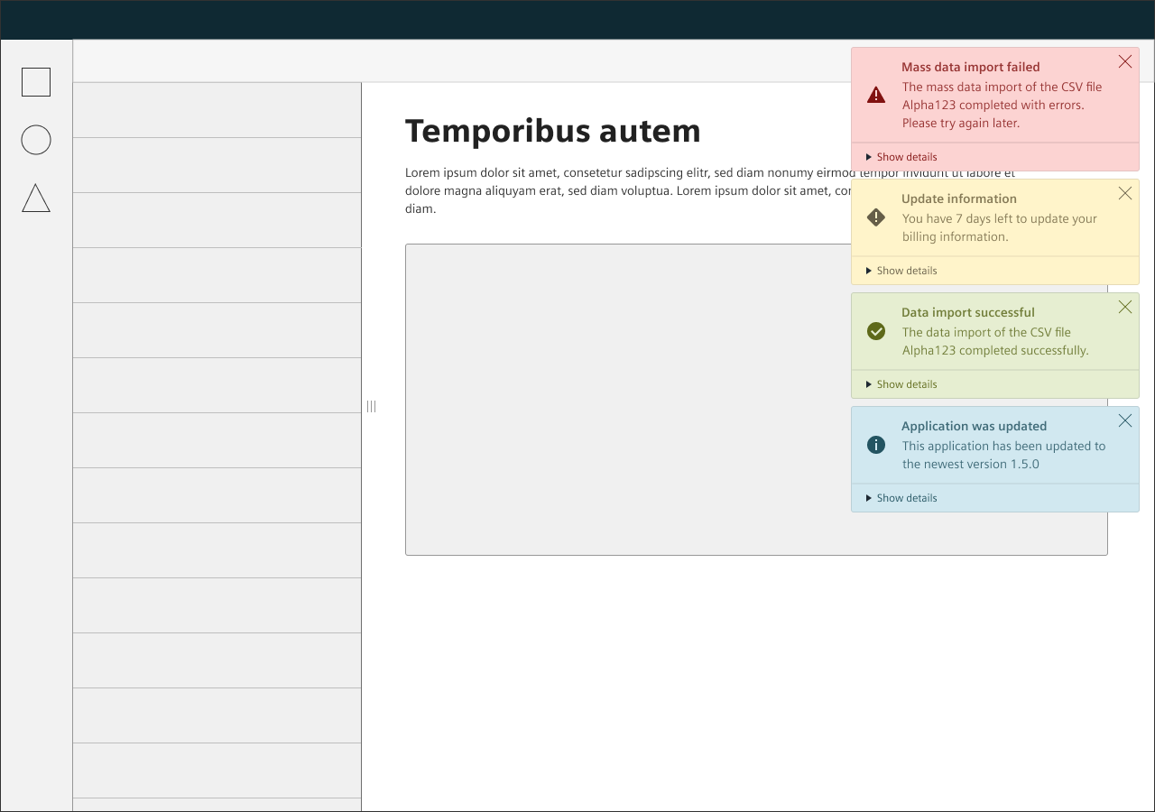
System notifications for example appear ‘above’ the existing user interface, catching the users attention by animating their visibility and being displayed above all other elements.
See also: Notification
8. Indicator type
The different available elements are combined into visual indicators, that have unique uses for different contexts. Choose from available indicators whenever possible.
Icon indicator
Used as main application of status. Use anywhere you want to draw full attention to a status, even with limited space.

Badge indicator (with numbers)
Choose when the number of status occurrences is of particular interest; it is often used in conjunction with icons or content groups, to indicate number of contained status.

Badge indicator (dot)
Choose for a compact indication where numbers or labels are not necessarily needed; it is frequently used in conjunction with icons to indicate new or not yet visited content.

Badge indicator (label)
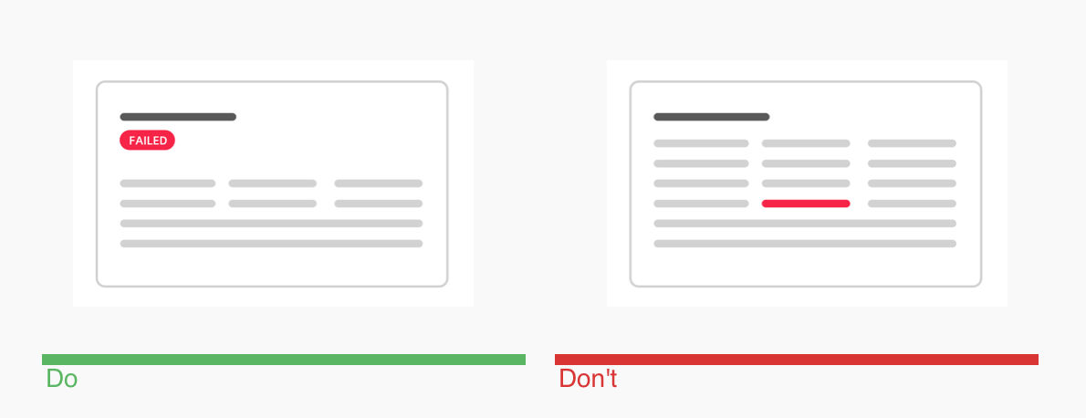
Used as label within content, depending on placement/proximity (e.g. placement next to the title of a content indicates the entire content as “failed”).

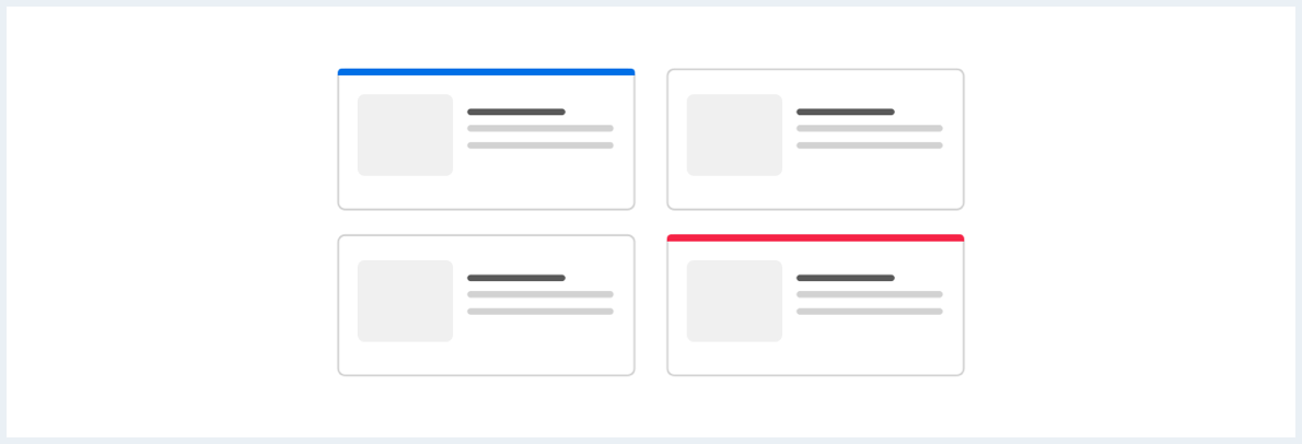
Highlight indicator
Choose when users need to scan lists or find specific sections within long (scrollable) content.
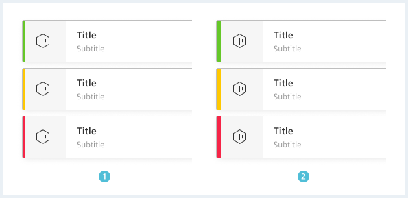
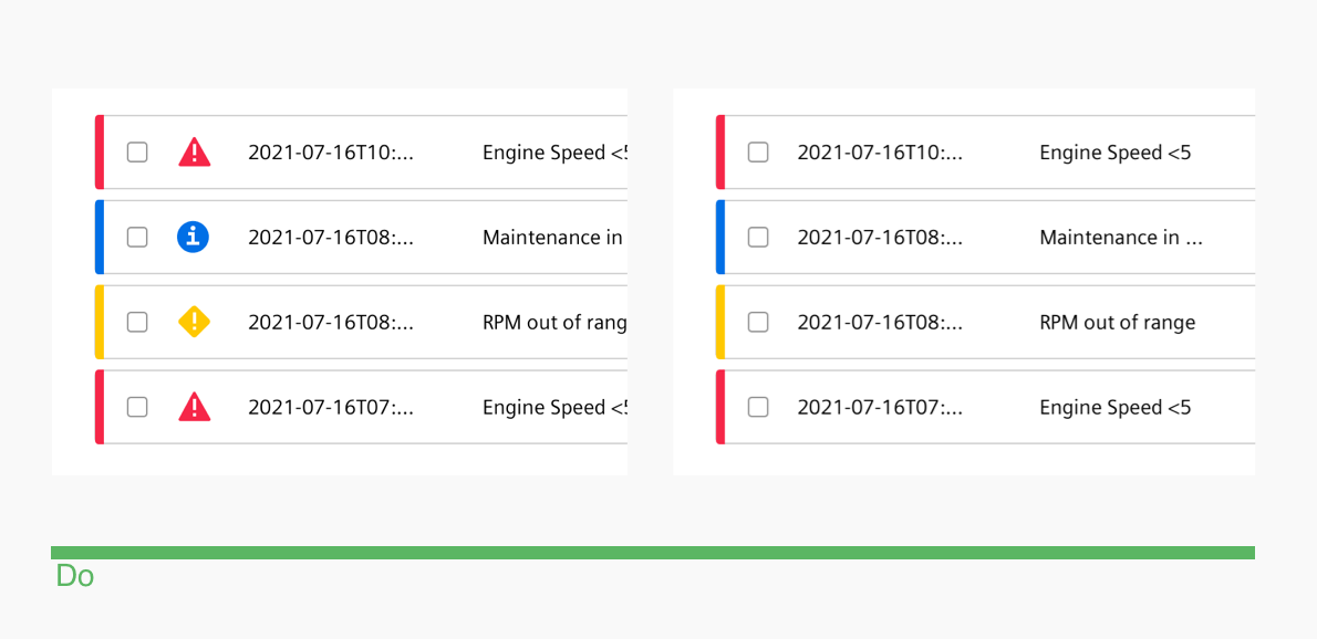
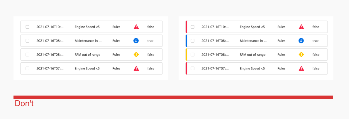
Direction
The vertical indicator is intended for highlighting of table rows, expandable groups and sections within content. The horizontal indicator is intended for card grids or similar layouts. Never combine vertical and horizontal indicators!
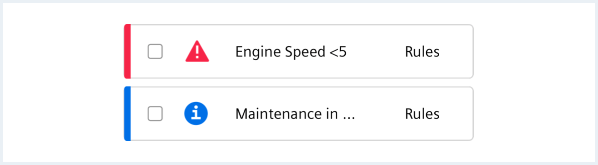
Depending on the relevance the indicator can be thinner or thicker.