Dialog
A dialog is a window that passes on information to a user and prompts him for a response.
Usage
When to use
Use a dialog in the following cases:
- When you need to draw attention to an important piece of information.
- When you need the user to input information, especially if that information is necessary to continue.
- When you want to show additional information without losing the context of the parent page, for example showing larger images or videos.
- When you want to show information that is not directly related to the parent page, for example “What’s new” dialog.
Types
There are the following dialog types:
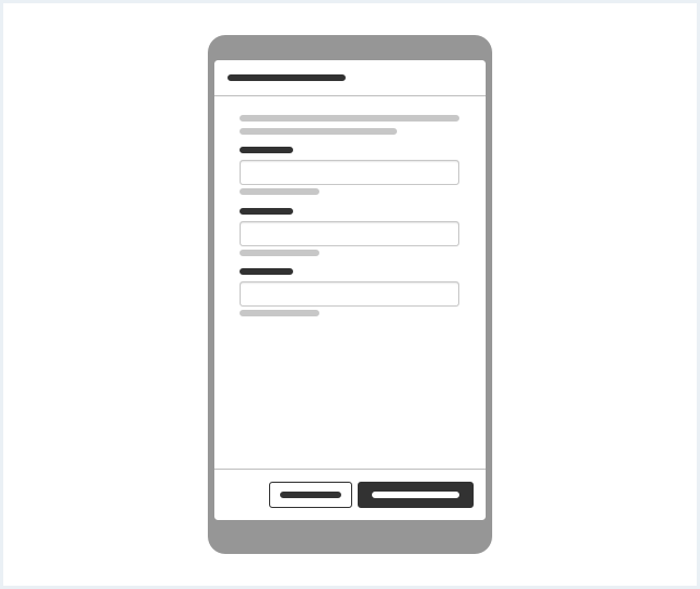
Dialog with forced interaction
Use this type when an interaction is needed from the user to continue.
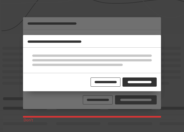
Confirm dialog
Use this type to reduce the risk that people automatically agree to a warning without realizing the consequences. For more information see chapter Confirm dialog.
Dialog with a detail view
Use this type to display detail information about an object.
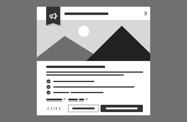
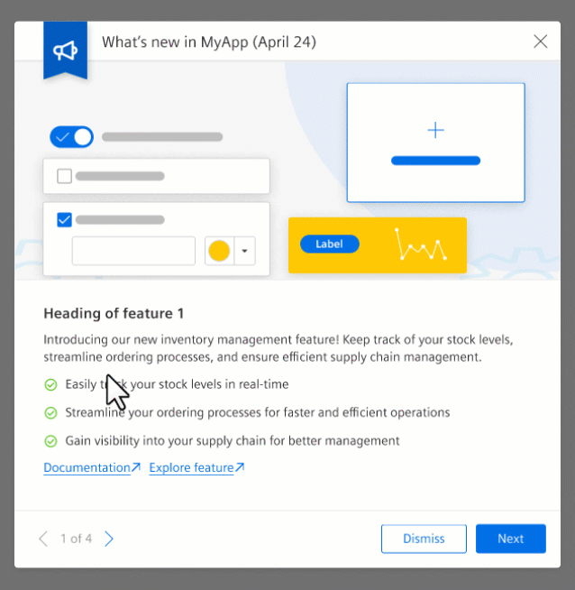
What’s new dialog
Use this type when you want to highlight a new feature to a user upon login.
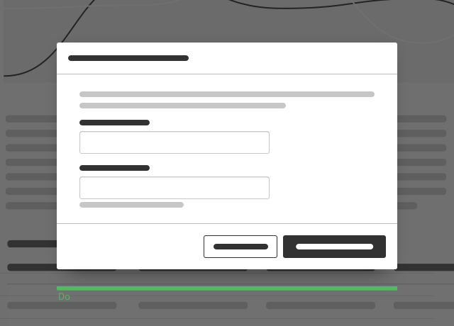
General construction
A dialog consists of the following elements:
Type: Dialog with forced interaction
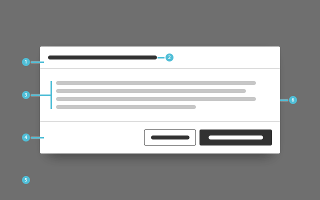
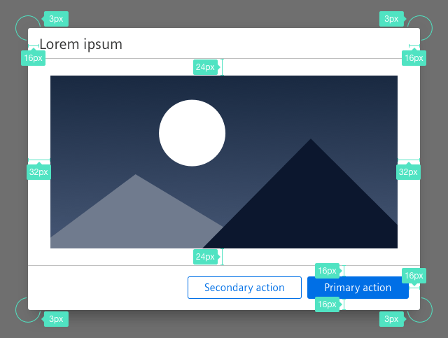
1. Header bar
- The header bar contains the title.
2. Descriptive title
- The button label which launches the dialog window should generally match with the dialog title or at least be recognizably related to it.
3. Content
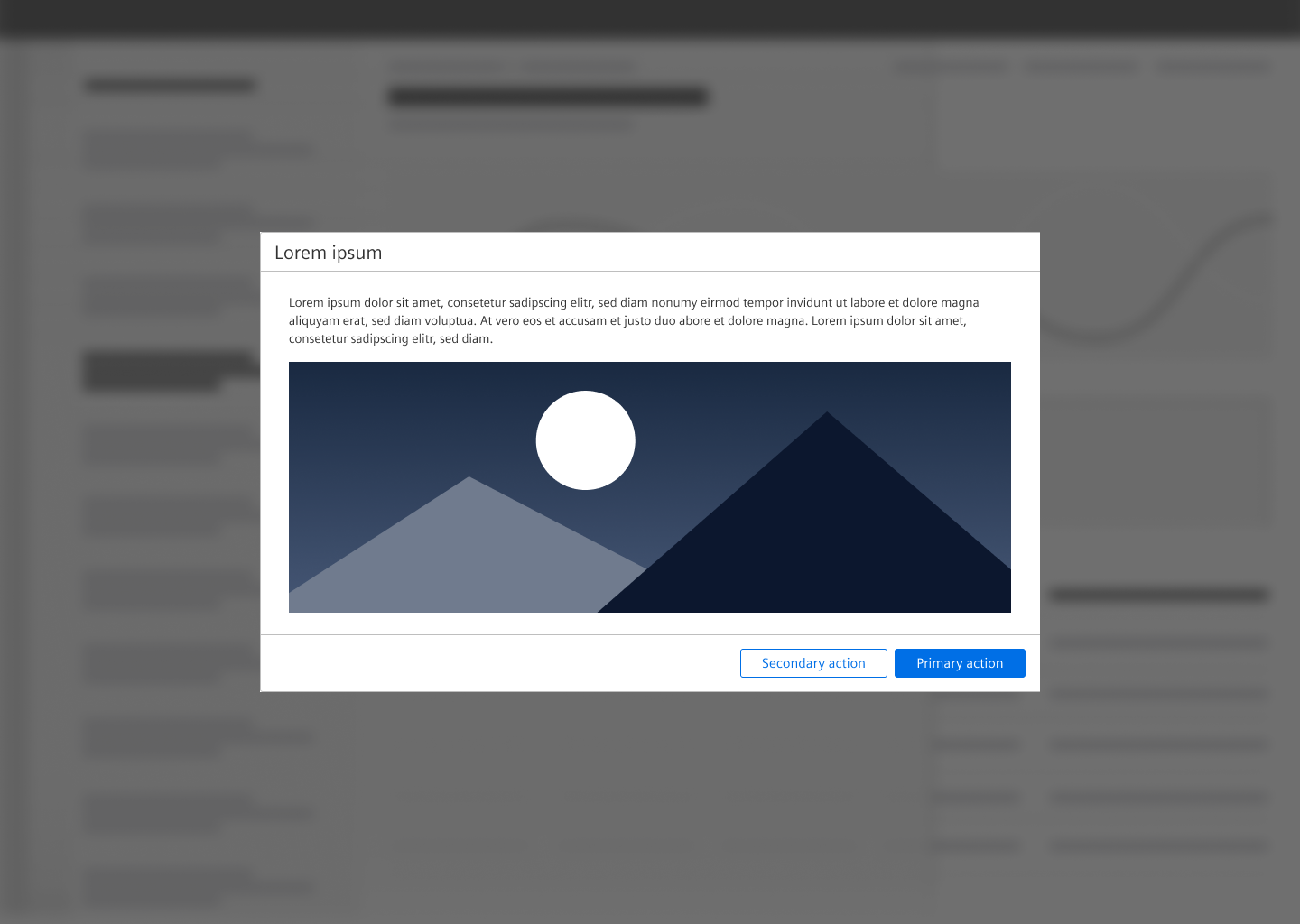
- Content of a dialog with forced interaction can be for example a form, an image or text.
4. Footer bar with buttons
- A footer bar helps to separate the content area from the submit and cancel buttons.
- The button labels inform the user about the action that is triggered by clicking the button.
5. Overlay
- The screen dimming overlay is always located above all other content.
- It lets the user know that the page is currently not active.
6. Background
- The dialog has a drop shadow.
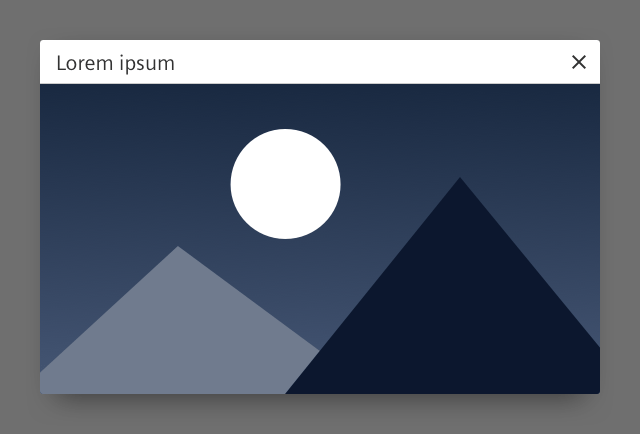
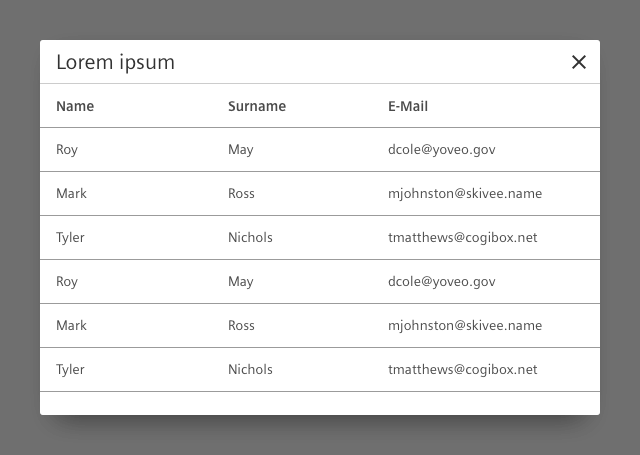
Type: Dialog with a detail view
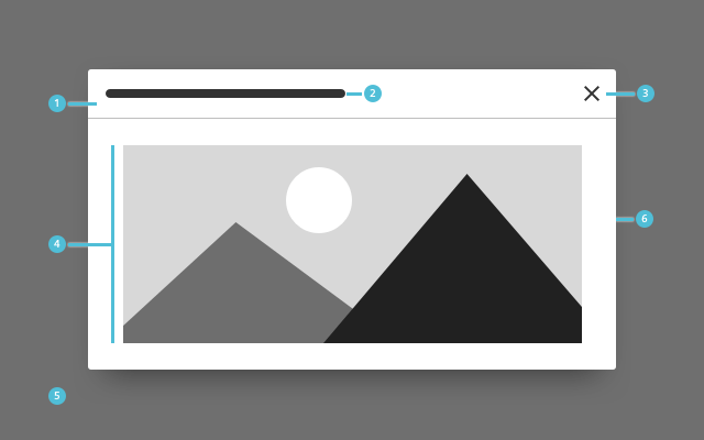
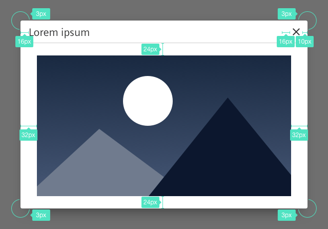
1. Header bar
- The header bar contains the title and the close button.
2. Descriptive title
- The button label which launches the dialog window should generally match with the dialog title or at least be recognizably related to it.
3. Close button
- This button closes the dialog.
4. Content
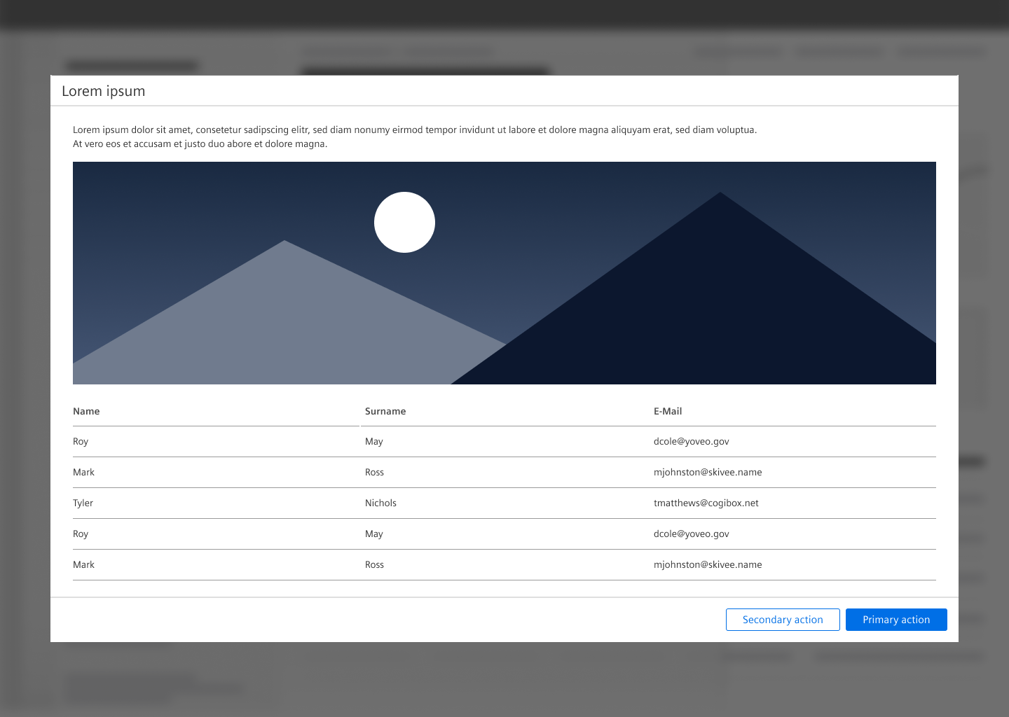
- Content of a dialog with a detail view can be for example an image, a table, text.
5. Overlay
- The screen dimming overlay is always located above all other content.
- It lets the user know that the page is currently not active.
6. Background
- The dialog has a drop shadow.
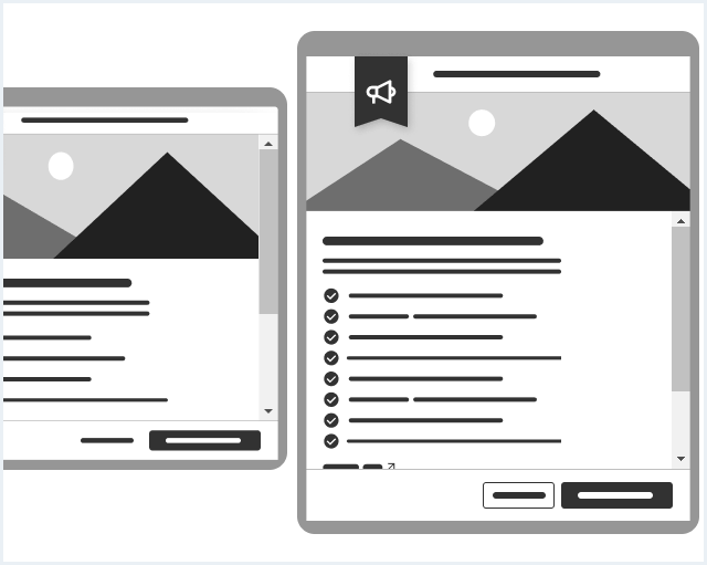
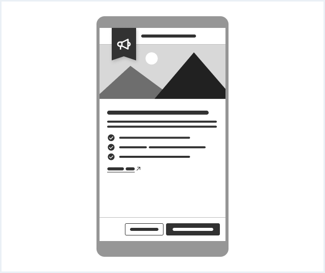
Type: What’s new dialog
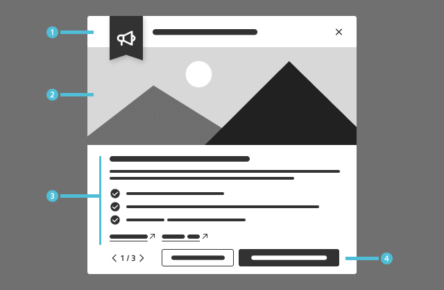
1. Title
- The title states the app and optionally the version
2. Feature visual
- Include a visual representation that represents the featured update or enhancement.
- Use a screenshot, a schematic graphic, or any other visual element that best showcases the new feature.
3. Feature details
- Title: A short, descriptive name of the feature (should not exceed one line of text)
- Description: States how the feature helps the user by utilizing either 2-3 lines of block text, a list of bullet points, or both.
- Hyperlinks: Additional external resources or in-app content that continues the user journey (see behavior).
4. Navigational footer
- Use the pager and the buttons to navigate to other features promoted on the dialog, and close it (see behavior).
Options
The following dialog options are available:
Sizing
- The dialog adapts to the size of its content.
- There are three widths that can be used: small, medium and large.
- The height of a dialog is determined by the length of its content. The maximum height of the container is determined by its exterior margin. If the content is longer than the length of the dialog, the user can scroll within the dialog.
- The heights of the header bar and the optional footer bar are fixed.
Frameless
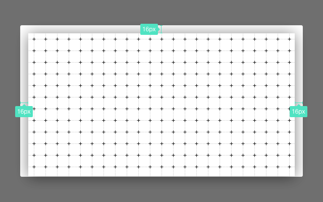
Use the frameless option if the content does not require a margin, for example:
- Image
- Graphic elements like a map
- Framed table, which already has a spacing
Behavior
Dialog exit
Closing a dialog is possible in the following ways:
- Submit / Cancel button Quit the dialog by clicking a button that submits or cancels the process (only for dialog with forced interaction and confirm dialog).
- Close button Quit the dialog by clicking the close button in the header bar (only for dialog with a detail view).
- Click on overlay Quit the dialog by clicking on the overlay (only for dialog with a detail view).
- Enter key
- Submit and close the dialog by pressing the enter key.
- Dialog with forced interaction / Confirm dialog = Primary action
- Escape key
- Quit the dialog by pressing the escape key.
- Dialog with forced interaction / Confirm dialog = Cancel action
- Dialog with a detail view = Close button
Scrolling
- The amount of content determines the height of the dialog. If there is more content than is visible, the content area may be scrolled.
- The header bar and the footer bar have a fixed position and are not scrollable.
- On the What’s new dialog, only the textual content is scrollable
- On small viewport heights the image is scrollable as well (see #responsive-behavior)
Responsive behavior
If the viewport becomes less than the minimum width, the dialog will use the full screen size.
Navigation in what’s new dialog
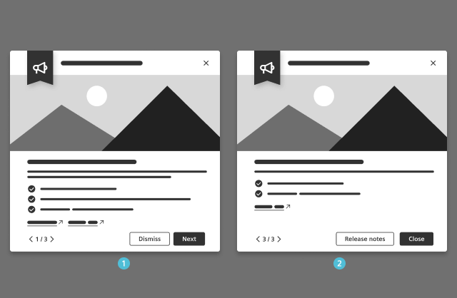
- Navigate to other features promoted on the dialog via these controls:
- the pager
- the primary button (except the last page)
- Close the dialog using these controls:
- The secondary button
- On the last page, the primary button
- Possible additional actions:
- The secondary button on the last page navigates to the full release notes.
- Hyperlinks below the feature description with feature-related links e.g.:
- The promoted feature within the UI
- The respective documentation page
- Guided tours connected to the feature
Do’s & Don’ts
- Show only one dialog at the same time.
- Don’t open multiple dialogs at the same time.
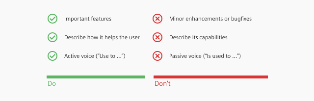
- Highlight the most noteworthy aspects of the design system, focusing on the standout features rather than minor enhancements or bug fixes.
- Focus on explaining how it specifically helps users, instead of simply describing its capabilities.
- Craft the description as if it were intended for someone who will actively use the feature.
- Use active voice to convey the usability of the feature (e.g., “Use this feature to …” instead of “This feature can be used to …”).
Style
This chapter shows several dialog styles in the User Experience Toolkit.
Overview
Typography
The following table gives reference to the different font sizes and weights:
| Name | State | Font-family | Font-size | Line-height | Text-align |
|---|---|---|---|---|---|
| Title | all | Siemens Sans Roman | 21px | 29px | left |
Sizing and spacing
The following measurements show the dimensions for this component:
General
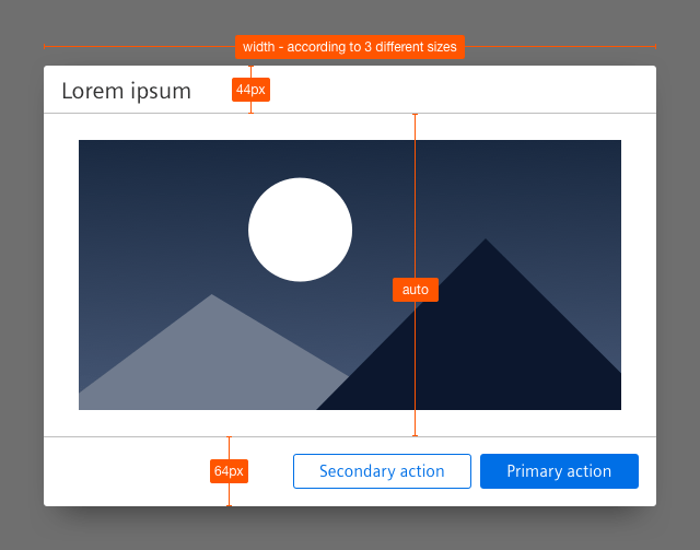
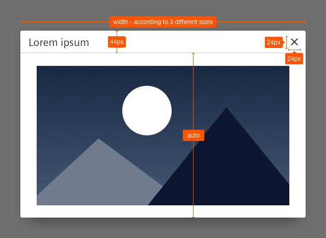
- All dialog sizes have a minimum width of 600px.
- The height of the dialog adapts to the length of the content.
Small
- Width: 600px
- Maximum height: 600px
Medium
- Width: 60% of the width of the user’s viewport
- Maximum width: 960px
- Maximum height: 60% of the height of the user’s viewport
Large
- Width: 90% of the width of the user’s viewport
- Maximum width: 1920px
- Maximum height: 90% of the height of the user’s viewport
Dialog with forced interaction
Dialog with a detail view
Shadow layer
Position
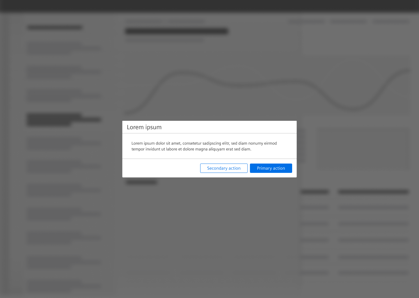
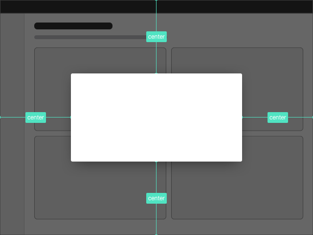
The dialog is positioned in the center of the screen, that means it is vertically and horizontally centered.
To see a detailed explanation of all existing helper and size classes, please refer to the usage table below.
Dialog
<div class="dialog is-shown">
<div class="dialog__overlay"></div>
<div class="dialog__container">
<div class="dialog__background">
<header class="dialog__title">
Dialog title
<a class="dialog__close" href="#" title="Close dialog"></a>
</header>
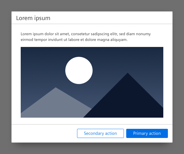
<section class="dialog__content">
<p>
Lorem ipsum dolor sit amet, consectetur adipiscing elit. Proin pulvinar, dolor vitae feugiat ultricies, leo eros cursus eros, vel aliquam quam nunc at ligula. Pellentesque habitant morbi tristique senectus et netus et malesuada fames ac turpis egestas. Phasellus ut massa id enim faucibus interdum a vehicula leo. Fusce et sodales ante.
</p>
<img src="assets/images/image.png" alt="image placeholder" />
<p>
Proin pulvinar, dolor vitae feugiat ultricies, leo eros cursus eros.
</p>
</section>
</div>
</div>
</div>Dialog size medium
<div class="dialog dialog--medium is-shown">
    <div class="dialog__overlay"></div>
    <div class="dialog__container">
        <div class="dialog__background">
            <header class="dialog__title">
                Dialog size "medium"
                <a class="dialog__close" href="#" title="Close dialog"></a>
            </header>
            <section class="dialog__content">
                <p>
                    Lorem ipsum dolor sit amet, consetetur sadipscing elitr, sed diam nonumy eirmod tempor invidunt ut labore et dolore magna aliquyam erat, sed diam voluptua. At vero eos et accusam et justo duo dolores et ea rebum. Stet clita kasd gubergren, no sea takimata sanctus est Lorem ipsum dolor sit amet. Lorem ipsum dolor sit amet, consetetur sadipscing elitr.
                </p>
                <img src="assets/images/image.png" alt="image placeholder" />
                <p>
                    Lorem ipsum dolor sit amet, consetetur sadipscing elitr, sed diam nonumy eirmod tempor.
                </p>
            </section>
        </div>
    </div>
</div>
Dialog size large
<div class="dialog dialog--large is-shown">
    <div class="dialog__overlay"></div>
    <div class="dialog__container">
        <div class="dialog__background">
            <header class="dialog__title">
                Dialog size "large"
                <a class="dialog__close" href="#" title="Close dialog"></a>
            </header>
            <section class="dialog__content">
                <p>
                    Lorem ipsum dolor sit amet, consetetur sadipscing elitr, sed diam nonumy eirmod tempor invidunt ut labore et dolore magna aliquyam erat, sed diam voluptua. At vero eos et accusam et justo duo dolores et ea rebum. Stet clita kasd gubergren, no sea takimata sanctus est. Lorem ipsum dolor sit amet, consetetur sadipscing elitr, sed diam nonumy eirmod tempor invidunt ut labore et dolore magna aliquyam erat, sed diam voluptua. Stet clita kasd gubergren, no sea takimata sanctus est. Lorem ipsum dolor sit amet, consetetur sadipscing elitr, sed diam nonumy eirmod tempor invidunt ut labore et dolore magna aliquyam erat, sed diam voluptua. At vero eos et accusam et justo duo dolores et ea rebum. Stet clita kasd gubergren, no sea takimata sanctus est.
                </p>
                <img src="assets/images/image.png" alt="image placeholder" />
                <p>
                    Lorem ipsum dolor sit amet, consetetur sadipscing elitr, sed diam nonumy eirmod tempor.
                </p>
            </section>
        </div>
    </div>
</div>
Frameless dialog
<div class="dialog is-shown dialog--frameless">
    <div class="dialog__overlay"></div>
    <div class="dialog__container">
        <div class="dialog__background">
            <header class="dialog__title">
                Frameless dialog
                <a class="dialog__close" href="#" title="Close dialog"></a>
            </header>
            <section class="dialog__content">
                <img src="assets/images/image.png" alt="image placeholder" />
            </section>
        </div>
    </div>
</div>
Frameless dialog with a list
<div class="dialog is-shown dialog--frameless">
    <div class="dialog__overlay"></div>
    <div class="dialog__container">
        <div class="dialog__background">
            <header class="dialog__title">
                Frameless dialog
                <a class="dialog__close" href="#" title="Close dialog"></a>
            </header>
            <section class="dialog__content">
                <div class="list list--compact">
                    <ul class="list__list">
                        <li class="list__item">
                            <div class="item__content">
                                <div class="content__column content__column--primary xs-100 sm-60 md-60 lg-60 xl-60">
                                    <h4 class="item__title">
                                        List item title
                                    </h4>
                                    <div class="item__description">
                                        Congue eu consequat ac felis donec et odio, congue eu consequat ac felis donec et odio.
                                    </div>
                                </div>
                                <div class="content__column xs-50 sm-25 md-25 lg-10 xl-10">
                                    <div class="item__meta">
                                        Additional information
                                    </div>
                                </div>
                                <div class="content__column has-alignment-right xs-50 sm-5 md-5 lg-20 xl-20">
                                    <span class="badge has-bgColor-primary has-color-base1000">
                                        3
                                    </span>
                                    <i aria-hidden="true" class="iconUxt information filled has-color-primary"></i>
                                </div>
                            </div>
                        </li>
                        <li class="list__item">
                            <div class="item__content">
                                <div class="content__column content__column--primary xs-100 sm-60 md-60 lg-60 xl-60">
                                    <h4 class="item__title">
                                        Next list item title
                                    </h4>
                                </div>
                                <div class="content__column xs-50 sm-25 md-25 lg-10 xl-10">
                                    <div class="item__meta">
                                        Metainfo
                                    </div>
                                </div>
                                <div class="content__column has-alignment-right xs-50 sm-5 md-5 lg-20 xl-20">
                                    <span class="badge has-bgColor-warning has-color-base1000">
                                        45
                                    </span>
                                    <i aria-hidden="true" class="iconUxt exclamationDiamond filled has-color-warning"></i>
                                </div>
                            </div>
                        </li>
                        <li class="list__item">
                            <div class="item__content">
                                <div class="content__column content__column--primary xs-100 sm-60 md-60 lg-60 xl-60">
                                    <h4 class="item__title">
                                        Another list item
                                    </h4>
                                    <div class="item__description">
                                        No sea takimata sanctus.
                                    </div>
                                </div>
                                <div class="content__column xs-50 sm-25 md-25 lg-10 xl-10">
                                    <div class="item__meta">
                                        Meta information
                                    </div>
                                </div>
                                <div class="content__column has-alignment-right xs-50 sm-5 md-5 lg-20 xl-20">
                                    <i aria-hidden="true" class="iconUxt ok filled has-color-success"></i>
                                </div>
                            </div>
                        </li>
                        <li class="list__item">
                            <div class="item__content">
                                <div class="content__column content__column--primary xs-100 sm-60 md-60 lg-60 xl-60">
                                    <h4 class="item__title">
                                        List item
                                    </h4>
                                    <div class="item__description">
                                        Lorem ipsum dolor sit amet, consetetur sadipscing elitr.
                                    </div>
                                </div>
                                <div class="content__column xs-50 sm-25 md-25 lg-10 xl-10">
                                </div>
                                <div class="content__column has-alignment-right xs-50 sm-5 md-5 lg-20 xl-20">
                                    <span class="badge has-bgColor-error has-color-base1000">
                                        258
                                    </span>
                                    <i aria-hidden="true" class="iconUxt attention filled has-color-error"></i>
                                </div>
                            </div>
                        </li>
                        <li class="list__item">
                            <div class="item__content">
                                <div class="content__column content__column--primary xs-100 sm-60 md-60 lg-60 xl-60">
                                    <h4 class="item__title">
                                        List item title
                                    </h4>
                                    <div class="item__description">
                                        Sed diam nonumy eirmod tempor invidunt ut labore et dolore magna aliquyam erat sed diam voluptua. At vero eos etaccusam et justo duo dolores.
                                    </div>
                                </div>
                                <div class="content__column xs-50 sm-25 md-25 lg-10 xl-10">
                                    <div class="item__meta">
                                        Information
                                    </div>
                                </div>
                                <div class="content__column has-alignment-right xs-50 sm-5 md-5 lg-20 xl-20">
                                    <i aria-hidden="true" class="iconUxt ok filled has-color-success"></i>
                                </div>
                            </div>
                        </li>
                    </ul>
                </div>
            </section>
        </div>
    </div>
</div>
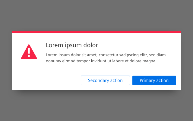
Dialog with forced interaction
<div class="dialog is-shown">
    <div class="dialog__overlay"></div>
    <div class="dialog__container">
        <div class="dialog__background">
            <header class="dialog__title">
                Dialog with forced interaction
            </header>
            <section class="dialog__content">
                <p>
                    Lorem ipsum dolor sit amet, consectetur adipiscing elit. Proin pulvinar, dolor vitae feugiat ultricies, leo eros cursus eros, vel aliquam quam nunc at ligula. Pellentesque habitant morbi tristique senectus et netus et malesuada fames ac turpis egestas. Phasellus ut massa id enim faucibus interdum a vehicula leo. Fusce et sodales ante.
                </p>
                <img src="assets/images/image.png" alt="image placeholder" />
                <p>
                    Proin pulvinar, dolor vitae feugiat ultricies, leo eros cursus eros.
                </p>
            </section>
            <footer class="dialog__footer">
                <a class="button button--secondary" href="#">Secondary action</a>
                <a class="button button--primary" href="#">Primary action</a>
            </footer>
        </div>
    </div>
</div>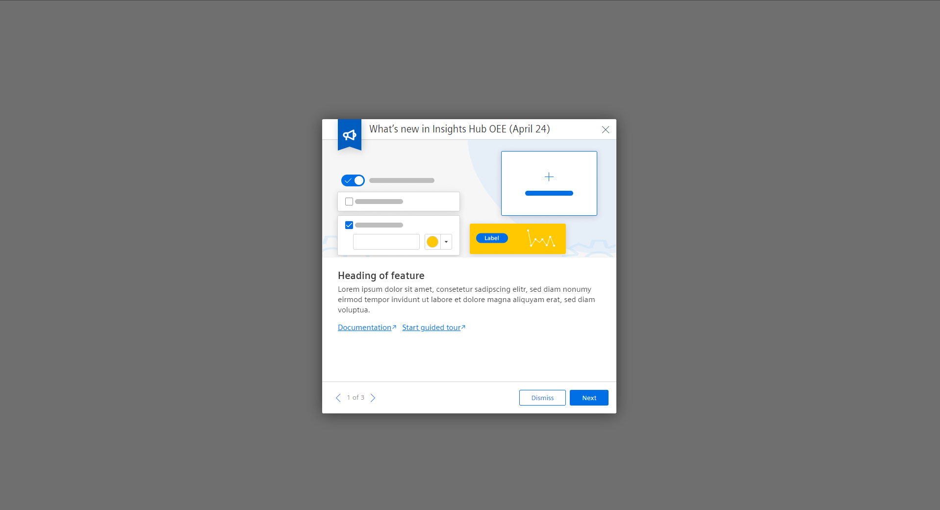
What's new dialog with sample content and functionality
This demo shows sample content and functionality.What's new dialog interactive demo
<div class="dialog dialog__whatsNew dialog--frameless is-shown">
    <div class="dialog__overlay"></div>
    <div class="dialog__container">
        <div class="dialog__background">
            <div class="dialog__whatsNew__banner">
                <div class="banner__background"></div>
                <span aria-hidden='true' class='banner__icon iconUxt announcement bold'></span>
            </div>
            <header class="dialog__title">
                What’s new in Insights Hub OEE (April 24)
                <a class="dialog__close" href="#" title="Close dialog"></a>
            </header>
            <section class="dialog__content">
                <div class="dialog__content__img"><img src="assets/images/whatsNew1.png" alt="image placeholder" /></div>
                <div class="dialog__content__container">
                    <h4>Heading of feature</h4>
                    <p>
                        Lorem ipsum dolor sit amet, consetetur sadipscing elitr, sed diam nonumy eirmod tempor invidunt ut labore et dolore magna aliquyam erat, sed diam voluptua.
                    </p>
                    <a href="https://www.mindsphere.io" class="is-external" rel="noopener noreferrer">Documentation</a>
                    <a href="https://www.mindsphere.io" class="is-external" rel="noopener noreferrer">Start guided tour</a>
                </div>
            </section>
            <section class="dialog__content">
                <div class="dialog__content__img"><img src="assets/images/whatsNew2.png" alt="image placeholder" /></div>
                <div class="dialog__content__container">
                    <h4>Heading of feature</h4>
                    <p>
                        Lorem ipsum dolor sit amet, consetetur sadipscing elitr, sed diam nonumy eirmod tempor invidunt ut labore et dolore magna aliquyam erat, sed diam voluptua.
                    </p>
                    <a href="https://www.mindsphere.io" class="is-external" rel="noopener noreferrer">Explore feature</a>
                    <a href="https://www.mindsphere.io" class="is-external" rel="noopener noreferrer">Documentation</a>
                </div>
            </section>
            <section class="dialog__content">
                <div class="dialog__content__img"><img src="assets/images/whatsNew3.png" alt="image placeholder" /></div>
                <div class="dialog__content__container">
                    <h4>Heading of feature</h4>
                    <p>
                        Lorem ipsum dolor sit amet, consetetur sadipscing elitr, sed diam nonumy eirmod tempor invidunt ut labore et dolore magna aliquyam erat, sed diam voluptua.
                    </p>
                    <ul class="whatsNew__list">
                        <li class="whatsNew__list__item">Ullamco pariatur adipisicing ad qui. Ullamco pariatur adipisicing ad qui. Ullamco pariatur adipisicing ad qui.</li>
                        <li class="whatsNew__list__item">Velit qui esse est excepteur nostrud quis.</li>
                        <li class="whatsNew__list__item">Esse voluptate anim voluptate adipisicing aute consequat.</li>
                        <li class="whatsNew__list__item">Incididunt excepteur in eu eiusmod.</li>
                        <li class="whatsNew__list__item">Qui officia enim velit cillum in ipsum velit ad occaecat fugiat proident laboris.</li>
                    </ul>
                </div>
            </section>
            <section class="dialog__content">
                <div class="dialog__content__img"><img src="assets/images/whatsNew4.png" alt="image placeholder" /></div>
                <div class="dialog__content__container">
                    <h4>Heading of feature</h4>
                    <p>
                        Lorem ipsum dolor sit amet, consetetur sadipscing elitr, sed diam nonumy eirmod tempor invidunt ut labore et dolore magna aliquyam erat, sed diam voluptua.
                    </p>
                    <a href="https://www.mindsphere.io" class="is-external" rel="noopener noreferrer">Explore feature</a>
                    <a href="https://www.mindsphere.io" class="is-external" rel="noopener noreferrer">Documentation</a>
                    <a href="https://www.mindsphere.io" class="is-external" rel="noopener noreferrer">Start guided tour</a>
                </div>
            </section>
            <footer class="dialog__footer">
                <div class="pager">
                    <ul>
                        <li class="pager__page pager__firstPage"> <a href="#"> <span class="iconUxt arrowSingleLeft"></span> </a></li>
                        <li class="pager__page"> 1 of 4</li>
                        <li class="pager__page pager__lastPage"> <a href="#"> <span class="iconUxt arrowSingleRight"></span> </a></li>
                    </ul>
                </div>
                <a id="whatsNewDismiss" class="button button--secondary" href="#">Dismiss</a>
                <a id="whatsNewReleaseNotes" class="button button--secondary has-icon-left" href="#"><span class="iconUxt outgoing" aria-hidden="true"></span>Release notes</a>
                <a id="whatsNewNext" class="button button--primary" href="#">Next</a>
                <a id="whatsNewClose" class="button button--primary" href="#">Close</a>
            </footer>
        </div>
    </div>
</div>
<script>

    document.addEventListener('DOMContentLoaded', function () {
        const dialogContent = document.querySelectorAll('.dialog__content');
        const pager = document.querySelector('.pager');
        const pagerCounter = document.querySelector('.pager__page:nth-child(2)');
        const previousButton = document.querySelector('.pager__firstPage');
        const nextButton = document.querySelector('.pager__lastPage');
        const dismissButton = document.querySelector('#whatsNewDismiss');
        const releaseNotesButton = document.querySelector('#whatsNewReleaseNotes');
        const nextPrimaryButton = document.querySelector('#whatsNewNext');
        const closePrimaryButton = document.querySelector('#whatsNewClose');

        let currentPage = 0;
        const pageCount = dialogContent.length;

        closePrimaryButton.style.display = 'none';
        releaseNotesButton.style.display = 'none';

        previousButton.classList.toggle('is-disabled', currentPage === 0);

        // Initialize dialog content
        dialogContent.forEach((content, index) => {
            if (index !== currentPage) {
                content.style.display = 'none';
            }
        });

        // Update pager counter
        pagerCounter.textContent = `${currentPage + 1} of ${pageCount}`;

        // Function to update page
        function updatePage(direction) {
            dialogContent[currentPage].style.display = 'none';
            currentPage += direction;
            dialogContent[currentPage].style.display = 'flex';
            pagerCounter.textContent = `${currentPage + 1} of ${pageCount}`;

            if (currentPage < pageCount - 1) {
                nextPrimaryButton.style.display = 'block';
                dismissButton.style.display = 'block';
                closePrimaryButton.style.display = 'none';
                releaseNotesButton.style.display = 'none';
            } else if (currentPage === pageCount - 1) {
                nextPrimaryButton.style.display = 'none';
                dismissButton.style.display = 'none';
                closePrimaryButton.style.display = 'block';
                releaseNotesButton.style.display = 'block';
            }

            previousButton.classList.toggle('is-disabled', currentPage === 0);
            nextButton.classList.toggle('is-disabled', currentPage === pageCount - 1);
        }

        // Previous page
        previousButton.addEventListener('click', function () {
            if (currentPage > 0) {
                updatePage(-1);
            }
        });

        // Next page
        nextButton.addEventListener('click', function () {
            if (currentPage < pageCount - 1) {
                updatePage(1);
            }
        });

        // Dismiss dialog
        dismissButton.addEventListener('click', function () {
            // Your dismiss logic here
        });

        // Next primary button
        nextPrimaryButton.addEventListener('click', function () {
            if (currentPage < pageCount - 1) {
                updatePage(1);
            }
        });
    }
    );
</script>
What's new dialog
<div class="dialog dialog__whatsNew dialog--frameless is-shown">
    <div class="dialog__overlay"></div>
    <div class="dialog__container">
        <div class="dialog__background">
            <div class="dialog__whatsNew__banner">
                <div class="banner__background"></div>
                <span aria-hidden='true' class='banner__icon iconUxt announcement bold'></span>
            </div>
            <header class="dialog__title">
                What’s new in Insights Hub OEE (April 24)
                <a class="dialog__close" href="#" title="Close dialog"></a>
            </header>
            <section class="dialog__content">
                <div class="dialog__content__img"><img src="assets/images/whatsNew1.png" alt="image placeholder" /></div>
                <div class="dialog__content__container">
                    <h4>Heading of feature</h4>
                    <p>
                        Lorem ipsum dolor sit amet, consetetur sadipscing elitr, sed diam nonumy eirmod tempor invidunt ut labore et dolore magna aliquyam erat, sed diam voluptua.
                    </p>
                    <a href="https://www.mindsphere.io" class="is-external" rel="noopener noreferrer">Explore feature</a>
                    <a href="https://www.mindsphere.io" class="is-external" rel="noopener noreferrer">Documentation</a>
                    <a href="https://www.mindsphere.io" class="is-external" rel="noopener noreferrer">Start guided tour</a>
                </div>
            </section>
            <footer class="dialog__footer">
                <div class="pager">
                    <ul>
                        <li class="pager__page pager__firstPage is-disabled"> <a href="#"> <span class="iconUxt arrowSingleLeft"></span> </a></li>
                        <li class="pager__page"> 1 of 4</li>
                        <li class="pager__page pager__lastPage"> <a href="#"> <span class="iconUxt arrowSingleRight"></span> </a></li>
                    </ul>
                </div>
                <a class="button button--secondary" href="#">Dismiss</a>
                <a class="button button--primary" href="#">Next</a>
            </footer>
        </div>
    </div>
</div>
What's new dialog with modified list
<div class="dialog dialog__whatsNew dialog--frameless is-shown">
    <div class="dialog__overlay"></div>
    <div class="dialog__container">
        <div class="dialog__background">
            <div class="dialog__whatsNew__banner">
                <div class="banner__background"></div>
                <span aria-hidden='true' class='banner__icon iconUxt announcement bold'></span>
            </div>
            <header class="dialog__title">
                What’s new in Insights Hub OEE (April 24)
                <a class="dialog__close" href="#" title="Close dialog"></a>
            </header>
            <section class="dialog__content">
                <div class="dialog__content__img"><img src="assets/images/whatsNew1.png" alt="image placeholder" /></div>
                <div class="dialog__content__container">
                    <h4>Heading of feature</h4>
                    <p>
                        Lorem ipsum dolor sit amet, consetetur sadipscing elitr, sed diam nonumy eirmod tempor invidunt ut labore et dolore magna aliquyam erat, sed diam voluptua.
                    </p>
                    <ul class="whatsNew__list">
                        <li class="whatsNew__list__item">Ullamco pariatur adipisicing ad qui. Ullamco pariatur adipisicing ad qui. Ullamco pariatur adipisicing ad qui.</li>
                        <li class="whatsNew__list__item">Velit qui esse est excepteur nostrud quis.</li>
                        <li class="whatsNew__list__item">Esse voluptate anim voluptate adipisicing aute consequat.</li>
                        <li class="whatsNew__list__item">Incididunt excepteur in eu eiusmod.</li>
                        <li class="whatsNew__list__item">Qui officia enim velit cillum in ipsum velit ad occaecat fugiat proident laboris.</li>
                    </ul>
                </div>
            </section>
            <footer class="dialog__footer">
                <div class="pager">
                    <ul>
                        <li class="pager__page pager__firstPage is-disabled"> <a href="#"> <span class="iconUxt arrowSingleLeft"></span> </a></li>
                        <li class="pager__page"> 1 of 4</li>
                        <li class="pager__page pager__lastPage"> <a href="#"> <span class="iconUxt arrowSingleRight"></span> </a></li>
                    </ul>
                </div>
                <a class="button button--secondary" href="#">Dismiss</a>
                <a class="button button--primary" href="#">Next</a>
            </footer>
        </div>
    </div>
</div>
Usage
| Element | Class | Description |
|---|---|---|
.dialog | .is-shown | Displays the default dialog (default size small). |
.dialog | .dialog--medium | Sets the size of the dialog to medium. This class works in combination with the style-class .dialog--frameless. |
.dialog | .dialog--large | Sets the size of the dialog to large. This class works in combination with the style-class .dialog--frameless. |
.dialog | .dialog--frameless | Applies a frameless dialog style. Note that this class can be used in combination with all available size classes .dialog--medium and .dialog--large. |
.dialog | .dialog__whatsNew | Applies the what's new dialog style. |