Color
Color is an essential component of an expressive user interface.
You can click any color identifier/name, color value and helper classes below to copy them into your clipboard.
Base colors
.has-color-base000
.has-bgColor-base000
.has-borderColor-base000
.has-color-base200
.has-bgColor-base200
.has-borderColor-base200
.has-color-base450
.has-bgColor-base450
.has-borderColor-base450
.has-color-base600
.has-bgColor-base600
.has-borderColor-base600
.has-color-base750
.has-bgColor-base750
.has-borderColor-base750
.has-color-base800
.has-bgColor-base800
.has-borderColor-base800
.has-color-base900
.has-bgColor-base900
.has-borderColor-base900
.has-color-base950
.has-bgColor-base950
.has-borderColor-base950
.has-color-base1000
.has-bgColor-base1000
.has-borderColor-base1000
Primary color
.has-color-primary-darker
.has-bgColor-primary-darker
.has-borderColor-primary-darker
.has-color-primary-dark
.has-bgColor-primary-dark
.has-borderColor-primary-dark
.has-color-primary
.has-bgColor-primary
.has-borderColor-primary
.has-color-primary-light
.has-bgColor-primary-light
.has-borderColor-primary-light
.has-color-primary-lighter
.has-bgColor-primary-lighter
.has-borderColor-primary-lighter
.has-color-primary-lightest
.has-bgColor-primary-lightest
.has-borderColor-primary-lightest
Functional colors
.has-color-info-dark
.has-bgColor-info-dark
.has-borderColor-info-dark
.has-color-info
.has-bgColor-info
.has-borderColor-info
.has-color-info-light
.has-bgColor-info-light
.has-borderColor-info-light
.has-color-info-lighter
.has-bgColor-info-lighter
.has-borderColor-info-lighter
.has-color-warning-dark
.has-bgColor-warning-dark
.has-borderColor-warning-dark
.has-color-warning
.has-bgColor-warning
.has-borderColor-warning
.has-color-warning-light
.has-bgColor-warning-light
.has-borderColor-warning-light
.has-color-warning-lighter
.has-bgColor-warning-lighter
.has-borderColor-warning-lighter
.has-color-error-dark
.has-bgColor-error-dark
.has-borderColor-error-dark
.has-color-error
.has-bgColor-error
.has-borderColor-error
.has-color-error-light
.has-bgColor-error-light
.has-borderColor-error-light
.has-color-error-lighter
.has-bgColor-error-lighter
.has-borderColor-error-lighter
.has-color-success-dark
.has-bgColor-success-dark
.has-borderColor-success-dark
.has-color-success
.has-bgColor-success
.has-borderColor-success
.has-color-success-light
.has-bgColor-success-light
.has-borderColor-success-light
.has-color-success-lighter
.has-bgColor-success-lighter
.has-borderColor-success-lighter
Charting colors
.has-color-charting01
.has-bgColor-charting01
.has-borderColor-charting01
.has-color-charting02
.has-bgColor-charting02
.has-borderColor-charting02
.has-color-charting03
.has-bgColor-charting03
.has-borderColor-charting03
.has-color-charting04
.has-bgColor-charting04
.has-borderColor-charting04
.has-color-charting05
.has-bgColor-charting05
.has-borderColor-charting05
.has-color-charting06
.has-bgColor-charting06
.has-borderColor-charting06
.has-color-charting07
.has-bgColor-charting07
.has-borderColor-charting07
.has-color-charting08
.has-bgColor-charting08
.has-borderColor-charting08
.has-color-charting09
.has-bgColor-charting09
.has-borderColor-charting09
.has-color-charting10
.has-bgColor-charting10
.has-borderColor-charting10
.has-color-charting11
.has-bgColor-charting11
.has-borderColor-charting11
.has-color-charting12
.has-bgColor-charting12
.has-borderColor-charting12
.has-color-charting13
.has-bgColor-charting13
.has-borderColor-charting13
.has-color-charting14
.has-bgColor-charting14
.has-borderColor-charting14
.has-color-charting15
.has-bgColor-charting15
.has-borderColor-charting15
.has-color-charting16
.has-bgColor-charting16
.has-borderColor-charting16
.has-color-charting17
.has-bgColor-charting17
.has-borderColor-charting17
.has-color-charting18
.has-bgColor-charting18
.has-borderColor-charting18
.has-color-charting19
.has-bgColor-charting19
.has-borderColor-charting19
.has-color-charting20
.has-bgColor-charting20
.has-borderColor-charting20
.has-color-charting21
.has-bgColor-charting21
.has-borderColor-charting21
Danger Button
.has-color-dangerPrimary
.has-bgColor-dangerPrimary
.has-borderColor-dangerPrimary
.has-color-dangerPrimary-hover
.has-bgColor-dangerPrimary-hover
.has-borderColor-dangerPrimary-hover
.has-color-dangerPrimary-active
.has-bgColor-dangerPrimary-active
.has-borderColor-dangerPrimary-active
.has-color-dangerSecondary
.has-bgColor-dangerSecondary
.has-borderColor-dangerSecondary
.has-color-dangerSecondary-hover
.has-bgColor-dangerSecondary-hover
.has-borderColor-dangerSecondary-hover
.has-color-dangerSecondary-active
.has-bgColor-dangerSecondary-active
.has-borderColor-dangerSecondary-active
OS Bar / Launchpad colors
.has-color-firefly
.has-bgColor-firefly
.has-borderColor-firefly
.has-color-aquaHaze
.has-bgColor-aquaHaze
.has-borderColor-aquaHaze
Overview
Color communicates relevance and relations among different user interface elements. The following palettes display all existing colors of the core components and lists exemplary patterns of their usage.
Neutral text, background and border colors
The User Experience Toolkit uses subtle grays for most backgrounds, borders and text.
| Color name | Usage examples |
|---|---|
| base000 | Shadows (in various grades of opacity) |
| base200 | Typography: Headline, paragraph – foreground, input elements: border color |
| base450 | Button groups: Active border and background color, empty state area: conditional graphics |
| base600 | User input: border Primary button, disabled state: background Secondary button, disabled state: border, foreground Switch, off state: background Typography, subheadline and caption: foreground |
| base750 | Container: border Fieldset: border |
| base800 | Menu: active item background |
| base900 | Vertical tab: background, input elements: readonly background |
| base1000 | Main region: background |
Primary color
Blue is used to highlight interactive elements.
| Color name | Usage examples |
|---|---|
| primary-darker | Toggle button, Active state: background |
| primary-dark | Primary button, Pressed state: background |
| primary | Primary button: background Secondary button: border, foreground Switch, Active state: background |
| primary-light | Primary button, Mouseover state: background Focus state: border |
| primary-lighter | Secondary button, Pressed state: background |
| primary-lightest | Secondary button, Mouseover state: background |
Functional colors
Bold colors are used to attract the user’s attention to specific components of the interface.
| Color name | Usage examples |
|---|---|
| info-dark | Message, info: foreground |
| info | Severity “info” Data visualization |
| info-light | Message, info: border |
| info-lighter | Message: info: background |
| error-dark | Message, error / alert: foreground |
| error | Severity “error” / “alert” Data visualization |
| error-light | Message, error / alert: border |
| error-lighter | Message, error / alert: background |
| warning-dark | Message, warning: foreground |
| warning | Severity “warning” Data visualization |
| warning-light | Message, warning: border |
| warning-lighter | Message, warning: background |
| success-dark | Message, success: foreground |
| success | Severity “success” Data visualization |
| success-light | Message, success: border |
| success-lighter | Message, success: background |
Meta colors
Meta colors offer a semantic way of applying colors. It makes it easier to decide on a color in specific, more frequently occurring contexts.
| Color name | Reference color | Usage examples |
|---|---|---|
| Interface (main background colors) | ||
| interface | base1000 | Background color of body and main region |
| interface-secondary | base950 | Background color of leading and context region |
| interface-highlight | base1000 | Background color of header sections, card, container and similar components |
| interface-headerfooter | base1000 | Background color of dialog headers and footers |
| Font | ||
| font | base200 | Base font color (headlines, paragraphs, labels) |
| font-secondary | base600 | Secondary font objects, e.g. descriptions, subtitles |
| font-disabled | base600 | Font color for disabled elements |
| font-contrast | base1000 | Text elements on darker colored backgrounds, e.g. primary button color |
| Disabled | ||
| disabled | base600 | Border or background color for disabled elements |
| disabled-contrast | base1000 | Contrast for disabled elements |
| Miscellaneous | ||
| border | base800 | Border color for components like cards, fieldsets, containers, tables, dialogs |
| shadow | base000 | Box shadows |
| overlay | base200 | Overlay background |
Note: Reference colors are only applicable for the Classic Light theme.
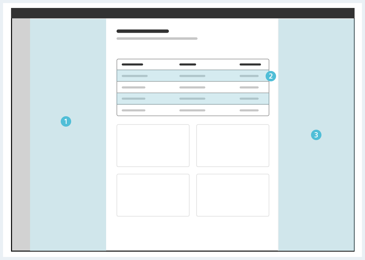
Usage of interface-secondary on leading region (1), table with alternate rows (2), item/context region (3)
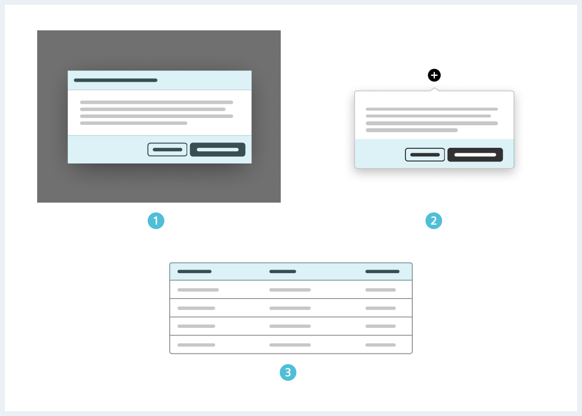
Exemplary usage of interface-headerfooter: dialog footer & header (1), popover footer (2), table header (3)
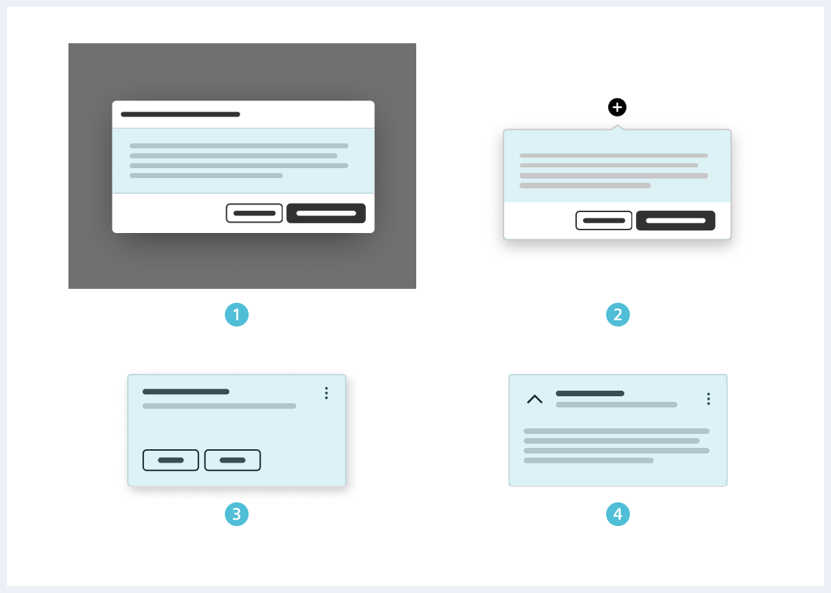
Exemplary usage of interface-highlight: dialog (1), popover (3), card (2), container (3)
Component-specific colors
In contrast to the general meta colors, the following colors are intended only for specific components.
| Color name | Reference color | Usage examples |
|---|---|---|
| App bar | ||
| appBar-bg | interface-secondary | Background color |
| appBar-color | font | Link / foreground color |
| appBar-hover | primary | Hover link color for items |
| appBar-border | (individual color) | Border around second level items |
| appBar‐‐active-bg | interface | Background color for active items (“highlight”) |
| appBar‐‐active-color | primary | Link color for active items |
| appBar‐‐active-indicator | primary | Active indicator (“left border”) of highlighted item |
| appBar‐‐badge | error | Background color for optional badges of App bar items |
| App header | ||
| app-header-bg | interface-secondary | Background color |
| app-header-font | primary | Buttons on the app header |
| Danger primary | ||
| dangerPrimary | error | Background color in default state |
| dangerPrimary-hover | (individual color) | Background color in hover state |
| dangerPrimary-active | (individual color) | Background color in active state |
| Danger secondary | ||
| dangerSecondary | error | Border color |
| dangerSecondary-hover | error-lighter | Background color in hover state |
| dangerSecondary-active | (individual color) | Background color in active state |
Note: Reference colors are only applicable for the Classic Light theme.
To see a detailed explanation of all existing helper classes, please refer to the usage table below.
Color integration examples
<span class="has-color-primary">Foreground color</span>

<span class="has-bgColor-primary">Background color</span>
<span class="has-borderColor-primary">Border color</span>
Usage
| Element | Class | Description |
|---|---|---|
.has-bgColor-<color name> | Sets the background color of an element to the chosen color. All available color names can be found in the html examples above. Example: has-bgColor-primary | |
.has-bgColor-forced-<color name> | Using the keyword -forced adds the chosen background color with !important to the element.Example: has-bgColor-forced-primaryThis helps to override other potential classes which might have a higher specificity as the 'normal' color helper classes. Be careful since the usage of !important can quickly create a mess in your stylesheets. | |
.has-borderColor-<color name> | Sets the border color of an element to the chosen color. All available color names can be found in the html examples above. Example: has-borderColor-primary | |
.has-borderColor-forced-<color name> | Using the keyword -forced adds the chosen border color with !important to the element. Example: has-bgColor-forced-primaryThis helps to override other potential classes which might have a higher specificity as the 'normal' color helper classes. Be careful since the usage of !important can quickly create a mess in your stylesheets. | |
.has-color-<color name> | Sets the text color of an element to the chosen color. All available color names can be found in the html examples above. Example: has-color-primary | |
.has-color-forced-<color name> | Using the keyword -forced adds the text color with !important to the element. Example: has-color-forced-primaryThis helps to override other potential classes which might have a higher specificity as the 'normal' color helper classes. Be careful since the usage of !important can quickly create a mess in your stylesheets. | |