Busy indicator
A busy indicator informs the user about the status of an ongoing process to reduce uncertainty.
Usage
When to use
Use busy indicators in the following cases:
- For activities (short, indeterminate) requiring user attention.
- To display the status of a process.
- To notify users that something is loading.
General construction
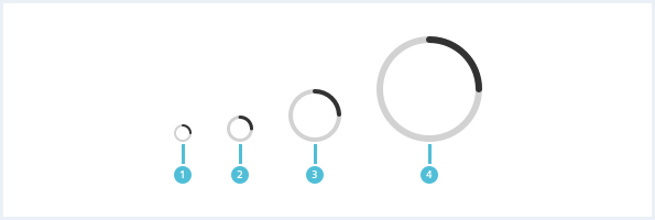
A busy indicator consists of the following elements:

1. Progress ring
- An animated circle shows that something is loading at the moment.
2. Background ring
- The background ring describes the busy indicator.
Options
The following busy indicator options are available:
Sizes
Behavior
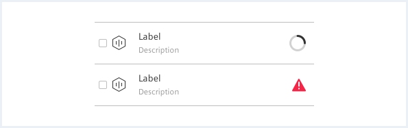
Placement
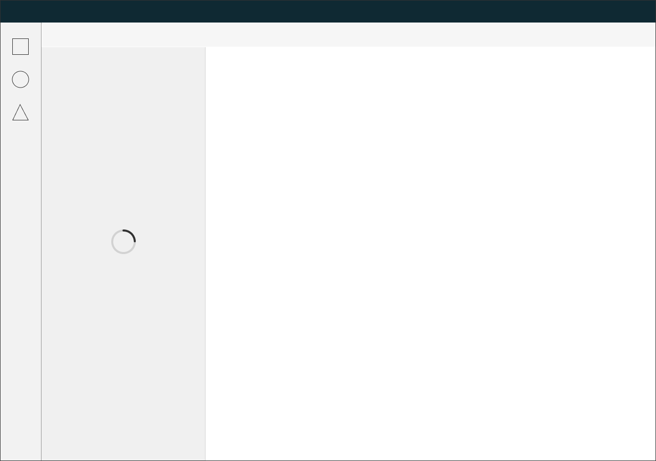
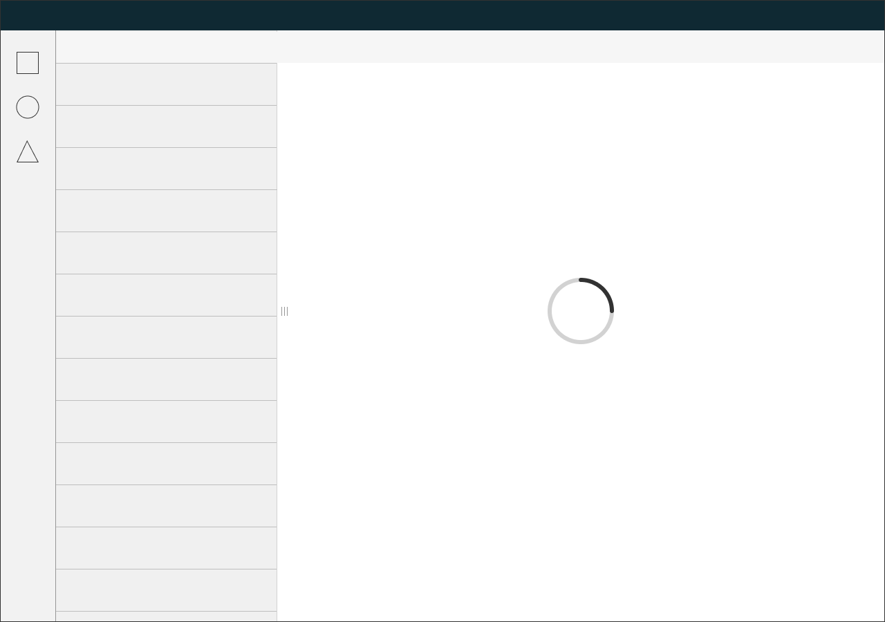
- If a busy indicator is triggered by an element or component, place the spinner in that component / element and disable the element while the busy indicator is visible.
- You can place the busy indicator at a point where the user’s attention is required.
Style
This chapter shows several busy indicator styles in the User Experience Toolkit.
Overview

Examples
Sizing and spacing
The following measurements show the dimensions for this component:
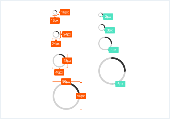
To see a detailed explanation of all existing modifier and state classes, please refer to the usage table below.
Busy indicator (xsmall)
<div class="busyIndicator is-shown">
    <div class="busyIndicator__ring busyIndicator__ring--xsmall"></div>
</div>
Busy indicator (small)
<div class="busyIndicator is-shown">
    <div class="busyIndicator__ring busyIndicator__ring--small"></div>
</div>
Busy indicator (medium / default)
<div class="busyIndicator is-shown">
    <div class="busyIndicator__ring"></div>
</div>
<!-- the busyIndicator__ring--medium class is optional / default size -->
<div class="busyIndicator is-shown">
    <div class="busyIndicator__ring busyIndicator__ring--medium"></div>
</div>
Busy indicator (large)
<div class="busyIndicator is-shown">
<div class="busyIndicator__ring busyIndicator__ring--large"></div>
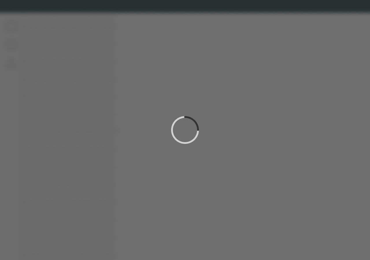
</div>Large Busy indicator with overlay
<div class="busyIndicator busyIndicator--withOverlay is-shown">
    <div class="busyIndicator__ring"></div>
    <div class="busyIndicator__overlay"></div>
</div>

<h2>This demo toggles the visibility of a Busy indicator every 1.5 seconds.</h2>

<!-- ============================================================= -->
<!-- JavaScript Code following is only for demonstrational purpose -->
<!-- ============================================================= -->
<script>
    window.onload = function(e) {
        // sample JS for activating busy indicator every 1.5 seconds

        function displayRandomIndicator() {
            var indicators = document.querySelectorAll('.busyIndicator');
            for (var i = 0; i < indicators.length; i++) {
                indicators[i].classList.toggle("is-shown");
            }

        }

        window.setInterval(function(){
            displayRandomIndicator();
        }, 1500);

    };
</script>
Usage
| Element | Class | Description |
|---|---|---|
.busyIndicator | .is-shown | Sets a Busy indicator's visibility. Without this class, it will not be shown. Also toggles the visibility of a "large Busy indicator with overlay". |
.busyIndicator__ring | .busyIndicator__ring--medium | Sets the size of the Busy indicator to default size. |
.busyIndicator__ring | .busyIndicator__ring--xsmall | Sets the size of the Busy indicator to extra small. |
.busyIndicator__ring | .busyIndicator__ring--small | Sets the size of the busy indicator to small size. |
.busyIndicator__ring | .busyIndicator__ring--large | Sets the size of the Busy indicator to large size. |
.busyIndicator | .busyIndicator--withOverlay | Centers the Busy indicator on screen and displays an overlay behind it. |