Data table
A data table provides more functions than a simple table, e.g. multi-select, sort, expand and collapse.
Usage
When to use
Use a data table in the following cases:
- When the application requires the user to display, manipulate and/or administrate large amounts of data.
- To expand or collapse regular tables and/or allow more advanced interactions.
- To present large amounts of data that don’t fit on one page.
General construction
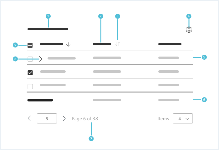
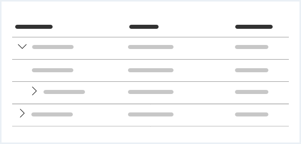
- Title, 2. Table header, 3. Sort indicator, 4. Column settings, 5. Table body, 6. Table footer, 7. Pager, 8. Expandable row, 9. Checkbox
1. Title (optional)
- The table title describes the content of the table.
2. Table header
- The table header describes the content of the column.
- Column headings match the text alignment in the column.
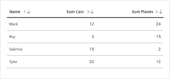
3. Sort indicator (optional)
- The sort indicator is available in three states: default (not sorted), ascending and descending.
- The indicator can contain a number indicating the order of the sort sequence.
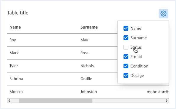
4. Column settings (optional)
- Allows the user to hide and show columns.
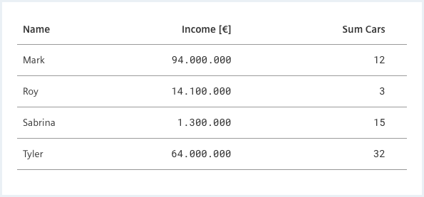
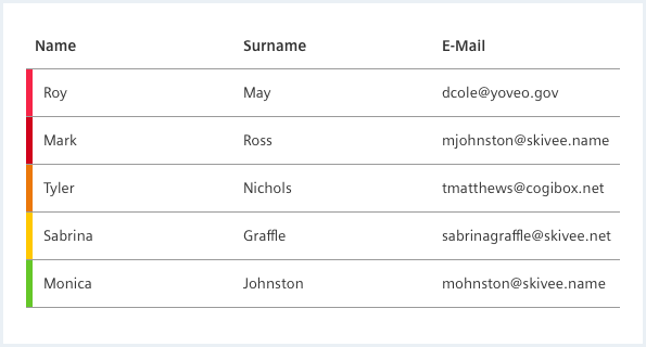
5. Table body
- The table body contains the table data.
- The text is left aligned.
- Numeric values align right and numeric identifiers align left (e.g. serial numbers).
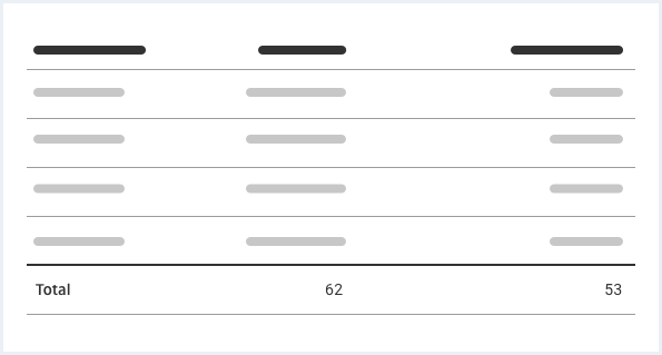
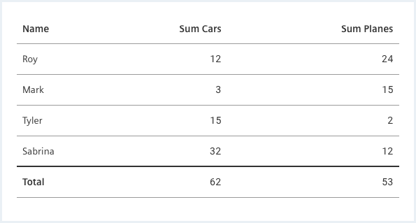
6. Table footer (optional)
- The table footer is often used to show total values of columns.
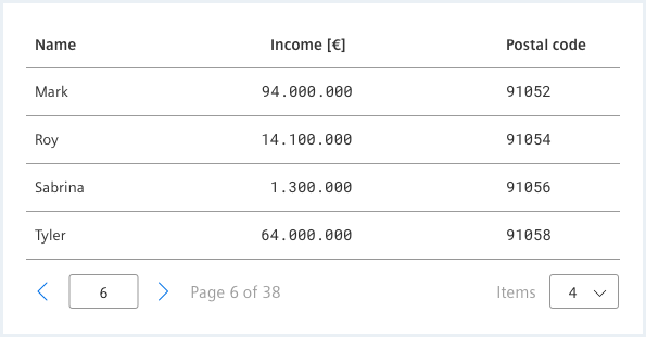
7. Pager (optional)
- A pager can be either an advanced or a simple pager.
8. Expandable row action (optional)
- An expandable row action indicates that a row is expandable or collapsible.
9. Checkbox (optional)
- Checkboxes for rows allow users to select multiple items at a time.
Options
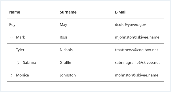
Expandable rows
Use expandable rows when you want to provide additional information on a row or row cells that does not always need to be displayed.
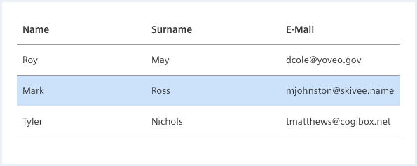
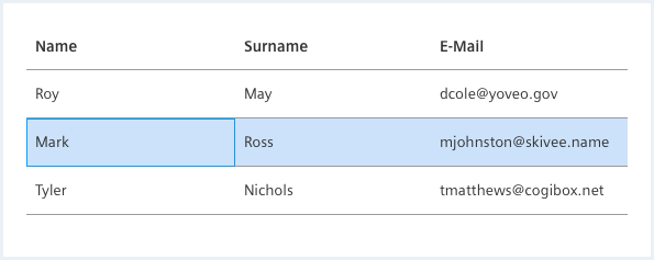
Selection
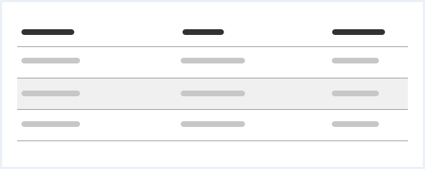
It is possible to single select a row to show, for example, detailed information of that row or to perform actions on that row.
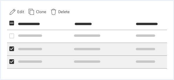
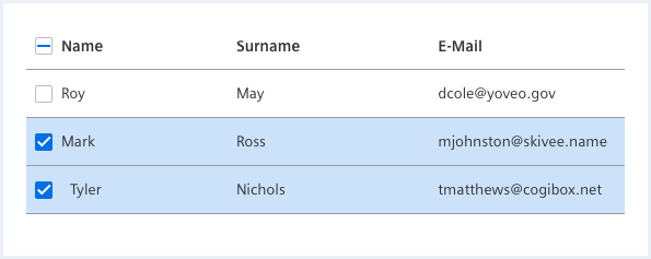
To enable actions on several elements at once, it is possible to select rows in the data table. If nothing is selected the table batch actions are invisible or disabled.
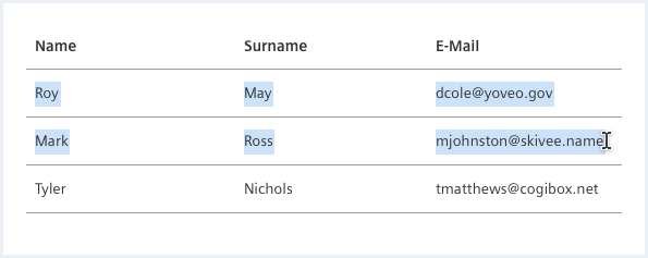
There is the option to either select text or to select cells/rows/columns. It is not possible to do both at the same time.
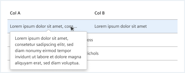
Ellipsis and additional content
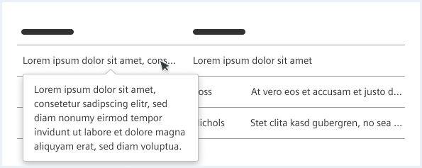
To prevent the cells in the data table row from becoming too large, you can set the cell values to be truncated.
Summary / Table Footer
Sorting
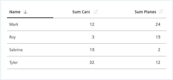
To help users sort information, columns can be displayed sorted by default. However, make sure that the default sort order makes sense for your type of data. In most cases, the default sort order shows the latest entries at the top (most recently created or modified) or the entries that need attention most urgently (e.g. lowest inventory, highest priority).
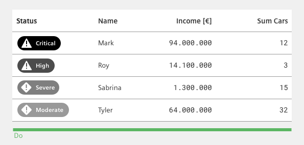
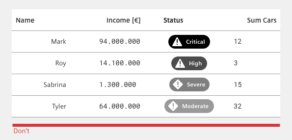
Status
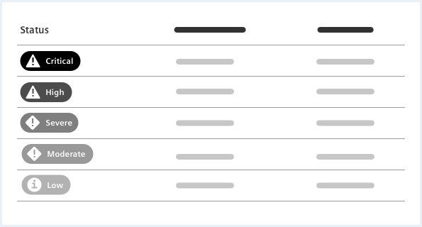
The combination of background color, icon and label allows the best possible readability of the status.
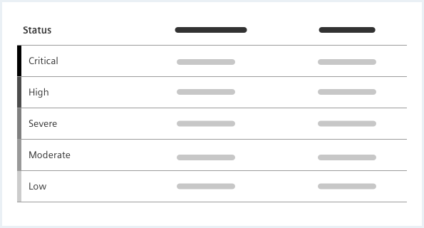
This compact status display can also be used without an identifier. This is particularly recommended if the status levels are manageable and common and if little space is available.
Alignments
- The table header has the same alignment as the content of the respective column.
- Textual data is left aligned.
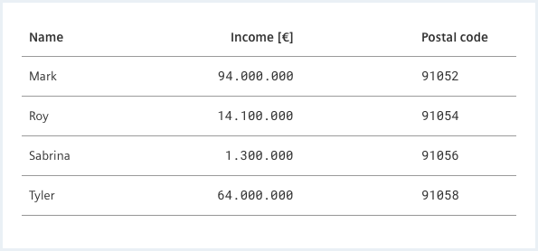
- Align numeric data to the right if the numbers are to be added together.
- Numeric data is left aligned if it represents an ID, date or time.
It is recommended to use a monospace font for numeric values within a data table. This type of typography is much easier to scan and compare because all characters are the same size and are not proportionally spaced.
Behavior
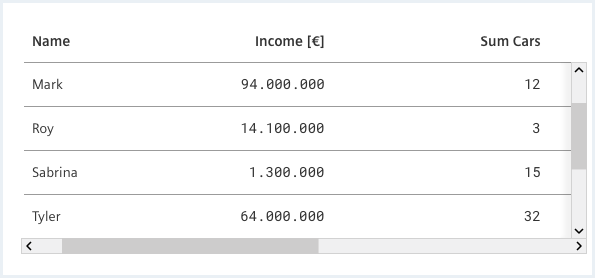
Scrolling behavior
Multi-Column Sorting
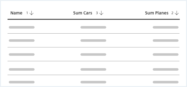
It is possible to sort by multiple columns. The default action for multiple column sorting is to hold down e.g. the ‘Shift’ key while clicking the column header.
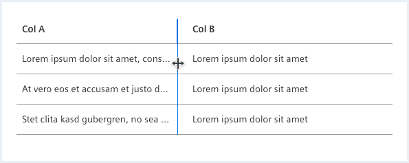
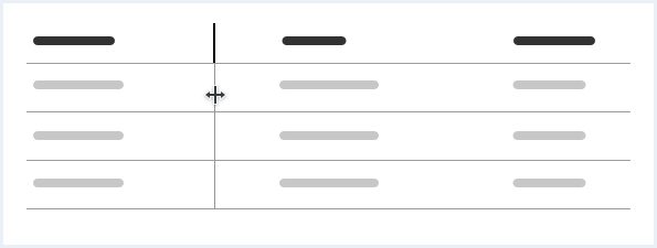
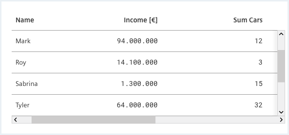
Resizable columns
Hide / show columns
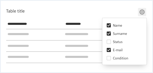
It is possible to select multiple columns and hide or show them in the displayed data table view.
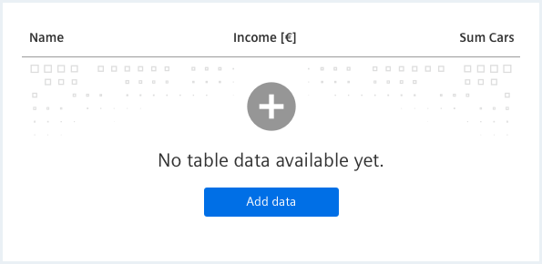
Empty state
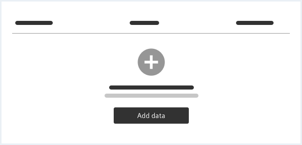
If the user loads the data table within the application interface and no data source has been predefined in the workflow, the empty state of the data table is displayed. This empty state shows the table header and a call-to-action message with an optional action button that allows the user to
- start entering new records
- or select an external data source to pull records from and populate the data table.
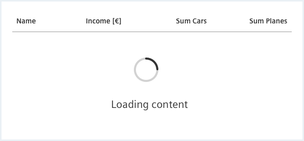
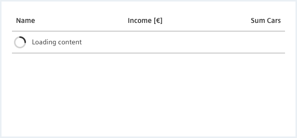
Loading
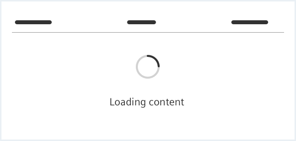
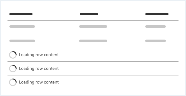
If expected loading / busy time is longer than 1 second, the application should give a “please wait” feedback using a busy indicator.
Dos & Don’ts
Aligning the heading to the column
Style
This chapter shows several data table styles in the User Experience Toolkit.
Content types
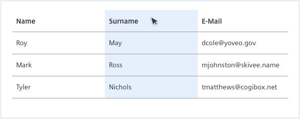
Selection
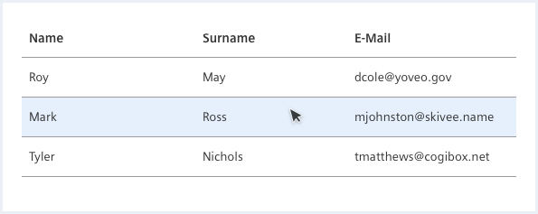
Hover
Sorting

Interaction with lots of information
Empty state
Additional options