System icons
The System icons helps the user to easily identify features and functions.
Icon search
You can click any icon identifier/name to copy it's markup into your clipboard.
Regular
Bold
Filled
Usage
When to use
Use system icons in the following cases:
- For buttons, to support the meaning of the label.
- For other elements, to visually structure or help identify the elements.
- To replace large text in minute spaces.
Types
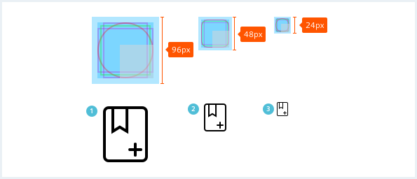
The system icons are available in the following sizes:
- 24x24px
- 16x16px
- 8x8px
These are scalable in a ratio @2x. It is recommended to have a minimum of 2x2 units for the smallest part of any icon. Since pixel perfection is preferred, do not use halftone dots.

Categories
The following categories are available: action, alert, audiovisual, communication, content, device, editor, file, hardware, image, map, navigation, notification, places, social and toggle. Each icon shall be assigned to one specific category.

General construction
1. Consistent visual language
Icons with related meaning should keep the primary image content consistent to make them easy to recognize.

2. Grid
Maintain the grid accuracy and do not dismiss safety margin. Since the icons must also work for very small sizes, low resolution of icons must be handled carefully while designing.

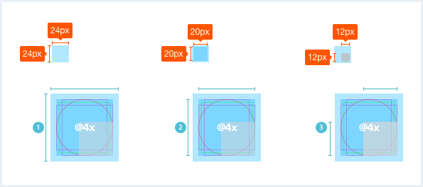
3. Recommended maximum sizes
Depending on the format, the icons differ in their perceived size. This difference should be considered when designing and should be balanced.

Options
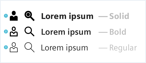
Use the icons in regular style for standard use. Solid icons are used for active or pressed states. The bold variant is a supplement to the two basic versions. It is used additionally when the two standard versions are not sufficient.


Do’s & Don’ts

- Maintain consistency with the font weights in the same context and state.
- Do not use different font weights of icons within the same context and with the same state or importance.
Style
This chapter shows several system icon styles in the User Experience Toolkit.
Overview
Buttons

Messages

Color
As a rule, icons inherit their color from sibling or parent elements. However, depending on the state or context of the icon, the color can be chosen within a reasonable range of contrast.
Sizing and Spacing
Scaling
It is always recommended to scale icons by the factor of two.

Actual sizes

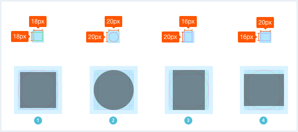
Visual equalization
Visual equalization is necessary to make the icons look the same size.

Please note that the icons delivered with this web-font only work when encapsulated / contained within an element with the .uxt .uxt-defaults classes.
Icon integration
<i aria-hidden="true" class="iconUxt grid"></i>
<i aria-hidden="true" class="iconUxt grid bold"></i>
<i aria-hidden="true" class="iconUxt grid filled"></i>
We offer some utility classes in order to rotate, flip, or mirror an icon:
Icon utility classes
<i aria-hidden="true" class="iconUxt image"></i>
<i aria-hidden="true" class="iconUxt image is-rotated-90"></i>
<i aria-hidden="true" class="iconUxt image is-rotated-180"></i>
<i aria-hidden="true" class="iconUxt image is-rotated-270"></i>
<i aria-hidden="true" class="iconUxt image is-flipped-vertical"></i>
<i aria-hidden="true" class="iconUxt image is-flipped-horizontal"></i>
<i aria-hidden="true" class="iconUxt image is-flipped"></i>