App icons
Your application icon is the first way to communicate the benefits of your application.
Overview
Your Insights Hub or Industrial IoT application requires an icon, which is displayed in the Store, websites, Launchpad and more.
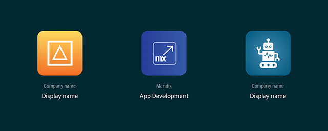
Creating your App icon
An App icon is always displayed with your company name and the application’s name.
- App icon: The design of your App icon must be distinctively different from the design of icons used by Siemens as part of their Services (e.g. Asset Manager, Fleet Manager, Settings). See the different applications below.
- Company name: Your registered company name must be attached to the application icon to clearly indicate that you are the provider of the application.
- Display name: Every application needs to have an unique display name. The name of the application is important so that potential customers get a clear understanding of what your application offers.
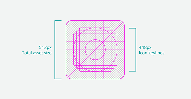
Icon artwork can populate the entire asset space, or you can design and position artwork elements onto the keyline grid. When placing your artwork, use keylines as a guideline, not a hard rule. When creating your icon, ensure it conforms to the following:
| Attribute | Value |
|---|---|
| Icon size | 512px x 512px |
| File format | 32-bit PNG or SVG |
| Color Space | sRGB |
| Recommended file size | < 100 KB |
Keep the following guidelines and advices in mind when designing the App icon in order to avoid common pitfalls and mistakes.
Simplicity
Find an element that captures the idea of your app and express that element in a simple, unique icon. If an icon’s content or shape is overly complex, the details can be hard to discern. Aim to capture attention that clearly identifies your app.
Recognizability
People shouldn’t have to analyze the icon to figure out what it represents. Take time to design a beautiful and simplistic icon that represents your app’s purpose.
Background
Make sure your icon stands out, and don’t over complicate the background. Give it a simple background so it doesn’t overpower the app icon.
Usage of words and terms
An app’s name appears below its icon on the dashboard. Don’t include nonessential words that repeat the name. If your design includes any text, emphasize words that relate to the actual content your app offers.
Usage of Photos and Screenshots
Screenshots are too complex for an App icon and don’t help communicate your app’s purpose. Interface elements in an icon can be misleading and confusing. Using a photo or a complex texture is not advised as it will not clearly define your app’s purpose.
Context and testing
Your icon will be displayed in the Store, websites, Launchpad and more, which may vary in background colors. See how your icon looks against a light and dark color for accessibility reasons.
Different applications
The App icons shown in the Store, websites, Launchpad and more, use a visual differentiation so that users can quickly distinguish between an application from a third-party, Siemens and a system tool, which are the default Insights Hub and Industrial IoT applications.
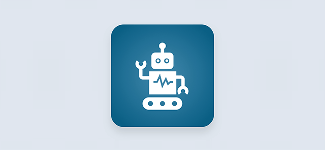
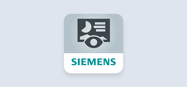
The documentation for SIEMENS app icons can be found at Siemens Brandville (External login).
The documentation for System tool icons can be found at Siemens Brandville (External login).