List
A list displays related content in a vertical format.
Usage
When to use
Use a list in the following cases:
- To display and interact with simple pieces of data in a consistent format in the main region of an application.
- Don’t use a list for displaying complex datasets: Consider using a table instead.
- Don’t use a list to show a collection of items inside of a navigation- or selection-component: Use a list navigation instead.
Types
There are the following list types:
List
A list in the main region uses 100% width of the region. A list has larger spacings than a compact list.
Compact list
A compact list is used in container elements. It has smaller spacings than a list and shows fewer information and attributes.
It is used to:
- Structure content into logical sections.
- Prevent that small amounts of content is visually spread out too far and becomes hard to read.
General construction
A list consists of the following elements:
1. List item
- List item information quantity can vary.
- A list item contains at least a label.
- A consistent format helps the user to scan and read the content efficiently.
2. Left action
Possible left action elements are the following:
- Move handle
- Selection component (checkbox or radio button)
3. Supporting visual
- A supporting visual is optional.
- A supporting visual may be an icon, pictogram (for example avatar) or image.
- Use only one type of visualization.
4. Label
- A label is mandatory.
5. Description and additional information
- A description text is optional.
- Use a description text to give additional content-related information.
- Possible additional information elements are the following:
- Meta information
- Badge
- Flag
- Severity state
6. Right action
Possible additional right action elements are the following but should be restricted to not more then 3 actions:
- Secondary button
- Ghost button (for a `more` menu containing an arbitrary number of actions)
7. Item status (optional)
Sets the status for an item, such as success, information, error etc. This status is optional.
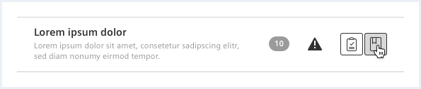
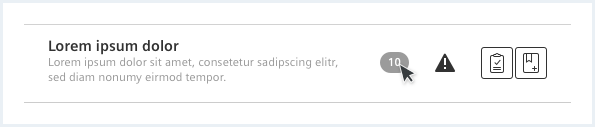
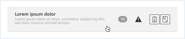
Behavior
Feedback of clickable items
Feedback of clickable items to mouse interaction:
Do’s & Don’ts
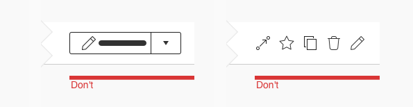
- Use a more menu for more than three right actions.
- Don’t use more than 3 buttons per list item.
- Don’t use split buttons for right actions.
Style
This chapter shows several list styles in the User Experience Toolkit.
Overview
List
Compact list
Supporting visual
- Icon, 2. Pictogram (for example avatar)
Left action
- Checkbox, 2. Radio button, 3. Move handle
Typography
The following table gives reference to the different font sizes and weights:
| Name | State | Font-family | Font-size | Line-height | Text-align |
|---|---|---|---|---|---|
| Label | all | Siemens Sans Bold | 14px | 20px | left |
| Description | all | Siemens Sans Roman | 12px | 15px | left |
Sizing and spacing
The following measurements show the dimensions for this component:
General
Per default a list item uses 100% of the region or container it is in.
List
Compact list
Supporting visual
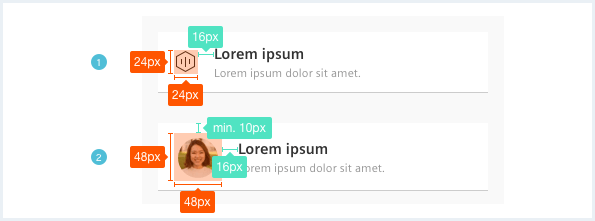
Left action (optional)
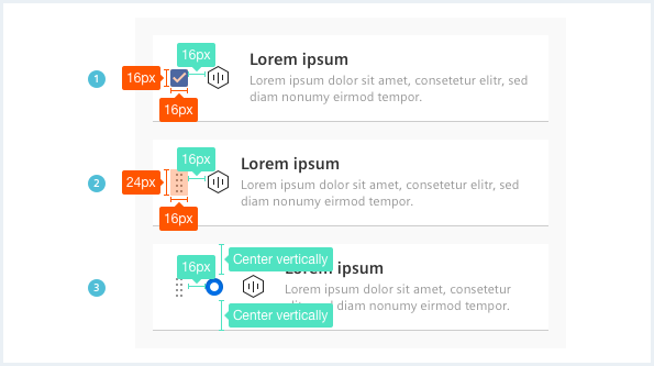
To align content in different columns, the .item__content column/wrapper elements have to be used.
To see a detailed explanation of all existing helper and debug classes, please refer to the usage table below.
List
Pump overheat
This event happened 3 times, the last time 2 hours and 23 minutes ago, at 10:48am Oct. 2nd 20203Pump busy
This event happened 3 times during measurementPump busy
This event happened 3 times during measurement
<div class="list">
    <ul class="list__list">
        <li class="list__item is-info">
            <div class="item__icon">
                <span class="iconUxt asset" aria-hidden="true"></span>
            </div>
            <div class="item__content">
                <div class="content__column content__column--primary has-default-width-50 sm-60 xs-100">
                    <h4 class="item__title">
                        Pump maintenance
                    </h4>
                    <div class="item__description">
                        This event happened <a href="#">10 minutes ago, at 08:48pm Oct. 3rd 2020</a>
                    </div>
                </div>
                <div class="content__column has-default-width-10 xl-10 xs-hide sm-hide">
                    <div class="item__meta">
                        Informal
                    </div>
                </div>
                <div class="content__column has-default-width-10 sm-10">
                    <i aria-hidden="true" class="iconUxt attention filled has-color-primary"></i>
                </div>
                <div class="content__column has-default-width-10 sm-10">
                    <span class="badge has-bgColor-base600 has-color-base1000">
                        1
                    </span>
                </div>
                <div class="content__column has-default-width-20 has-alignment-right">
                    <button class="button button--secondary has-icon-only">
                        <span class="iconUxt edit" aria-hidden="true"></span>
                    </button>
                    <button class="button button--secondary has-icon-only">
                        <span class="iconUxt clipboardCheck" aria-hidden="true"></span>
                    </button>
                    <button class="button button--ghost has-icon-only">
                        <span class="iconUxt bold more" aria-hidden="true"></span>
                    </button>
                </div>
            </div>
        </li>
        <li class="list__item is-warning">
            <div class="item__icon">
                <span class="iconUxt asset" aria-hidden="true"></span>
            </div>
            <div class="item__content">
                <div class="content__column content__column--primary has-default-width-50 sm-60 xs-100">
                    <h4 class="item__title">
                        Pump overheat
                    </h4>
                    <div class="item__description">
                        This event happened 3 times, the last time <a href="#">2 hours and 23 minutes ago, at 10:48am Oct. 2nd 2020</a>
                    </div>
                </div>
                <div class="content__column has-default-width-10 xl-10 xs-hide sm-hide">
                    <div class="item__meta">
                        Uncritical
                    </div>
                </div>
                <div class="content__column has-default-width-10 sm-10">
                    <i aria-hidden="true" class="iconUxt errorAlert filled has-color-warning"></i>
                </div>
                <div class="content__column has-default-width-10 sm-10">
                    <span class="badge has-bgColor-base600 has-color-base1000">
                        3
                    </span>
                </div>
                <div class="content__column has-default-width-20 has-alignment-right">
                    <button class="button button--secondary has-icon-only">
                        <span class="iconUxt clipboardCheck" aria-hidden="true"></span>
                    </button>
                    <button class="button button--ghost has-icon-only">
                        <span class="iconUxt bold more" aria-hidden="true"></span>
                    </button>
                </div>
            </div>
        </li>
        <li class="list__item">
            <div class="item__icon">
                <span class="iconUxt asset" aria-hidden="true"></span>
            </div>
            <div class="item__content">
                <div class="content__column content__column--primary has-default-width-50 sm-60 xs-100">
                    <h4 class="item__title">
                        Pump busy
                    </h4>
                    <div class="item__description">
                        This event happened 3 times during measurement
                    </div>
                </div>
                <div class="content__column has-default-width-10 xl-10 xs-hide sm-hide">
                    <div class="item__meta">

                    </div>
                </div>
                <div class="content__column has-default-width-10 sm-10">

                </div>
                <div class="content__column has-default-width-10 sm-10">

                </div>
                <div class="content__column has-default-width-20 has-alignment-right">
                    <button class="button button--secondary has-icon-only">
                        <span class="iconUxt clipboardCheck" aria-hidden="true"></span>
                    </button>
                    <button class="button button--ghost has-icon-only">
                        <span class="iconUxt bold more" aria-hidden="true"></span>
                    </button>
                </div>
            </div>
        </li>
        <li class="list__item is-selected">
            <div class="item__icon">
                <span class="iconUxt asset" aria-hidden="true"></span>
            </div>
            <div class="item__content">
                <div class="content__column content__column--primary has-default-width-50 sm-60 xs-100">
                    <h4 class="item__title">
                        Pump busy
                    </h4>
                    <div class="item__description">
                        This event happened 3 times during measurement
                    </div>
                </div>
                <div class="content__column has-default-width-10 xl-10 xs-hide sm-hide">
                    <div class="item__meta">

                    </div>
                </div>
                <div class="content__column has-default-width-10 sm-10">

                </div>
                <div class="content__column has-default-width-10 sm-10">

                </div>
                <div class="content__column has-default-width-20 has-alignment-right">
                    <button class="button button--secondary has-icon-only">
                        <span class="iconUxt clipboardCheck" aria-hidden="true"></span>
                    </button>
                    <button class="button button--ghost has-icon-only">
                        <span class="iconUxt bold more" aria-hidden="true"></span>
                    </button>
                </div>
            </div>
        </li>
        <li class="list__item is-error">
            <div class="item__icon">
                <span class="iconUxt asset" aria-hidden="true"></span>
            </div>
            <div class="item__content">
                <div class="content__column content__column--primary has-default-width-50 sm-60 xs-100">
                    <h4 class="item__title">
                        Pump breakdown
                    </h4>
                    <div class="item__description">
                        This event happened 121 times, last time <a href="#">3 days ago, at 04:18am Oct. 1st 2020</a>
                    </div>
                </div>
                <div class="content__column has-default-width-10 xl-10 xs-hide sm-hide">
                    <div class="item__meta">
                        Critical
                    </div>
                </div>
                <div class="content__column has-default-width-10 sm-10">
                    <i aria-hidden="true" class="iconUxt errorAlert filled has-color-error"></i>
                </div>
                <div class="content__column has-default-width-10 sm-10">
                    <span class="badge has-bgColor-base600 has-color-base1000">
                        121
                    </span>
                </div>
                <div class="content__column has-default-width-20 has-alignment-right">
                    <button class="button button--secondary has-icon-only">
                        <span class="iconUxt edit" aria-hidden="true"></span>
                    </button>
                    <button class="button button--secondary has-icon-only">
                        <span class="iconUxt clipboardCheck" aria-hidden="true"></span>
                    </button>
                    <button class="button button--ghost has-icon-only">
                        <span class="iconUxt bold more" aria-hidden="true"></span>
                    </button>
                </div>
            </div>
        </li>
    </ul>
</div>
List with bold indicators
Pump overheat
This event happened 3 times, the last time 2 hours and 23 minutes ago, at 10:48am Oct. 2nd 20203
<div class="list">
    <ul class="list__list">
        <li class="list__item is-info has-indicator-bold">
            <div class="item__icon">
                <span class="iconUxt asset" aria-hidden="true"></span>
            </div>
            <div class="item__content">
                <div class="content__column content__column--primary has-default-width-50 sm-60 xs-100">
                    <h4 class="item__title">
                        Pump maintenance
                    </h4>
                    <div class="item__description">
                        This event happened <a href="#">10 minutes ago, at 08:48pm Oct. 3rd 2020</a>
                    </div>
                </div>
                <div class="content__column has-default-width-10 xl-10 xs-hide sm-hide">
                    <div class="item__meta">
                        Informal
                    </div>
                </div>
                <div class="content__column has-default-width-10 sm-10">
                    <i aria-hidden="true" class="iconUxt attention filled has-color-primary"></i>
                </div>
                <div class="content__column has-default-width-10 sm-10">
                    <span class="badge has-bgColor-base600 has-color-base1000">
                        1
                    </span>
                </div>
                <div class="content__column has-default-width-20 has-alignment-right">
                    <button class="button button--secondary has-icon-only">
                        <span class="iconUxt edit" aria-hidden="true"></span>
                    </button>
                    <button class="button button--secondary has-icon-only">
                        <span class="iconUxt clipboardCheck" aria-hidden="true"></span>
                    </button>
                    <button class="button button--ghost has-icon-only">
                        <span class="iconUxt bold more" aria-hidden="true"></span>
                    </button>
                </div>
            </div>
        </li>
        <li class="list__item is-warning has-indicator-bold">
            <div class="item__icon">
                <span class="iconUxt asset" aria-hidden="true"></span>
            </div>
            <div class="item__content">
                <div class="content__column content__column--primary has-default-width-50 sm-60 xs-100">
                    <h4 class="item__title">
                        Pump overheat
                    </h4>
                    <div class="item__description">
                        This event happened 3 times, the last time <a href="#">2 hours and 23 minutes ago, at 10:48am Oct. 2nd 2020</a>
                    </div>
                </div>
                <div class="content__column has-default-width-10 xl-10 xs-hide sm-hide">
                    <div class="item__meta">
                        Uncritical
                    </div>
                </div>
                <div class="content__column has-default-width-10 sm-10">
                    <i aria-hidden="true" class="iconUxt errorAlert filled has-color-warning"></i>
                </div>
                <div class="content__column has-default-width-10 sm-10">
                    <span class="badge has-bgColor-base600 has-color-base1000">
                        3
                    </span>
                </div>
                <div class="content__column has-default-width-20 has-alignment-right">
                    <button class="button button--secondary has-icon-only">
                        <span class="iconUxt clipboardCheck" aria-hidden="true"></span>
                    </button>
                    <button class="button button--ghost has-icon-only">
                        <span class="iconUxt bold more" aria-hidden="true"></span>
                    </button>
                </div>
            </div>
        </li>
        <li class="list__item is-error has-indicator-bold">
            <div class="item__icon">
                <span class="iconUxt asset" aria-hidden="true"></span>
            </div>
            <div class="item__content">
                <div class="content__column content__column--primary has-default-width-50 sm-60 xs-100">
                    <h4 class="item__title">
                        Pump breakdown
                    </h4>
                    <div class="item__description">
                        This event happened 121 times, last time <a href="#">3 days ago, at 04:18am Oct. 1st 2020</a>
                    </div>
                </div>
                <div class="content__column has-default-width-10 xl-10 xs-hide sm-hide">
                    <div class="item__meta">
                        Critical
                    </div>
                </div>
                <div class="content__column has-default-width-10 sm-10">
                    <i aria-hidden="true" class="iconUxt errorAlert filled has-color-error"></i>
                </div>
                <div class="content__column has-default-width-10 sm-10">
                    <span class="badge has-bgColor-base600 has-color-base1000">
                        121
                    </span>
                </div>
                <div class="content__column has-default-width-20 has-alignment-right">
                    <button class="button button--secondary has-icon-only">
                        <span class="iconUxt edit" aria-hidden="true"></span>
                    </button>
                    <button class="button button--secondary has-icon-only">
                        <span class="iconUxt clipboardCheck" aria-hidden="true"></span>
                    </button>
                    <button class="button button--ghost has-icon-only">
                        <span class="iconUxt bold more" aria-hidden="true"></span>
                    </button>
                </div>
            </div>
        </li>
    </ul>
</div>
List with checkboxes
Pump overheat
This event happened 3 times, the last time 2 hours and 23 minutes ago, at 10:48am Oct. 2nd 20203Pump busy
This event happened 3 times during measurementPump busy
This event happened 3 times during measurement
<div class="list">
    <ul class="list__list">
        <li class="list__item is-info">
            <div class="item__checkbox">
                <input type="checkbox" id="checkboxList01" value="checkbox01" />
            </div>
            <div class="item__icon">
                <span class="iconUxt asset" aria-hidden="true"></span>
            </div>
            <div class="item__content">
                <div class="content__column content__column--primary has-default-width-50 sm-60 xs-100">
                    <h4 class="item__title">
                        Pump maintenance
                    </h4>
                    <div class="item__description">
                        This event happened <a href="#">10 minutes ago, at 08:48pm Oct. 3rd 2020</a>
                    </div>
                </div>
                <div class="content__column has-default-width-10 xl-10 xs-hide sm-hide">
                    <div class="item__meta">
                        Informal
                    </div>
                </div>
                <div class="content__column has-default-width-10 sm-10">
                    <i aria-hidden="true" class="iconUxt attention filled has-color-primary"></i>
                </div>
                <div class="content__column has-default-width-10 sm-10">
                    <span class="badge has-bgColor-base600 has-color-base1000">
                        1
                    </span>
                </div>
                <div class="content__column has-default-width-20 has-alignment-right">
                    <button class="button--secondary has-icon-only">
                        <span class="iconUxt edit" aria-hidden="true"></span>
                    </button>
                    <button class="button--secondary has-icon-only">
                        <span class="iconUxt clipboardCheck" aria-hidden="true"></span>
                    </button>
                    <button class="button button--ghost has-icon-only">
                        <span class="iconUxt bold more" aria-hidden="true"></span>
                    </button>
                </div>
            </div>
        </li>
        <li class="list__item is-warning">
            <div class="item__checkbox">
                <input type="checkbox" id="checkboxList02" value="checkbox01" />
            </div>
            <div class="item__icon">
                <span class="iconUxt asset" aria-hidden="true"></span>
            </div>
            <div class="item__content">
                <div class="content__column content__column--primary has-default-width-50 sm-60 xs-100">
                    <h4 class="item__title">
                        Pump overheat
                    </h4>
                    <div class="item__description">
                        This event happened 3 times, the last time <a href="#">2 hours and 23 minutes ago, at 10:48am Oct. 2nd 2020</a>
                    </div>
                </div>
                <div class="content__column has-default-width-10 xl-10 xs-hide sm-hide">
                    <div class="item__meta">
                        Uncritical
                    </div>
                </div>
                <div class="content__column has-default-width-10 sm-10">
                    <i aria-hidden="true" class="iconUxt errorAlert filled has-color-warning"></i>
                </div>
                <div class="content__column has-default-width-10 sm-10">
                    <span class="badge has-bgColor-base600 has-color-base1000">
                        3
                    </span>
                </div>
                <div class="content__column has-default-width-20 has-alignment-right">
                    <button class="button--secondary has-icon-only">
                        <span class="iconUxt clipboardCheck" aria-hidden="true"></span>
                    </button>
                    <button class="button button--ghost has-icon-only">
                        <span class="iconUxt bold more" aria-hidden="true"></span>
                    </button>
                </div>
            </div>
        </li>
        <li class="list__item">
            <div class="item__checkbox">
                <input type="checkbox" id="checkboxList03" value="checkbox01" />
            </div>
            <div class="item__icon">
                <span class="iconUxt asset" aria-hidden="true"></span>
            </div>
            <div class="item__content">
                <div class="content__column content__column--primary has-default-width-50 sm-60 xs-100">
                    <h4 class="item__title">
                        Pump busy
                    </h4>
                    <div class="item__description">
                        This event happened 3 times during measurement
                    </div>
                </div>
                <div class="content__column has-default-width-10 xl-10 xs-hide sm-hide">
                    <div class="item__meta">

                    </div>
                </div>
                <div class="content__column has-default-width-10 sm-10">

                </div>
                <div class="content__column has-default-width-10 sm-10">

                </div>
                <div class="content__column has-default-width-20 has-alignment-right">
                    <button class="button--secondary has-icon-only">
                        <span class="iconUxt clipboardCheck" aria-hidden="true"></span>
                    </button>
                    <button class="button button--ghost has-icon-only">
                        <span class="iconUxt bold more" aria-hidden="true"></span>
                    </button>
                </div>
            </div>
        </li>
        <li class="list__item is-selected">
            <div class="item__checkbox">
                <input type="checkbox" id="checkboxList04" value="checkbox01" />
            </div>
            <div class="item__icon">
                <span class="iconUxt asset" aria-hidden="true"></span>
            </div>
            <div class="item__content">
                <div class="content__column content__column--primary has-default-width-50 sm-60 xs-100">
                    <h4 class="item__title">
                        Pump busy
                    </h4>
                    <div class="item__description">
                        This event happened 3 times during measurement
                    </div>
                </div>
                <div class="content__column has-default-width-10 xl-10 xs-hide sm-hide">
                    <div class="item__meta">

                    </div>
                </div>
                <div class="content__column has-default-width-10 sm-10">

                </div>
                <div class="content__column has-default-width-10 sm-10">

                </div>
                <div class="content__column has-default-width-20 has-alignment-right">
                    <button class="button--secondary has-icon-only">
                        <span class="iconUxt clipboardCheck" aria-hidden="true"></span>
                    </button>
                    <button class="button button--ghost has-icon-only">
                        <span class="iconUxt bold more" aria-hidden="true"></span>
                    </button>
                </div>
            </div>
        </li>
        <li class="list__item is-error">
            <div class="item__checkbox">
                <input type="checkbox" id="checkboxList05" value="checkbox01" />
            </div>
            <div class="item__icon">
                <span class="iconUxt asset" aria-hidden="true"></span>
            </div>
            <div class="item__content">
                <div class="content__column content__column--primary has-default-width-50 sm-60 xs-100">
                    <h4 class="item__title">
                        Pump breakdown
                    </h4>
                    <div class="item__description">
                        This event happened 121 times, last time <a href="#">3 days ago, at 04:18am Oct. 1st 2020</a>
                    </div>
                </div>
                <div class="content__column has-default-width-10 xl-10 xs-hide sm-hide">
                    <div class="item__meta">
                        Critical
                    </div>
                </div>
                <div class="content__column has-default-width-10 sm-10">
                    <i aria-hidden="true" class="iconUxt errorAlert filled has-color-error"></i>
                </div>
                <div class="content__column has-default-width-10 sm-10">
                    <span class="badge has-bgColor-base600 has-color-base1000">
                        121
                    </span>
                </div>
                <div class="content__column has-default-width-20 has-alignment-right">
                    <button class="button--secondary has-icon-only">
                        <span class="iconUxt edit" aria-hidden="true"></span>
                    </button>
                    <button class="button--secondary has-icon-only">
                        <span class="iconUxt clipboardCheck" aria-hidden="true"></span>
                    </button>
                    <button class="button button--ghost has-icon-only">
                        <span class="iconUxt bold more" aria-hidden="true"></span>
                    </button>
                </div>
            </div>
        </li>
    </ul>
</div>
Compact list
Pump overheat
This event happened 3 times, the last time 2 hours and 23 minutes ago, at 10:48am Oct. 2nd 20203Pump busy
This event happened 3 times during measurementPump busy
This event happened 3 times during measurement
<div class="list list--compact">
    <ul class="list__list">
        <li class="list__item is-info">
            <div class="item__icon">
                <span class="iconUxt asset" aria-hidden="true"></span>
            </div>
            <div class="item__content">
                <div class="content__column content__column--primary has-default-width-50 sm-60 xs-100">
                    <h4 class="item__title">
                        Pump maintenance
                    </h4>
                    <div class="item__description">
                        This event happened <a href="#">10 minutes ago, at 08:48pm Oct. 3rd 2020</a>
                    </div>
                </div>
                <div class="content__column has-default-width-10 xl-10 xs-hide sm-hide">
                    <div class="item__meta">
                        Informal
                    </div>
                </div>
                <div class="content__column has-default-width-10 sm-10">
                    <i aria-hidden="true" class="iconUxt attention filled has-color-primary"></i>
                </div>
                <div class="content__column has-default-width-10 sm-10">
                    <span class="badge has-bgColor-base600 has-color-base1000">
                        1
                    </span>
                </div>
                <div class="content__column has-default-width-20 has-alignment-right">
                    <button class="button button--secondary has-icon-only">
                        <span class="iconUxt edit" aria-hidden="true"></span>
                    </button>
                    <button class="button button--secondary has-icon-only">
                        <span class="iconUxt clipboardCheck" aria-hidden="true"></span>
                    </button>
                    <button class="button button--ghost has-icon-only">
                        <span class="iconUxt bold more" aria-hidden="true"></span>
                    </button>
                </div>
            </div>
        </li>
        <li class="list__item is-warning">
            <div class="item__icon">
                <span class="iconUxt asset" aria-hidden="true"></span>
            </div>
            <div class="item__content">
                <div class="content__column content__column--primary has-default-width-50 sm-60 xs-100">
                    <h4 class="item__title">
                        Pump overheat
                    </h4>
                    <div class="item__description">
                        This event happened 3 times, the last time <a href="#">2 hours and 23 minutes ago, at 10:48am Oct. 2nd 2020</a>
                    </div>
                </div>
                <div class="content__column has-default-width-10 xl-10 xs-hide sm-hide">
                    <div class="item__meta">
                        Uncritical
                    </div>
                </div>
                <div class="content__column has-default-width-10 sm-10">
                    <i aria-hidden="true" class="iconUxt errorAlert filled has-color-warning"></i>
                </div>
                <div class="content__column has-default-width-10 sm-10">
                    <span class="badge has-bgColor-base600 has-color-base1000">
                        3
                    </span>
                </div>
                <div class="content__column has-default-width-20 has-alignment-right">
                    <button class="button button--secondary has-icon-only">
                        <span class="iconUxt clipboardCheck" aria-hidden="true"></span>
                    </button>
                    <button class="button button--ghost has-icon-only">
                        <span class="iconUxt bold more" aria-hidden="true"></span>
                    </button>
                </div>
            </div>
        </li>
        <li class="list__item">
            <div class="item__icon">
                <span class="iconUxt asset" aria-hidden="true"></span>
            </div>
            <div class="item__content">
                <div class="content__column content__column--primary has-default-width-50 sm-60 xs-100">
                    <h4 class="item__title">
                        Pump busy
                    </h4>
                    <div class="item__description">
                        This event happened 3 times during measurement
                    </div>
                </div>
                <div class="content__column has-default-width-10 xl-10 xs-hide sm-hide">
                    <div class="item__meta">

                    </div>
                </div>
                <div class="content__column has-default-width-10 sm-10">

                </div>
                <div class="content__column has-default-width-10 sm-10">

                </div>
                <div class="content__column has-default-width-20 has-alignment-right">
                    <button class="button button--secondary has-icon-only">
                        <span class="iconUxt clipboardCheck" aria-hidden="true"></span>
                    </button>
                    <button class="button button--ghost has-icon-only">
                        <span class="iconUxt bold more" aria-hidden="true"></span>
                    </button>
                </div>
            </div>
        </li>
        <li class="list__item is-selected">
            <div class="item__icon">
                <span class="iconUxt asset" aria-hidden="true"></span>
            </div>
            <div class="item__content">
                <div class="content__column content__column--primary has-default-width-50 sm-60 xs-100">
                    <h4 class="item__title">
                        Pump busy
                    </h4>
                    <div class="item__description">
                        This event happened 3 times during measurement
                    </div>
                </div>
                <div class="content__column has-default-width-10 xl-10 xs-hide sm-hide">
                    <div class="item__meta">

                    </div>
                </div>
                <div class="content__column has-default-width-10 sm-10">

                </div>
                <div class="content__column has-default-width-10 sm-10">

                </div>
                <div class="content__column has-default-width-20 has-alignment-right">
                    <button class="button button--secondary has-icon-only">
                        <span class="iconUxt clipboardCheck" aria-hidden="true"></span>
                    </button>
                    <button class="button button--ghost has-icon-only">
                        <span class="iconUxt bold more" aria-hidden="true"></span>
                    </button>
                </div>
            </div>
        </li>
        <li class="list__item is-error">
            <div class="item__icon">
                <span class="iconUxt asset" aria-hidden="true"></span>
            </div>
            <div class="item__content">
                <div class="content__column content__column--primary has-default-width-50 sm-60 xs-100">
                    <h4 class="item__title">
                        Pump breakdown
                    </h4>
                    <div class="item__description">
                        This event happened 121 times, last time <a href="#">3 days ago, at 04:18am Oct. 1st 2020</a>
                    </div>
                </div>
                <div class="content__column has-default-width-10 xl-10 xs-hide sm-hide">
                    <div class="item__meta">
                        Critical
                    </div>
                </div>
                <div class="content__column has-default-width-10 sm-10">
                    <i aria-hidden="true" class="iconUxt errorAlert filled has-color-error"></i>
                </div>
                <div class="content__column has-default-width-10 sm-10">
                    <span class="badge has-bgColor-base600 has-color-base1000">
                        121
                    </span>
                </div>
                <div class="content__column has-default-width-20 has-alignment-right">
                    <button class="button button--secondary has-icon-only">
                        <span class="iconUxt edit" aria-hidden="true"></span>
                    </button>
                    <button class="button button--secondary has-icon-only">
                        <span class="iconUxt clipboardCheck" aria-hidden="true"></span>
                    </button>
                    <button class="button button--ghost has-icon-only">
                        <span class="iconUxt bold more" aria-hidden="true"></span>
                    </button>
                </div>
            </div>
        </li>
    </ul>
</div>
Compact list with checkboxes
Pump overheat
This event happened 3 times, the last time 2 hours and 23 minutes ago, at 10:48am Oct. 2nd 20203Pump busy
This event happened 3 times during measurementPump busy
This event happened 3 times during measurement
<div class="list list--compact">
    <ul class="list__list">
        <li class="list__item is-info">
            <div class="item__checkbox">
                <input type="checkbox" id="checkboxList01b" value="checkbox01" />
            </div>
            <div class="item__icon">
                <span class="iconUxt asset" aria-hidden="true"></span>
            </div>
            <div class="item__content">
                <div class="content__column content__column--primary has-default-width-50 sm-60 xs-100">
                    <h4 class="item__title">
                        Pump maintenance
                    </h4>
                    <div class="item__description">
                        This event happened <a href="#">10 minutes ago, at 08:48pm Oct. 3rd 2020</a>
                    </div>
                </div>
                <div class="content__column has-default-width-10 xl-10 xs-hide sm-hide">
                    <div class="item__meta">
                        Informal
                    </div>
                </div>
                <div class="content__column has-default-width-10 sm-10">
                    <i aria-hidden="true" class="iconUxt attention filled has-color-primary"></i>
                </div>
                <div class="content__column has-default-width-10 sm-10">
                    <span class="badge has-bgColor-base600 has-color-base1000">
                        1
                    </span>
                </div>
                <div class="content__column has-default-width-20 has-alignment-right">
                    <button class="button button--secondary has-icon-only">
                        <span class="iconUxt edit" aria-hidden="true"></span>
                    </button>
                    <button class="button button--secondary has-icon-only">
                        <span class="iconUxt clipboardCheck" aria-hidden="true"></span>
                    </button>
                    <button class="button button--ghost has-icon-only">
                        <span class="iconUxt bold more" aria-hidden="true"></span>
                    </button>
                </div>
            </div>
        </li>
        <li class="list__item is-warning">
            <div class="item__checkbox">
                <input type="checkbox" id="checkboxList02b" value="checkbox01" />
            </div>
            <div class="item__icon">
                <span class="iconUxt asset" aria-hidden="true"></span>
            </div>
            <div class="item__content">
                <div class="content__column content__column--primary has-default-width-50 sm-60 xs-100">
                    <h4 class="item__title">
                        Pump overheat
                    </h4>
                    <div class="item__description">
                        This event happened 3 times, the last time <a href="#">2 hours and 23 minutes ago, at 10:48am Oct. 2nd 2020</a>
                    </div>
                </div>
                <div class="content__column has-default-width-10 xl-10 xs-hide sm-hide">
                    <div class="item__meta">
                        Uncritical
                    </div>
                </div>
                <div class="content__column has-default-width-10 sm-10">
                    <i aria-hidden="true" class="iconUxt errorAlert filled has-color-warning"></i>
                </div>
                <div class="content__column has-default-width-10 sm-10">
                    <span class="badge has-bgColor-base600 has-color-base1000">
                        3
                    </span>
                </div>
                <div class="content__column has-default-width-20 has-alignment-right">
                    <button class="button button--secondary has-icon-only">
                        <span class="iconUxt clipboardCheck" aria-hidden="true"></span>
                    </button>
                    <button class="button button--ghost has-icon-only">
                        <span class="iconUxt bold more" aria-hidden="true"></span>
                    </button>
                </div>
            </div>
        </li>
        <li class="list__item">
            <div class="item__checkbox">
                <input type="checkbox" id="checkboxList03b" value="checkbox01" />
            </div>
            <div class="item__icon">
                <span class="iconUxt asset" aria-hidden="true"></span>
            </div>
            <div class="item__content">
                <div class="content__column content__column--primary has-default-width-50 sm-60 xs-100">
                    <h4 class="item__title">
                        Pump busy
                    </h4>
                    <div class="item__description">
                        This event happened 3 times during measurement
                    </div>
                </div>
                <div class="content__column has-default-width-10 xl-10 xs-hide sm-hide">
                    <div class="item__meta">

                    </div>
                </div>
                <div class="content__column has-default-width-10 sm-10">

                </div>
                <div class="content__column has-default-width-10 sm-10">

                </div>
                <div class="content__column has-default-width-20 has-alignment-right">
                    <button class="button button--secondary has-icon-only">
                        <span class="iconUxt clipboardCheck" aria-hidden="true"></span>
                    </button>
                    <button class="button button--ghost has-icon-only">
                        <span class="iconUxt bold more" aria-hidden="true"></span>
                    </button>
                </div>
            </div>
        </li>
        <li class="list__item is-selected">
            <div class="item__checkbox">
                <input type="checkbox" id="checkboxList04b" value="checkbox01" />
            </div>
            <div class="item__icon">
                <span class="iconUxt asset" aria-hidden="true"></span>
            </div>
            <div class="item__content">
                <div class="content__column content__column--primary has-default-width-50 sm-60 xs-100">
                    <h4 class="item__title">
                        Pump busy
                    </h4>
                    <div class="item__description">
                        This event happened 3 times during measurement
                    </div>
                </div>
                <div class="content__column has-default-width-10 xl-10 xs-hide sm-hide">
                    <div class="item__meta">

                    </div>
                </div>
                <div class="content__column has-default-width-10 sm-10">

                </div>
                <div class="content__column has-default-width-10 sm-10">

                </div>
                <div class="content__column has-default-width-20 has-alignment-right">
                    <button class="button button--secondary has-icon-only">
                        <span class="iconUxt clipboardCheck" aria-hidden="true"></span>
                    </button>
                    <button class="button button--ghost has-icon-only">
                        <span class="iconUxt bold more" aria-hidden="true"></span>
                    </button>
                </div>
            </div>
        </li>
        <li class="list__item is-error">
            <div class="item__checkbox">
                <input type="checkbox" id="checkboxList05b" value="checkbox01" />
            </div>
            <div class="item__icon">
                <span class="iconUxt asset" aria-hidden="true"></span>
            </div>
            <div class="item__content">
                <div class="content__column content__column--primary has-default-width-50 sm-60 xs-100">
                    <h4 class="item__title">
                        Pump breakdown
                    </h4>
                    <div class="item__description">
                        This event happened 121 times, last time <a href="#">3 days ago, at 04:18am Oct. 1st 2020</a>
                    </div>
                </div>
                <div class="content__column has-default-width-10 xl-10 xs-hide sm-hide">
                    <div class="item__meta">
                        Critical
                    </div>
                </div>
                <div class="content__column has-default-width-10 sm-10">
                    <i aria-hidden="true" class="iconUxt errorAlert filled has-color-error"></i>
                </div>
                <div class="content__column has-default-width-10 sm-10">
                    <span class="badge has-bgColor-base600 has-color-base1000">
                        121
                    </span>
                </div>
                <div class="content__column has-default-width-20 has-alignment-right">
                    <button class="button button--secondary has-icon-only">
                        <span class="iconUxt edit" aria-hidden="true"></span>
                    </button>
                    <button class="button button--secondary has-icon-only">
                        <span class="iconUxt clipboardCheck" aria-hidden="true"></span>
                    </button>
                    <button class="button button--ghost has-icon-only">
                        <span class="iconUxt bold more" aria-hidden="true"></span>
                    </button>
                </div>
            </div>
        </li>
    </ul>
</div>
Compact list without icon
Pump overheat
This event happened 3 times, the last time 2 hours and 23 minutes ago, at 10:48am Oct. 2nd 20203Pump busy
This event happened 3 times during measurementPump busy
This event happened 3 times during measurement
<div class="list list--compact">
    <ul class="list__list">
        <li class="list__item is-info">
            <div class="item__content">
                <div class="content__column content__column--primary has-default-width-50 sm-60 xs-100">
                    <h4 class="item__title">
                        Pump maintenance
                    </h4>
                    <div class="item__description">
                        This event happened <a href="#">10 minutes ago, at 08:48pm Oct. 3rd 2020</a>
                    </div>
                </div>
                <div class="content__column has-default-width-10 xl-10 xs-hide sm-hide">
                    <div class="item__meta">
                        Informal
                    </div>
                </div>
                <div class="content__column has-default-width-10 sm-10">
                    <i aria-hidden="true" class="iconUxt attention filled has-color-primary"></i>
                </div>
                <div class="content__column has-default-width-10 sm-10">
                    <span class="badge has-bgColor-base600 has-color-base1000">
                        1
                    </span>
                </div>
                <div class="content__column has-default-width-20 has-alignment-right">
                    <button class="button button--secondary has-icon-only">
                        <span class="iconUxt edit" aria-hidden="true"></span>
                    </button>
                    <button class="button button--secondary has-icon-only">
                        <span class="iconUxt clipboardCheck" aria-hidden="true"></span>
                    </button>
                    <button class="button button--ghost has-icon-only">
                        <span class="iconUxt bold more" aria-hidden="true"></span>
                    </button>
                </div>
            </div>
        </li>
        <li class="list__item is-warning">
            <div class="item__content">
                <div class="content__column content__column--primary has-default-width-50 sm-60 xs-100">
                    <h4 class="item__title">
                        Pump overheat
                    </h4>
                    <div class="item__description">
                        This event happened 3 times, the last time <a href="#">2 hours and 23 minutes ago, at 10:48am Oct. 2nd 2020</a>
                    </div>
                </div>
                <div class="content__column has-default-width-10 xl-10 xs-hide sm-hide">
                    <div class="item__meta">
                        Uncritical
                    </div>
                </div>
                <div class="content__column has-default-width-10 sm-10">
                    <i aria-hidden="true" class="iconUxt errorAlert filled has-color-warning"></i>
                </div>
                <div class="content__column has-default-width-10 sm-10">
                    <span class="badge has-bgColor-base600 has-color-base1000">
                        3
                    </span>
                </div>
                <div class="content__column has-default-width-20 has-alignment-right">
                    <button class="button button--secondary has-icon-only">
                        <span class="iconUxt clipboardCheck" aria-hidden="true"></span>
                    </button>
                    <button class="button button--ghost has-icon-only">
                        <span class="iconUxt bold more" aria-hidden="true"></span>
                    </button>
                </div>
            </div>
        </li>
        <li class="list__item">
            <div class="item__content">
                <div class="content__column content__column--primary has-default-width-50 sm-60 xs-100">
                    <h4 class="item__title">
                        Pump busy
                    </h4>
                    <div class="item__description">
                        This event happened 3 times during measurement
                    </div>
                </div>
                <div class="content__column has-default-width-10 xl-10 xs-hide sm-hide">
                    <div class="item__meta">

                    </div>
                </div>
                <div class="content__column has-default-width-10 sm-10">

                </div>
                <div class="content__column has-default-width-10 sm-10">

                </div>
                <div class="content__column has-default-width-20 has-alignment-right">
                    <button class="button button--secondary has-icon-only">
                        <span class="iconUxt clipboardCheck" aria-hidden="true"></span>
                    </button>
                    <button class="button button--ghost has-icon-only">
                        <span class="iconUxt bold more" aria-hidden="true"></span>
                    </button>
                </div>
            </div>
        </li>
        <li class="list__item is-selected">
            <div class="item__content">
                <div class="content__column content__column--primary has-default-width-50 sm-60 xs-100">
                    <h4 class="item__title">
                        Pump busy
                    </h4>
                    <div class="item__description">
                        This event happened 3 times during measurement
                    </div>
                </div>
                <div class="content__column has-default-width-10 xl-10 xs-hide sm-hide">
                    <div class="item__meta">

                    </div>
                </div>
                <div class="content__column has-default-width-10 sm-10">

                </div>
                <div class="content__column has-default-width-10 sm-10">

                </div>
                <div class="content__column has-default-width-20 has-alignment-right">
                    <button class="button button--secondary has-icon-only">
                        <span class="iconUxt clipboardCheck" aria-hidden="true"></span>
                    </button>
                    <button class="button button--ghost has-icon-only">
                        <span class="iconUxt bold more" aria-hidden="true"></span>
                    </button>
                </div>
            </div>
        </li>
        <li class="list__item is-error">
            <div class="item__content">
                <div class="content__column content__column--primary has-default-width-50 sm-60 xs-100">
                    <h4 class="item__title">
                        Pump breakdown
                    </h4>
                    <div class="item__description">
                        This event happened 121 times, last time <a href="#">3 days ago, at 04:18am Oct. 1st 2020</a>
                    </div>
                </div>
                <div class="content__column has-default-width-10 xl-10 xs-hide sm-hide">
                    <div class="item__meta">
                        Critical
                    </div>
                </div>
                <div class="content__column has-default-width-10 sm-10">
                    <i aria-hidden="true" class="iconUxt errorAlert filled has-color-error"></i>
                </div>
                <div class="content__column has-default-width-10 sm-10">
                    <span class="badge has-bgColor-base600 has-color-base1000">
                        121
                    </span>
                </div>
                <div class="content__column has-default-width-20 has-alignment-right">
                    <button class="button button--secondary has-icon-only">
                        <span class="iconUxt edit" aria-hidden="true"></span>
                    </button>
                    <button class="button button--secondary has-icon-only">
                        <span class="iconUxt clipboardCheck" aria-hidden="true"></span>
                    </button>
                    <button class="button button--ghost has-icon-only">
                        <span class="iconUxt bold more" aria-hidden="true"></span>
                    </button>
                </div>
            </div>
        </li>
    </ul>
</div>
Compact list in (frameless) container
Pump maintenance
This event happened 10 minutes ago, at 08:48pm Oct. 3rd 2020Pump overheat
This event happened 3 times, the last time 2 hours and 23 minutes ago, at 10:48am Oct. 2nd 2020Pump busy
This event happened 3 times during measurementPump busy
This event happened 3 times during measurementPump breakdown
This event happened 121 times, last time 3 days ago, at 04:18am Oct. 1st 2020
<div class="container container--frameless container--collapsable">
<div class="container__title">
<a class="title__content" href="#">
Collapsable frameless non-collapsed container with compact list
</a>
</div>
<div class="container__content">
<div class="list list--compact">
<ul class="list__list">
<li class="list__item">
<div class="item__icon">
<span class="iconUxt asset" aria-hidden="true"></span>
</div>
<div class="item__content">
<div class="content__column content__column--primary has-default-width-50 sm-60 xs-100">
<h4 class="item__title">
Pump maintenance
</h4>
<div class="item__description">
This event happened <a href="#">10 minutes ago, at 08:48pm Oct. 3rd 2020</a>
</div>
</div>
<div class="content__column has-default-width-20 has-alignment-right">
<button class="button button--secondary has-icon-only">
<span class="iconUxt edit" aria-hidden="true"></span>
</button>
<button class="button button--secondary has-icon-only">
<span class="iconUxt clipboardCheck" aria-hidden="true"></span>
</button>
<button class="button button--ghost has-icon-only">
<span class="iconUxt bold more" aria-hidden="true"></span>
</button>
</div>
</div>
</li>
<li class="list__item">
<div class="item__icon">
<span class="iconUxt asset" aria-hidden="true"></span>
</div>
<div class="item__content">
<div class="content__column content__column--primary has-default-width-50 sm-60 xs-100">
<h4 class="item__title">
Pump overheat
</h4>
<div class="item__description">
This event happened 3 times, the last time <a href="#">2 hours and 23 minutes ago, at 10:48am Oct. 2nd 2020</a>
</div>
</div>
<div class="content__column has-default-width-20 has-alignment-right">
<button class="button button--secondary has-icon-only">
<span class="iconUxt clipboardCheck" aria-hidden="true"></span>
</button>
<button class="button button--ghost has-icon-only">
<span class="iconUxt bold more" aria-hidden="true"></span>
</button>
</div>
</div>
</li>
<li class="list__item">
<div class="item__icon">
<span class="iconUxt asset" aria-hidden="true"></span>
</div>
<div class="item__content">
<div class="content__column content__column--primary has-default-width-50 sm-60 xs-100">
<h4 class="item__title">
Pump busy
</h4>
<div class="item__description">
This event happened 3 times during measurement
</div>
</div>
<div class="content__column has-default-width-20 has-alignment-right">
<button class="button button--secondary has-icon-only">
<span class="iconUxt clipboardCheck" aria-hidden="true"></span>
</button>
<button class="button button--ghost has-icon-only">
<span class="iconUxt bold more" aria-hidden="true"></span>
</button>
</div>
</div>
</li>
<li class="list__item">
<div class="item__icon">
<span class="iconUxt asset" aria-hidden="true"></span>
</div>
<div class="item__content">
<div class="content__column content__column--primary has-default-width-50 sm-60 xs-100">
<h4 class="item__title">
Pump breakdown
</h4>
<div class="item__description">
This event happened 121 times, last time <a href="#">3 days ago, at 04:18am Oct. 1st 2020</a>
</div>
</div>
<div class="content__column has-default-width-20 has-alignment-right">
<button class="button button--secondary has-icon-only">
<span class="iconUxt edit" aria-hidden="true"></span>
</button>
<button class="button button--secondary has-icon-only">
<span class="iconUxt clipboardCheck" aria-hidden="true"></span>
</button>
<button class="button button--ghost has-icon-only">
<span class="iconUxt bold more" aria-hidden="true"></span>
</button>
</div>
</div>
</li>
</ul>
</div>
</div>
</div>
<div class="container container--frameless">
<div class="container__content">
<div class="list list--compact">
<ul class="list__list">
<li class="list__item">
<div class="item__icon">
<span class="iconUxt asset" aria-hidden="true"></span>
</div>
<div class="item__content">
<div class="content__column content__column--primary has-default-width-50 sm-60 xs-100">
<h4 class="item__title">
Pump maintenance
</h4>
<div class="item__description">
This event happened <a href="#">10 minutes ago, at 08:48pm Oct. 3rd 2020</a>
</div>
</div>
<div class="content__column has-default-width-20 has-alignment-right">
<button class="button button--secondary has-icon-only">
<span class="iconUxt edit" aria-hidden="true"></span>
</button>
<button class="button button--secondary has-icon-only">
<span class="iconUxt clipboardCheck" aria-hidden="true"></span>
</button>
<button class="button button--ghost has-icon-only">
<span class="iconUxt bold more" aria-hidden="true"></span>
</button>
</div>
</div>
</li>
<li class="list__item">
<div class="item__icon">
<span class="iconUxt asset" aria-hidden="true"></span>
</div>
<div class="item__content">
<div class="content__column content__column--primary has-default-width-50 sm-60 xs-100">
<h4 class="item__title">
Pump overheat
</h4>
<div class="item__description">
This event happened 3 times, the last time <a href="#">2 hours and 23 minutes ago, at 10:48am Oct. 2nd 2020</a>
</div>
</div>
<div class="content__column has-default-width-20 has-alignment-right">
<button class="button button--secondary has-icon-only">
<span class="iconUxt clipboardCheck" aria-hidden="true"></span>
</button>
<button class="button button--ghost has-icon-only">
<span class="iconUxt bold more" aria-hidden="true"></span>
</button>
</div>
</div>
</li>
<li class="list__item">
<div class="item__icon">
<span class="iconUxt asset" aria-hidden="true"></span>
</div>
<div class="item__content">
<div class="content__column content__column--primary has-default-width-50 sm-60 xs-100">
<h4 class="item__title">
Pump busy
</h4>
<div class="item__description">
This event happened 3 times during measurement
</div>
</div>
<div class="content__column has-default-width-20 has-alignment-right">
<button class="button button--secondary has-icon-only">
<span class="iconUxt clipboardCheck" aria-hidden="true"></span>
</button>
<button class="button button--ghost has-icon-only">
<span class="iconUxt bold more" aria-hidden="true"></span>
</button>
</div>
</div>
</li>
<li class="list__item">
<div class="item__icon">
<span class="iconUxt asset" aria-hidden="true"></span>
</div>
<div class="item__content">
<div class="content__column content__column--primary has-default-width-50 sm-60 xs-100">
<h4 class="item__title">
Pump busy
</h4>
<div class="item__description">
This event happened 3 times during measurement
</div>
</div>
<div class="content__column has-default-width-20 has-alignment-right">
<button class="button button--secondary has-icon-only">
<span class="iconUxt clipboardCheck" aria-hidden="true"></span>
</button>
<button class="button button--ghost has-icon-only">
<span class="iconUxt bold more" aria-hidden="true"></span>
</button>
</div>
</div>
</li>
<li class="list__item">
<div class="item__icon">
<span class="iconUxt asset" aria-hidden="true"></span>
</div>
<div class="item__content">
<div class="content__column content__column--primary has-default-width-50 sm-60 xs-100">
<h4 class="item__title">
Pump breakdown
</h4>
<div class="item__description">
This event happened 121 times, last time <a href="#">3 days ago, at 04:18am Oct. 1st 2020</a>
</div>
</div>
<div class="content__column has-default-width-20 has-alignment-right">
<button class="button button--secondary has-icon-only">
<span class="iconUxt edit" aria-hidden="true"></span>
</button>
<button class="button button--secondary has-icon-only">
<span class="iconUxt clipboardCheck" aria-hidden="true"></span>
</button>
<button class="button button--ghost has-icon-only">
<span class="iconUxt bold more" aria-hidden="true"></span>
</button>
</div>
</div>
</li>
</ul>
</div>
</div>
</div>
List with debug option
Pump overheat
This event happened 3 times, the last time 2 hours and 23 minutes ago, at 10:48am Oct. 2nd 20203Pump busy
This event happened 3 times during measurementPump busy
This event happened 3 times during measurement
<div class="list debug">
    <ul class="list__list">
        <li class="list__item is-info">
            <div class="item__checkbox">
                <input type="checkbox" id="checkboxList01d" value="checkbox01" />
            </div>
            <div class="item__icon">
                <span class="iconUxt asset" aria-hidden="true"></span>
            </div>
            <div class="item__content">
                <div class="content__column content__column--primary has-default-width-50 sm-60 xs-100">
                    <h4 class="item__title">
                        Pump maintenance
                    </h4>
                    <div class="item__description">
                        This event happened <a href="#">10 minutes ago, at 08:48pm Oct. 3rd 2020</a>
                    </div>
                </div>
                <div class="content__column has-default-width-10 xl-10 xs-hide sm-hide">
                    <div class="item__meta">
                        Informal
                    </div>
                </div>
                <div class="content__column has-default-width-10 sm-10">
                    <i aria-hidden="true" class="iconUxt attention filled has-color-primary"></i>
                </div>
                <div class="content__column has-default-width-10 sm-10">
                    <span class="badge has-bgColor-base600 has-color-base1000">
                        1
                    </span>
                </div>
                <div class="content__column has-default-width-20 has-alignment-right">
                    <button class="button button--secondary has-icon-only">
                        <span class="iconUxt edit" aria-hidden="true"></span>
                    </button>
                    <button class="button button--secondary has-icon-only">
                        <span class="iconUxt clipboardCheck" aria-hidden="true"></span>
                    </button>
                    <button class="button button--ghost has-icon-only">
                        <span class="iconUxt bold more" aria-hidden="true"></span>
                    </button>
                </div>
            </div>
        </li>
        <li class="list__item is-warning">
            <div class="item__checkbox">
                <input type="checkbox" id="checkboxList02d" value="checkbox01" />
            </div>
            <div class="item__icon">
                <span class="iconUxt asset" aria-hidden="true"></span>
            </div>
            <div class="item__content">
                <div class="content__column content__column--primary has-default-width-50 sm-60 xs-100">
                    <h4 class="item__title">
                        Pump overheat
                    </h4>
                    <div class="item__description">
                        This event happened 3 times, the last time <a href="#">2 hours and 23 minutes ago, at 10:48am Oct. 2nd 2020</a>
                    </div>
                </div>
                <div class="content__column has-default-width-10 xl-10 xs-hide sm-hide">
                    <div class="item__meta">
                        Uncritical
                    </div>
                </div>
                <div class="content__column has-default-width-10 sm-10">
                    <i aria-hidden="true" class="iconUxt errorAlert filled has-color-warning"></i>
                </div>
                <div class="content__column has-default-width-10 sm-10">
                    <span class="badge has-bgColor-base600 has-color-base1000">
                        3
                    </span>
                </div>
                <div class="content__column has-default-width-20 has-alignment-right">
                    <button class="button button--secondary has-icon-only">
                        <span class="iconUxt clipboardCheck" aria-hidden="true"></span>
                    </button>
                    <button class="button button--ghost has-icon-only">
                        <span class="iconUxt bold more" aria-hidden="true"></span>
                    </button>
                </div>
            </div>
        </li>
        <li class="list__item">
            <div class="item__checkbox">
                <input type="checkbox" id="checkboxList03d" value="checkbox01" />
            </div>
            <div class="item__icon">
                <span class="iconUxt asset" aria-hidden="true"></span>
            </div>
            <div class="item__content">
                <div class="content__column content__column--primary has-default-width-50 sm-60 xs-100">
                    <h4 class="item__title">
                        Pump busy
                    </h4>
                    <div class="item__description">
                        This event happened 3 times during measurement
                    </div>
                </div>
                <div class="content__column has-default-width-10 xl-10 xs-hide sm-hide">
                    <div class="item__meta">

                    </div>
                </div>
                <div class="content__column has-default-width-10 sm-10">

                </div>
                <div class="content__column has-default-width-10 sm-10">

                </div>
                <div class="content__column has-default-width-20 has-alignment-right">
                    <button class="button button--secondary has-icon-only">
                        <span class="iconUxt clipboardCheck" aria-hidden="true"></span>
                    </button>
                    <button class="button button--ghost has-icon-only">
                        <span class="iconUxt bold more" aria-hidden="true"></span>
                    </button>
                </div>
            </div>
        </li>
        <li class="list__item is-selected">
            <div class="item__checkbox">
                <input type="checkbox" id="checkboxList04d" value="checkbox01" />
            </div>
            <div class="item__icon">
                <span class="iconUxt asset" aria-hidden="true"></span>
            </div>
            <div class="item__content">
                <div class="content__column content__column--primary has-default-width-50 sm-60 xs-100">
                    <h4 class="item__title">
                        Pump busy
                    </h4>
                    <div class="item__description">
                        This event happened 3 times during measurement
                    </div>
                </div>
                <div class="content__column has-default-width-10 xl-10 xs-hide sm-hide">
                    <div class="item__meta">

                    </div>
                </div>
                <div class="content__column has-default-width-10 sm-10">

                </div>
                <div class="content__column has-default-width-10 sm-10">

                </div>
                <div class="content__column has-default-width-20 has-alignment-right">
                    <button class="button button--secondary has-icon-only">
                        <span class="iconUxt clipboardCheck" aria-hidden="true"></span>
                    </button>
                    <button class="button button--ghost has-icon-only">
                        <span class="iconUxt bold more" aria-hidden="true"></span>
                    </button>
                </div>
            </div>
        </li>
        <li class="list__item is-error">
            <div class="item__checkbox">
                <input type="checkbox" id="checkboxList05d" value="checkbox01" />
            </div>
            <div class="item__icon">
                <span class="iconUxt asset" aria-hidden="true"></span>
            </div>
            <div class="item__content">
                <div class="content__column content__column--primary has-default-width-50 sm-60 xs-100">
                    <h4 class="item__title">
                        Pump breakdown
                    </h4>
                    <div class="item__description">
                        This event happened 121 times, last time <a href="#">3 days ago, at 04:18am Oct. 1st 2020</a>
                    </div>
                </div>
                <div class="content__column has-default-width-10 xl-10 xs-hide sm-hide">
                    <div class="item__meta">
                        Critical
                    </div>
                </div>
                <div class="content__column has-default-width-10 sm-10">
                    <i aria-hidden="true" class="iconUxt errorAlert filled has-color-error"></i>
                </div>
                <div class="content__column has-default-width-10 sm-10">
                    <span class="badge has-bgColor-base600 has-color-base1000">
                        121
                    </span>
                </div>
                <div class="content__column has-default-width-20 has-alignment-right">
                    <button class="button button--secondary has-icon-only">
                        <span class="iconUxt edit" aria-hidden="true"></span>
                    </button>
                    <button class="button button--secondary has-icon-only">
                        <span class="iconUxt clipboardCheck" aria-hidden="true"></span>
                    </button>
                    <button class="button button--ghost has-icon-only">
                        <span class="iconUxt bold more" aria-hidden="true"></span>
                    </button>
                </div>
            </div>
        </li>
    </ul>
</div>
Compact list with debug option
Pump overheat
This event happened 3 times, the last time 2 hours and 23 minutes ago, at 10:48am Oct. 2nd 20203Pump busy
This event happened 3 times during measurementPump busy
This event happened 3 times during measurement
<div class="list list--compact debug">
    <ul class="list__list">
        <li class="list__item is-info">
            <div class="item__checkbox">
                <input type="checkbox" id="checkboxList01c" value="checkbox01" />
            </div>
            <div class="item__icon">
                <span class="iconUxt asset" aria-hidden="true"></span>
            </div>
            <div class="item__content">
                <div class="content__column content__column--primary has-default-width-50 sm-60 xs-100">
                    <h4 class="item__title">
                        Pump maintenance
                    </h4>
                    <div class="item__description">
                        This event happened <a href="#">10 minutes ago, at 08:48pm Oct. 3rd 2020</a>
                    </div>
                </div>
                <div class="content__column has-default-width-10 xl-10 xs-hide sm-hide">
                    <div class="item__meta">
                        Informal
                    </div>
                </div>
                <div class="content__column has-default-width-10 sm-10">
                    <i aria-hidden="true" class="iconUxt attention filled has-color-primary"></i>
                </div>
                <div class="content__column has-default-width-10 sm-10">
                    <span class="badge has-bgColor-base600 has-color-base1000">
                        1
                    </span>
                </div>
                <div class="content__column has-default-width-20 has-alignment-right">
                    <button class="button button--secondary has-icon-only">
                        <span class="iconUxt edit" aria-hidden="true"></span>
                    </button>
                    <button class="button button--secondary has-icon-only">
                        <span class="iconUxt clipboardCheck" aria-hidden="true"></span>
                    </button>
                    <button class="button button--ghost has-icon-only">
                        <span class="iconUxt bold more" aria-hidden="true"></span>
                    </button>
                </div>
            </div>
        </li>
        <li class="list__item is-warning">
            <div class="item__checkbox">
                <input type="checkbox" id="checkboxList02c" value="checkbox01" />
            </div>
            <div class="item__icon">
                <span class="iconUxt asset" aria-hidden="true"></span>
            </div>
            <div class="item__content">
                <div class="content__column content__column--primary has-default-width-50 sm-60 xs-100">
                    <h4 class="item__title">
                        Pump overheat
                    </h4>
                    <div class="item__description">
                        This event happened 3 times, the last time <a href="#">2 hours and 23 minutes ago, at 10:48am Oct. 2nd 2020</a>
                    </div>
                </div>
                <div class="content__column has-default-width-10 xl-10 xs-hide sm-hide">
                    <div class="item__meta">
                        Uncritical
                    </div>
                </div>
                <div class="content__column has-default-width-10 sm-10">
                    <i aria-hidden="true" class="iconUxt errorAlert filled has-color-warning"></i>
                </div>
                <div class="content__column has-default-width-10 sm-10">
                    <span class="badge has-bgColor-base600 has-color-base1000">
                        3
                    </span>
                </div>
                <div class="content__column has-default-width-20 has-alignment-right">
                    <button class="button button--secondary has-icon-only">
                        <span class="iconUxt clipboardCheck" aria-hidden="true"></span>
                    </button>
                    <button class="button button--ghost has-icon-only">
                        <span class="iconUxt bold more" aria-hidden="true"></span>
                    </button>
                </div>
            </div>
        </li>
        <li class="list__item">
            <div class="item__checkbox">
                <input type="checkbox" id="checkboxList03c" value="checkbox01" />
            </div>
            <div class="item__icon">
                <span class="iconUxt asset" aria-hidden="true"></span>
            </div>
            <div class="item__content">
                <div class="content__column content__column--primary has-default-width-50 sm-60 xs-100">
                    <h4 class="item__title">
                        Pump busy
                    </h4>
                    <div class="item__description">
                        This event happened 3 times during measurement
                    </div>
                </div>
                <div class="content__column has-default-width-10 xl-10 xs-hide sm-hide">
                    <div class="item__meta">

                    </div>
                </div>
                <div class="content__column has-default-width-10 sm-10">

                </div>
                <div class="content__column has-default-width-10 sm-10">

                </div>
                <div class="content__column has-default-width-20 has-alignment-right">
                    <button class="button button--secondary has-icon-only">
                        <span class="iconUxt clipboardCheck" aria-hidden="true"></span>
                    </button>
                    <button class="button button--ghost has-icon-only">
                        <span class="iconUxt bold more" aria-hidden="true"></span>
                    </button>
                </div>
            </div>
        </li>
        <li class="list__item is-selected">
            <div class="item__checkbox">
                <input type="checkbox" id="checkboxList04c" value="checkbox01" />
            </div>
            <div class="item__icon">
                <span class="iconUxt asset" aria-hidden="true"></span>
            </div>
            <div class="item__content">
                <div class="content__column content__column--primary has-default-width-50 sm-60 xs-100">
                    <h4 class="item__title">
                        Pump busy
                    </h4>
                    <div class="item__description">
                        This event happened 3 times during measurement
                    </div>
                </div>
                <div class="content__column has-default-width-10 xl-10 xs-hide sm-hide">
                    <div class="item__meta">

                    </div>
                </div>
                <div class="content__column has-default-width-10 sm-10">

                </div>
                <div class="content__column has-default-width-10 sm-10">

                </div>
                <div class="content__column has-default-width-20 has-alignment-right">
                    <button class="button button--secondary has-icon-only">
                        <span class="iconUxt clipboardCheck" aria-hidden="true"></span>
                    </button>
                    <button class="button button--ghost has-icon-only">
                        <span class="iconUxt bold more" aria-hidden="true"></span>
                    </button>
                </div>
            </div>
        </li>
        <li class="list__item is-error">
            <div class="item__checkbox">
                <input type="checkbox" id="checkboxList05c" value="checkbox01" />
            </div>
            <div class="item__icon">
                <span class="iconUxt asset" aria-hidden="true"></span>
            </div>
            <div class="item__content">
                <div class="content__column content__column--primary has-default-width-50 sm-60 xs-100">
                    <h4 class="item__title">
                        Pump breakdown
                    </h4>
                    <div class="item__description">
                        This event happened 121 times, last time <a href="#">3 days ago, at 04:18am Oct. 1st 2020</a>
                    </div>
                </div>
                <div class="content__column has-default-width-10 xl-10 xs-hide sm-hide">
                    <div class="item__meta">
                        Critical
                    </div>
                </div>
                <div class="content__column has-default-width-10 sm-10">
                    <i aria-hidden="true" class="iconUxt errorAlert filled has-color-error"></i>
                </div>
                <div class="content__column has-default-width-10 sm-10">
                    <span class="badge has-bgColor-base600 has-color-base1000">
                        121
                    </span>
                </div>
                <div class="content__column has-default-width-20 has-alignment-right">
                    <button class="button button--secondary has-icon-only">
                        <span class="iconUxt edit" aria-hidden="true"></span>
                    </button>
                    <button class="button button--secondary has-icon-only">
                        <span class="iconUxt clipboardCheck" aria-hidden="true"></span>
                    </button>
                    <button class="button button--ghost has-icon-only">
                        <span class="iconUxt bold more" aria-hidden="true"></span>
                    </button>
                </div>
            </div>
        </li>
    </ul>
</div>
Usage
| Element | Class | Description |
|---|---|---|
.list | .debug | Applies different background colors to the columns to have a visual debugging option. |
.list | .list--compact | The list spacing is more dense compared to the default list. |
.list__item | .is-info, .is-warning, .is-error, .is-success | Adds different states to the list item. |
.list__item | has-indicator-bold | Changes the indicator to a bold variant. |
.list__item | .is-selected | Highlights the list item visually (for a selected state). |
.list__item | .is-hovered | Highlights the list item visually (for a hover state), if items are clickable. |
.content__column | .content__column--primary | Marks the primary data cell for a special headline and description styling. |
.content__column | .xx-yyy | This class can be customized for following breakpoints (xx):
.lg-25, .md-50, .sm-75, .xs-100, ... |
.content__column | .has-default-width-XX | Sets the default width in percent for the according data cell if no other specific width is set for the viewport:
.has-defaultWidth-50, can be overwritten with the classes described above, e.g. .lg-75 for large displays. |
.content__column | .xx-hide | Every data cell can be hidden for a certain breakpoint. Note that the data cell will still be visible below and above the two breakpoints. Following values are possible:
|
.item__content | .xx-nowrap | Every list row can be set so that its columns don't wrap if their combined widths are more then 100 percent. By default, columns wrap if they don't fit into one row. By adding this class, the columns will stay in one line for the specified breakpoint range. Following values are possible:
|
.content__column | .has-alignment-right | Marks the data cell which shall be used for action icons/buttons:
.content__column--primary. |
.content__column | .has-alignment-top | The content of this data cell will be aligned to the top of the cell's row. |
.content__column | .has-alignment-bottom | The content of this data cell will be aligned to the bottom of the cell's row. |
.content__column | .has-alignment-center | The content of this data cell will be vertically centered within the cell's row. Note that a cell can only be aligned top OR center OR bottom, assigning multiple of these helper classes might result in unexpected behaviour. |
.content__column .iconUxt | .no-margin-left | The default left margin of the icon gets removed. |
.content__column a | .has-icon-only | The underlining of an icon nested in an <a> tag gets removed. |