Search & filter
Help users to find and organize relevant information within a data set.
Usage
When to use
Use the search and filter pattern in the following cases:
- When your users need to have the possibility to narrow down a list by filtering.
- When your users need to have the possibility to modify the sorting order of elements or hide columns from a list or table view.
Types
Depending on the different use cases, we provide the following variants:
- Search field: Use for a simple text search.
- Extended search field: Use when multiple search terms or advanced filtering options are possible.
- Sorting button: Use to allow sorting by multiple columns.
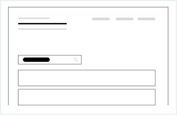
Search field
Use a small search field for a simple text search. The given search term will be submitted when pressing Enter or on loose focus (when the user leaves the input field).
Extended search field
Use an extended search field if multiple search terms are intended.
General construction
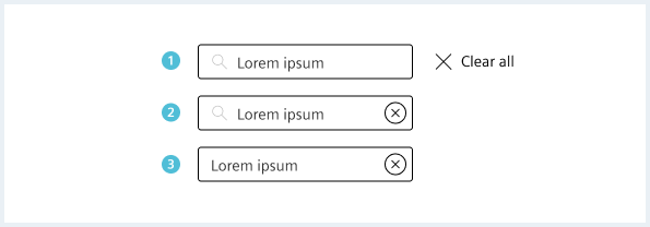
A search field consists of the following elements:
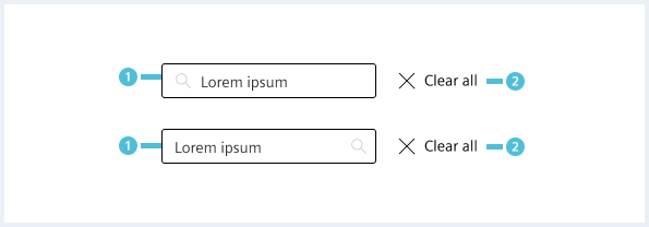
- Input field
- Has a search icon on the left (default) or right.
- Clear button
- Empties the search field.
- Can be placed also on the right inside the input, if no place is available (see options).
Options
Clear search button
Style
This chapter shows several search field styles in the User Experience Toolkit.
Overview
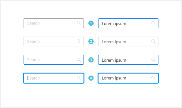
Search field states and types
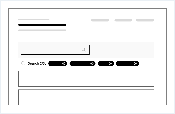
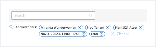
Filtering with result badge
The result badge shows the name of the search item and the number of found items. The removal of result badges can be performed by clicking on the clear all symbol present in each result badge, as well as the “clear all” button at the end.
Typography
Search field
| State | Font-family | Font-size | Line-height | Text alignment |
|---|---|---|---|---|
| all | Siemens Sans Roman | 14px | 16x | left |