Popover
A popover provides contextual information or area for interaction to a specific element independent of the overall page layout.
Usage
When to use
Use a popover in the following cases:
- To provide additional information related to an element on the page.
- When content is too long for a tooltip.
- When users need to access additional functions without losing their current position on the user interface.
- To create a contextual relationship to an element on the screen that a dialog cannot provide.
- For feature prompts in guided tours, for example.
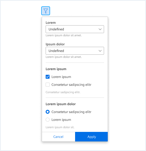
- To display setting, filter or sort menus.
- When displaying content in dropdown types, such as profile menus, split buttons and menu buttons.
Best practices
Keep popovers at a reasonable size.
A popover should not take up too much screen space. It is meant to be a small moment that can open over different areas of a page. It should not disrupt the user’s workflow or take up the whole screen. Keep the content of a popover short and include only necessary information.
One popover at a time
If there are multiple places on a page where a popover can be found, only one should be opened at a time to avoid cluttering (of) the screen and ensure users can focus on the information that is being shown.
Do not hide critical information within a popover
Do not hide important information in a popover that users need to complete a task or workflow. Keep important information at a higher level so that users have a better overview.
Types
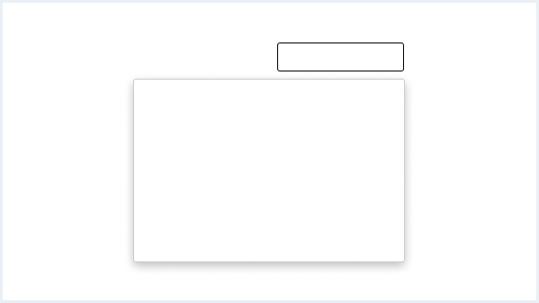
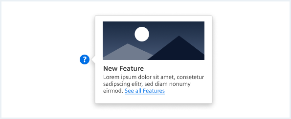
No context arrow (default)
Use a popover without context arrow if the reference to the triggering element is clear due to the popover’s distance from the triggering element or its position.
With context arrow
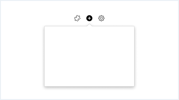
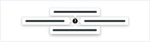
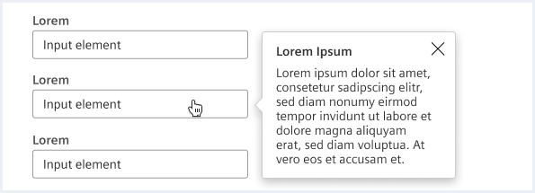
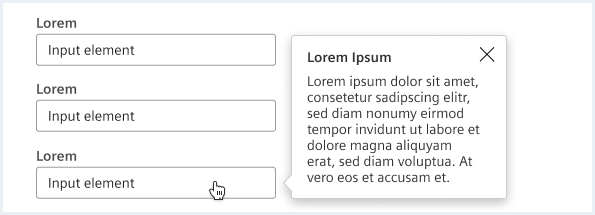
General construction
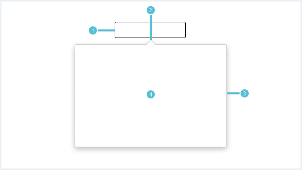
- Trigger element, 2. Context arrow 3. Elevated container, 4. Content area
1. Trigger element
- An interactive element that opens the popover on click, hover or focus.
2. Context arrow (optional)
- An indicator added to a popover container to show the relationship between the popover and the element from which it was triggered.
3. Elevated container
- The area where the content will be placed.
4. Content area
- Placed content can be interactive elements, images, videos or text.
The type of content in a popover can vary depending on the use case. A popover can be simple and contain only text. Unlike a tooltip, in some cases, the content can be more complex and include a combination of multiple sections and interactive elements.
Options
The following popover options are available:
Headline and text
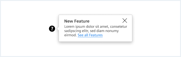
A simple variant is to add a title and description that might include a link to additional information. For more content options see chapter infotip.
Buttons
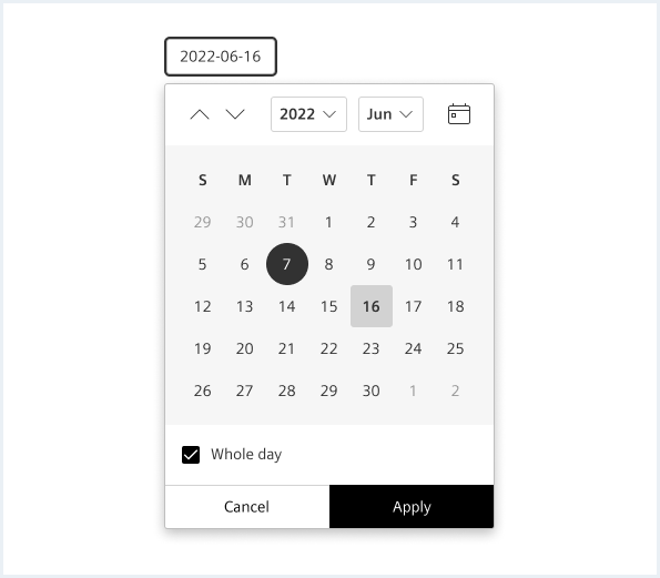
A popover is supposed to be a compact component, so the buttons inside it should be especially space-efficient. Use fluid buttons in the footer area in a popover. For more content options see chapter date time range picker.
Popover with sections
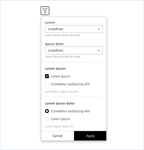
Add sections to break content that is too long or to divide the popover into meaningful areas. Avoid scrolling in popups with different sections. For more information see chapter form elements.
List
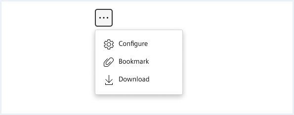
For less relevant actions buttons can be combined into a list. For more information see chapter menu.
Behavior
Placement
By default, the popover will open where there is enough space. It may display above, below, to the right, or to the left of the trigger object as needed. It may display above, below, to the right, or to the left of the trigger object as needed.
Context arrow orientation
Popover context arrows are centered at the bottom, top, right, or side of the popover container. The default position of the context arrow is center-aligned at the top. However, the position can change dynamically depending on the position of the associated trigger object in the layout and the resizing of the viewport.
Opening and closing
The popover is opened by selecting a trigger element and disappears when clicking on the space or selecting content outside the element’s boundaries or when triggering a closing element like a button.
In some cases, popovers will open automatically, such as in guided tours.
Style
This chapter shows several popover styles in the User Experience Toolkit.
Overview
To see a detailed explanation of all existing helper and size classes, please refer to the usage table below.
Popover positions
<p style="margin-top: 250px;"></p><!-- Placeholder for some spacing -->

Faucibus vitae aliquet nec ullamcorper sit amet risus.
<div class="popover is-left is-bottom-aligned is-shown">
    <a class="button button--primary" href="#">Primary link button</a>
    <div class="popover__container ">
        <div class="popover__close"></div>
        <div class="popover__content">
            <div class="popover__title">
                New Feature
            </div>
            Donec id elit non mi porta <a rel="noopener noreferrer" target="_blank" href="https://www.mindsphere.io/design">gravida at eget metus</a>. Duis mollis, est non commodo luctus.
            <img src="assets/images/image.png" alt="image placeholder">
        </div>
    </div>
</div>
Faucibus vitae aliquet nec ullamcorper sit amet risus.
<div class="popover has-arrow is-left is-center-aligned is-shown">
    <a class="button button--primary" href="#">Primary link button</a>
    <div class="popover__container ">
        <div class="popover__close"></div>
        <div class="popover__content">
            <div class="popover__title">
                New Feature
            </div>
            Donec id elit non mi porta <a rel="noopener noreferrer" target="_blank" href="https://www.mindsphere.io/design">gravida at eget metus</a>. Duis mollis, est non commodo luctus.
            <img src="assets/images/image.png" alt="image placeholder">
        </div>
    </div>
</div>
Faucibus vitae aliquet nec ullamcorper sit amet risus.
<div class="popover is-left is-shown">
    <a class="button button--primary" href="#">Primary link button</a>
    <div class="popover__container ">
        <div class="popover__close"></div>
        <div class="popover__content">
            <div class="popover__title">
                New Feature
            </div>
            Donec id elit non mi porta <a rel="noopener noreferrer" target="_blank" href="https://www.mindsphere.io/design">gravida at eget metus</a>. Duis mollis, est non commodo luctus.
            <img src="assets/images/image.png" alt="image placeholder">
        </div>
    </div>
</div>

<p style="margin-top: 420px;"></p><!-- Placeholder for some spacing -->

Faucibus vitae
<div class="popover is-right is-shown">
    <a class="button button--primary" href="#">Primary link button</a>
    <div class="popover__container ">
        <div class="popover__close"></div>
        <div class="popover__content">
            <div class="popover__title">
                New Feature
            </div>
            Donec id elit non mi porta <a rel="noopener noreferrer" target="_blank" href="https://www.mindsphere.io/design">gravida at eget metus</a>. Duis mollis, est non commodo luctus.
            <img src="assets/images/image.png" alt="image placeholder">
        </div>
    </div>
</div>
Faucibus vitae aliquet nec ullamcorper sit amet risus.
<div class="popover has-arrow is-right is-center-aligned is-shown">
    <a class="button button--primary" href="#">Primary link button</a>
    <div class="popover__container ">
        <div class="popover__close"></div>
        <div class="popover__content">
            <div class="popover__title">
                New Feature
            </div>
            Donec id elit non mi porta <a rel="noopener noreferrer" target="_blank" href="https://www.mindsphere.io/design">gravida at eget metus</a>. Duis mollis, est non commodo luctus.
            <img src="assets/images/image.png" alt="image placeholder">
        </div>
    </div>
</div>
Faucibus vitae aliquet nec ullamcorper sit amet risus.
<div class="popover is-right is-bottom-aligned is-shown">
    <a class="button button--primary" href="#">Primary link button</a>
    <div class="popover__container ">
        <div class="popover__close"></div>
        <div class="popover__content">
            <div class="popover__title">
                New Feature
            </div>
            Donec id elit non mi porta <a rel="noopener noreferrer" target="_blank" href="https://www.mindsphere.io/design">gravida at eget metus</a>. Duis mollis, est non commodo luctus.
            <img src="assets/images/image.png" alt="image placeholder">
        </div>
    </div>
</div>

<p style="margin-top: 450px;"></p><!-- Placeholder for some spacing -->

Faucibus vitae
<div class="popover is-top is-shown">
    <a class="button button--primary" href="#">Primary link button</a>
    <div class="popover__container ">
        <div class="popover__close"></div>
        <div class="popover__content">
            <div class="popover__title">
                New Feature
            </div>
            Donec id elit non mi porta <a rel="noopener noreferrer" target="_blank" href="https://www.mindsphere.io/design">gravida at eget metus</a>. Duis mollis, est non commodo luctus.
            <img src="assets/images/image.png" alt="image placeholder">
        </div>
    </div>
</div>
Faucibus vitae aliquet nec ullamcorper sit amet risus.
<div class="popover has-arrow is-top is-center-aligned is-shown">
    <a class="button button--primary" href="#">Primary link button</a>
    <div class="popover__container ">
        <div class="popover__close"></div>
        <div class="popover__content">
            <div class="popover__title">
                New Feature
            </div>
            Donec id elit non mi porta <a rel="noopener noreferrer" target="_blank" href="https://www.mindsphere.io/design">gravida at eget metus</a>. Duis mollis, est non commodo luctus.
            <img src="assets/images/image.png" alt="image placeholder">
        </div>
    </div>
</div>
Faucibus vitae aliquet nec ullamcorper sit amet risus.
<div class="popover is-top is-right-aligned is-shown">
    <a class="button button--primary" href="#">Primary link button</a>
    <div class="popover__container ">
        <div class="popover__close"></div>
        <div class="popover__content">
            <div class="popover__title">
                New Feature
            </div>
            Donec id elit non mi porta <a rel="noopener noreferrer" target="_blank" href="https://www.mindsphere.io/design">gravida at eget metus</a>. Duis mollis, est non commodo luctus.
            <img src="assets/images/image.png" alt="image placeholder">
        </div>
    </div>
</div>

<p style="margin-top: 50px;"></p><!-- Placeholder for some spacing -->

Faucibus vitae
<div class="popover is-bottom is-shown">
    <a class="button button--primary" href="#">Primary link button</a>
    <div class="popover__container ">
        <div class="popover__close"></div>
        <div class="popover__content">
            <div class="popover__title">
                New Feature
            </div>
            Donec id elit non mi porta <a rel="noopener noreferrer" target="_blank" href="https://www.mindsphere.io/design">gravida at eget metus</a>. Duis mollis, est non commodo luctus.
            <img src="assets/images/image.png" alt="image placeholder">
        </div>
    </div>
</div>
Faucibus vitae aliquet nec ullamcorper sit amet risus.
<div class="popover has-arrow is-bottom is-center-aligned is-shown">
    <a class="button button--primary" href="#">Primary link button</a>
    <div class="popover__container ">
        <div class="popover__close"></div>
        <div class="popover__content">
            <div class="popover__title">
                New Feature
            </div>
            Donec id elit non mi porta <a rel="noopener noreferrer" target="_blank" href="https://www.mindsphere.io/design">gravida at eget metus</a>. Duis mollis, est non commodo luctus.
            <img src="assets/images/image.png" alt="image placeholder">
        </div>
    </div>
</div>
Faucibus vitae aliquet nec ullamcorper sit amet risus.
<div class="popover is-bottom is-right-aligned is-shown">
    <a class="button button--primary" href="#">Primary link button</a>
    <div class="popover__container ">
        <div class="popover__close"></div>
        <div class="popover__content">
            <div class="popover__title">
                New Feature
            </div>
            Donec id elit non mi porta <a rel="noopener noreferrer" target="_blank" href="https://www.mindsphere.io/design">gravida at eget metus</a>. Duis mollis, est non commodo luctus.
            <img src="assets/images/image.png" alt="image placeholder">
        </div>
    </div>
</div>
<p style="margin-top: 250px;"></p><!-- Placeholder for some spacing -->
Usage
| Element | Class | Description |
|---|---|---|
.popover | .is-shown | Displays the default popover with the default position (below and left aligned). |
.popover | .is-top .is-bottom .is-left .is-right | Defines the orientation of the popover. |
.popover | .is-center-aligned .is-bottom-aligned .is-right-aligned | In combination with the orientation classes, the alignment can be defined with these classes. Left and bottom alignments are default and don't require a class. |
.popover | .has-arrow | Adds an arrow to the popover. |