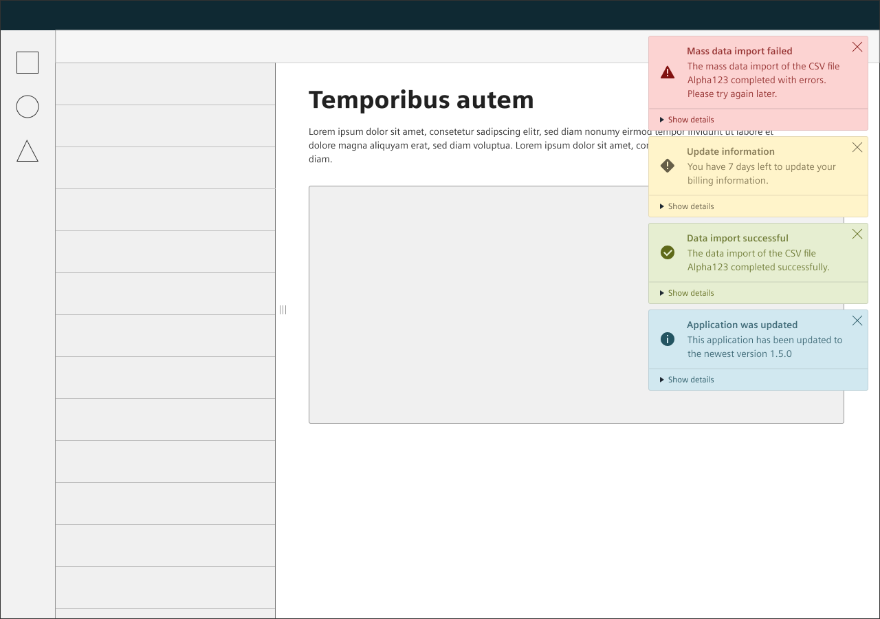
Notification
Notifications provide feedback about the system status and activity.
Usage
When to use
Use notifications in the following cases:
- To interrupt the user, for a specific reason.
- To alert the user about system activities.
- To inform the user about the change in system status or any other expected event.
- To share information to the user without blocking the whole screen.
- To notify users about asynchronous events.
Avoid using notifications in the following cases:
- Immediate decisions should be better enforced by using a confirm dialog box.
- Content related to a specific section of the screen, e.g. feedback regarding a form is better done using a message.
Types
There are the following notification types:
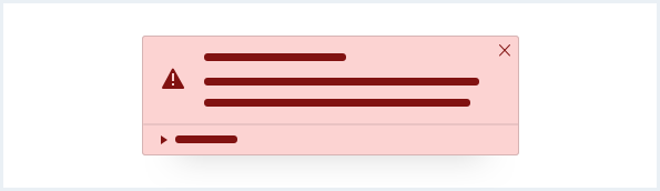
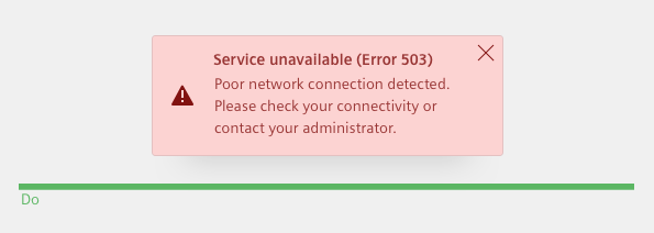
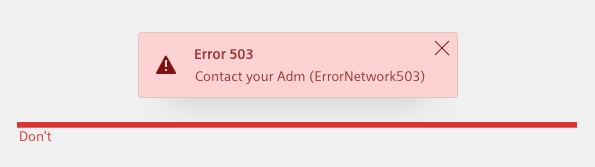
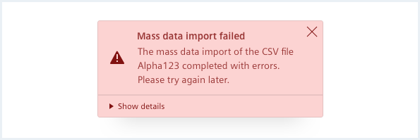
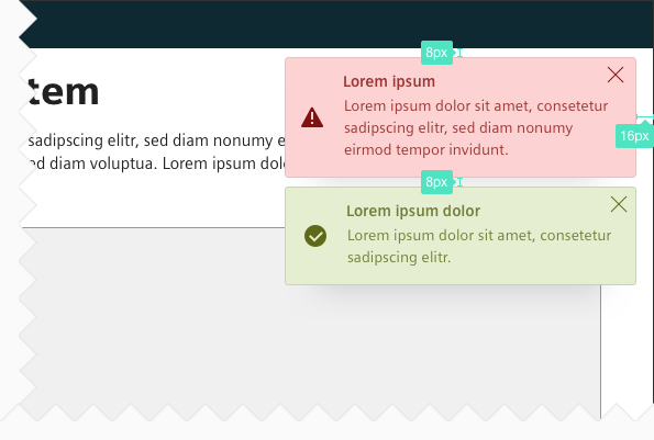
Error/Alert
Use an error/alert notification to notify the user about an action or system failure.
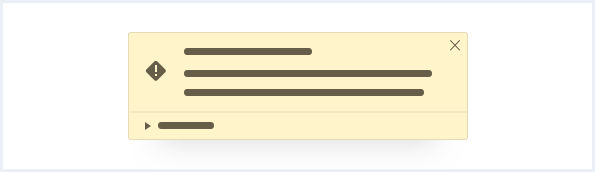
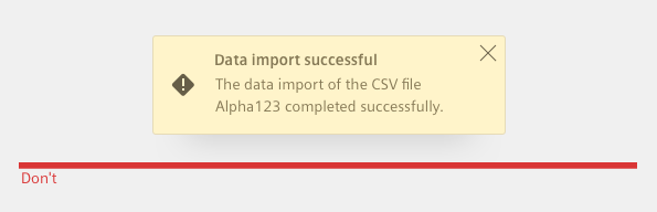
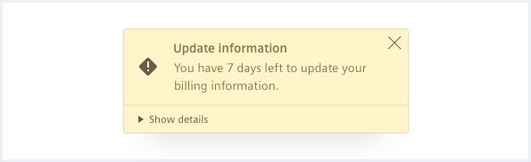
Warning
Use a warning notification to notify the user about a potential trouble or during an unexpected behavior of the system.
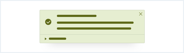
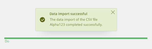
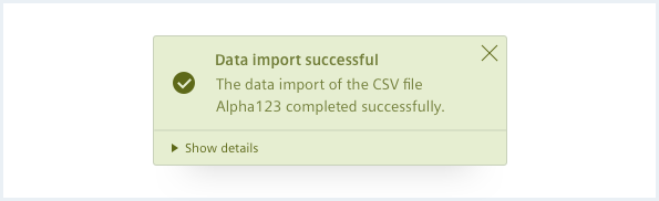
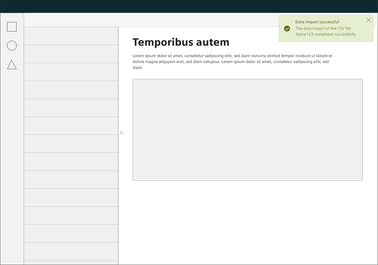
Success
Use a success notification to notify the user when an action successfully completes.
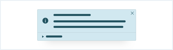
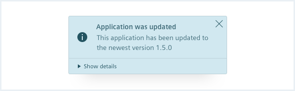
Info
Use an info notification to inform the user about useful and relevant information.
General construction
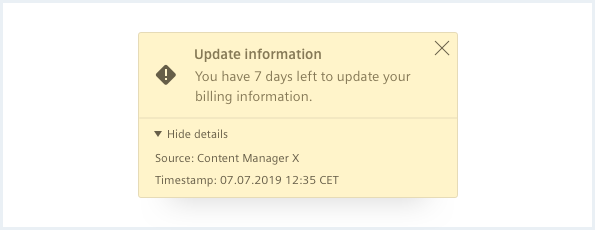
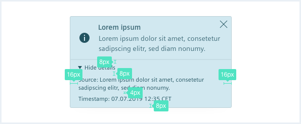
A notification consists of the following elements:
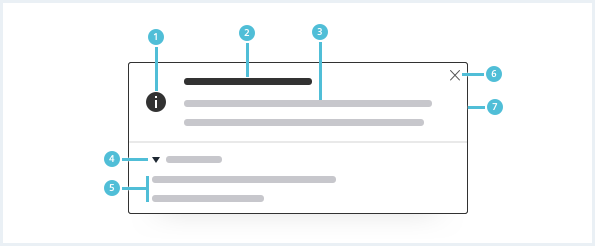
1. Severity icon
- Use the icon to emphasize the meaning of the notification.
2. Title
- All notifications have a title, which should be short and descriptive.
3. Description
- The description should have a maximum length of three lines.
- Make sure that the notification provides enough information to help the user understand the current or the next steps.
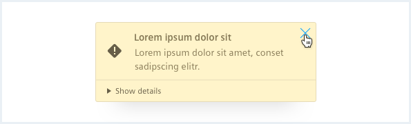
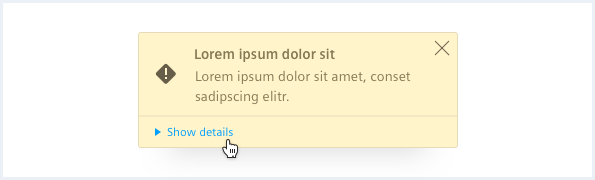
4. Show/Hide details expander (optional)
- Expands and collapses the additional information. It is collapsed by default.
5. Optional data
- This can be tabular data or a key-value list.
- It is recommended to display the source and timestamp. But it can also have arbitrary content.
6. Close button
- Use this button to close the notification.
7. Background
- The background color matches the severity.
A notification
- Describes the current activity.
- Is short and precise.
- Uses the appropriate severity for the content.
Behavior
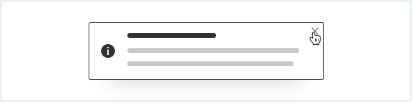
Close notification
Notifications can be actively dismissed by clicking the close button.
Placement
The notification appears on the top right corner of the screen.
Dialog and notifications
Notifications are always in front of a dialog or confirm dialog.
Do’s & Don’ts
- Use simple words.
- Do not use only technical jargon. Always add an explanation.
- Use an appropriate severity color that matches the content of the notification.
- Do not mix the color and content of the notification arbitrarily.
Style
This chapter shows several notifications in the User Experience Toolkit.
Overview
Typography
The following table gives reference to the different font sizes and weights:
| Name | State | Font-family | Font-size | Line-height | Text-align |
|---|---|---|---|---|---|
| Title | all | Siemens Sans Bold | 14px | 20px | left |
| Description | all | Siemens Sans Roman | 14px | 20px | left |
| Expander, Optional data | all | Siemens Sans Roman | 12px | 16px | left |
Sizing and spacing
The following measurements show the dimensions for this component:
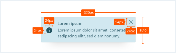
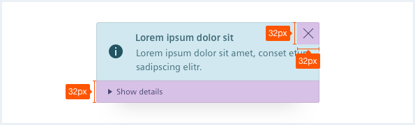
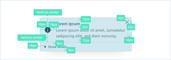
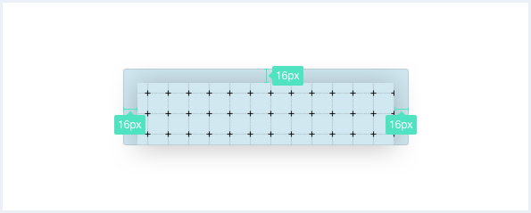
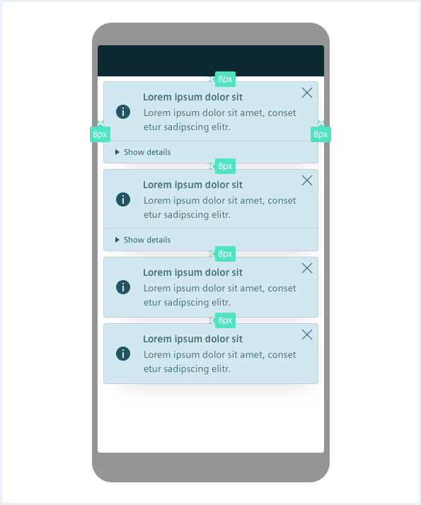
To see a detailed explanation of all existing classes, please refer to the usage table below.
Example 1: Standalone preview
<div class="notificationContainer">
    <div class="notifications">

        <!-- single notification item START -->
        <div class="notification is-warning">
            <div class="notification__main">
                <h4 class="notification__title">
                    Lorem ipsum
                    <a class="notification__close" href="#" title="Close dialog"></a>
                </h4>
                <div class="notification__content">
                    We recommend the description to have a
                    maximum length of 3 lines.
                    Make sure that the notification provides
                    enough information to help the user</div>
            </div>
        </div>
        <!-- single notification item END -->

        <div class="notification">
            <div class="notification__main">
                <h4 class="notification__title">
                    Another notification with a very long title that will break in more lines
                    <a class="notification__close" href="#" title="Close notification"></a>
                </h4>
                <div class="notification__content">
                    We recommend the description to have a
                    https://sub.domain.tld/dir/another/dir/4207/11289781#789178
                    maximum length of 3 lines.
                    Make sure that the notification provides
                    enough information to help the user</div>
            </div>
            <div class="notification__details is-expanded">
                <a href="#" class="details__expander">Show details</a>
                <div class="details__content">
                    Lorem ipsum dolor sit amet following measurements show the dimensions for this component: <a href="#" rel="noopener noreferrer">https://sub.domain.tld/dir/another/dir/4207/11289781#789178</a> a maximal width of 320px.
                </div>
            </div>
        </div>
        <div class="notification is-alert">
            <div class="notification__main">
                <h4 class="notification__title">
                    Lorem ipsum
                    <a class="notification__close" href="#" title="Close notification"></a>
                </h4>
                <div class="notification__content">
                    We recommend the description to have a
                    maximum length of 3 lines.
                    Make sure that the notification provides
                    enough information to help the user</div>
            </div>
            <div class="notification__details">
                <a href="#" class="details__expander">Show details</a>
                <div class="details__content">
                    Lorem ipsum dolor sit amet following measurements show the dimensions for this component:
                    <a href="#">A notification has</a> a maximal width of 320px.
                </div>
            </div>
        </div>
        <div class="notification is-success">
            <div class="notification__main">
                <h4 class="notification__title">
                    Lorem ipsum
                    <a class="notification__close" href="#" title="Close notification"></a>
                </h4>
                <div class="notification__content">
                    We recommend the description to have a
                    maximum length of 3 lines.
                    Make sure that the notification provides
                    enough information to help the user</div>
            </div>
            <div class="notification__details">
                <a href="#" class="details__expander">Show details</a>
                <div class="details__content">
                    Lorem ipsum dolor sit amet following measurements show the dimensions for this component:
                    A notification has a maximal width of 320px.
                </div>
            </div>
        </div>
    </div>
</div>

<!-- ============================================================= -->
<!-- JavaScript Code following is only for demonstrational purpose -->
<!-- ============================================================= -->
<script>
    window.onload = function(e){
        // sample JS for closing notifications
        var close = document.querySelectorAll('.notification__close');
        for (var i=0; i<close.length; i++) {
            close[i].addEventListener('click', function(e) {
                this.parentNode.parentNode.parentNode.classList.add('is-hidden');
            });
        }

        // sample JS for expanding / collapsing notifications
        var expand = document.querySelectorAll('.details__expander');
        for (var i=0; i<expand.length; i++) {
            expand[i].addEventListener('click', function(e) {
                var node = this;
                if (this.parentNode.classList.contains('is-expanded')) {
                    node.textContent = node.textContent.replace("Hide", "Show");
                } else {
                    node.textContent = node.textContent.replace("Show", "Hide");
                }
                this.parentNode.classList.toggle('is-expanded');
            });
        }

        // sample JS for creating new notifications every x seconds
        setInterval(function() {
            var notif = document.querySelectorAll('.notification');
            var clone = notif[notif.length - 1].cloneNode(true);
            notif[notif.length - 1].parentNode.insertBefore(clone, null);
            clone.classList.remove('is-hidden');

            // we need to manually add the events, again since they were not cloned
            var close = clone.querySelector('.notification__close');
            close.addEventListener('click', function(e) {
                this.parentNode.parentNode.parentNode.classList.add('is-hidden');
            });
            var expand = clone.querySelector('.details__expander');
            expand.addEventListener('click', function(e) {
                this.parentNode.classList.toggle('is-expanded');
            });
            // IE 11 does not handle multiple classList assignments properly
            clone.classList.remove('is-alert');
            clone.classList.remove('is-warning');
            clone.classList.remove('is-success');
            clone.classList.remove('is-info');
            var type = Math.floor(Math.random() * 4);
            switch (type) {
                case 0:
                    clone.classList.add('is-warning');
                    break;
                case 1:
                    clone.classList.add('is-alert');
                    break;
                case 2:
                    clone.classList.add('is-success');
                    break;
                case 3:
                    clone.classList.add('is-info');
                    break;
            }
        }, 5000);
    }
</script>
Example 2: Application integration
<div class="appWrapper has-appBarAdvanced has-appBarAdvanced-collapsed">

    <div class="appWrapper__regions has-appHeader has-contextRegion has-leadingRegion contextRegion-is-expanded leadingRegion-is-expanded appWrapper__regions--pushLayout">

        <section class="appHeader">
            <div class="appHeader__breadcrumb">
            </div>
            <div class="appHeader__content">
            </div>
            <div class="appHeader__viewToggler">
                <button class="button button--ghost has-icon-only" id="toggleLeadingRegionDemo">
                    <i aria-hidden="true" class="iconUxt sidebar"></i>
                </button>

                <button class="button button--ghost has-icon-only" id="toggleContextRegionDemo">
                    <i aria-hidden="true" class="iconUxt sidebar is-flipped-horizontal"></i>
                </button>
            </div>
        </section>

        <section class="leadingRegion">
            <!-- content for leading region goes here -->
        </section>

        <section class="mainRegion">
            <div class="contentHeader">
                <div class="contentHeader__header">
                    <h1 class="header__headline">Notification Demo</h1>
                    <div class="header__subline">Will create a new notification every 5 seconds.</div>
                </div>
            </div>
        </section>

        <section class="contextRegion">
            <!-- content for context region goes here -->
        </section>
    </div>

    <nav class="appBarAdvanced">
        <div class="appBarAdvanced__inner">
            <div class="appBarAdvanced__header">
                <!-- optional header -->
            </div>
            <ul class="appBarAdvanced__content">
                <li class="level1 is-home">
                    <a href="#" class="item__link">
                        <div class="item__icon">
                            <i aria-hidden="true" class="iconUxt home"></i>
                        </div>
                        <span class="item__title">Home</span>
                    </a>
                </li>
            </ul>
            <div class="appBarAdvanced__footer">
                <a href="#" id="appBar--expander">
                    <!-- optional expand / collapse label -->
                    <span class="item__title">Collapse</span>
                </a>
            </div>
        </div>
    </nav>

    <!-- Notification markup START -->
    <div class="notificationContainer">
        <ul class="notifications">
            <li class="notification is-warning">
                <div class="notification__main">
                    <h4 class="notification__title">
                        Lorem ipsum
                        <a class="notification__close" href="#" title="Close notification"></a>
                    </h4>
                    <div class="notification__content">
                        We recommend the description to have a
                        maximum length of 3 lines.
                        Make sure that the notification provides
                        enough information to help the user</div>
                </div>
            </li>
            <li class="notification">
                <div class="notification__main">
                    <h4 class="notification__title">
                        Another notification
                        <a class="notification__close" href="#" title="Close notification"></a>
                    </h4>
                    <div class="notification__content">
                        We recommend the description to have a
                        maximum length of 3 lines.
                        Make sure that the notification provides
                        enough information to help the user</div>
                </div>
            </li>
            <li class="notification is-alert">
                <div class="notification__main">
                    <h4 class="notification__title">
                        Lorem ipsum
                        <a class="notification__close" href="#" title="Close notification"></a>
                    </h4>
                    <div class="notification__content">
                        We recommend the description to have a
                        maximum length of 3 lines.
                        Make sure that the notification provides
                        enough information to help the user</div>
                </div>
                <div class="notification__details">
                    <a href="#" class="details__expander">Show details</a>
                    <div class="details__content">
                        Lorem ipsum dolor sit amet following measurements show the dimensions for this component:
                        <a href="#">A notification has</a> a maximal width of 320px.
                    </div>
                </div>
            </li>
            <li class="notification is-success">
                <div class="notification__main">
                    <h4 class="notification__title">
                        Lorem ipsum
                        <a class="notification__close" href="#" title="Close notification"></a>
                    </h4>
                    <div class="notification__content">
                        We recommend the description to have a
                        maximum length of 3 lines.
                        Make sure that the notification provides
                        enough information to help the user</div>
                </div>
                <div class="notification__details">
                    <a href="#" class="details__expander">Show details</a>
                    <div class="details__content">
                        Lorem ipsum dolor sit amet following measurements show the dimensions for this component:
                        A notification has a maximal width of 320px.
                    </div>
                </div>
            </li>
        </ul>
    </div>
    <!-- Notification markup END -->

</div>
<script type="text/javascript" src="https://static.eu1.mindsphere.io/osbar/v4/js/main.min.js"></script>

<!-- ============================================================= -->
<!-- JavaScript Code following is only for demonstrational purpose -->
<!-- ============================================================= -->
<script>
    _msb.init({
        title: "App Layout",
        showLegal: true,
        polyfills: {
            promise: true
        }
    });
    window.onload = function(e){
        // sample JS for closing notifications
        var close = document.querySelectorAll('.notification__close');
        for (var i=0; i<close.length; i++) {
            close[i].addEventListener('click', function(e) {
                this.parentNode.parentNode.parentNode.classList.add('is-hidden');
            });
        }

        // sample JS for expanding / collapsing notifications
        var expand = document.querySelectorAll('.details__expander');
        for (var i=0; i<expand.length; i++) {
            expand[i].addEventListener('click', function(e) {
                var node = this;
                if (this.parentNode.classList.contains('is-expanded')) {
                    node.textContent = node.textContent.replace("Hide", "Show");
                } else {
                    node.textContent = node.textContent.replace("Show", "Hide");
                }
                this.parentNode.classList.toggle('is-expanded');
            });
        }

        // sample JS for creating new notifications every x seconds
        setInterval(function() {
            var notif = document.querySelectorAll('.notification');
            var clone = notif[notif.length - 1].cloneNode(true);
            notif[notif.length - 1].parentNode.insertBefore(clone, null);
            clone.classList.remove('is-hidden');

            // we need to manually add the events, again since they were not cloned
            var close = clone.querySelector('.notification__close');
            close.addEventListener('click', function(e) {
                this.parentNode.parentNode.parentNode.classList.add('is-hidden');
            });
            var expand = clone.querySelector('.details__expander');
            expand.addEventListener('click', function(e) {
                this.parentNode.classList.toggle('is-expanded');
            });
            // IE 11 does not handle multiple classList assignments properly
            clone.classList.remove('is-alert');
            clone.classList.remove('is-warning');
            clone.classList.remove('is-success');
            clone.classList.remove('is-info');
            var type = Math.floor(Math.random() * 4);
            switch (type) {
                case 0:
                    clone.classList.add('is-warning');
                    break;
                case 1:
                    clone.classList.add('is-alert');
                    break;
                case 2:
                    clone.classList.add('is-success');
                    break;
                case 3:
                    clone.classList.add('is-info');
                    break;
            }
        }, 5000);

        // toggle expand / collapse feature of sidebar
        var toggle = document.querySelector("#appBar--expander");
        var appWrapper = document.querySelector(".appWrapper");
        toggle.addEventListener("click", function () {
            // appBar.classList.toggle("has-appBarAdvanced-collapsed");
            appWrapper.classList.toggle("has-appBarAdvanced-collapsed");
            var elems = document.querySelectorAll(".appBarAdvanced .level1");
            for (var i = 0; i < elems.length; i++) {
                elems[i].classList.remove("is-shown");
            }
        });

        var regionsWrapper = document.querySelector(".appWrapper__regions");

        // functionality to hide context and/or leadimg region through button
        var toggleLeading = document.querySelector("#toggleLeadingRegionDemo");
        toggleLeading.addEventListener('click', function() {
            regionsWrapper.classList.toggle('leadingRegion-is-expanded');
        });

        var toggleContext = document.querySelector("#toggleContextRegionDemo");
        toggleContext.addEventListener('click', function() {
            regionsWrapper.classList.toggle('contextRegion-is-expanded');
        });
    }
</script>
Usage
| Element | Class | Description |
|---|---|---|
.notification | .is-error,.is-alert .is-warning .is-success .is-info | Sets the appropriate severity state for a notification. |
.notification | .is-hidden | Moves a notification out of the viewport so that other notifications can slide into view. Remove this class to re-positions the notification again in the visible part of the viewport. Remove the element from the DOM if you want to delete a notification. |
.notification__details | An optional wrapper element for additional content. | |
.notification__details | .is-expanded | Add this class to expand the wrapper element. Remove the class to collapse the container again. |