List navigation
A list navigation makes data structures navigable.
Usage
When to use
Use a list navigation in the following cases:
- To represent data structures in a scannable way and make them navigable.
- To select a detail view in a master detail layout.
Use a hierarchical list navigation in the following cases:
- To navigate between different hierarchical levels.
- When it is not necessary to see different levels at the same time.
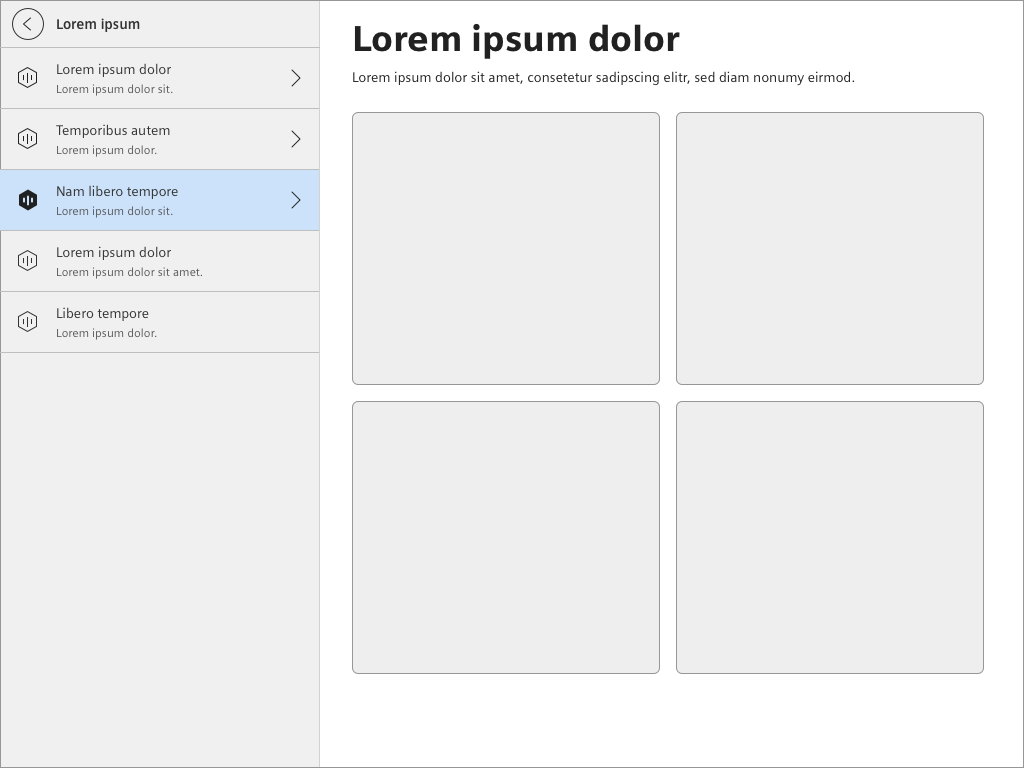
General construction
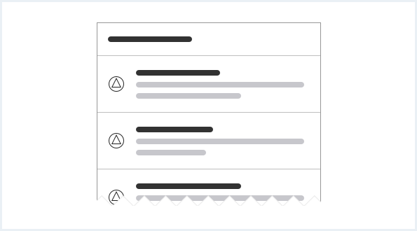
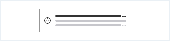
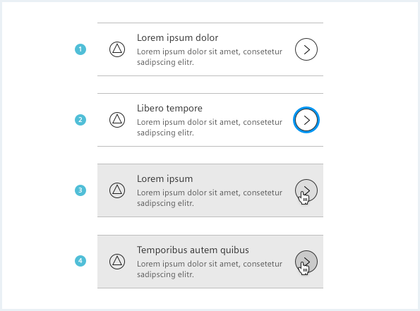
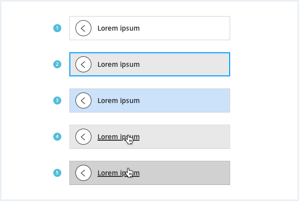
A list navigation consists of the following elements:
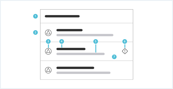
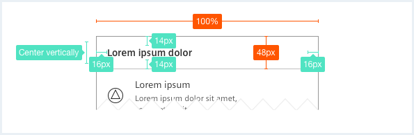
1. Header
- The header contains a title which explains the context of the items below.
2. List item
- The list item represents a navigational step and consists of the elements 3. – 7. as listed below.
- Be consistent when constructing your list items. For example, each list item or none has a supporting visual.
3. Supporting visual
- The supporting visual may be an icon, pictogram (for example avatar) or an image.
- The supporting visual is used exclusively for classification.
- The supporting visual is optional.
4. Label
- The label summarizes the content of an item.
- The label is often equal to the title of the related domain object.
- The label is mandatory.
5. Description
- The description text is used to give additional content-related information.
- The description is optional.
6. Meta information
- The meta information element can be an icon (e.g. severity state).
- The meta information is optional.
7. Item background
- The item background inherits the background color of the container element.
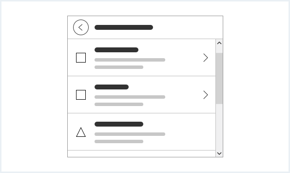
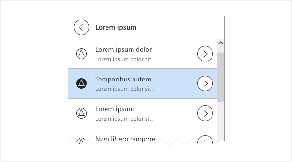
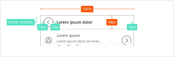
A hierarchical list navigation consists of the following elements:
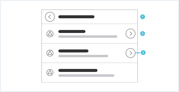
1. Header
- A hierarchical list navigation must have a back navigation which is greyed out or vanishes at the root level.
- The header always contains a title indicating the current level.
2. List item
- See above for further information.
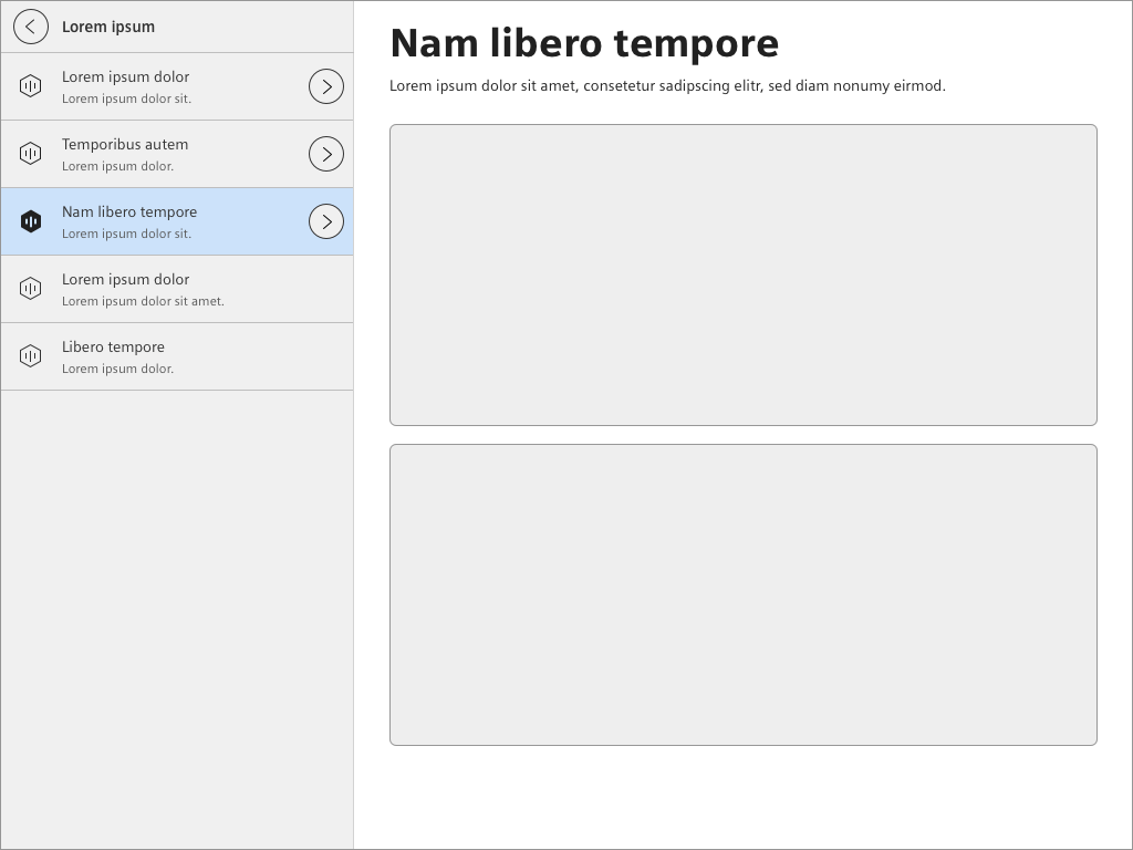
3. Drill down action
- A drill down action can be a drill down indicator or drill down button depending whether the item itself has own content or not.
- A drill down action is used when an item has child items.
Options
The following list navigation options are available:
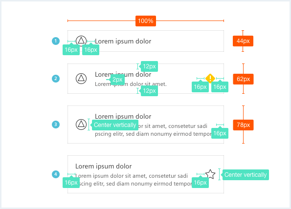
Single-line item
A single-line item contains a label.
Two-line item
A two-line item contains a label and a one-line description.
Three-line item
A three-line item contains a label and a two-line description.
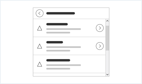
Hierarchical list navigation with drill down indicator
Use a drill down indicator when the item is a container for child items and has no content itself. It cannot be selected without navigating into the next level.
Hierarchical list navigation with drill down button
Use a drill down button when the item is a container for child items and has additional own content. It has a select option for example to show a state or basic information in the main region.
Behavior
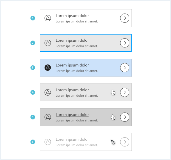
General interaction
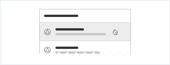
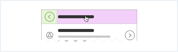
In a list navigation
- the entire item is clickable. Click the item to show related information.
- the header is not clickable.
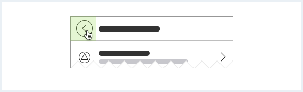
In a hierarchical list navigation
- the back button leads back to the previous hierarchy level.
- the title is clickable. Click the item to show related information.
Ellipsis
If the title, label or description is too long, use an ellipsis at the end. If necessary the ellipsis can be placed in a different position, for example in the middle.
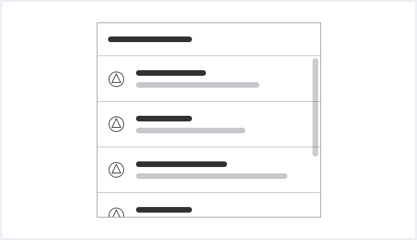
Scrolling
If there are more items than visible, the list may be scrolled. The header is fixed.
Placement
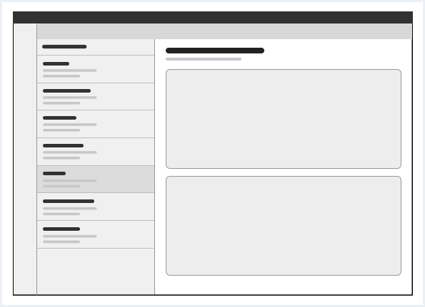
The list navigation can be part of a master detail layout. It is placed in the leading region.
Default sorting
It is recommended that items with drill down action come first in a list.

Do’s & Don’ts
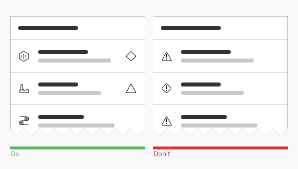
- Use an icon as supporting visual exclusively for classification. Use an icon as meta information to show the state.
- Do not use the supporting visual to show the state or meta information.
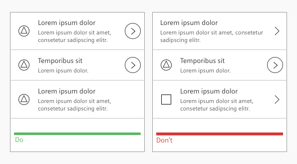
- Stay consistent with the drill down action.
- Do not mix drill down indicator with drill down button in one list.
Style
This chapter shows several list navigation styles in the User Experience Toolkit.
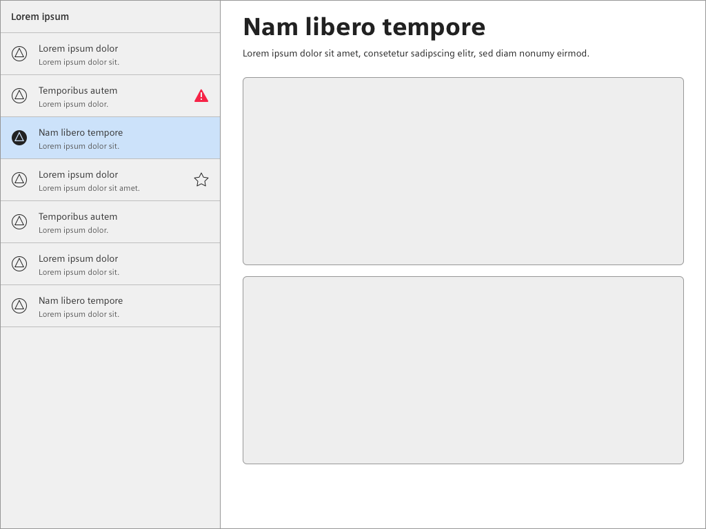
Overview
Item states
The current item state can be emphasized by a solid icon style.
Background
Header
Clickable title
Examples
 List navigation in a master detail layout
Typography
The following table gives reference to the different font sizes and weights:
| Name | State | Font-family | Font-size | Line-height | Text-align |
|---|---|---|---|---|---|
| Header | all | Siemens Sans Bold | 14px | 20px | left |
| Label | all | Siemens Sans Roman | 14px | 20px | left |
| Description | all | Siemens Sans Roman | 12px | 16px | left |
Sizing and spacing
The following measurements show the dimensions for this component:
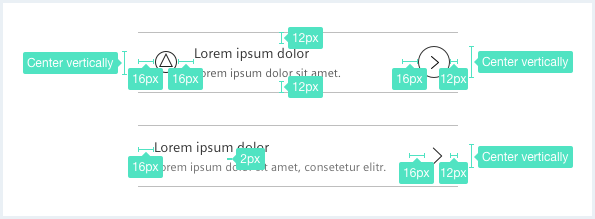
To see a detailed explanation of all existing helper and size classes, please refer to the usage table below.
List navigation, basic example
<div class="listNavigation">
    <div class="listNavigation__lists">
        <div class="listNavigation__header">
            Very simple List navigation
        </div>
        <ul class="listNavigation__list">
            <li class="list__item">
                <a href="#" class="item__link">
                    <div class="item__icon">
                        <span class="iconUxt person" aria-hidden="true"></span>
                    </div>
                    <div class="item__content">
                        <h4 class="label">List item A</h4>
                        <div class="description">This is a list item. There is a status set to indicate something important.</div>
                    </div>
                    <div class="item__metaInfo">
                        <span class="iconUxt arrowSingleRight" aria-hidden="true"></span>
                    </div>
                </a>
            </li>
            <li class="list__item">
                <a href="#" class="item__link">
                    <div class="item__icon">
                        <span class="iconUxt person" aria-hidden="true"></span>
                    </div>
                    <div class="item__content">
                        <h4 class="label">List item B</h4>
                        <div class="description">This is a list item. There is a status set to indicate something important.</div>
                    </div>
                    <div class="item__metaInfo">
                        <button class="button button--ghost has-icon-only item__favorite"></button>
                    </div>
                    <div class="item__metaInfo">
                        <span class="iconUxt arrowSingleRight" aria-hidden="true"></span>
                    </div>
                </a>
            </li>
            <li class="list__item">
                <a href="#" class="item__link">
                    <div class="item__icon">
                        <span class="iconUxt person" aria-hidden="true"></span>
                    </div>
                    <div class="item__content">
                        <h4 class="label">List item C</h4>
                        <div class="description">This is a list item. There is a status set to indicate something important.</div>
                    </div>
                    <div class="item__metaInfo">
                        <button class="button button--ghost has-icon-only item__favorite"></button>
                    </div>
                </a>
            </li>
            <li class="list__item">
                <a href="#" class="item__link">
                    <div class="item__icon">
                        <span class="iconUxt person" aria-hidden="true"></span>
                    </div>
                    <div class="item__content">
                        <h4 class="label">List item D</h4>
                        <div class="description">This is a list item and there is a status set to indicate something important.</div>
                    </div>
                    <div class="item__metaInfo">
                        <button class="button button--ghost has-icon-only item__favorite"></button>
                    </div>
                </a>
            </li>
            <li class="list__item">
                <a href="#" class="item__link">
                    <div class="item__content">
                        <h4 class="label">List item A</h4>
                        <div class="description">This is a list item. There is no icon or status indicator set.</div>
                    </div>
                </a>
            </li>
        </ul>
    </div>
</div>
List navigation, states and variants
<div class="listNavigation">
    <div class="listNavigation__lists">
        <div class="listNavigation__header">
            List navigation header, different variants and combinations of list items and states
        </div>
        <ul class="listNavigation__list">
            <li class="list__item">
                <a href="#" class="item__link">
                    <div class="item__icon">
                        <span class="iconUxt person" aria-hidden="true"></span>
                    </div>
                    <div class="item__content">
                        <h4 class="label">List item A</h4>
                        <div class="description">This is a list item. There is a status set to indicate something important.</div>
                    </div>
                    <div class="item__metaInfo">
                        <span class="iconUxt exclamationDiamond filled has-color-warning" aria-hidden="true"></span>
                    </div>
                </a>
            </li>
            <li class="list__item">
                <a href="#" class="item__link">
                    <div class="item__icon">
                        <span class="iconUxt person" aria-hidden="true"></span>
                    </div>
                    <div class="item__content">
                        <h4 class="label">List item A</h4>
                        <div class="description">This is a list item and there is a status set to indicate something important.</div>
                    </div>
                    <div class="item__metaInfo">
                        <span class="iconUxt exclamationDiamond filled has-color-warning" aria-hidden="true"></span>
                    </div>
                </a>
            </li>
            <li class="list__item list__item--oneLine">
                <a href="#" class="item__link">
                    <div class="item__content">
                        <h4 class="label">List item one line</h4>
                        <div class="description">This is a one line list item with some descriptional text.</div>
                    </div>
                    <div class="item__metaInfo">
                    </div>
                </a>
            </li>
            <li class="list__item list__item--twoLine">
                <a href="#" class="item__link">
                    <div class="item__content">
                        <h4 class="label">List item two line</h4>
                        <div class="description">This is a two line list item with some descriptional text. Curabitur aliquet ac ante vel rhoncus. Aliquam mauris nisl, rutrum quis sem aliquam. Morbi enim nisi, pretium ac felis vitae, luctus molestie elit. </div>
                    </div>
                    <div class="item__metaInfo">
                    </div>
                </a>
            </li>
            <li class="list__item list__item--threeLine">
                <a href="#" class="item__link">
                    <div class="item__content">
                        <h4 class="label">List item three line</h4>
                        <div class="description">This is a one line list item with some descriptional text. Nulla facilisi. Integer nec tincidunt orci. Maecenas semper rutrum massa sit amet hendrerit. Curabitur aliquet ac ante vel rhoncus. Aliquam mauris nisl, rutrum quis sem aliquam. Donec euismod, nibh a ultricies fermentum, justo erat tincidunt quam.</div>
                    </div>
                    <div class="item__metaInfo">
                    </div>
                </a>
            </li>
            <li class="list__item list__item--twoLine has-overflowIndicator">
                <a href="#" class="item__link">
                    <div class="item__content">
                        <h4 class="label">List item two line with overflow indicator</h4>
                        <div class="description">This is a two line list item with some descriptional text. Curabitur aliquet ac ante vel rhoncus. Aliquam mauris nisl, rutrum quis sem aliquam. Morbi enim nisi, pretium ac felis vitae, luctus molestie elit. </div>
                    </div>
                    <div class="item__metaInfo">
                    </div>
                </a>
            </li>
            <li class="list__item list__item--threeLine has-overflowIndicator">
                <a href="#" class="item__link">
                    <div class="item__content">
                        <h4 class="label">List item three line with overflow indicator</h4>
                        <div class="description">This is a one line list item with some descriptional text. Nulla facilisi. Integer nec tincidunt orci. Maecenas semper rutrum massa sit amet hendrerit. Curabitur aliquet ac ante vel rhoncus. Aliquam mauris nisl, rutrum quis sem aliquam. Donec euismod, nibh a ultricies fermentum, justo erat tincidunt quam.</div>
                    </div>
                    <div class="item__metaInfo">
                        <button class="button button--ghost has-icon-only item__favorite"></button>
                    </div>
                </a>
            </li>
            <li class="list__item">
                <a href="#" class="item__link is-disabled">
                    <div class="item__icon">
                        <span class="iconUxt person" aria-hidden="true"></span>
                    </div>
                    <div class="item__content">
                        <h4 class="label">List item, disabled</h4>
                        <div class="description">This is a list item. There is a status set to indicate something important.</div>
                    </div>
                    <div class="item__metaInfo">
                        <span class="iconUxt exclamationDiamond filled has-color-warning" aria-hidden="true"></span>
                    </div>
                </a>
            </li>
            <li class="list__item">
                <a href="#" class="item__link is-current">
                    <div class="item__icon">
                        <span class="iconUxt person" aria-hidden="true"></span>
                    </div>
                    <div class="item__content">
                        <h4 class="label">List item, current</h4>
                        <div class="description">This is a list item. There is a status set to indicate something important.</div>
                    </div>
                    <div class="item__metaInfo">
                    </div>
                </a>
            </li>
        </ul>
    </div>
</div>
Hierarchical list navigation
<div class="listNavigation">
    <div class="listNavigation__lists">
        <div class="listNavigation__header is-advanced">
            <a href="#" class="header__link">
                Hierarchical list navigation
            </a>
            <a href="#" class="header__back">
            </a>
        </div>
        <ul class="listNavigation__list">
            <li class="list__item list__item--drilldown">
                <a href="#" class="item__link">
                    <div class="item__icon">
                        <span class="iconUxt person" aria-hidden="true"></span>
                    </div>
                    <div class="item__content">
                        <h4 class="label">List item A</h4>
                        <div class="description">This is a list item with drilldown action and there is a status set to indicate something important, wrapping over more lines to show that the 'hit area' for the drilldown button on the right stretches over the whole row from top to bottom.</div>
                    </div>
                    <div class="item__metaInfo">
                        <span class="iconUxt exclamationDiamond filled has-color-warning" aria-hidden="true"></span>
                    </div>
                    <a href="#" class="item__drilldown">
                    </a>
                </a>
            </li>
            <li class="list__item list__item--drilldown">
                <a href="#" class="item__link">
                    <div class="item__icon">
                        <span class="iconUxt person" aria-hidden="true"></span>
                    </div>
                    <div class="item__content">
                        <h4 class="label">List item B</h4>
                        <div class="description">This is a list item with drilldown action and there is a status set to indicate something important.</div>
                    </div>
                    <div class="item__metaInfo">
                        <button class="button button--ghost has-icon-only item__favorite"></button>
                    </div>
                    <div class="item__metaInfo">
                        <span class="iconUxt errorAlert filled has-color-error" aria-hidden="true"></span>
                    </div>
                </a>
                <a href="#" class="item__drilldown">
                </a>
            </li>
            <li class="list__item">
                <a href="#" class="item__link">
                    <div class="item__icon">
                        <span class="iconUxt person" aria-hidden="true"></span>
                    </div>
                    <div class="item__content">
                        <h4 class="label">List item C</h4>
                        <div class="description">This is a list item and there is a status set to indicate something important.</div>
                    </div>
                    <div class="item__metaInfo">
                        <span class="iconUxt exclamationDiamond filled has-color-warning" aria-hidden="true"></span>
                    </div>
                </a>
            </li>
            <li class="list__item list__item--oneLine">
                <a href="#" class="item__link">
                    <div class="item__content">
                        <h4 class="label">List item one line</h4>
                        <div class="description">This is a one line list item with some descriptional text.</div>
                    </div>
                    <div class="item__metaInfo">
                    </div>
                </a>
            </li>
            <li class="list__item list__item--twoLine">
                <a href="#" class="item__link">
                    <div class="item__content">
                        <h4 class="label">List item two line</h4>
                        <div class="description">This is a two line list item with some descriptional text. Curabitur aliquet ac ante vel rhoncus. Aliquam mauris nisl, rutrum quis sem aliquam. Morbi enim nisi, pretium ac felis vitae, luctus molestie elit. </div>
                    </div>
                    <div class="item__metaInfo">
                    </div>
                </a>
            </li>
            <li class="list__item list__item--threeLine">
                <a href="#" class="item__link">
                    <div class="item__content">
                        <h4 class="label">List item three line</h4>
                        <div class="description">This is a one line list item with some descriptional text. Nulla facilisi. Integer nec tincidunt orci. Maecenas semper rutrum massa sit amet hendrerit. Curabitur aliquet ac ante vel rhoncus. Aliquam mauris nisl, rutrum quis sem aliquam. Donec euismod, nibh a ultricies fermentum, justo erat tincidunt quam.</div>
                    </div>
                    <div class="item__metaInfo">
                    </div>
                </a>
            </li>
            <li class="list__item list__item--twoLine has-overflowIndicator">
                <a href="#" class="item__link">
                    <div class="item__content">
                        <h4 class="label">List item two line with overflow indicator</h4>
                        <div class="description">This is a two line list item with some descriptional text. Curabitur aliquet ac ante vel rhoncus. Aliquam mauris nisl, rutrum quis sem aliquam. Morbi enim nisi, pretium ac felis vitae, luctus molestie elit. </div>
                    </div>
                    <div class="item__metaInfo">
                    </div>
                </a>
            </li>
            <li class="list__item list__item--threeLine has-overflowIndicator">
                <a href="#" class="item__link">
                    <div class="item__content">
                        <h4 class="label">List item three line with overflow indicator</h4>
                        <div class="description">This is a one line list item with some descriptional text. Nulla facilisi. Integer nec tincidunt orci. Maecenas semper rutrum massa sit amet hendrerit. Curabitur aliquet ac ante vel rhoncus. Aliquam mauris nisl, rutrum quis sem aliquam. Donec euismod, nibh a ultricies fermentum, justo erat tincidunt quam.</div>
                    </div>
                    <div class="item__metaInfo">
                        <button class="button button--ghost has-icon-only item__favorite"></button>
                    </div>
                </a>
            </li>
            <li class="list__item">
                <a href="#" class="item__link is-disabled">
                    <div class="item__icon">
                        <span class="iconUxt person" aria-hidden="true"></span>
                    </div>
                    <div class="item__content">
                        <h4 class="label">List item, disabled</h4>
                        <div class="description">This is a list item with drilldown action and there is a status set to indicate something important.</div>
                    </div>
                    <div class="item__metaInfo">
                        <span class="iconUxt exclamationDiamond filled has-color-warning" aria-hidden="true"></span>
                    </div>
                </a>
            </li>
            <li class="list__item">
                <a href="#" class="item__link is-current">
                    <div class="item__icon">
                        <span class="iconUxt person" aria-hidden="true"></span>
                    </div>
                    <div class="item__content">
                        <h4 class="label">List item, current</h4>
                        <div class="description">This is a list item with drilldown action and there is a status set to indicate something important.</div>
                    </div>
                    <div class="item__metaInfo">
                    </div>
                </a>
            </li>
        </ul>
    </div>
</div>
Hierarchical list navigation, alternative color
<div class="listNavigation listNavigation--alternateBgColor">
    <div class="listNavigation__lists">
        <div class="listNavigation__header is-advanced">
            <a href="#" class="header__link">
                Hierarchical list navigation
            </a>
            <a href="#" class="header__back">
            </a>
        </div>
        <ul class="listNavigation__list">
            <li class="list__item list__item--drilldown">
                <a href="#" class="item__link">
                    <div class="item__icon">
                        <span class="iconUxt person" aria-hidden="true"></span>
                    </div>
                    <div class="item__content">
                        <h4 class="label">List item A</h4>
                        <div class="description">This is a list item with drilldown action and there is a status set to indicate something important, wrapping over more lines to show that the 'hit area' for the drilldown button on the right stretches over the whole row from top to bottom.</div>
                    </div>
                    <div class="item__metaInfo">
                        <span class="iconUxt exclamationDiamond filled has-color-warning" aria-hidden="true"></span>
                    </div>
                </a>
                <a href="#" class="item__drilldown">
                </a>
            </li>
            <li class="list__item list__item--drilldown">
                <a href="#" class="item__link">
                    <div class="item__icon">
                        <span class="iconUxt person" aria-hidden="true"></span>
                    </div>
                    <div class="item__content">
                        <h4 class="label">List item B</h4>
                        <div class="description">This is a list item with drilldown action and there is a status set to indicate something important.</div>
                    </div>
                    <div class="item__metaInfo">
                        <button class="button button--ghost has-icon-only item__favorite"></button>
                    </div>
                    <div class="item__metaInfo">
                        <span class="iconUxt errorAlert filled has-color-error" aria-hidden="true"></span>
                    </div>
                </a>
                <a href="#" class="item__drilldown">
                </a>
            </li>
            <li class="list__item">
                <a href="#" class="item__link">
                    <div class="item__icon">
                        <span class="iconUxt person" aria-hidden="true"></span>
                    </div>
                    <div class="item__content">
                        <h4 class="label">List item C</h4>
                        <div class="description">This is a list item and there is a status set to indicate something important.</div>
                    </div>
                    <div class="item__metaInfo">
                        <span class="iconUxt exclamationDiamond filled has-color-warning" aria-hidden="true"></span>
                    </div>
                </a>
            </li>
            <li class="list__item list__item--oneLine">
                <a href="#" class="item__link">
                    <div class="item__content">
                        <h4 class="label">List item one line</h4>
                        <div class="description">This is a one line list item with some descriptional text.</div>
                    </div>
                    <div class="item__metaInfo">
                    </div>
                </a>
            </li>
            <li class="list__item list__item--twoLine">
                <a href="#" class="item__link">
                    <div class="item__content">
                        <h4 class="label">List item two line</h4>
                        <div class="description">This is a two line list item with some descriptional text. Curabitur aliquet ac ante vel rhoncus. Aliquam mauris nisl, rutrum quis sem aliquam. Morbi enim nisi, pretium ac felis vitae, luctus molestie elit. </div>
                    </div>
                    <div class="item__metaInfo">
                    </div>
                </a>
            </li>
            <li class="list__item list__item--threeLine">
                <a href="#" class="item__link">
                    <div class="item__content">
                        <h4 class="label">List item three line</h4>
                        <div class="description">This is a one line list item with some descriptional text. Nulla facilisi. Integer nec tincidunt orci. Maecenas semper rutrum massa sit amet hendrerit. Curabitur aliquet ac ante vel rhoncus. Aliquam mauris nisl, rutrum quis sem aliquam. Donec euismod, nibh a ultricies fermentum, justo erat tincidunt quam.</div>
                    </div>
                    <div class="item__metaInfo">
                    </div>
                </a>
            </li>
            <li class="list__item list__item--twoLine has-overflowIndicator">
                <a href="#" class="item__link">
                    <div class="item__content">
                        <h4 class="label">List item two line with overflow indicator</h4>
                        <div class="description">This is a two line list item with some descriptional text. Curabitur aliquet ac ante vel rhoncus. Aliquam mauris nisl, rutrum quis sem aliquam. Morbi enim nisi, pretium ac felis vitae, luctus molestie elit. </div>
                    </div>
                    <div class="item__metaInfo">
                    </div>
                </a>
            </li>
            <li class="list__item list__item--threeLine has-overflowIndicator">
                <a href="#" class="item__link">
                    <div class="item__content">
                        <h4 class="label">List item three line with overflow indicator</h4>
                        <div class="description">This is a one line list item with some descriptional text. Nulla facilisi. Integer nec tincidunt orci. Maecenas semper rutrum massa sit amet hendrerit. Curabitur aliquet ac ante vel rhoncus. Aliquam mauris nisl, rutrum quis sem aliquam. Donec euismod, nibh a ultricies fermentum, justo erat tincidunt quam.</div>
                    </div>
                    <div class="item__metaInfo">
                        <button class="button button--ghost has-icon-only item__favorite"></button>
                    </div>
                </a>
            </li>
            <li class="list__item">
                <a href="#" class="item__link is-disabled">
                    <div class="item__icon">
                        <span class="iconUxt person" aria-hidden="true"></span>
                    </div>
                    <div class="item__content">
                        <h4 class="label">List item, disabled</h4>
                        <div class="description">This is a list item with drilldown action and there is a status set to indicate something important.</div>
                    </div>
                    <div class="item__metaInfo">
                        <span class="iconUxt exclamationDiamond filled has-color-warning" aria-hidden="true"></span>
                    </div>
                </a>
            </li>
            <li class="list__item">
                <a href="#" class="item__link is-current">
                    <div class="item__icon">
                        <span class="iconUxt person" aria-hidden="true"></span>
                    </div>
                    <div class="item__content">
                        <h4 class="label">List item, current</h4>
                        <div class="description">This is a list item with drilldown action and there is a status set to indicate something important.</div>
                    </div>
                    <div class="item__metaInfo">
                    </div>
                </a>
            </li>
        </ul>
    </div>
</div>
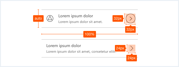
Compact list navigation
<div class="listNavigation listNavigation--compact">
    <div class="listNavigation__lists">
        <div class="listNavigation__header">
            Very simple List navigation
        </div>
        <ul class="listNavigation__list">
            <li class="list__item">
                <a href="#" class="item__link">
                    <div class="item__icon">
                        <span class="iconUxt person" aria-hidden="true"></span>
                    </div>
                    <div class="item__content">
                        <h4 class="label">List item A</h4>
                        <div class="description">This is a list item. There is a status set to indicate something important.</div>
                    </div>
                    <div class="item__metaInfo">
                        <span class="iconUxt arrowSingleRight" aria-hidden="true"></span>
                    </div>
                </a>
            </li>
            <li class="list__item">
                <a href="#" class="item__link">
                    <div class="item__icon">
                        <span class="iconUxt person" aria-hidden="true"></span>
                    </div>
                    <div class="item__content">
                        <h4 class="label">List item B</h4>
                        <div class="description">This is a list item. There is a status set to indicate something important.</div>
                    </div>
                    <div class="item__metaInfo">
                        <button class="button button--ghost has-icon-only item__favorite"></button>
                    </div>
                    <div class="item__metaInfo">
                        <span class="iconUxt arrowSingleRight" aria-hidden="true"></span>
                    </div>
                </a>
            </li>
            <li class="list__item">
                <a href="#" class="item__link">
                    <div class="item__icon">
                        <span class="iconUxt person" aria-hidden="true"></span>
                    </div>
                    <div class="item__content">
                        <h4 class="label">List item C</h4>
                        <div class="description">This is a list item. There is a status set to indicate something important.</div>
                    </div>
                    <div class="item__metaInfo">
                        <button class="button button--ghost has-icon-only item__favorite"></button>
                    </div>
                </a>
            </li>
            <li class="list__item">
                <a href="#" class="item__link">
                    <div class="item__icon">
                        <span class="iconUxt person" aria-hidden="true"></span>
                    </div>
                    <div class="item__content">
                        <h4 class="label">List item D</h4>
                        <div class="description">This is a list item and there is a status set to indicate something important.</div>
                    </div>
                    <div class="item__metaInfo">
                        <button class="button button--ghost has-icon-only item__favorite"></button>
                    </div>
                </a>
            </li>
            <li class="list__item">
                <a href="#" class="item__link">
                    <div class="item__content">
                        <h4 class="label">List item A</h4>
                        <div class="description">This is a list item. There is no icon or status indicator set.</div>
                    </div>
                </a>
            </li>
            <li class="list__item">
                <a href="#" class="item__link">
                    <div class="item__content">
                        <h4 class="label">List item A</h4>
                        <div class="description">This is a list item. There is no icon or status indicator set.</div>
                    </div>
                </a>
            </li>
        </ul>
    </div>
</div>
List navigation, basic example with status indicators
<div class="listNavigation">
    <div class="listNavigation__lists">
        <div class="listNavigation__header">
            Very simple List navigation
        </div>
        <ul class="listNavigation__list">
            <li class="list__item is-error">
                <a href="#" class="item__link">
                    <div class="item__icon">
                        <span class="iconUxt person" aria-hidden="true"></span>
                    </div>
                    <div class="item__content">
                        <h4 class="label">List item A</h4>
                        <div class="description">This is a list item. There is a status set to indicate something important.</div>
                    </div>
                    <div class="item__metaInfo">
                        <span class="iconUxt arrowSingleRight" aria-hidden="true"></span>
                    </div>
                </a>
            </li>
            <li class="list__item is-warning">
                <a href="#" class="item__link">
                    <div class="item__icon">
                        <span class="iconUxt person" aria-hidden="true"></span>
                    </div>
                    <div class="item__content">
                        <h4 class="label">List item B</h4>
                        <div class="description">This is a list item. There is a status set to indicate something important.</div>
                    </div>
                    <div class="item__metaInfo">
                        <button class="button button--ghost has-icon-only item__favorite"></button>
                    </div>
                    <div class="item__metaInfo">
                        <span class="iconUxt arrowSingleRight" aria-hidden="true"></span>
                    </div>
                </a>
            </li>
            <li class="list__item is-success">
                <a href="#" class="item__link">
                    <div class="item__icon">
                        <span class="iconUxt person" aria-hidden="true"></span>
                    </div>
                    <div class="item__content">
                        <h4 class="label">List item C</h4>
                        <div class="description">This is a list item. There is a status set to indicate something important.</div>
                    </div>
                    <div class="item__metaInfo">
                        <button class="button button--ghost has-icon-only item__favorite"></button>
                    </div>
                </a>
            </li>
        </ul>
    </div>
</div>
List navigation, basic example with checkboxes
<div class="listNavigation">
    <div class="listNavigation__lists">
        <div class="listNavigation__header">
            Very simple List navigation
        </div>
        <ul class="listNavigation__list">
            <li class="list__item">
                <a href="#" class="item__link">
                    <div class="checkboxWrapper">
                        <input type="checkbox" class="inputGroup__checkbox" id="checkboxListNavigation01" name="checkboxListNavigation01" value="checkboxListNavigation01" checked="checked" />
                        <label for="checkboxListNavigation01"></label>
                    </div>
                    <div class="item__icon">
                        <span class="iconUxt person" aria-hidden="true"></span>
                    </div>
                    <div class="item__content">
                        <h4 class="label">List item A</h4>
                        <div class="description">This is a list item. There is a status set to indicate something important.</div>
                    </div>
                    <div class="item__metaInfo">
                        <span class="iconUxt arrowSingleRight" aria-hidden="true"></span>
                    </div>
                </a>
            </li>
            <li class="list__item">
                <a href="#" class="item__link">
                    <div class="checkboxWrapper">
                        <input type="checkbox" class="inputGroup__checkbox" id="checkboxListNavigation02" name="checkboxListNavigation02" value="checkboxListNavigation02" checked="checked" />
                        <label for="checkboxListNavigation02"></label>
                    </div>
                    <div class="item__icon">
                        <span class="iconUxt person" aria-hidden="true"></span>
                    </div>
                    <div class="item__content">
                        <h4 class="label">List item B</h4>
                        <div class="description">This is a list item. There is a status set to indicate something important.</div>
                    </div>
                    <div class="item__metaInfo">
                        <button class="button button--ghost has-icon-only item__favorite"></button>
                    </div>
                    <div class="item__metaInfo">
                        <span class="iconUxt arrowSingleRight" aria-hidden="true"></span>
                    </div>
                </a>
            </li>
            <li class="list__item">
                <a href="#" class="item__link">
                    <div class="checkboxWrapper">
                        <input type="checkbox" class="inputGroup__checkbox" id="checkboxListNavigation03" name="checkboxListNavigation03" value="checkboxListNavigation03" checked="checked" />
                        <label for="checkboxListNavigation03"></label>
                    </div>
                    <div class="item__icon">
                        <span class="iconUxt person" aria-hidden="true"></span>
                    </div>
                    <div class="item__content">
                        <h4 class="label">List item C</h4>
                        <div class="description">This is a list item. There is a status set to indicate something important.</div>
                    </div>
                    <div class="item__metaInfo">
                        <button class="button button--ghost has-icon-only item__favorite"></button>
                    </div>
                </a>
            </li>
            <li class="list__item">
                <a href="#" class="item__link">
                    <div class="checkboxWrapper">
                        <input type="checkbox" class="inputGroup__checkbox" id="checkboxListNavigation04" name="checkboxListNavigation04" value="checkboxListNavigation04" checked="checked" />
                        <label for="checkboxListNavigation04"></label>
                    </div>
                    <div class="item__icon">
                        <span class="iconUxt person" aria-hidden="true"></span>
                    </div>
                    <div class="item__content">
                        <h4 class="label">List item D</h4>
                        <div class="description">This is a list item and there is a status set to indicate something important.</div>
                    </div>
                    <div class="item__metaInfo">
                        <button class="button button--ghost has-icon-only item__favorite"></button>
                    </div>
                </a>
            </li>
            <li class="list__item">
                <a href="#" class="item__link">
                    <div class="checkboxWrapper">
                        <input type="checkbox" class="inputGroup__checkbox" id="checkboxListNavigation05" name="checkboxListNavigation05" value="checkboxListNavigation05" checked="checked" />
                        <label for="checkboxListNavigation05"></label>
                    </div>
                    <div class="item__content">
                        <h4 class="label">List item A</h4>
                        <div class="description">This is a list item. There is no icon or status indicator set.</div>
                    </div>
                </a>
            </li>
            <li class="list__item">
                <a href="#" class="item__link">
                    <div class="checkboxWrapper">
                        <input type="checkbox" class="inputGroup__checkbox" id="checkboxListNavigation06" name="checkboxListNavigation06" value="checkboxListNavigation06" checked="checked" />
                        <label for="checkboxListNavigation06"></label>
                    </div>
                    <div class="item__content">
                        <h4 class="label">List item A</h4>
                        <div class="description">This is a list item. There is no icon or status indicator set.</div>
                    </div>
                </a>
            </li>
        </ul>
    </div>
</div>
Usage
| Element | Class | Description |
|---|---|---|
.listNavigation | .listNavigation--alternateBgColor | Colors the complete list navigation with a white background instead of grey, all child elements are colored white where appropriate, too. |
.listNavigation | .listNavigation--compact | Compact variant of the list navigation. |
.list__item | .is-info, .is-warning, .is-error, .is-success | Adds different states to the list item. |
.item__icon | Optional element: adds a supporting visual. | |
.item__metaInfo | Optional element: adds an icon at the end of a list element to e.g. indicate a status. | |
.list__item | .list__item--oneLine .list__item--twoLine .list__item--threeLine | By default a list item is always two line tall. These classes restrict the height of a list item to be in either one line (just the label), two line (label + one line description) or three line. |
.item__link | .is-activated | Sets the list item to the same style as selected usin the mouse. |
.item__link | .is-current | Marks the list item such that it is the currently selected item. |
.item__link | .is-disabled | Disables the list item visually. |