Layout
A layout offers versatile ways of presenting and structuring content to create a balanced user experience.
Overview
The layout and app structure is the foundation for designing Insights Hub or Industrial IoT applications.
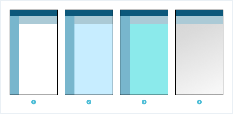
A layout consists of several regions which in combination form several layout patterns for different scenarios.
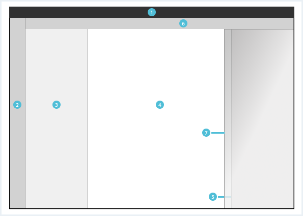
General app layout
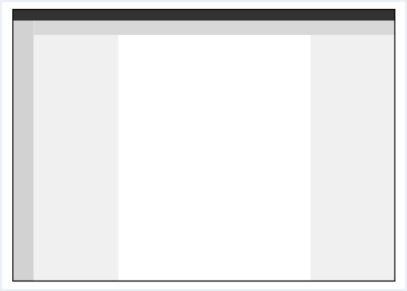
General construction
A layout consists of combinations of the following elements:
- Global region: The global region is reserved for the OS Bar (only).
- Local region: The local region is reserved for the app bar and used as the first level navigation within an application.
- Leading region: The leading region is mainly used for the content navigation and selection.
- Main region: The main region contains the main content of the application.
- Context region: The context region is used for additional information and components.
- App header: The app header can be used to display hierarchy in form of a breadcrumb, display information that has to be visible at all times and contains the region toggle buttons.
- Item region: The item region is only visible when an item is selected. Information regarding the selected item is displayed to the user.
The global and the main region are required in all parts of an application. All other regions are optional and depend on context and pattern.
Region behavior
Desktop and tablet (landscape) screens
Mobile and tablet (portrait) screens
Responsive behavior
Mobile size and tablet portrait size
To use the limited screen area of a mobile device, there are two options for the sidebars - overlay the main content or push the main content. The smaller the device, the more the overlay mode is used.
Different regions in Layout
There are different regions a layout can make use of. For example, you can have a layout without a leading or a context region.To see a detailed explanation of all existing helper classes, please refer to the usage table below and inspect the samples in action with your developer tools.
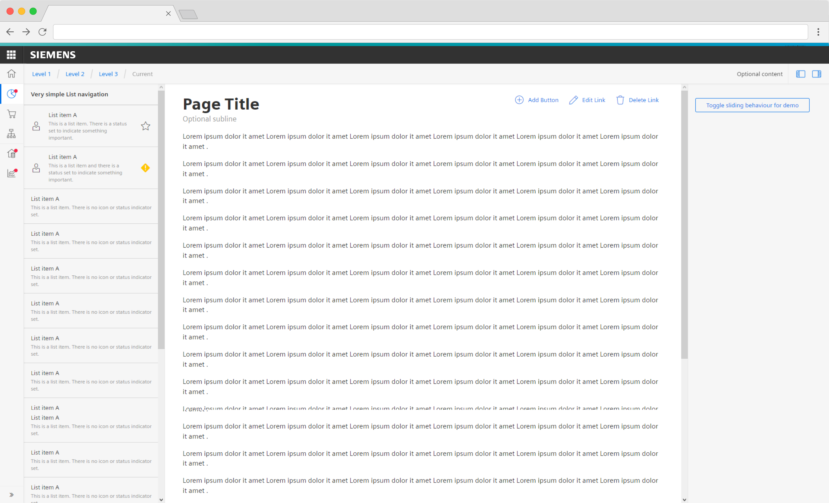
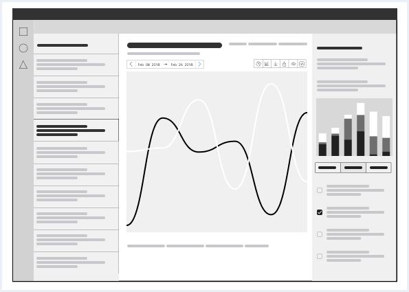
Layout with sample content and functionality
This layout contains all regions as well as sample content and functionality.Layout with sample content and functionality
<div class="appWrapper has-appBarAdvanced has-appBarAdvanced-collapsed">
<div class="appWrapper__regions has-appHeader has-contextRegion has-leadingRegion contextRegion-is-expanded leadingRegion-is-expanded appWrapper__regions--pushLayout">
<section class="appHeader">
<div class="appHeader__breadcrumb">
<div class="breadcrumb">
<div class="breadcrumb__item">
<a href="#">Level 1</a>
</div>
<div class="breadcrumb__item">
<a href="#">Level 2</a>
</div>
<div class="breadcrumb__item">
<a href="#">Level 3</a>
</div>
<div class="breadcrumb__item is-current">
<a href="#">Current</a>
</div>
</div>
</div>
<div class="appHeader__content">
Optional content
</div>
<div class="appHeader__viewToggler">
<button class="button button--ghost has-icon-only button--leading" id="toggleLeadingRegionDemo">
<span aria-hidden="true" class="iconUxt"></span>
</button>
<button class="button button--ghost has-icon-only button--context" id="toggleContextRegionDemo">
<span aria-hidden="true" class="iconUxt is-flipped-horizontal"></span>
</button>
</div>
</section>
<section class="leadingRegion">
<div class="listNavigation">
<div class="listNavigation__lists">
<div class="listNavigation__header">
Very simple List navigation
</div>
<ul class="listNavigation__list">
<li class="list__item">
<a href="#" class="item__link">
<div class="item__icon">
<span class="iconUxt person" aria-hidden="true"></span>
</div>
<div class="item__content">
<h4 class="label">List item A</h4>
<div class="description">This is a list item. There is a status set to indicate something important.</div>
</div>
<div class="item__metaInfo">
<span class="iconUxt star has-color-info-dark" aria-hidden="true"></span>
</div>
</a>
</li>
<li class="list__item">
<a href="#" class="item__link">
<div class="item__icon">
<span class="iconUxt person" aria-hidden="true"></span>
</div>
<div class="item__content">
<h4 class="label">List item A</h4>
<div class="description">This is a list item and there is a status set to indicate something important.</div>
</div>
<div class="item__metaInfo">
<span class="iconUxt exclamationDiamond filled has-color-warning" aria-hidden="true"></span>
</div>
</a>
</li>
<li class="list__item">
<a href="#" class="item__link">
<div class="item__content">
<h4 class="label">List item A</h4>
<div class="description">This is a list item. There is no icon or status indicator set.</div>
</div>
</a>
</li>
<li class="list__item">
<a href="#" class="item__link">
<div class="item__content">
<h4 class="label">List item A</h4>
<div class="description">This is a list item. There is no icon or status indicator set.</div>
</div>
</a>
</li>
<li class="list__item">
<a href="#" class="item__link">
<div class="item__content">
<h4 class="label">List item A</h4>
<div class="description">This is a list item. There is no icon or status indicator set.</div>
</div>
</a>
</li>
<li class="list__item">
<a href="#" class="item__link">
<div class="item__content">
<h4 class="label">List item A</h4>
<div class="description">This is a list item. There is no icon or status indicator set.</div>
</div>
</a>
</li>
<li class="list__item">
<a href="#" class="item__link">
<div class="item__content">
<h4 class="label">List item A</h4>
<div class="description">This is a list item. There is no icon or status indicator set.</div>
</div>
</a>
</li>
<li class="list__item">
<a href="#" class="item__link">
<div class="item__content">
<h4 class="label">List item A</h4>
<div class="description">This is a list item. There is no icon or status indicator set.</div>
</div>
</a>
</li>
<li class="list__item">
<a href="#" class="item__link">
<div class="item__content">
<h4 class="label">List item A</h4>
<div class="description">This is a list item. There is no icon or status indicator set.</div>
</div>
</a>
</li>
<li class="list__item">
<a href="#" class="item__link">
<div class="item__content">
<h4 class="label">List item A</h4>
<div class="description">This is a list item. There is no icon or status indicator set.</div>
</div>
</a>
</li>
<li class="list__item">
<a href="#" class="item__link">
<div class="item__content">
<h4 class="label">List item A</h4>
<div class="description">This is a list item. There is no icon or status indicator set.</div>
</div>
</a>
</li>
<li class="list__item">
<a href="#" class="item__link">
<div class="item__content">
<h4 class="label">List item A</h4>
<div class="description">This is a list item. There is no icon or status indicator set.</div>
</div>
</a>
</li>
<li class="list__item">
<a href="#" class="item__link">
<div class="item__content">
<h4 class="label">List item A</h4>
<div class="description">This is a list item. There is no icon or status indicator set.</div>
</div>
</a>
</li>
<li class="list__item">
<a href="#" class="item__link">
<div class="item__content">
<h4 class="label">List item A</h4>
<div class="description">This is a list item. There is no icon or status indicator set.</div>
</div>
</a>
</li>
</ul>
</div>
</div>
</section>
<section class="mainRegion">
<div class="contentHeader">
<div class="contentHeader__header">
<h1 class="header__headline">Page Title</h1>
<div class="header__subline">Optional subline</div>
</div>
<div class="contentHeader__actions">
<button class="button--secondaryContentAction">
<span class="iconUxt addCircle" aria-hidden="true"></span>
Add Button
</button>
<a class="button button--secondaryContentAction" href="#">
<span class="iconUxt edit" aria-hidden="true"></span>
Edit Link
</a>
<a class="button button--secondaryContentAction" href="#">
<span class="iconUxt delete" aria-hidden="true"></span>
Delete Link
</a>
</div>
</div>
<p>Lorem ipsum dolor it amet Lorem ipsum dolor it amet Lorem ipsum dolor it amet Lorem ipsum dolor it amet Lorem ipsum dolor it amet Lorem ipsum dolor it amet .</p>
<p>Lorem ipsum dolor it amet Lorem ipsum dolor it amet Lorem ipsum dolor it amet Lorem ipsum dolor it amet Lorem ipsum dolor it amet Lorem ipsum dolor it amet .</p>
<p>Lorem ipsum dolor it amet Lorem ipsum dolor it amet Lorem ipsum dolor it amet Lorem ipsum dolor it amet Lorem ipsum dolor it amet Lorem ipsum dolor it amet .</p>
<p>Lorem ipsum dolor it amet Lorem ipsum dolor it amet Lorem ipsum dolor it amet Lorem ipsum dolor it amet Lorem ipsum dolor it amet Lorem ipsum dolor it amet .</p>
<p>Lorem ipsum dolor it amet Lorem ipsum dolor it amet Lorem ipsum dolor it amet Lorem ipsum dolor it amet Lorem ipsum dolor it amet Lorem ipsum dolor it amet .</p>
<p>Lorem ipsum dolor it amet Lorem ipsum dolor it amet Lorem ipsum dolor it amet Lorem ipsum dolor it amet Lorem ipsum dolor it amet Lorem ipsum dolor it amet .</p>
<p>Lorem ipsum dolor it amet Lorem ipsum dolor it amet Lorem ipsum dolor it amet Lorem ipsum dolor it amet Lorem ipsum dolor it amet Lorem ipsum dolor it amet .</p>
<p>Lorem ipsum dolor it amet Lorem ipsum dolor it amet Lorem ipsum dolor it amet Lorem ipsum dolor it amet Lorem ipsum dolor it amet Lorem ipsum dolor it amet .</p>
<p>Lorem ipsum dolor it amet Lorem ipsum dolor it amet Lorem ipsum dolor it amet Lorem ipsum dolor it amet Lorem ipsum dolor it amet Lorem ipsum dolor it amet .</p>
<p>Lorem ipsum dolor it amet Lorem ipsum dolor it amet Lorem ipsum dolor it amet Lorem ipsum dolor it amet Lorem ipsum dolor it amet Lorem ipsum dolor it amet .</p>
<p>Lorem ipsum dolor it amet Lorem ipsum dolor it amet Lorem ipsum dolor it amet Lorem ipsum dolor it amet Lorem ipsum dolor it amet Lorem ipsum dolor it amet .</p>
<p>Lorem ipsum dolor it amet Lorem ipsum dolor it amet Lorem ipsum dolor it amet Lorem ipsum dolor it amet Lorem ipsum dolor it amet Lorem ipsum dolor it amet .</p>
<p>Lorem ipsum dolor it amet Lorem ipsum dolor it amet Lorem ipsum dolor it amet Lorem ipsum dolor it amet Lorem ipsum dolor it amet Lorem ipsum dolor it amet .</p>
<p>Lorem ipsum dolor it amet Lorem ipsum dolor it amet Lorem ipsum dolor it amet Lorem ipsum dolor it amet Lorem ipsum dolor it amet Lorem ipsum dolor it amet .</p>
<p>Lorem ipsum dolor it amet Lorem ipsum dolor it amet Lorem ipsum dolor it amet Lorem ipsum dolor it amet Lorem ipsum dolor it amet Lorem ipsum dolor it amet .</p>
<p>Lorem ipsum dolor it amet Lorem ipsum dolor it amet Lorem ipsum dolor it amet Lorem ipsum dolor it amet Lorem ipsum dolor it amet Lorem ipsum dolor it amet .</p>
</section>
<section class="contextRegion">
<button class="button button--secondary" id="toggleSlidingBehaviour">
Toggle sliding behaviour for demo
</button>
</section>
</div>
<nav class="appBarAdvanced">
<div class="appBarAdvanced__inner">
<div class="appBarAdvanced__header">
<!-- optional header -->
</div>
<ul class="appBarAdvanced__content">
<li class="level1 is-home">
<a href="#" class="item__link">
<div class="item__icon">
<i aria-hidden="true" class="iconUxt home"></i>
</div>
<span class="item__title">Home</span>
</a>
</li>
<li class="level1 is-active">
<a href="#" class="item__link">
<div class="item__icon has-notification">
<i aria-hidden="true" class="iconUxt chartPie"></i>
</div>
<span class="item__title">Issues</span>
<span class="badge">31</span>
</a>
<ul class="level2">
<li class="subitem">
<a href="#">Details</a>
</li>
<li class="subitem">
<a href="#">Activity</a>
</li>
</ul>
</li>
<li class="level1">
<a href="#" class="item__link">
<div class="item__icon">
<i aria-hidden="true" class="iconUxt shoppingCart"></i>
</div>
<span class="item__title">Activity</span>
</a>
<ul class="level2">
<li class="subitem">
<a href="#">Details</a>
</li>
<li class="subitem">
<a href="#">Activity</a>
</li>
</ul>
</li>
<li class="level1">
<a href="#" class="item__link">
<div class="item__icon">
<i aria-hidden="true" class="iconUxt hierarchy"></i>
</div>
<span class="item__title">Members</span>
</a>
<ul class="level2">
<li class="subitem">
<a href="#">Details</a>
</li>
<li class="subitem">
<a href="#">Activity</a>
</li>
</ul>
</li>
<li class="level1 has-separator">
<a href="#" class="item__link">
<div class="item__icon has-notification">
<i aria-hidden="true" class="iconUxt subtenant4"></i>
</div>
<span class="item__title">Settings</span>
<span class="badge">12</span>
</a>
<ul class="level2">
<li class="subitem">
<a href="#">Details</a>
</li>
<li class="subitem">
<a href="#">Activity</a>
</li>
</ul>
</li>
<li class="level1">
<a href="#" class="item__link">
<div class="item__icon has-notification">
<i aria-hidden="true" class="iconUxt chartTrend"></i>
</div>
<span class="item__title"> Tools </span>
<span class="badge">4</span>
</a>
<ul class="level2">
<li class="subitem">
<a href="#"> Details </a>
</li>
<li class="subitem">
<a href="#"> Activity </a>
</li>
</ul>
</li>
</ul>
<div class="appBarAdvanced__footer">
<a href="#" id="appBar--expander">
<!-- optional expand / collapse label -->
<span class="item__title">Collapse</span>
</a>
</div>
</div>
</nav>
</div>
<script type="text/javascript" src="https://static.eu1.mindsphere.io/osbar/v4/js/main.min.js"></script>
<script>
_msb.init({
title: "App Layout",
showLegal: true,
polyfills: {
promise: true
}
});
window.onload = function(e){
// polyfill for closest() - IE11 does not support that out of the box
if (!Element.prototype.matches) {
Element.prototype.matches = Element.prototype.msMatchesSelector ||
Element.prototype.webkitMatchesSelector;
}
if (!Element.prototype.closest) {
Element.prototype.closest = function(s) {
var el = this;
do {
if (Element.prototype.matches.call(el, s)) return el;
el = el.parentElement || el.parentNode;
} while (el !== null && el.nodeType === 1);
return null;
};
}
// toggle expand / collapse feature of sidebar
var toggle = document.querySelector("#appBar--expander");
var appWrapper = document.querySelector(".appWrapper");
toggle.addEventListener("click", function () {
// appBar.classList.toggle("has-appBarAdvanced-collapsed");
appWrapper.classList.toggle("has-appBarAdvanced-collapsed");
var elems = document.querySelectorAll(".appBarAdvanced .level1");
for (var i = 0; i < elems.length; i++) {
elems[i].classList.remove("is-shown");
}
});
// set active state of item on click
var level1links = document.querySelectorAll(".appBarAdvanced .item__link");
for (var i = 0; i < level1links.length; i++) {
level1links[i].addEventListener("click", function (event) {
for (var j = 0; j < level1links.length; j++) {
level1links[j].parentElement.classList.remove("is-active");
}
event.target.closest(".level1").classList.add("is-active");
event.target.blur();
event.target.parentNode.parentNode.blur(); // needed for collapsed mode
event.preventDefault();
});
}
// add class to show app bar submenu on hover
var timerHover;
var collapsedAppBarElements = document.querySelectorAll(
".has-appBarAdvanced-collapsed .appBarAdvanced .level1"
);
var collapsedAppBarLinks = document.querySelectorAll(
".has-appBarAdvanced-collapsed .appBarAdvanced .level1 a"
);
for (var i = 0; i < collapsedAppBarLinks.length; i++) {
collapsedAppBarLinks[i].addEventListener("mouseenter", function (event) {
clearTimeout(timerHover);
for (var j = 0; j < collapsedAppBarElements.length; j++) {
collapsedAppBarElements[j].classList.remove("is-shown");
}
event.target.closest(".level1").classList.add("is-shown");
});
}
// hide all possible open app bar items on mouse-leave, but wait for a split second
// to avoid unintentional mouseleave events
var appBar = document.querySelector(".appBarAdvanced");
appBar.addEventListener("mouseleave", function () {
timerHover = setTimeout(function () {
for (var j = 0; j < collapsedAppBarElements.length; j++) {
collapsedAppBarElements[j].classList.remove("is-shown");
}
}, 100);
});
var regionsWrapper = document.querySelector(".appWrapper__regions");
// functionality to hide context and/or leadimg region through button
var toggleLeading = document.querySelector("#toggleLeadingRegionDemo");
toggleLeading.addEventListener('click', function() {
regionsWrapper.classList.toggle('leadingRegion-is-expanded');
});
var toggleContext = document.querySelector("#toggleContextRegionDemo");
toggleContext.addEventListener('click', function() {
regionsWrapper.classList.toggle('contextRegion-is-expanded');
});
// functionality to toggle sliding behaviour for leading and context region
var switchLayoutType = document.querySelector("#toggleSlidingBehaviour");
switchLayoutType.addEventListener('click', function() {
regionsWrapper.classList.toggle('appWrapper__regions--pushLayout');
});
}
</script>
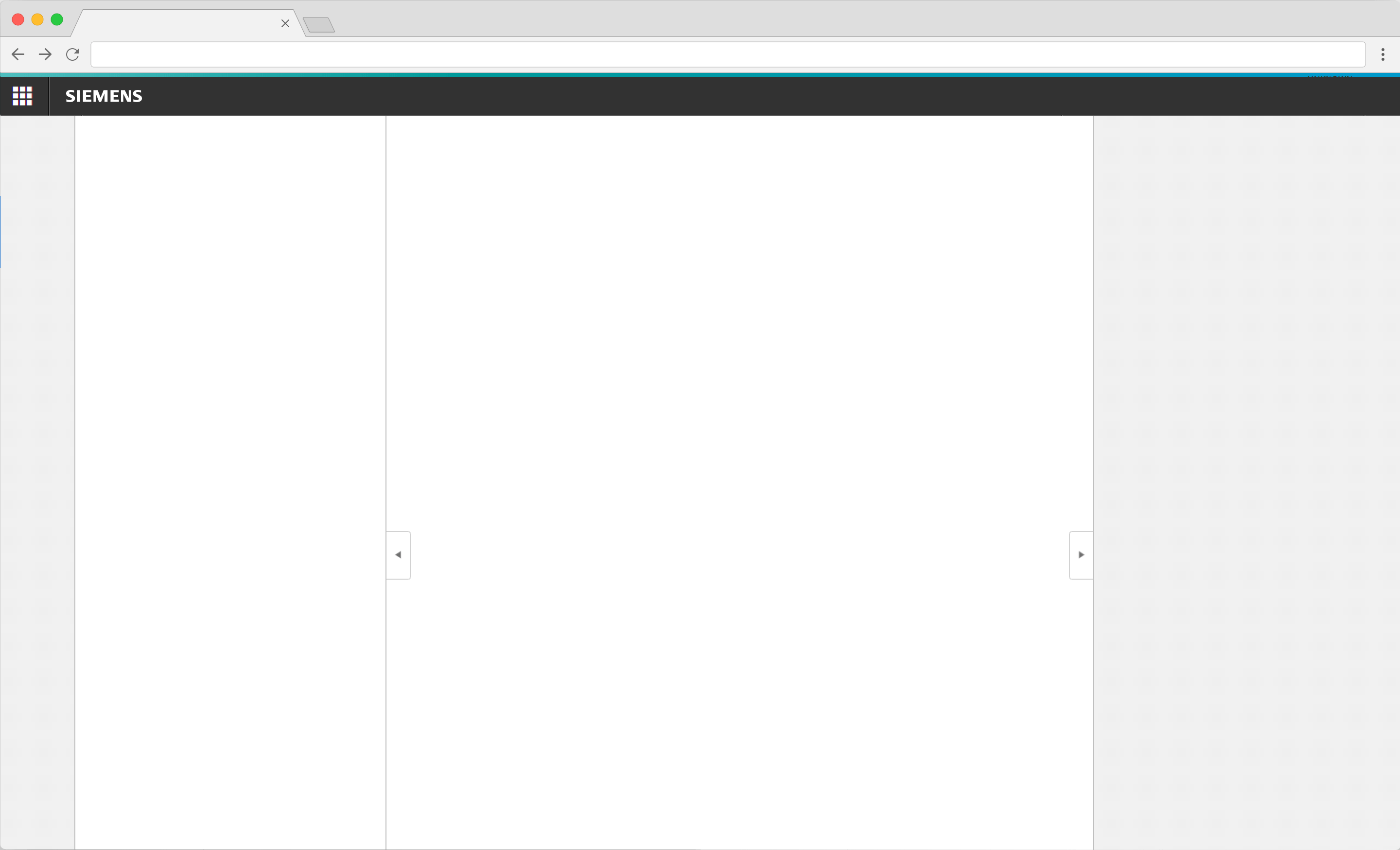
Empty layout with all regions
This layout contains all regions (including the App bar), without any content.Empty layout with all regions
<div class="appWrapper has-appBarAdvanced has-appBarAdvanced-collapsed">

    <div class="appWrapper__regions has-appHeader has-contextRegion has-leadingRegion contextRegion-is-expanded leadingRegion-is-expanded appWrapper__regions--pushLayout">

        <section class="appHeader">
            <div class="appHeader__breadcrumb">
            </div>
            <div class="appHeader__content">
            </div>
            <div class="appHeader__viewToggler">
                <button class="button button--ghost has-icon-only button--leading" id="toggleLeadingRegionDemo">
                    <span aria-hidden="true" class="iconUxt"></span>
                </button>

                <button class="button button--ghost has-icon-only button--context" id="toggleContextRegionDemo">
                    <span aria-hidden="true" class="iconUxt is-flipped-horizontal"></span>
                </button>
            </div>
        </section>

        <section class="leadingRegion">
        </section>

        <section class="mainRegion">
        </section>

        <section class="contextRegion">
        </section>

    </div>

    <nav class="appBarAdvanced">
        <div class="appBarAdvanced__inner">
            <div class="appBarAdvanced__header">
                <!-- optional header -->
            </div>
            <ul class="appBarAdvanced__content">
                <li class="level1 is-home">
                    <a href="#" class="item__link">
                        <div class="item__icon">
                            <i aria-hidden="true" class="iconUxt home"></i>
                        </div>
                        <span class="item__title">Home</span>
                    </a>
                </li>
            </ul>
            <div class="appBarAdvanced__footer">
                <a href="#" id="appBar--expander">
                    <!-- optional expand / collapse label -->
                    <span class="item__title">Collapse</span>
                </a>
            </div>
        </div>
    </nav>
</div>

<script type="text/javascript" src="https://static.eu1.mindsphere.io/osbar/v4/js/main.min.js"></script>
<script>
    _msb.init({
        title: "App Layout",
        showLegal: true,
        polyfills: {
            promise: true
        }
    });

    window.onload = function(e){
        // polyfill for closest() - IE11 does not support that out of the box
        if (!Element.prototype.matches) {
            Element.prototype.matches = Element.prototype.msMatchesSelector ||
                Element.prototype.webkitMatchesSelector;
        }
        if (!Element.prototype.closest) {
            Element.prototype.closest = function(s) {
                var el = this;

                do {
                    if (Element.prototype.matches.call(el, s)) return el;
                    el = el.parentElement || el.parentNode;
                } while (el !== null && el.nodeType === 1);
                return null;
            };
        }

        // toggle expand / collapse feature of sidebar
        var toggle = document.querySelector("#appBar--expander");
        var appWrapper = document.querySelector(".appWrapper");
        toggle.addEventListener("click", function () {
            // appBar.classList.toggle("has-appBarAdvanced-collapsed");
            appWrapper.classList.toggle("has-appBarAdvanced-collapsed");
            var elems = document.querySelectorAll(".appBarAdvanced .level1");
            for (var i = 0; i < elems.length; i++) {
                elems[i].classList.remove("is-shown");
            }
        });

        // set active state of item on click
        var level1links = document.querySelectorAll(".appBarAdvanced .item__link");
        for (var i = 0; i < level1links.length; i++) {
            level1links[i].addEventListener("click", function (event) {
                for (var j = 0; j < level1links.length; j++) {
                    level1links[j].parentElement.classList.remove("is-active");
                }
                event.target.closest(".level1").classList.add("is-active");
                event.target.blur();
                event.target.parentNode.parentNode.blur(); // needed for collapsed mode
                event.preventDefault();
            });
        }

        // add class to show app bar submenu on hover
        var timerHover;
        var collapsedAppBarElements = document.querySelectorAll(
            ".has-appBarAdvanced-collapsed .appBarAdvanced .level1"
        );
        var collapsedAppBarLinks = document.querySelectorAll(
            ".has-appBarAdvanced-collapsed .appBarAdvanced .level1 a"
        );
        for (var i = 0; i < collapsedAppBarLinks.length; i++) {
            collapsedAppBarLinks[i].addEventListener("mouseenter", function (event) {
                clearTimeout(timerHover);
                for (var j = 0; j < collapsedAppBarElements.length; j++) {
                    collapsedAppBarElements[j].classList.remove("is-shown");
                }
                event.target.closest(".level1").classList.add("is-shown");
            });
        }

        // hide all possible open app bar items on mouse-leave, but wait for a split second
        // to avoid unintentional mouseleave events
        var appBar = document.querySelector(".appBarAdvanced");
        appBar.addEventListener("mouseleave", function () {
            timerHover = setTimeout(function () {
                for (var j = 0; j < collapsedAppBarElements.length; j++) {
                    collapsedAppBarElements[j].classList.remove("is-shown");
                }
            }, 100);
        });
        var regionsWrapper = document.querySelector(".appWrapper__regions");

        // functionality to hide context and/or leadimg region through button
        var toggleLeading = document.querySelector("#toggleLeadingRegionDemo");
        toggleLeading.addEventListener('click', function() {
            regionsWrapper.classList.toggle('leadingRegion-is-expanded');
        });

        var toggleContext = document.querySelector("#toggleContextRegionDemo");
        toggleContext.addEventListener('click', function() {
            regionsWrapper.classList.toggle('contextRegion-is-expanded');
        });
    }
</script>
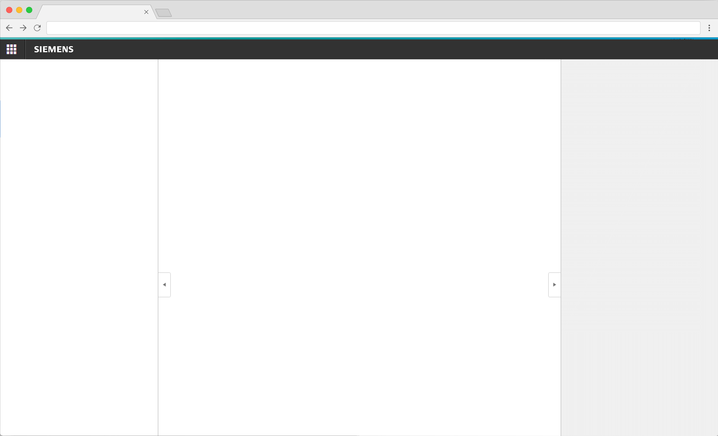
Empty layout without App bar
This layout contains all regions (without the App bar) without any content.Empty layout without App bar
<div class="appWrapper">

    <div class="appWrapper__regions has-appHeader has-contextRegion has-leadingRegion contextRegion-is-expanded leadingRegion-is-expanded appWrapper__regions--pushLayout">

        <section class="appHeader">
            <div class="appHeader__breadcrumb">
                <div class="breadcrumb">
                    <div class="breadcrumb__item">
                        <a href="#">Level 1</a>
                    </div>
                    <div class="breadcrumb__item">
                        Level 2
                    </div>
                    <div class="breadcrumb__item">
                        <a href="#">Level 3</a>
                    </div>
                    <div class="breadcrumb__item is-current">
                        <a href="#">Level 4</a>
                    </div>
                </div>
            </div>
            <div class="appHeader__content">
                Optional content
            </div>
            <div class="appHeader__viewToggler">
                <button class="button button--ghost has-icon-only button--leading" id="toggleLeadingRegionDemo">
                    <span aria-hidden="true" class="iconUxt"></span>
                </button>

                <button class="button button--ghost has-icon-only button--context" id="toggleContextRegionDemo">
                    <span aria-hidden="true" class="iconUxt is-flipped-horizontal"></span>
                </button>
            </div>
        </section>

        <section class="leadingRegion">
            <!-- content for leading region goes here -->
            Leading region
        </section>

        <section class="mainRegion">
            <!-- content for main region goes here -->
            Main region
        </section>

        <section class="contextRegion">
            <!-- content for context region goes here -->
            <button class="button button--secondary" id="toggleSlidingBehaviour">
                Toggle sliding behaviour for demo
            </button>
        </section>

    </div>

</div>

<script type="text/javascript" src="https://static.eu1.mindsphere.io/osbar/v4/js/main.min.js"></script>
<script>
    _msb.init({
        title: "App Layout",
        showLegal: true,
        polyfills: {
            promise: true
        }
    });

    window.onload = function(e){
        var regionsWrapper = document.querySelector(".appWrapper__regions");

        // functionality to hide context and/or leading region through button
        var toggleLeading = document.querySelector("#toggleLeadingRegionDemo");
        toggleLeading.addEventListener("click", function () {
            regionsWrapper.classList.toggle("leadingRegion-is-expanded");
        });

        var toggleContext = document.querySelector("#toggleContextRegionDemo");
        toggleContext.addEventListener("click", function () {
            regionsWrapper.classList.toggle("contextRegion-is-expanded");
        });

        // functionality to toggle sliding behaviour for leading and context region
        var switchLayoutType = document.querySelector("#toggleSlidingBehaviour");
        switchLayoutType.addEventListener('click', function() {
            regionsWrapper.classList.toggle('appWrapper__regions--pushLayout');
        });
    }
</script>
Usage
| Element | Class | Description |
|---|---|---|
.appWrapper__regions | .has-appBar | Moves the regions to the right so that there is enough space for an app bar on the left. If this class is not present, the leading or main region starts at the very left of the browser window. |
.appWrapper__regions | .has-appHeader | Moves the regions down to make room for the app header (including mobile buttons for hiding/showing leading and context region). |
.appWrapper__regions | .has-leadingRegion | Sets the layout for a leading region on the left. If not set, the leading region will not be shown, even if it is present in the markup. |
.appWrapper__regions | .has-contextRegion | Sets the layout for a context region on the right. If not set, the context region will not be shown, even if it is present in the markup. |
.appWrapper__regions | .leadingRegion-is-expanded | Changes the layout such that the leading region is visible and the other regions react accordingly. Use this class to show/toggle the leading region. |
.appWrapper__regions | .contextRegion-is-expanded | Changes the layout such that the context region is visible and the other regions react accordingly. Use this class to show/toggle the context region. |
.appWrapper__regions | .appWrapper__regions--pushLayout | Sets the layout algorithm such that for tablets in portrait mode (and above) leading region and context region 'share' the available space (= main region uses whats left of leading and context region). Default behaviour without this class is that the leading and context region 'overlay' the main region. |
.appWrapper__regions | .has-distribution-width-xx | Overrides the default width distribution between main region and context region. By default the context region has a width of 320px, by applying one of the following classes this can be set to the according percentage distribution. Please note: This override only works with tablets with a screen width of >= 768 pixels, below that it will fallback to default width. Possible values are:
.has-distribution-width-33, .has-distribution-width-50, ... |
.leadingRegion, .contextRegion | .leadingRegion--hasSpacing .contextRegion--hasSpacing | Adds the same spacing (technically: margin) to the leading / context region as the main region. Without these classes the regions default to a zero spacing. |
.appHeader__viewToggler .button | .button--leading.button--context | These classes are necessary on the two buttons responsible for showing/hiding the leading and context region(s) to indicate on the buttons whether these areas are visible or not. |
.appHeader__viewToggler .button | .is-disabled | Can be used to disable the button(s) for leading and/or context region. |