Form and form elements
A form allows the user to input data.
Usage
When to use
Use a form in the following cases:
- Use forms to collect information from the user.
Types
There are the following UI element types:
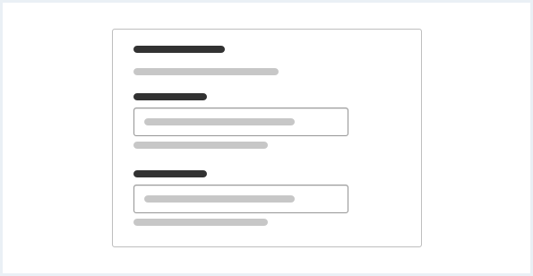
Text input controls
Text input elements have a top aligned label. They can also have an optional placeholder text and a description.
Single text input
Use a single text input to limit the amount of text to enter. You should specify the expected format in the title, such as number or email address.

Textarea
A textarea is a multiline text input that allows the user to enter long text.
Selection controls
Checkbox
Use a checkbox group to allow users to select no, one or more options. The group label informs the user about the topic of the group. The checkbox label informs the user what will happen if the box is checked. Checkboxes and the checkbox group can have a description text for explanation.

Radio button
Use a radio button group when you want the user to select a single option from a short list. If you have more than ten options, consider using a select instead. Use a description text to give more explanation.

Switch
Use a switch to visualize the selection of binary states, for example “On” or “Off”.

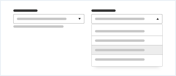
Select
Use a select to let the user choose from a set of multiple choices.
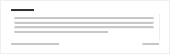
Fieldset
A fieldset visually groups related form elements. The fieldset can only be used in forms. Fieldsets shall be used to structure complex forms within logical groups. Fieldsets are not mandatory but their use is considered best practice.
Don’t mix form content without fieldsets with form content contained in fieldsets within a single form to create consistent forms.
General construction
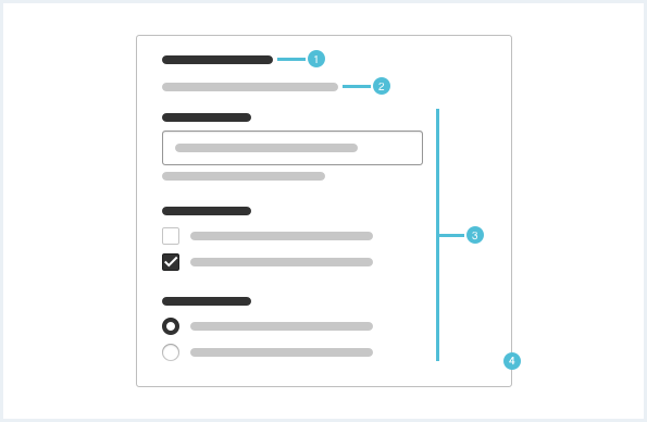
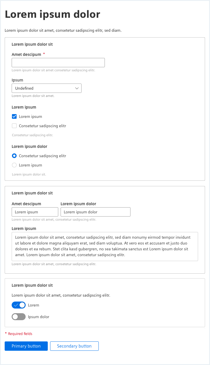
A form consists of the following elements:
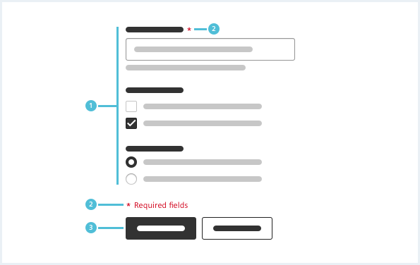
- UI elements, 2. Required field and indicator, 3. Submit buttons
1. UI elements
- UI elements are disabled if not currently needed.
- Various UI elements are described in the types section above.
2. Required field and indicator
- Mandatory input fields are marked with an asterisk.
3. Submit buttons
- Use a primary button for the main action and a secondary or ghost button for alternative actions.
- The submit buttons under a form should be left aligned with the primary button at first.
- For further information, see chapter Button.
Fieldset
- A fieldset visually groups related form elements.
- It can only be used in forms.
- Don’t mix form content with fieldsets and form content without fieldsets.
Use a fieldset in the following cases:
- When there is a relation between multiple inputs and controls.
- When actions affect multiple control elements.
- When a form is too complex to be represented or filled out in one single step.
- Title, 2. Description, 3. UI elements, 4. Fieldset
1. Title
- A title is mandatory.
2. Description
- A description is optional but recommended.
- The description gives context information about the contained control elements.
3. UI elements
- A fieldset contains multiple UI elements.
4. Fieldset
- A fieldset visually groups all contained elements.
- The fieldset is visually related to the container. It inherits nearly all options of the container, though a fieldset can never be a simple container without title and it does not have content actions.
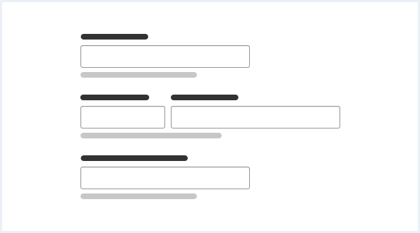
Layout
Arrange input controls in one column. User inputs that are directly related may be placed next to each other. For example postal code and city.
Progressive disclosure
Keep the form as simple as possible. Reveal more input controls only when they are needed.
Behavior
Form validation is explained in the chapter Form validation.
Do’s & Don’ts
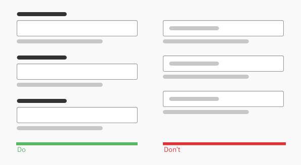
- Use labels to give input controls a title.
- Never label input fields inside the placeholder text. With user input the placeholder text is hidden.
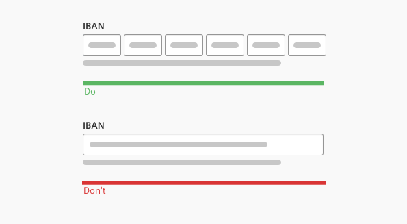
- Fit the field size to the expected content.
- Don’t use one field size for all input formats.
Style
This chapter shows form styles in the User Experience Toolkit.
Overview
Also see chapter Form validation and Typography for the use of the different font sizes and font styles.
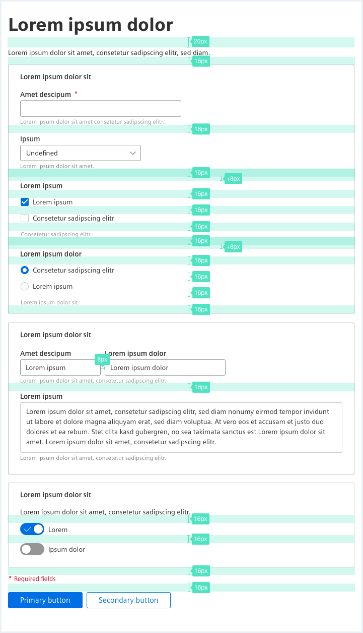
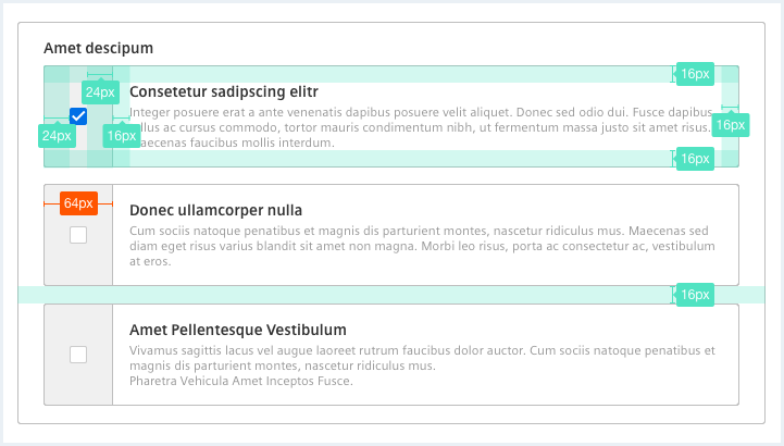
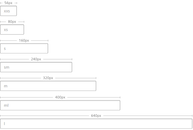
Sizing and spacing
The following measurements show the dimensions for forms:
| Type | Property | Spacing |
|---|---|---|
| Input controls | margin-bottom | 16px |
| Form submit actions | margin-bottom | 16px |
| Additional whitespace for visual separation of unrelated controls | margin-bottom | + 8px |
Form
<form novalidate="" autocomplete="off">
    <!-- Form elements, e.g. fieldsets, form-groups, etc., go here -->
</form>
It is considered best practice to structure a form (and/or complex forms) within logical groups. The 'fieldset' element is the appropriate element for such grouping.
A form can be used without fieldsets, but you must not mix form content with fieldsets and form content without fieldsets.
Fieldset
<div class="fieldset">
    <div class="legend">Fieldset title</div>
    <div>Here goes the form content for this fieldset with fieldset class.</div>
</div><fieldset>
<legend>Fieldset title</legend>
<div>Here goes the form content in a native fieldset.</div>
</fieldset>
Alternative fieldset
<fieldset class="fieldset--alternative">
    <legend>
        <div class="legend__title">Alternative fieldset title</div>
        <div class="legend__subtitle">Lorem ipsum dolor sit amet fieldset subtitle bibendum Sollicitudin Condimentum.</div>
    </legend>
    <div>Here goes the form content in a native fieldset.</div>
</fieldset>

<div class="fieldset fieldset--alternative">
    <div class="legend">
        <div class="legend__title">Alternative fieldset title</div>
        <div class="legend__subtitle">Lorem ipsum dolor sit amet fieldset subtitle bibendum Sollicitudin Condimentum.</div>
    </div>
    <div>Here goes the form content for this element with fieldset class.</div>
</div>
Alternative compact fieldset
<fieldset class="fieldset--alternative fieldset--compact">
    <legend>
        <div class="legend__title">Alternative compact fieldset title</div>
        <div class="legend__subtitle">Lorem ipsum dolor sit amet fieldset subtitle bibendum Sollicitudin Condimentum.</div>
    </legend>
    <div>Here goes the form content in a native fieldset.</div>
</fieldset>
Alternative compact fieldset
<div class="fieldset fieldset--alternative fieldset--compact">
    <div class="legend">
        <div class="legend__title">Alternative compact fieldset title</div>
        <div class="legend__subtitle">Lorem ipsum dolor sit amet fieldset subtitle bibendum Sollicitudin Condimentum.</div>
    </div>
    <div>Here goes the form content for this element with fieldset class.</div>
</div>
Usage
| Element | Class | Description |
|---|---|---|
.fieldset, fieldset | .fieldset--alternative | Styles the fieldset in a more compact way then the 'normal' fieldset. |
.fieldset--alternative | .fieldset--compact | Styles the fieldset in a more compact way then the 'normal' fieldset and without vertical margins. |
Text input
<div class="inputGroup">
    <label class="inputGroup__label" for="text-input01">
        Text input
    </label>
    <input class="inputGroup__textInput" type="text" value="Text input with value" id="text-input01" />
    <div class="inputGroup__description">
        Text input description.
    </div>
</div>

<div class="inputGroup">
    <label class="inputGroup__label is-required" for="text-input02">
        Required text input
    </label>
    <input class="inputGroup__textInput" type="text" placeholder="Text input with placeholder and without a value" id="text-input02" />
    <div class="inputGroup__description">
        Required text input description.
    </div>
</div>

<div class="inputGroup">
    <label class="inputGroup__label" for="text-input03">
        Text input with a long description text
    </label>
    <input class="inputGroup__textInput" type="text" value="Text input with value and a very long description text with a link" id="text-input03" />
    <div class="inputGroup__description">
        Text input description: in this case the description is very, very long and more than one line <a href="#">of text with a link</a> inside. This example should give you a preview of how this should look like.
    </div>
</div>

<div class="inputGroup">
    <label class="inputGroup__label" for="text-input04">
        Read-only text input
    </label>
    <input class="inputGroup__textInput is-readonly" readonly="readonly" type="text" value="Read-only text input with value" id="text-input04" />
    <div class="inputGroup__description">
        Read-only text input description.
    </div>
</div>

<div class="inputGroup">
    <label class="inputGroup__label" for="text-input05">
        Disabled text input
    </label>
    <input class="inputGroup__textInput is-disabled" disabled="disabled" type="text" value="Disabled text input with value" id="text-input05" />
    <div class="inputGroup__description">
        Disabled text input description.
    </div>
</div>

<div class="inputGroup">
    <label class="inputGroup__label" for="text-input06">
        Focused text input
    </label>
    <input class="inputGroup__textInput is-focused" type="text" value="Focused text input with value"  id="text-input06" />
    <div class="inputGroup__description">
        Focused text input description text.
    </div>
</div>

<div class="inputGroup">
    <label class="inputGroup__label" for="number-input01">
        Text input of type 'number'
    </label>
    <input class="inputGroup__input" type="number" id="number-input01" value="123" />
    <div class="inputGroup__description">
        Text input description for text input of type 'number'.
    </div>
</div>

<div class="inputGroup">
    <label class="inputGroup__label" for="password-input01">
        Text input of type 'password'
    </label>
    <input class="inputGroup__input" type="password" id="password-input01" value="testtest" />
    <div class="inputGroup__description">
        Text input description for text input of type 'password'.
    </div>
</div>
Native date time picker
<div class="inputGroup dateTimePicker">
    <label class="inputGroup__label" for="dateTimePicker-date">
        Date
    </label>
    <input id="dateTimePicker-date" class="dateTimePicker__textInput" type="date" max="" value="2024-03-04">
</div>

<div class="inputGroup dateTimePicker">
    <label class="inputGroup__label" for="dateTimePicker-time">
        Time
    </label>
    <input id="dateTimePicker-time" class="dateTimePicker__textInput" type="time" value="08:00">
</div>

<hr class="showcase">

<div class="inputGroup dateTimePicker">
    <label class="inputGroup__label" for="dateTimePicker-dateTime-local">
        Date-Time local
    </label>
    <input id="dateTimePicker-dateTime-local" class="dateTimePicker__textInput" type="datetime-local" id="dateTimePicker-dateTime-local" name="meeting-time" value="2024-03-04T08:00" min="2024-03-04T00:00" max="2024-03-18T00:00" />
</div>

<hr class="showcase">

<div class="inputGroup dateTimePicker">
    <label class="inputGroup__label" for="dateTimePicker-disabled">
        Disabled
    </label>
    <input class="dateTimePicker__textInput" type="datetime-local" id="dateTimePicker-disabled" name="meeting-time" value="2024-03-04T08:00" min="2024-03-04T00:00" max="2024-03-18T00:00" disabled />
</div>

<hr class="showcase">

<div class="inputGroup dateTimePicker">
    <label class="inputGroup__label" for="dateTimePicker-readonly">
        Read only
    </label>
    <input class="dateTimePicker__textInput" type="datetime-local" id="dateTimePicker-readonly" name="meeting-time" value="2024-03-04T08:00" min="2024-03-04T00:00" max="2024-03-18T00:00" readonly />
</div>
Note that the widths of the input fields are based on pixel values but are set in rem units. If the font size is increased by the end user in the browsers, also the widths scale accordingly.
Usage
| Element | Class | Description |
|---|---|---|
.inputGroup__textInput | .is-readonly | When this state class is present the text input element is read-only. |
.inputGroup__textInput | .is-disabled | When this state class is present the text input element is disabled. |
.inputGroup__textInput | .is-focused | When this state class is present the text input element is focused. |
.inputGroup__label | .is-required | Marks the following text input element as mandatory and adds a red asterisk after the text input label. |
Textarea
<div class="inputGroup">
    <label class="inputGroup__label" for="textarea01">
        Textarea with placeholder
    </label>
    <textarea class="inputGroup__textarea" spellcheck="false" id="textarea01" placeholder="Lorem ipsum dolor sit amet consectetur adipising elit."></textarea>
    <div class="inputGroup__description">
        Optional description for textarea with placeholder.
    </div>
</div>

<div class="inputGroup">
    <label class="inputGroup__label is-required" for="textarea02">
        Required textarea with placeholder
    </label>
    <textarea class="inputGroup__textarea" spellcheck="false" id="textarea02" placeholder="Lorem ipsum dolor sit amet consectetur adipising elit."></textarea>
    <div class="inputGroup__description">
        Optional description for required textarea with placeholder.
    </div>
</div>

<div class="inputGroup">
    <label class="inputGroup__label" for="textarea03">
        Readonly textarea
    </label>
    <textarea class="inputGroup__textarea is-readonly" readonly="readonly" spellcheck="false" id="textarea03">Lorem ipsum dolor sit amet consectetur adipising elit.
    </textarea>
    <div class="inputGroup__description">
        Optional description for readonly textarea with value.
    </div>
</div>

<div class="inputGroup">
    <label class="inputGroup__label" for="textarea04">
        Disabled textarea
    </label>
    <textarea class="inputGroup__textarea is-disabled" disabled="disabled" spellcheck="false" id="textarea04">Lorem ipsum dolor sit amet consectetur adipising elit.
    </textarea>
    <div class="inputGroup__description">
        Optional description for disabled textarea with value.
    </div>
</div>
Checkbox
<div class="inputGroup">
    <label class="inputGroup__label is-required" for="checkbox01">
        Optional label for group of checkboxes
    </label>

    <div class="checkboxWrapper">
        <input type="checkbox" class="inputGroup__checkbox" id="checkbox01" name="checkbox-A" value="checkbox01" checked="checked" />
        <label for="checkbox01">Option 01</label>
        <label for="checkbox01" class="checkbox__description">Optional description text for option 01.</label>
    </div>

    <div class="checkboxWrapper">
        <input type="checkbox" class="inputGroup__checkbox" id="checkbox02" name="checkbox-A" value="checkbox02" />
        <label for="checkbox02">Option 02 with a very long label so it might have to wrap on small screens because it does not fit one line.</label>
        <label for="checkbox02" class="checkbox__description">Optional description text for option 02.</label>
    </div>

    <div class="checkboxWrapper">
        <input type="checkbox" class="inputGroup__checkbox" id="checkbox03" name="checkbox-A" value="checkbox03" />
        <label for="checkbox03">Option 03</label>
    </div>

    <div class="checkboxWrapper">
        <input type="checkbox" class="inputGroup__checkbox" id="checkbox04" name="checkbox-A" value="checkbox04" />
        <label for="checkbox04">Option 04</label>
    </div>

    <div class="checkboxWrapper">
        <input type="checkbox" class="ipnutGroup__checkbox is-disabled" id="checkbox05" name="checkbox-A" value="checkbox05" disabled="disabled" />
        <label for="checkbox05">Option 05</label>
        <label for="checkbox05" class="checkbox__description">Optional description text for option 05.</label>
    </div>

    <div class="checkboxWrapper">
        <input type="checkbox" class="inputGroup__checkbox is-disabled" id="checkbox06" name="checkbox-A" value="checkbox06" disabled="disabled" checked="checked" />
        <label for="checkbox06">Option 06</label>
        <label for="checkbox06" class="checkbox__description">Optional description text for option 06.</label>
    </div>

    <div class="inputGroup__description">
        Optional description text for group of checkboxes.
    </div>
</div>
Usage
| Element | Class | Description |
|---|---|---|
label | Important: The label element must not be removed (use an empty one if you don't need it), otherwise there won't be any checkbox. | |
.checkbox | .is-readonly | When this state class is present, the checkbox element is read-only. |
.checkbox | .is-disabled | When this state class is present, the checkbox element is disabled. |
.checkbox | .is-focused | When this state class is present, the checkbox element is focused. |
.inputGroup__label | .is-required | Marks the following group of checkboxes as mandatory and adds a red asterisk after the checkbox group label. |
Radio button
<div class="inputGroup">
    <label class="inputGroup__label is-required" for="radio-button01">
        Optional label for group of radio buttons
    </label>

    <div class="radioButtonWrapper">
        <input type="radio" class="inputGroup__radioButton" id="radio-button01" name="radio-button" value="option01" checked />
        <label for="radio-button01">Option 01</label>
        <label for="radio-button01" class="radioButton__description">Optional description text for option 01.</label>
    </div>

    <div class="radioButtonWrapper">
        <input type="radio" class="inputGroup__radioButton" id="radio-button02" name="radio-button" value="option02" />
        <label for="radio-button02">Option 02  with a very long label so it might have to wrap on small screens because it does not fit one line.</label>
        <label for="radio-button02" class="radioButton__description">Optional description text for option 02.</label>
    </div>

    <div class="radioButtonWrapper">
        <input type="radio" class="inputGroup__radioButton" id="radio-button03" name="radio-button" value="option03" />
        <label for="radio-button03">Option 03</label>
    </div>

    <div class="radioButtonWrapper">
        <input type="radio" class="inputGroup__radioButton" id="radio-button04" name="radio-button" value="option04" />
        <label for="radio-button04">Option 04</label>
    </div>

    <div class="radioButtonWrapper">
        <input type="radio" class="inputGroup__radioButton is-disabled" id="radio-button05" name="radio-button" value="option05" disabled="disabled" />
        <label for="radio-button05">Option 05</label>
        <label for="radio-button05" class="radioButton__description">Optional description text for option 05.</label>
    </div>

    <div class="radioButtonWrapper">
        <input type="radio" class="inputGroup__radioButton" id="radio-button06" name="radio-button" value="option06" checked disabled="disabled" />
        <label for="radio-button06">Option 06</label>
        <label for="radio-button06" class="radioButton__description">Optional description text for option 06.</label>
    </div>

    <div class="inputGroup__description">
        Optional description text for a group of radio buttons.
    </div>
</div>
Additional label
<label class="label" for="radio-button11">
    Optional additional label for group of radio buttons
</label>
Additional required label
<label class="label label--is-required" for="radio-button11">
    Optional additional required label for group of radio buttons
</label>
Usage
| Element | Class | Description |
|---|---|---|
label | | Important: The label element must not be removed (use an empty one if you don't need it), otherwise there won't be any radio button. |
.inputGroup__radioButton | .is-readonly | When this state class is present, the radio button element is read-only. |
.inputGroup__radioButton | .is-disabled | When this state class is present, the radio button element is disabled. |
.inputGroup__radioButton | .is-focused | When this state class is present, the radio button element is focused. |
.inputGroup__label | .is-required | Marks the following group of radio buttons as mandatory and adds a red asterisk after the radio button group label. |
Checkbox, indeterminate status
<div class="inputGroup" id="indeterminateCheckboxes">
    <label class="inputGroup__label is-required" for="checkbox01indeterminate">
        Optional label for group of indeterminate checkboxes
    </label>

    <div class="checkboxWrapper">
        <input type="checkbox" class="inputGroup__checkbox inputGroup__checkbox--indeterminate" id="checkbox01indeterminate" name="checkbox-A" value="checkbox01indeterminate" />
        <label for="checkbox01indeterminate">Option 01</label>
        <label for="checkbox01indeterminate" class="checkbox__description">Optional description text for option 01.</label>
    </div>

    <div class="checkboxWrapper">
        <input type="checkbox" class="inputGroup__checkbox inputGroup__checkbox--indeterminate" id="checkbox02indeterminate" name="checkbox-A" value="checkbox02indeterminate" />
        <label for="checkbox02indeterminate">Option 02</label>
        <label for="checkbox02indeterminate" class="checkbox__description">Optional description text for option 02.</label>
    </div>

    <div class="checkboxWrapper">
        <input type="checkbox" class="inputGroup__checkbox inputGroup__checkbox--indeterminate" id="checkbox03indeterminate" name="checkbox-A" value="checkbox03indeterminate" />
        <label for="checkbox03indeterminate">Option 03</label>
    </div>

    <div class="checkboxWrapper">
        <input type="checkbox" class="inputGroup__checkbox inputGroup__checkbox--indeterminate" id="checkbox04indeterminate" name="checkbox-A" value="checkbox04indeterminate" />
        <label for="checkbox04indeterminate">Option 04</label>
    </div>

    <div class="checkboxWrapper">
        <input type="checkbox" class="ipnutGroup__checkbox is-disabled inputGroup__checkbox--indeterminate" id="checkbox05indeterminate" name="checkbox-A" value="checkbox05indeterminate" disabled="disabled" />
        <label for="checkbox05indeterminate">Option 05</label>
        <label for="checkbox05indeterminate" class="checkbox__description">Optional description text for option 05.</label>
    </div>

    <div class="inputGroup__description">
        Please be aware that the visual representation of these indeterminate checkboxes is a subject to change. The indeterminate status can only be set via JavaScript, not through attributes and/or classes alone.
    </div>
</div>

<script>
    /* sample scripting to set the checkboxes above into 'indeterminate' state */
    window.addEventListener("load", function(e){
        var checkboxesContainer = document.querySelector("#indeterminateCheckboxes");
        var checkboxes = checkboxesContainer.querySelectorAll("input");
        for (var i = 0; i < checkboxes.length; i++) {
            checkboxes[i].indeterminate = true;
            checkboxes[i].addEventListener('click', function() {
                this.classList.remove('inputGroup__checkbox--indeterminate');
            });
        }
    });
</script>
Radio button, indeterminate status
<div class="inputGroup" id="indeterminateRadios">
    <label class="inputGroup__label is-required" for="radio-button01indeterminate">
        Optional label for group of indeterminate radio buttons
    </label>

    <div class="radioButtonWrapper">
        <input type="radio" class="inputGroup__radioButton inputGroup__radioButton--indeterminate" id="radio-button01indeterminate" name="radio-button" value="option01" />
        <label for="radio-button01indeterminate">Option 01</label>
        <label for="radio-button01indeterminate" class="radioButton__description">Optional description text for option 01.</label>
    </div>

    <div class="radioButtonWrapper">
        <input type="radio" class="inputGroup__radioButton inputGroup__radioButton--indeterminate" id="radio-button02indeterminate" name="radio-button" value="option02" />
        <label for="radio-button02indeterminate">Option 02</label>
        <label for="radio-button02indeterminate" class="radioButton__description">Optional description text for option 02.</label>
    </div>

    <div class="radioButtonWrapper">
        <input type="radio" class="inputGroup__radioButton inputGroup__radioButton--indeterminate" id="radio-button03indeterminate" name="radio-button" value="option03" />
        <label for="radio-button03indeterminate">Option 03</label>
    </div>

    <div class="radioButtonWrapper">
        <input type="radio" class="inputGroup__radioButton inputGroup__radioButton--indeterminate" id="radio-button04indeterminate" name="radio-button" value="option04" />
        <label for="radio-button04indeterminate">Option 04</label>
    </div>

    <div class="radioButtonWrapper">
        <input type="radio" class="inputGroup__radioButton inputGroup__radioButton--indeterminate is-disabled" id="radio-button05indeterminate" name="radio-button" value="option05" disabled="disabled" />
        <label for="radio-button05indeterminate">Option 05</label>
        <label for="radio-button05indeterminate" class="radioButton__description">Optional description text for option 05.</label>
    </div>

    <div class="radioButtonWrapper">
        <input type="radio" class="inputGroup__radioButton inputGroup__radioButton--indeterminate" id="radio-button06indeterminate" name="radio-button" value="option06" disabled="disabled" />
        <label for="radio-button06indeterminate">Option 06</label>
        <label for="radio-button06indeterminate" class="radioButton__description">Optional description text for option 06.</label>
    </div>

    <div class="inputGroup__description">
        Optional description text for a group of radio buttons.
    </div>
</div>

<script>
    /* sample scripting to set the radios above into 'indeterminate' state */
    window.addEventListener("load",  function(e){
        var radioContainer = document.querySelector("#indeterminateRadios");
        var radio = radioContainer.querySelectorAll("input");
        for (var i = 0; i < radio.length; i++) {
            radio[i].indeterminate = true;
            radio[i].addEventListener('click', function() {
                this.classList.remove('inputGroup__radioButton--indeterminate');
            });
        }
    });
</script>
Usage
| Element | Class | Description |
|---|---|---|
.inputGroup__radioButton | .inputGroup__radioButton--indeterminate | Applies the visual appearance of an indeterminate radio button. Note: This only applies some graphical appearance, the indeterminate state itself has to be set via JavaScript. Clicking / setting and unsetting the control does NOT remove the visual class, this has to be done in addition with e.g. JavaScript. |
.inputGroup__checkbox | .inputGroup__checkbox--indeterminate | Applies the visual appearance of an indeterminate checkbox. Note: This only applies some graphical appearance, the indeterminate state itself has to be set via JavaScript. Clicking / setting and unsetting the control does NOT remove the visual class, this has to be done in addition with e.g. JavaScript. |
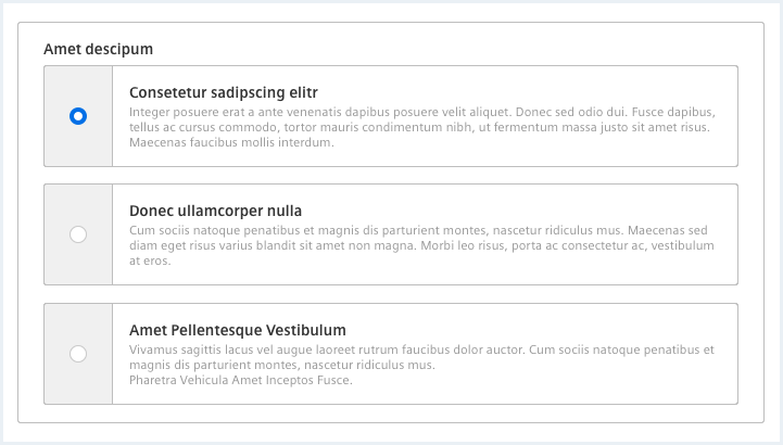
Radio button alternative
<fieldset class="fieldset">
    <legend class="legend">
        <div class="legend__title">Alternative radio button title</div>
    </legend>
    <div class="inputGroup">

        <label class="inputGroup__label" for="radio-button01v">
            Optional label for group of radio buttons
        </label>

        <div class="radioButtonWrapper radioButtonWrapper--alternative">
            <input type="radio" class="inputGroup__radioButton" id="radio-button01v" name="radio-button-V" value="radio-button01" />
            <label for="radio-button01v"></label>
            <div class="radioButtonWrapper--alternative__content">
                <div class="radioButtonWrapper--alternative__header">Duis tincitunt sagittis</div>
                <p>Aenean velit mi, bibendum sit amet consectetur sed, lacinia eget enim. Aenean viverra massa sit amet.</p>
            </div>
        </div>

        <div class="radioButtonWrapper radioButtonWrapper--alternative">
            <input type="radio" class="inputGroup__radioButton" id="radio-button03v" name="radio-button-V" value="radio-button03" />
            <label for="radio-button03v"></label>
            <div class="radioButtonWrapper--alternative__content">
                <div class="radioButtonWrapper--alternative__header">Dolor sit amet</div>
                <p>Aenean velit mi, bibendum sit amet consectetur sed, lacinia eget enim. <br />Aenean viverra massa sit amet <br />Duis tincitunt sagittis.</p>
            </div>
        </div>

        <div class="radioButtonWrapper radioButtonWrapper--alternative">
            <input type="radio" class="inputGroup__radioButton is-disabled" disabled="disabled" id="radio-button02v" name="radio-button-V" value="radio-button02" />
            <label for="radio-button02v"></label>
            <div class="radioButtonWrapper--alternative__content">
                <div class="radioButtonWrapper--alternative__header">Dolor sit amet</div>
                <p>Loream velit mi, bibendum sit amet consectetur sed, lacinia eget enim. Aenean viverra massa sit amet <br />Duis tincitunt sagittis.</p>
            </div>
        </div>

    </div>
</fieldset>
Checkbox alternative
<fieldset class="fieldset">
    <legend class="legend">
        <div class="legend__title">Alternative checkbox title</div>
    </legend>
    <div class="inputGroup">

        <label class="inputGroup__label" for="checkbox01v">
            Optional label for group of checkboxes
        </label>

        <div class="checkboxWrapper checkboxWrapper--alternative">
            <input type="checkbox" class="inputGroup__checkbox" id="checkbox01v" name="checkbox-V" value="checkbox01" checked="checked" />
            <label for="checkbox01v"></label>
            <div class="checkboxWrapper--alternative__content">
                <div class="checkboxWrapper--alternative__header">Duis tincitunt sagittis</div>
                <p>Aenean velit mi, bibendum sit amet consectetur sed, lacinia eget enim. Aenean viverra massa sit amet.</p>
            </div>
        </div>

        <div class="checkboxWrapper checkboxWrapper--alternative">
            <input type="checkbox" class="inputGroup__checkbox" id="checkbox02v" name="checkbox-V" value="checkbox02" />
            <label for="checkbox02v"></label>
            <div class="checkboxWrapper--alternative__content">
                <div class="checkboxWrapper--alternative__header">Dolor sit amet</div>
                <p>Aenean velit mi, bibendum sit amet consectetur sed, lacinia eget enim. <br />Aenean viverra massa sit amet <br />Duis tincitunt sagittis.</p>
            </div>
        </div>

        <div class="checkboxWrapper checkboxWrapper--alternative">
            <input type="checkbox" class="inputGroup__checkbox is-disabled" disabled="disabled" id="checkbox03v" name="checkbox-V" value="checkbox03" />
            <label for="checkbox03v"></label>
            <div class="checkboxWrapper--alternative__content">
                <div class="checkboxWrapper--alternative__header">Dolor sit amet</div>
                <p>Loream velit mi, bibendum sit amet consectetur sed, lacinia eget enim. Aenean viverra massa sit amet <br />Duis tincitunt sagittis.</p>
            </div>
        </div>
    </div>
</fieldset>
Checkbox / radio button alternative with shadow
<fieldset class="fieldset">
    <legend class="legend">
        <div class="legend__title">Alternative checkbox title</div>
    </legend>
    <div class="inputGroup">

        <label class="inputGroup__label" for="checkbox01va">
            Optional label for group of checkboxes with shadows
        </label>

        <div class="checkboxWrapper checkboxWrapper--alternative has-shadow">
            <input type="checkbox" class="inputGroup__checkbox" id="checkbox01va" name="checkbox-V" value="checkbox01" checked="checked" />
            <label for="checkbox01va"></label>
            <div class="checkboxWrapper--alternative__content">
                <div class="checkboxWrapper--alternative__header">Duis tincitunt sagittis</div>
                <p>Aenean velit mi, bibendum sit amet consectetur sed, lacinia eget enim. Aenean viverra massa sit amet.</p>
            </div>
        </div>

        <div class="checkboxWrapper checkboxWrapper--alternative has-shadow">
            <input type="checkbox" class="inputGroup__checkbox" id="checkbox02va" name="checkbox-V" value="checkbox02" />
            <label for="checkbox02va"></label>
            <div class="checkboxWrapper--alternative__content">
                <div class="checkboxWrapper--alternative__header">Dolor sit amet</div>
                <p>Aenean velit mi, bibendum sit amet consectetur sed, lacinia eget enim. <br />Aenean viverra massa sit amet <br />Duis tincitunt sagittis.</p>
            </div>
        </div>

        <div class="checkboxWrapper checkboxWrapper--alternative has-shadow">
            <input type="checkbox" class="inputGroup__checkbox is-disabled" disabled="disabled" id="checkbox03va" name="checkbox-V" value="checkbox03" />
            <label for="checkbox03va"></label>
            <div class="checkboxWrapper--alternative__content">
                <div class="checkboxWrapper--alternative__header">Dolor sit amet</div>
                <p>Loream velit mi, bibendum sit amet consectetur sed, lacinia eget enim. Aenean viverra massa sit amet <br />Duis tincitunt sagittis.</p>
            </div>
        </div>

    </div>
</fieldset>
Usage
| Element | Class | Description |
|---|---|---|
.checkboxWrapper | .checkboxWrapper--alternative | Applies a different styling to a checkbox group in order to add a more detailed description to the different choices. Make sure to remove any text from the actual label element since it would break the look and feel. |
.radioButtonWrapper | .radioButtonWrapper--alternative | Applies a different styling to a radio button group in order to add a more detailed description to the different choices. Make sure to remove any text from the actual label element since it would break the look and feel. |
.checkboxWrapper--alternative,.radioButtonWrapper--alternative | .has-shadow | Applies a soft shadow to every choice of a checkbox / radio button group element. This should not be used in normal forms but can make a choice within an e.g. dialog more appealing. |
Select
<div class="inputGroup">
    <label for="flavour-select2" class="inputGroup__label">Choose a flavour:</label>

    <div class="selectWrapper">
        <select id="flavour-select2" class="inputGroup__select">
            <option value="">Please choose an option</option>
            <option value="raspberry">Raspberry</option>
            <option value="pineapple">Pineapple</option>
            <option value="physalis">Physalis</option>
            <option value="cherry">Cherry with a very very long text to make this item much longer than the select container it is residing in</option>
        </select>
    </div>

    <div class="inputGroup__description">
        Optional description text.
    </div>
</div>

<div class="inputGroup">
    <label for="flavour-select2disabled" class="inputGroup__label">Choose a flavour, disabled:</label>

    <div class="selectWrapper">
        <select id="flavour-select2disabled" class="inputGroup__select" disabled>
            <option value="">Please choose an option</option>
            <option value="raspberry" selected="selected">Raspberry, disabled though</option>
            <option value="pineapple">Pineapple</option>
            <option value="physalis">Physalis</option>
            <option value="cherry">Cherry</option>
        </select>
    </div>

    <div class="inputGroup__description">
        Optional description text.
    </div>
</div>
Select multiple
<div class="inputGroup">
    <label for="flavour-select" class="inputGroup__label">Choose multiple flavours:</label>

    <div class="selectWrapper--multiple">
        <select id="flavour-select" size="5" multiple="multiple" class="inputGroup__select">
            <option value="">Please choose one or more option(s)</option>
            <option value="raspberry">Raspberry</option>
            <option value="pineapple">Pineapple</option>
            <option value="physalis">Physalis</option>
            <option value="cherry" selected="selected">Cherry</option>
        </select>
    </div>

    <div class="inputGroup__description">
        Optional description text.
    </div>
</div>

<div class="inputGroup">
    <label for="flavour-selectDisabled" class="inputGroup__label">Choose multiple flavours, disabled:</label>

    <div class="selectWrapper--multiple">

        <select id="flavour-selectDisabled" size="5" multiple="multiple" class="inputGroup__select" disabled="disabled">
            <option value="">Please choose one or more option(s)</option>
            <option value="raspberry">Raspberry</option>
            <option value="pineapple">Pineapple</option>
            <option value="physalis">Physalis</option>
            <option value="cherry" selected="selected">Cherry</option>
        </select>
    </div>

    <div class="inputGroup__description">
        Optional description text.
    </div>
</div>