Empty state
Empty states occur when there is no content to display. They provide users with feedback on the state of a content area and what they can do next.
Usage
When to use
Use an empty state in the following cases:
- When no data exists yet.
- When users need to take actions to display content.
- When a search or filter returned no results.
Types
There are the following empty state types:
Empty state
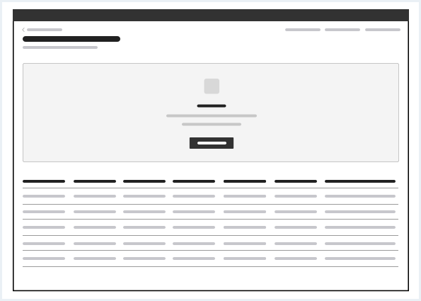
An empty state appears within the content of a region and fills out only a part of it (area, section, element).
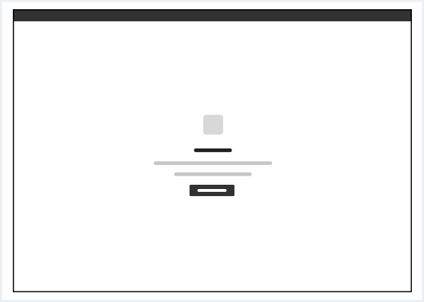
Frameless empty state
The frameless empty state fills out the whole region. It has no background.
General construction
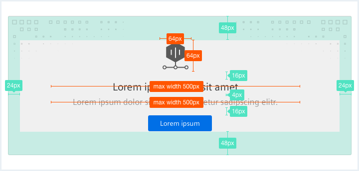
An empty state consists of the following elements:
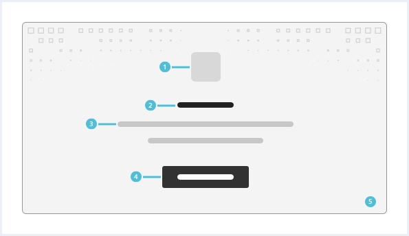
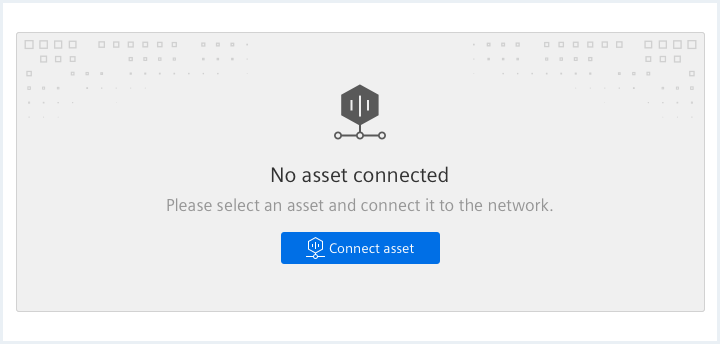
1. Icon or image (optional)
- Use an icon or image to support your empty state message.
- Use an image for empty states that occur in big areas and an icon for empty states that occur in small areas.
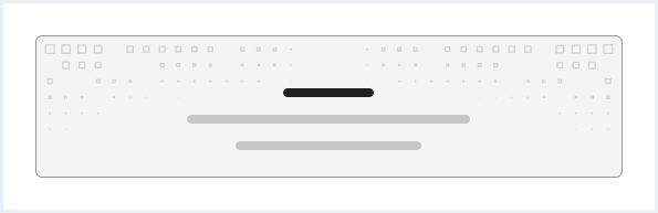
2. Title
- Provide information to the user about the reason for existence of an empty space.
3. Helper text
- Describe the next steps or possible actions for the user.
4. Call to action (optional)
- Provide the user with a next step, a link to another section or a primary button to interact with.
5. Background (optional)
- Has a border.
- Can be white or gray.
- Can have an optional background pattern.
- It is recommended not to use a background pattern for empty state with an image.
Options
The following empty state options are available:
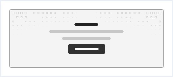
Simple empty state
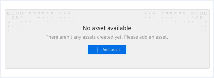
Empty state with call to action
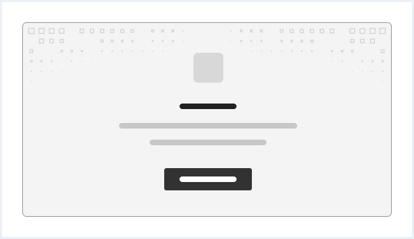
Empty state with call to action and icon or image
Do’s & Don’ts
- Use an empty state with the defined options above.
- Do not use containers to build empty states.
Style
This chapter shows several empty state styles in the User Experience Toolkit.
Overview
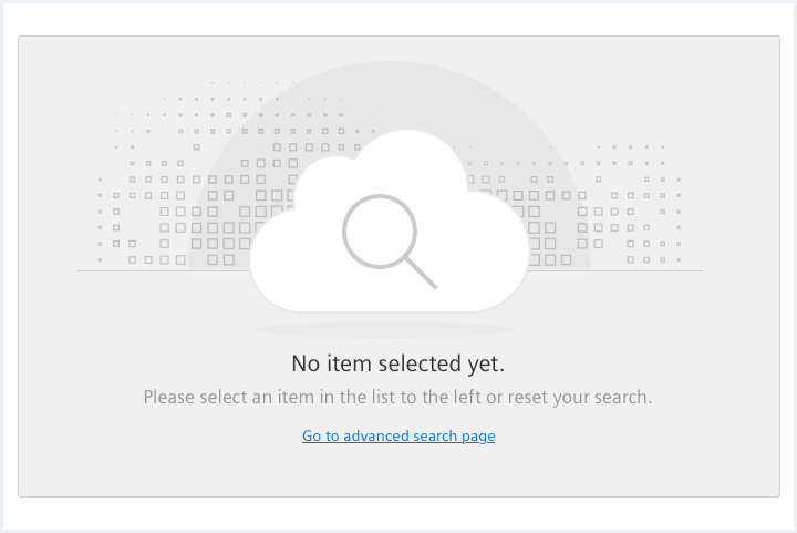
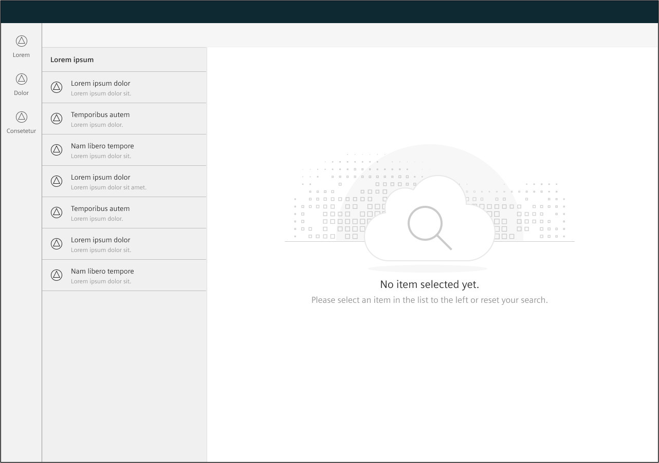
“Nothing selected” example
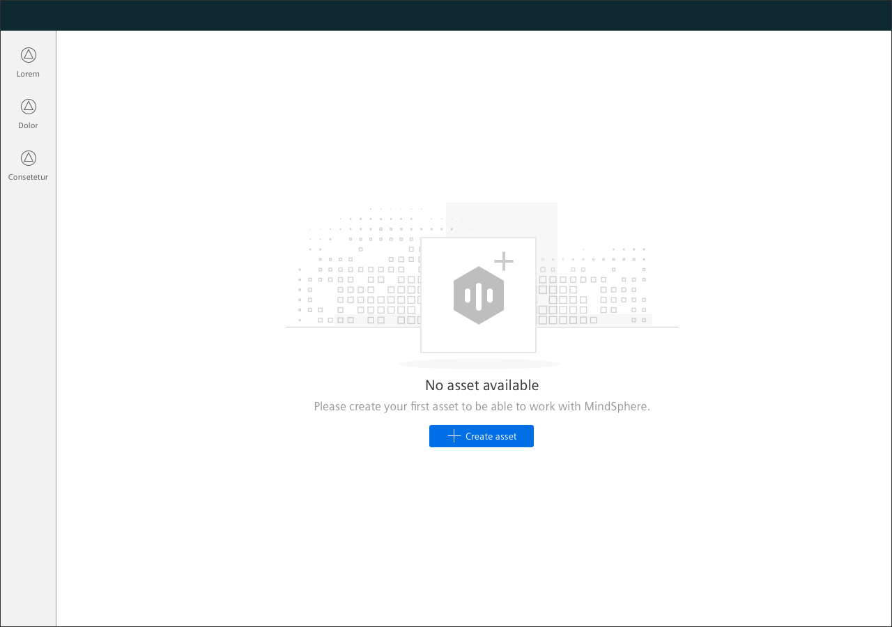
“First visit” example
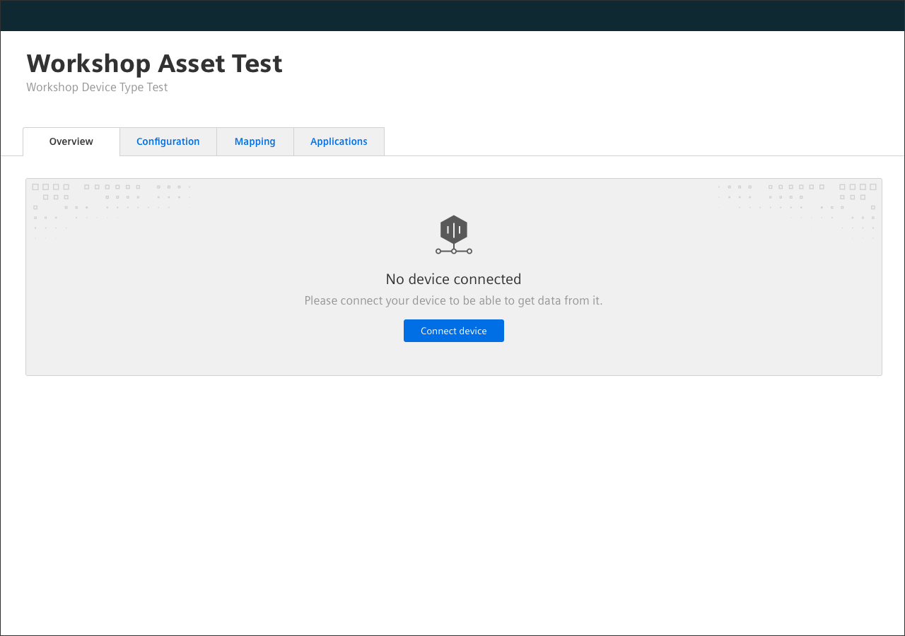
“Empty tab content” example.
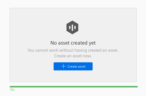
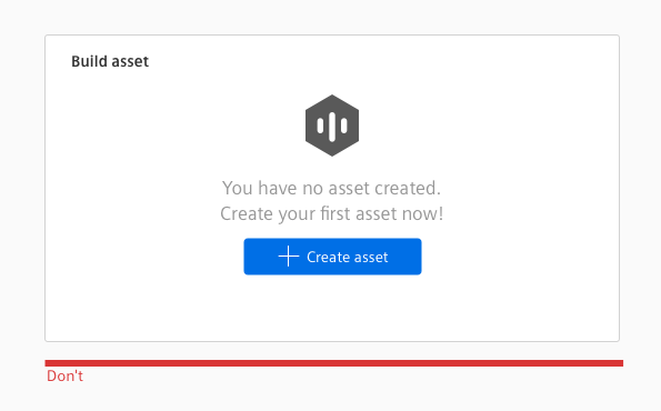
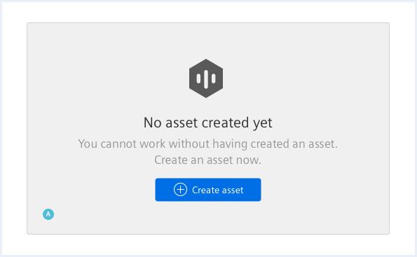
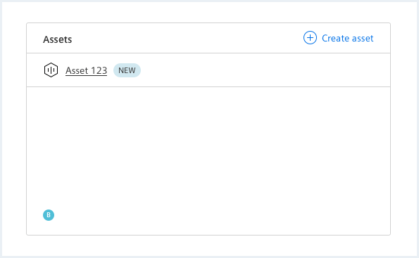
Element with and without content
In the example below, the element with content (B) replaces the empty element (A) after the first creation of an asset. If possible and logical, provide a button in the element with content (B) with the same function as in the empty element (A) and with consistent naming.
Typography
The following table gives reference to the different font sizes and weights:
| Name | State | Font-family | Font-size | Line-height | Text-align |
|---|---|---|---|---|---|
| Title | all | Siemens Sans Roman | 21px | 29px | center |
| Helper text | all | Siemens Sans Roman | 17px | 23px | center |
Sizing and spacing
The following measurements show the dimensions for this component:
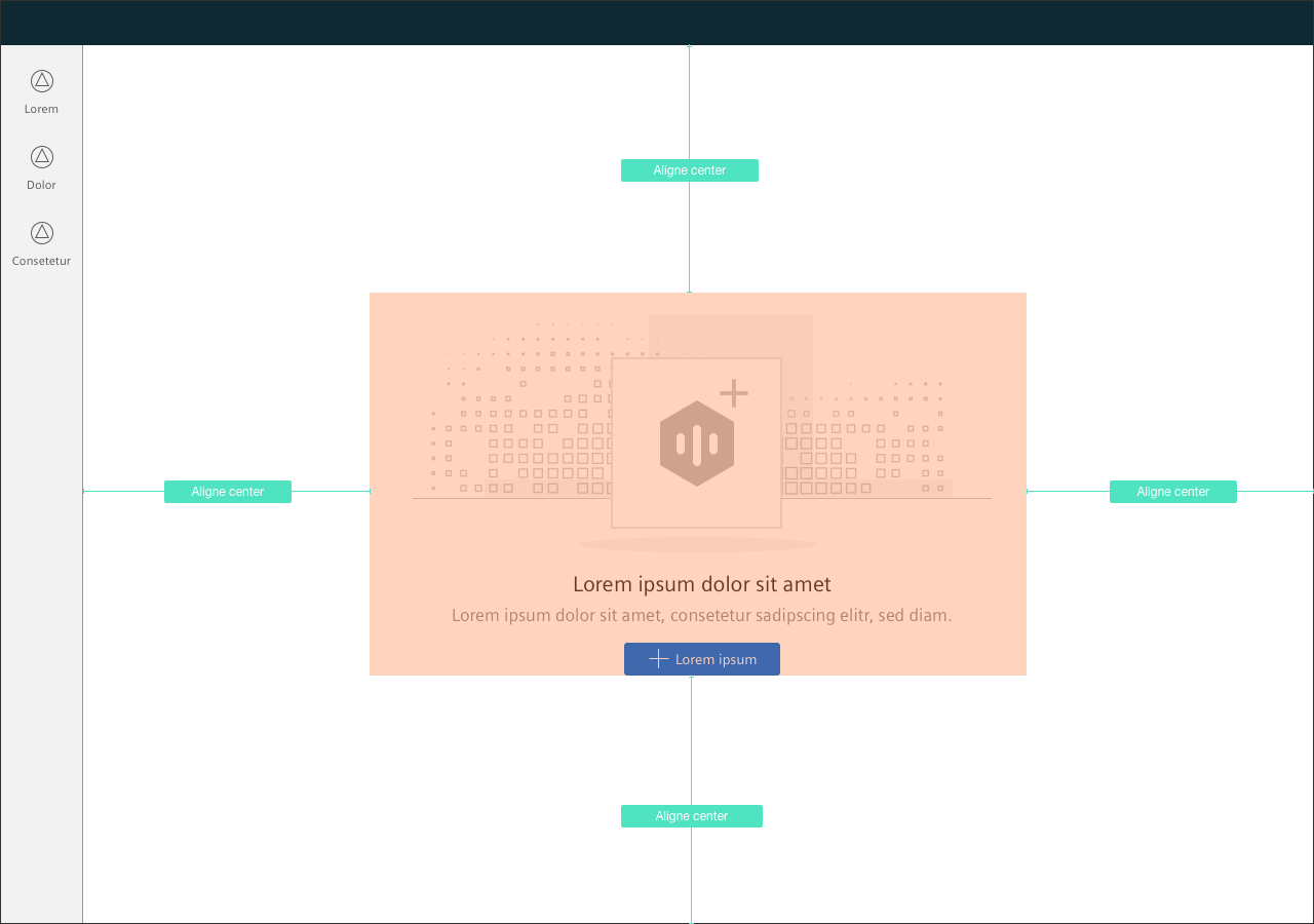
To see a detailed explanation of all existing helper and size classes, please refer to the usage table below.
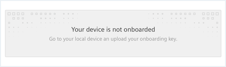
Empty state with button
<div class="emptyState">
    <div class="emptyState__visual">
        <span aria-hidden="true" class="iconUxt filled asset"></span>
    </div>

    <h2 class="emptyState__title">
        Your device is not onboarded
    </h2>
    <div class="emptyState__description">
        Go to your local device to upload an onboarding key
    </div>
    <div class="emptyState__callToAction">
        <a class="button button--primary" href="#"><span class="iconUxt add" aria-hidden="true"></span>Upload key</a>
    </div>
</div>
Empty state with link
<div class="emptyState">
    <div class="emptyState__visual">
        <span aria-hidden="true" class="iconUxt filled asset"></span>
    </div>

    <h2 class="emptyState__title">
        Your device is not onboarded
    </h2>
    <div class="emptyState__description">
        Go to your local device to upload an onboarding key
    </div>
    <div class="emptyState__callToAction">
        <a href="#">Upload key</a>
    </div>
</div>
Frameless Empty state
<div class="emptyState emptyState--frameless">
    <div class="emptyState__visual">
        <span aria-hidden="true" class="iconUxt filled asset"></span>
    </div>

    <h2 class="emptyState__title">
        Your device is not onboarded
    </h2>
    <div class="emptyState__description">
        Go to your local device to upload an onboarding key
    </div>
    <div class="emptyState__callToAction">
        <a href="#">Upload key</a>
    </div>
</div>
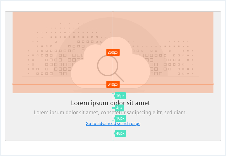
Empty state with image
<div class="emptyState emptyState--withImage">
    <div class="emptyState__visual">
        <img src="assets/images/cloud.png" alt="image placeholder" />
    </div>

    <h2 class="emptyState__title">
        Your device is not onboarded
    </h2>
    <div class="emptyState__description">
        Go to your local device to upload an onboarding key
    </div>
    <div class="emptyState__callToAction">
        <a href="#">Upload key</a>
    </div>
</div>
Frameless Empty state with image
<div class="emptyState emptyState--withImage emptyState--frameless">
    <div class="emptyState__visual">
        <img src="assets/images/cloud.png" alt="image placeholder" />
    </div>

    <h2 class="emptyState__title">
        Your device is not onboarded
    </h2>
    <div class="emptyState__description">
        Go to your local device to upload an onboarding key
    </div>
    <div class="emptyState__callToAction">
        <a class="button button--primary" href="#"><span class="iconUxt add" aria-hidden="true"></span>Upload key</a>
    </div>
</div>
Usage
| Element | Class | Description |
|---|---|---|
.emptyState | .emptyState--removeDefaultBg | Removes the default background pattern. |
.emptyState | .emptyState--withImage | Adds a more complex default background pattern and more spacing for a bigger visual / image. |
.emptyState | .emptyState--frameless | Sets the background color to white and removes the border around the Empty state area. |