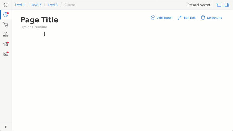
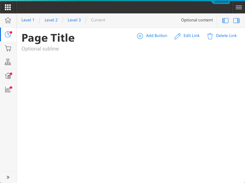
App bar
The app bar is used to switch between the different top-level views of an app.
Usage
When to use
Use the app bar in the following cases:
- When there are two to seven top-level destinations. The recommended number of items is three to five.
- When a quick navigation between unrelated parts of an application is necessary.
The app bar allows you to structure your app further within optional sub-sections.
General construction
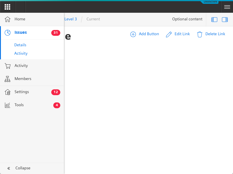
An app bar consists of the following elements:
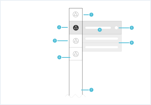
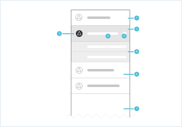
1. App bar item
- There must be a minimum of two and a maximum of seven app bar items.
2. Current page item
- There is always one current page item in the app bar.
- It visually stands out from the default items.
3. Icon
- The icon should be recognizable and represent the functionality of the according top-level destination.
4. Label
- The label should be short and descriptive.
5. Item badge (optional)
- The optional badge for an app bar item can visualize important events or notifications for a top-level destination.
6. Item background
- The item background changes visually according to the different item states.
7. App bar background
8. App bar item sub-section (optional)
Every app bar item can have an optional sub-section of items. These items have to fit in context of their parent item.
Behavior
General behavior
- An app can only have one app bar.
- The app bar must be available to the user whenever navigation is possible.
- The app bar can be hidden in fullscreen forms, for example on edit pages.
- The app bar can be scrolled vertically if there are more items in the viewport than visible.
- While the app bar top-level items should be limited to a maximum of 7 items, sub-sections may contain as many items as needed.
Label behavior
- Use short and precise labels.
- On mouseover, the sub-items of a app bar item are shown (if there are any).
- Depending on app bar state (expanded vs. collapsed) the currently active app bar item’s sub-section is visible / expanded.
Placement
The app bar is placed in the local region.
App bar states
The app bar can be toggled between 2 states: collapsed and expanded. These states can be toggled by clicking a toggle button positioned at the bottom of the app bar. When collapsed the first level of the app bar only shows icons and reveals labels and subitems on mouseover. When expanded the labels are shown permanently.
Do’s & Don’ts
- Use an app bar to provide quick access to top-level destinations in the app.
- Do not use an app bar for sub-level navigation in the main region.
Style
This chapter shows several app bar item styles in the User Experience Toolkit.
Overview
The current item state is emphasized by a solid icon style. It also has a vertical indicator line on the left side.
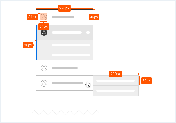
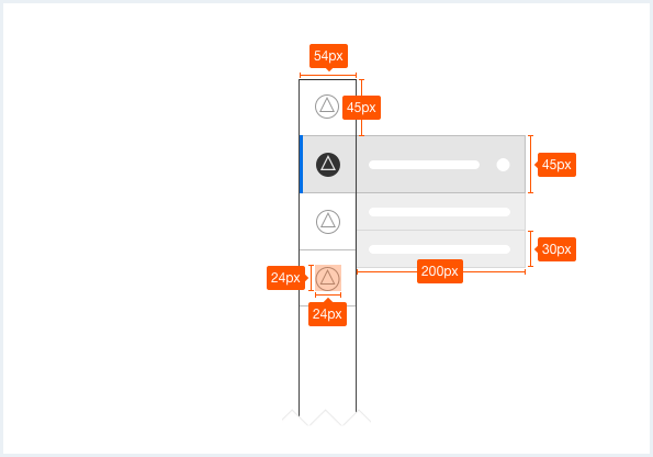
Sizing and spacing
The following measurements show the dimensions for this component:
To see a detailed explanation of all existing helper classes for the advanced app bar, please refer to the usage table below.
All functionality for expanding/collapsing, selecting and interacting is implemented (and documented) with plain JavaScript at the end of the examples.
App bar
<div class="appWrapper has-appBarAdvanced has-appBarAdvanced-collapsed">

    <div class="appWrapper__regions has-appHeader has-contextRegion has-leadingRegion contextRegion-is-expanded appWrapper__regions--pushLayout">

        <section class="appHeader">
            <div class="appHeader__breadcrumb">
                <div class="breadcrumb">
                    <div class="breadcrumb__item">
                        <a href="#">Level 1</a>
                    </div>
                    <div class="breadcrumb__item">
                        <a href="#">Level 2</a>
                    </div>
                    <div class="breadcrumb__item">
                        <a href="#">Level 3</a>
                    </div>
                    <div class="breadcrumb__item is-current">
                        <a href="#">Current</a>
                    </div>
                </div>
            </div>
            <div class="appHeader__content">
                Optional content
            </div>
            <div class="appHeader__viewToggler">
                <button class="button button--ghost has-icon-only button--leading" id="toggleLeadingRegionDemo">
                    <span aria-hidden="true" class="iconUxt"></span>
                </button>

                <button class="button button--ghost has-icon-only button--context" id="toggleContextRegionDemo">
                    <span aria-hidden="true" class="iconUxt is-flipped-horizontal"></span>
                </button>
            </div>
        </section>

        <section class="leadingRegion">
        </section>

        <section class="mainRegion">
            <div class="contentHeader">
                <div class="contentHeader__header">
                    <h1 class="header__headline">Page Title</h1>
                    <div class="header__subline">Optional subline</div>
                </div>

                <div class="contentHeader__actions">
                    <button class="button button--secondaryContentAction">
                        <span class="iconUxt addCircle" aria-hidden="true"></span>
                        Add Button
                    </button>

                    <a class="button button--secondaryContentAction" href="#">
                        <span class="iconUxt edit" aria-hidden="true"></span>
                        Edit Link
                    </a>

                    <a class="button button--secondaryContentAction" href="#">
                        <span class="iconUxt delete" aria-hidden="true"></span>
                        Delete Link
                    </a>
                </div>
            </div>
        </section>

        <section class="contextRegion">
            <button class="button button--secondary" id="toggleSlidingBehaviour">
                Toggle sliding behaviour for demo
            </button>
        </section>

    </div>

    <nav class="appBarAdvanced">
        <div class="appBarAdvanced__inner">
            <div class="appBarAdvanced__header">
                <!-- optional header -->
            </div>
            <ul class="appBarAdvanced__content">
                <li class="level1 is-home">
                    <a href="#" class="item__link">
                        <div class="item__icon">
                            <i aria-hidden="true" class="iconUxt home"></i>
                        </div>
                        <span class="item__title">Home</span>
                    </a>
                </li>
                <li class="level1 is-active">
                    <a href="#" class="item__link">
                        <div class="item__icon has-notification">
                            <i aria-hidden="true" class="iconUxt chartPie"></i>
                        </div>
                        <span class="item__title">Issues</span>
                        <span class="badge">31</span>
                    </a>
                    <ul class="level2">
                        <li class="subitem">
                            <a href="#">Details</a>
                        </li>
                        <li class="subitem">
                            <a href="#">Activity</a>
                        </li>
                    </ul>
                </li>
                <li class="level1">
                    <a href="#" class="item__link">
                        <div class="item__icon">
                            <i aria-hidden="true" class="iconUxt shoppingCart"></i>
                        </div>
                        <span class="item__title">Activity</span>
                    </a>
                    <ul class="level2">
                        <li class="subitem">
                            <a href="#">Details</a>
                        </li>
                        <li class="subitem">
                            <a href="#">Activity</a>
                        </li>
                    </ul>
                </li>
                <li class="level1">
                    <a href="#" class="item__link">
                        <div class="item__icon">
                            <i aria-hidden="true" class="iconUxt hierarchy"></i>
                        </div>
                        <span class="item__title">Members</span>
                    </a>
                    <ul class="level2">
                        <li class="subitem">
                            <a href="#">Details</a>
                        </li>
                        <li class="subitem">
                            <a href="#">Activity</a>
                        </li>
                    </ul>
                </li>
                <li class="level1 has-separator">
                    <a href="#" class="item__link">
                        <div class="item__icon has-notification">
                            <i aria-hidden="true" class="iconUxt subtenant4"></i>
                        </div>
                        <span class="item__title">Settings</span>
                        <span class="badge">12</span>
                    </a>
                    <ul class="level2">
                        <li class="subitem">
                            <a href="#">Details</a>
                        </li>
                        <li class="subitem">
                            <a href="#">Activity</a>
                        </li>
                    </ul>
                </li>
                <li class="level1">
                    <a href="#" class="item__link">
                        <div class="item__icon has-notification">
                            <i aria-hidden="true" class="iconUxt chartTrend"></i>
                        </div>
                        <span class="item__title"> Tools </span>
                        <span class="badge">4</span>
                    </a>
                    <ul class="level2">
                        <li class="subitem">
                            <a href="#"> Details </a>
                        </li>
                        <li class="subitem">
                            <a href="#"> Activity </a>
                        </li>
                    </ul>
                </li>
            </ul>
            <div class="appBarAdvanced__footer">
                <a href="#" id="appBar--expander">
                    <!-- optional expand / collapse label -->
                    <span class="item__title">Collapse</span>
                </a>
            </div>
        </div>
    </nav>
</div>
<script type="text/javascript" src="https://static.eu1.mindsphere.io/osbar/v4/js/main.min.js"></script>
<script>
   window.onload = function(e){

       // polyfill for closest() - IE11 does not support that out of the box
       if (!Element.prototype.matches) {
           Element.prototype.matches = Element.prototype.msMatchesSelector ||
               Element.prototype.webkitMatchesSelector;
       }
       if (!Element.prototype.closest) {
           Element.prototype.closest = function(s) {
               var el = this;

               do {
                   if (Element.prototype.matches.call(el, s)) return el;
                   el = el.parentElement || el.parentNode;
               } while (el !== null && el.nodeType === 1);
               return null;
           };
       }

       // toggle expand / collapse feature of sidebar
       var toggle = document.querySelector("#appBar--expander");
       var appWrapper = document.querySelector(".appWrapper");
       toggle.addEventListener("click", function () {
           // appBar.classList.toggle("has-appBarAdvanced-collapsed");
           appWrapper.classList.toggle("has-appBarAdvanced-collapsed");
           var elems = document.querySelectorAll(".appBarAdvanced .level1");
           for (var i = 0; i < elems.length; i++) {
               elems[i].classList.remove("is-shown");
           }
       });

       // set active state of item on click
       var level1links = document.querySelectorAll(".appBarAdvanced .item__link");
       for (var i = 0; i < level1links.length; i++) {
           level1links[i].addEventListener("click", function (event) {
               for (var j = 0; j < level1links.length; j++) {
                   level1links[j].parentElement.classList.remove("is-active");
               }
               event.target.closest(".level1").classList.add("is-active");
               event.target.blur();
               event.target.parentNode.parentNode.blur(); // needed for collapsed mode
               event.preventDefault();
           });
       }

       // add class to show app bar submenu on hover
       var timerHover;
       var collapsedAppBarElements = document.querySelectorAll(
           ".has-appBarAdvanced-collapsed .appBarAdvanced .level1"
       );
       var collapsedAppBarLinks = document.querySelectorAll(
           ".has-appBarAdvanced-collapsed .appBarAdvanced .level1 a"
       );
       for (var i = 0; i < collapsedAppBarLinks.length; i++) {
           collapsedAppBarLinks[i].addEventListener("mouseenter", function (event) {
               clearTimeout(timerHover);
               for (var j = 0; j < collapsedAppBarElements.length; j++) {
                   collapsedAppBarElements[j].classList.remove("is-shown");
               }
               event.target.closest(".level1").classList.add("is-shown");
           });
       }

       // hide all possible open app bar items on mouse-leave, but wait for a split second
       // to avoid unintentional mouseleave events
       var appBar = document.querySelector(".appBarAdvanced");
       appBar.addEventListener("mouseleave", function () {
           timerHover = setTimeout(function () {
               for (var j = 0; j < collapsedAppBarElements.length; j++) {
                   collapsedAppBarElements[j].classList.remove("is-shown");
               }
           }, 100);
       });
       var regionsWrapper = document.querySelector(".appWrapper__regions");

       // functionality to hide context and/or leadimg region through button
       var toggleLeading = document.querySelector("#toggleLeadingRegionDemo");
       toggleLeading.addEventListener('click', function() {
           regionsWrapper.classList.toggle('leadingRegion-is-expanded');
       });

       var toggleContext = document.querySelector("#toggleContextRegionDemo");
       toggleContext.addEventListener('click', function() {
           regionsWrapper.classList.toggle('contextRegion-is-expanded');
       });

       // functionality to toggle sliding behaviour for leading and context region
       var switchLayoutType = document.querySelector("#toggleSlidingBehaviour");
       switchLayoutType.addEventListener('click', function() {
           regionsWrapper.classList.toggle('appWrapper__regions--pushLayout');
       });
    }
</script>
App bar, with OS Bar
<div class="appWrapper has-appBarAdvanced has-appBarAdvanced-collapsed">

    <div class="appWrapper__regions has-appHeader has-contextRegion has-leadingRegion contextRegion-is-expanded appWrapper__regions--pushLayout">

        <section class="appHeader">
            <div class="appHeader__breadcrumb">
                <div class="breadcrumb">
                    <div class="breadcrumb__item">
                        <a href="#">Level 1</a>
                    </div>
                    <div class="breadcrumb__item">
                        <a href="#">Level 2</a>
                    </div>
                    <div class="breadcrumb__item">
                        <a href="#">Level 3</a>
                    </div>
                    <div class="breadcrumb__item is-current">
                        <a href="#">Current</a>
                    </div>
                </div>
            </div>
            <div class="appHeader__content">
                Optional content
            </div>
            <div class="appHeader__viewToggler">
                <button class="button button--ghost has-icon-only button--leading" id="toggleLeadingRegionDemo">
                    <span aria-hidden="true" class="iconUxt"></span>
                </button>

                <button class="button button--ghost has-icon-only button--context" id="toggleContextRegionDemo">
                    <span aria-hidden="true" class="iconUxt is-flipped-horizontal"></span>
                </button>
            </div>
        </section>

        <section class="leadingRegion">
        </section>

        <section class="mainRegion">
            <div class="contentHeader">
                <div class="contentHeader__header">
                    <h1 class="header__headline">Page Title</h1>
                    <div class="header__subline">Optional subline</div>
                </div>

                <div class="contentHeader__actions">
                    <button class="button button--secondaryContentAction">
                        <span class="iconUxt addCircle" aria-hidden="true"></span>
                        Add Button
                    </button>

                    <a class="button button--secondaryContentAction" href="#">
                        <span class="iconUxt edit" aria-hidden="true"></span>
                        Edit Link
                    </a>

                    <a class="button button--secondaryContentAction" href="#">
                        <span class="iconUxt delete" aria-hidden="true"></span>
                        Delete Link
                    </a>
                </div>
            </div>
        </section>

        <section class="contextRegion">
            <button class="button button--secondary" id="toggleSlidingBehaviour">
                Toggle sliding behaviour for demo
            </button>
        </section>

    </div>

    <nav class="appBarAdvanced">
        <div class="appBarAdvanced__inner">
            <div class="appBarAdvanced__header">
                <!-- optional header -->
            </div>
            <ul class="appBarAdvanced__content">
                <li class="level1 is-home">
                    <a href="#" class="item__link">
                        <div class="item__icon">
                            <i aria-hidden="true" class="iconUxt home"></i>
                        </div>
                        <span class="item__title">Home</span>
                    </a>
                </li>
                <li class="level1 is-active">
                    <a href="#" class="item__link">
                        <div class="item__icon has-notification">
                            <i aria-hidden="true" class="iconUxt chartPie"></i>
                        </div>
                        <span class="item__title">Issues</span>
                        <span class="badge">31</span>
                    </a>
                    <ul class="level2">
                        <li class="subitem">
                            <a href="#">Details</a>
                        </li>
                        <li class="subitem">
                            <a href="#">Activity</a>
                        </li>
                    </ul>
                </li>
                <li class="level1">
                    <a href="#" class="item__link">
                        <div class="item__icon">
                            <i aria-hidden="true" class="iconUxt shoppingCart"></i>
                        </div>
                        <span class="item__title">Activity</span>
                    </a>
                    <ul class="level2">
                        <li class="subitem">
                            <a href="#">Details</a>
                        </li>
                        <li class="subitem">
                            <a href="#">Activity</a>
                        </li>
                    </ul>
                </li>
                <li class="level1">
                    <a href="#" class="item__link">
                        <div class="item__icon">
                            <i aria-hidden="true" class="iconUxt hierarchy"></i>
                        </div>
                        <span class="item__title">Members</span>
                    </a>
                    <ul class="level2">
                        <li class="subitem">
                            <a href="#">Details</a>
                        </li>
                        <li class="subitem">
                            <a href="#">Activity</a>
                        </li>
                    </ul>
                </li>
                <li class="level1 has-separator">
                    <a href="#" class="item__link">
                        <div class="item__icon has-notification">
                            <i aria-hidden="true" class="iconUxt subtenant4"></i>
                        </div>
                        <span class="item__title">Settings</span>
                        <span class="badge">12</span>
                    </a>
                    <ul class="level2">
                        <li class="subitem">
                            <a href="#">Details</a>
                        </li>
                        <li class="subitem">
                            <a href="#">Activity</a>
                        </li>
                    </ul>
                </li>
                <li class="level1">
                    <a href="#" class="item__link">
                        <div class="item__icon has-notification">
                            <i aria-hidden="true" class="iconUxt chartTrend"></i>
                        </div>
                        <span class="item__title"> Tools </span>
                        <span class="badge">4</span>
                    </a>
                    <ul class="level2">
                        <li class="subitem">
                            <a href="#"> Details </a>
                        </li>
                        <li class="subitem">
                            <a href="#"> Activity </a>
                        </li>
                    </ul>
                </li>
            </ul>
            <div class="appBarAdvanced__footer">
                <a href="#" id="appBar--expander">
                    <!-- optional expand / collapse label -->
                    <span class="item__title">Collapse</span>
                </a>
            </div>
        </div>
    </nav>
</div>
<script type="text/javascript" src="https://static.eu1.mindsphere.io/osbar/v4/js/main.min.js"></script>
<script>
    _msb.init({
        title: "App Layout",
        showLegal: true,
        polyfills: {
            promise: true
        }
    });
    window.onload = function(e){

        // polyfill for closest() - IE11 does not support that out of the box
        if (!Element.prototype.matches) {
            Element.prototype.matches = Element.prototype.msMatchesSelector ||
                Element.prototype.webkitMatchesSelector;
        }
        if (!Element.prototype.closest) {
            Element.prototype.closest = function(s) {
                var el = this;

                do {
                    if (Element.prototype.matches.call(el, s)) return el;
                    el = el.parentElement || el.parentNode;
                } while (el !== null && el.nodeType === 1);
                return null;
            };
        }

        // toggle expand / collapse feature of sidebar
        var toggle = document.querySelector("#appBar--expander");
        var appWrapper = document.querySelector(".appWrapper");
        toggle.addEventListener("click", function () {
            // appBar.classList.toggle("has-appBarAdvanced-collapsed");
            appWrapper.classList.toggle("has-appBarAdvanced-collapsed");
            var elems = document.querySelectorAll(".appBarAdvanced .level1");
            for (var i = 0; i < elems.length; i++) {
                elems[i].classList.remove("is-shown");
            }
        });

        // set active state of item on click
        var level1links = document.querySelectorAll(".appBarAdvanced .item__link");
        for (var i = 0; i < level1links.length; i++) {
            level1links[i].addEventListener("click", function (event) {
                for (var j = 0; j < level1links.length; j++) {
                    level1links[j].parentElement.classList.remove("is-active");
                }
                event.target.closest(".level1").classList.add("is-active");
                event.target.blur();
                event.target.parentNode.parentNode.blur(); // needed for collapsed mode
                event.preventDefault();
            });
        }

        // add class to show app bar submenu on hover
        var timerHover;
        var collapsedAppBarElements = document.querySelectorAll(
            ".has-appBarAdvanced-collapsed .appBarAdvanced .level1"
        );
        var collapsedAppBarLinks = document.querySelectorAll(
            ".has-appBarAdvanced-collapsed .appBarAdvanced .level1 a"
        );
        for (var i = 0; i < collapsedAppBarLinks.length; i++) {
            collapsedAppBarLinks[i].addEventListener("mouseenter", function (event) {
                clearTimeout(timerHover);
                for (var j = 0; j < collapsedAppBarElements.length; j++) {
                    collapsedAppBarElements[j].classList.remove("is-shown");
                }
                event.target.closest(".level1").classList.add("is-shown");
            });
        }

        // hide all possible open app bar items on mouse-leave, but wait for a split second
        // to avoid unintentional mouseleave events
        var appBar = document.querySelector(".appBarAdvanced");
        appBar.addEventListener("mouseleave", function () {
            timerHover = setTimeout(function () {
                for (var j = 0; j < collapsedAppBarElements.length; j++) {
                    collapsedAppBarElements[j].classList.remove("is-shown");
                }
            }, 100);
        });
        var regionsWrapper = document.querySelector(".appWrapper__regions");

        // functionality to hide context and/or leadimg region through button
        var toggleLeading = document.querySelector("#toggleLeadingRegionDemo");
        toggleLeading.addEventListener('click', function() {
            regionsWrapper.classList.toggle('leadingRegion-is-expanded');
        });

        var toggleContext = document.querySelector("#toggleContextRegionDemo");
        toggleContext.addEventListener('click', function() {
            regionsWrapper.classList.toggle('contextRegion-is-expanded');
        });

        // functionality to toggle sliding behaviour for leading and context region
        var switchLayoutType = document.querySelector("#toggleSlidingBehaviour");
        switchLayoutType.addEventListener('click', function() {
            regionsWrapper.classList.toggle('appWrapper__regions--pushLayout');
        });
    }
</script>
Usage
| Element | Class | Description |
|---|---|---|
.appWrapper | .has-appBarAdvanced | This class is necessary for the general / overall layout to calculate (left side) whitespace for the advanced app bar. |
.appWrapper | .has-appBarAdvanced .has-appBarAdvanced-collapsed | This class has to be toggled from clicking the "collapse" link in the footer section of the advanced app bar and extends the app layout for a smaller, condensed version of the advanced app bar. |
.level1 | .is-shown | This class shows the title as well as the subitems ("level2") of an app bar item. This class should be removed on mouseout of such an item again. There should never be more then one single app bar item with this class. |
.level1 | .is-active | This class expands and visually highlights the currently selected ("active") app bar item. This should be triggered on click of the App bar item. There should never be more than one single app bar item with this class. |
.level1 | .is-home | This class can be used for the first item, it adds a thin visual separator after this item as well as hides the item label on hover in collapsed state. This class shall only be used on the first item (= the "home" item). |
.level1 | .has-separator | This class adds a thin visual separator between this and the preceding item. |
.subitem | .is-selected | This class expands and visually highlights the currently selected subitem. This should be triggered on click on the subitem. There should never be more than one single subitem with this class. |
.item__icon | .has-notification | This class shows an indicator next to an item's icon. This can be used to indicate that something within this app's module needs an user's attention. The color of the indicator is set to the global state color used for errors (default: red). |