Tabs
Tabs are used to separate information into logical sections and to quickly navigate between them.
Usage
When to use
- Use tabs when there is a large amount of content that can be separated.
- Use tabs to make the content accessible without reloading the page or compromising on space.
- Different tab-panes should be logically related but mutually exclusive. A content element should only be in one tab at a time.
Types
There are the following tab types:
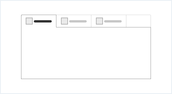
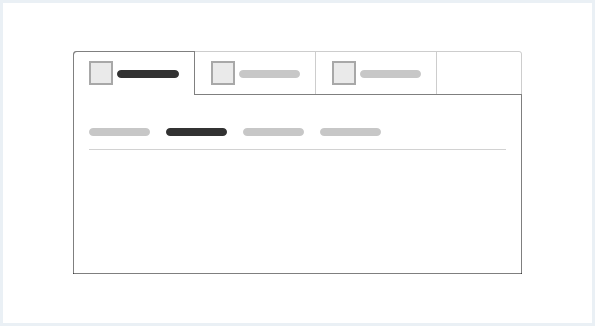
Horizontal tabs
- Horizontal tabs are best used with ten or fewer tabs.
- Pay attention to the legibility of tab labels. Especially with a large number of tabs and little horizontal screen space.
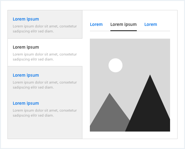
Horizontal tabs with secondary tabs
- Secondary tabs only appear as nested tab.
- Secondary tabs never appear without a parent set of primary tabs.
Frameless horizontal tabs
- If the whole content of the main region belongs to the current tab, use frameless tabs.
- Frameless tabs have to be horizontal.
- Navigating between tabs affects all content in the tab pane.
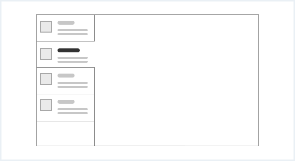
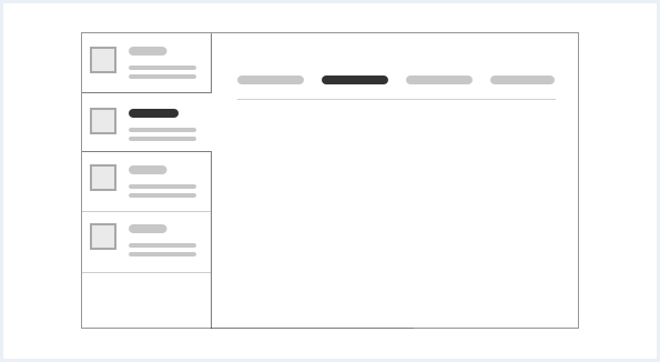
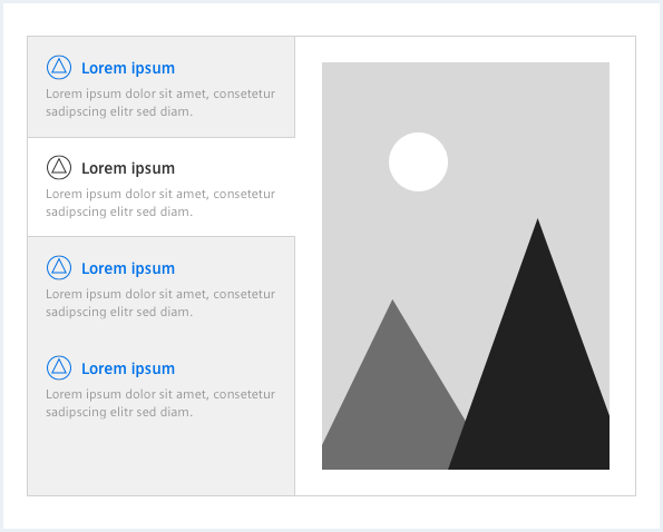
Vertical tabs
- Tab elements can be arranged in a vertical column.
- Vertical tabs share all main characteristics of the horizontal tab.
- Vertical tabs provide better scalability for a large amount of tabs (ten and more).
- Vertical tabs can have an additional description to summarize the tab’s content.
Vertical tabs with secondary tabs
- The number of secondary tabs should be as small as possible – not more than six are recommended.
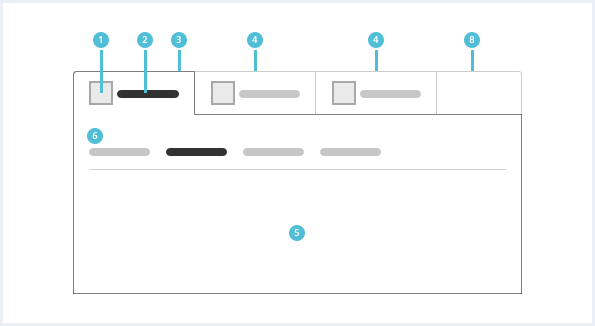
General construction
Tabs can either be arranged horizontally or vertically. The current tab defines what content is shown in the tab pane. Tabs can be nested in two levels.
Tabs consist of the following elements:
Horizontal tabs
Vertical tabs
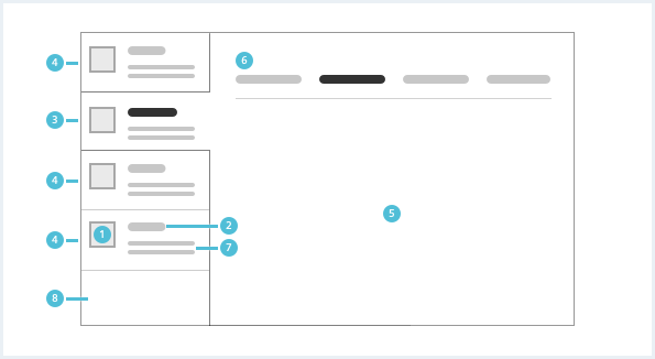
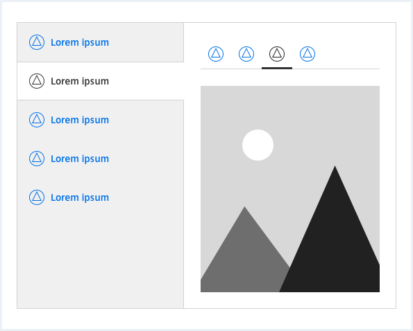
1. Icon
- Icons are optional. The icon should appear to the left of the tab label.
- Tab icon and label should match each other semantically.
- The icon color and style should match the label font.
2. Text label
- The label should summarize the tab’s content.
- Try not to use more than two words for a tab label.
- Tab labels should be written in title case and all words should be proper nouns.
3. Current tab
- The current tab is always connected to the tab pane.
4. Default tab
- All default tab elements should be visually distinct from the tab pane.
- Try to use as few tabs as possible (less than ten).
5. Tab pane
- The tab pane houses the content of the current tab.
6. Secondary tabs
- Secondary tabs are optional.
- Secondary tabs can be complex for the user. If possible, consider alternatives.
- Secondary tabs never appear as standalone tabs outside the tab pane.
7. Description
- Vertical tabs can have a description to summarize the tab’s content.
- A description without text label is not possible.
8. Tab bar background pane
- The tab bar background pane houses all tabs.
Behavior
Placement
Frameless tabs are placed in the main region below the content header.
Do’s & Don’ts
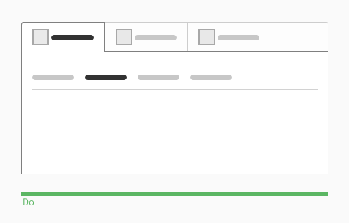
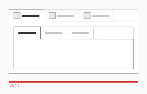
- Use secondary tabs as a nested tab element.
- Do not use horizontal or vertical primary tabs as a nested tab element.
Style
This chapter shows several tabs styles in the User Experience Toolkit.
Overview
Horizontal tabs
Frameless tabs
Vertical tabs
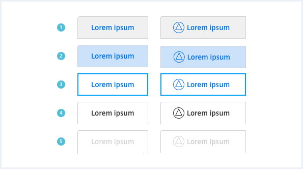
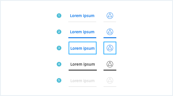
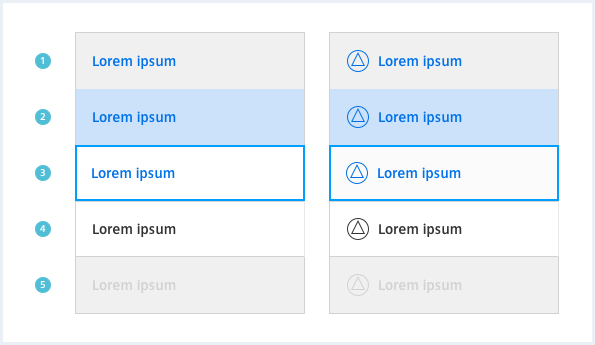
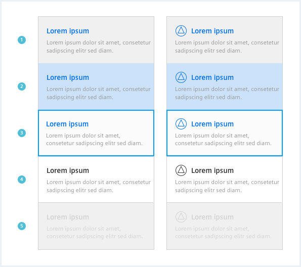
Item states
- The default state indicates an available, but not selected tab.
- The mouseover state shows a hover state of a tab.
- The focus state is only visible when a tab is selected by keyboard.
- The current state indicates the currently selected tab.
- The disabled state shows a tab that can’t be selected.
Typography
The following table gives reference to the different font sizes and weights:
| Name | State | Font-family | Font-size | Line-height | Text-align |
|---|---|---|---|---|---|
| Horizontal tab label | all | Siemens Sans Bold | 14px | 20px | left, center |
| Vertical tab label | all | Siemens Sans Bold | 14px | 24px | left |
| Vertical tab description | all | Siemens Sans Roman | 12px | 16px | left |
| Secondary tab label | all | Siemens Sans Bold | 14px | 20px | left |
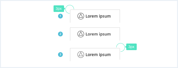
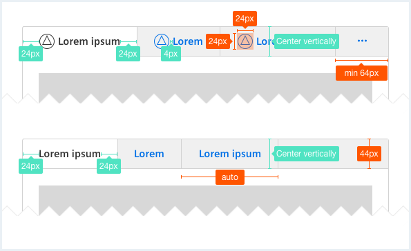
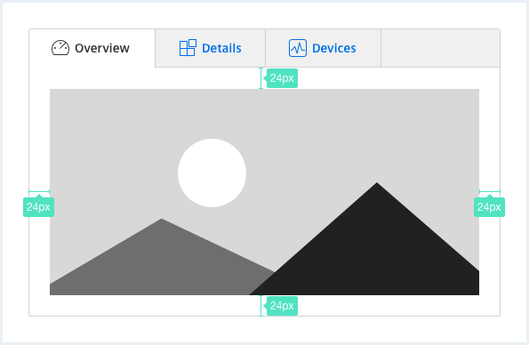
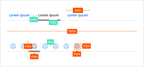
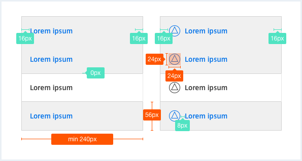
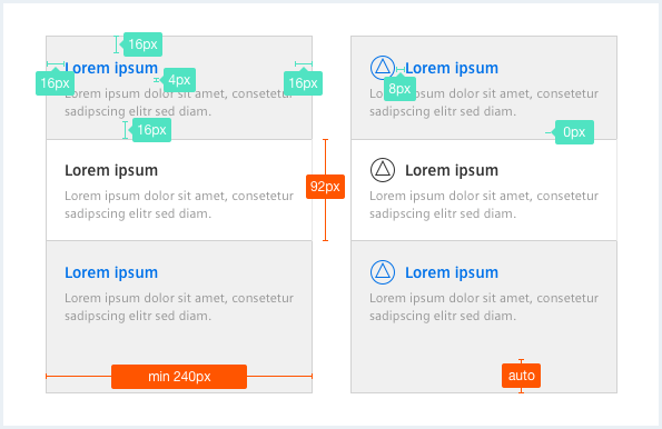
Sizing and spacing
The following measurements show the dimensions for this component:
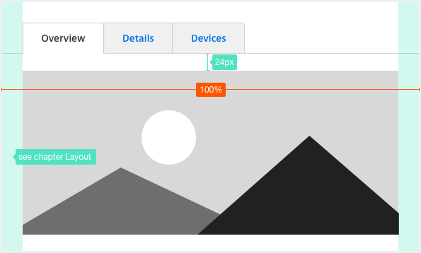
Especially as the content grows it may be useful to split the content into smaller views.
On small displays, a view is used in which individual tabs occupy the entire line in order to work on these devices.
To see a detailed explanation of all existing helper classes, please refer to the usage table below.
Primary tabs
Primary tab
Example of a left aligned horizontal primary tab.
<div class="tabs--primary">
    <nav class="tab__nav">
        <ul>
            <li class="tab__item">
                <a href="#">
                    Tab 1
                </a>
            </li>
            <li class="tab__item">
                <a href="#" class="is-activated">
                    Tab 2
                </a>
            </li>
            <li class="tab__item">
                <a href="#" class="is-disabled">
                    Tab 3
                </a>
            </li>
            <li class="tab__item">
                <a href="#">
                    Tab 4
                </a>
            </li>
            <li class="tab__item">
                <a href="#">
                    Tab 5
                </a>
            </li>
        </ul>
    </nav>

    <div class="tab__content">
        <h3>Primary tab</h3>
        <p>
            Example of a left aligned horizontal primary tab.
        </p>
    </div>
</div>
Primary tabs with icon
Primary tab with icon
Example of a left aligned horizontal primary tab with icon.
<div class="tabs--primary sm">
    <nav class="tab__nav">
        <ul>
            <li class="tab__item">
                <a href="#">
                    <span class="iconUxt edit" aria-hidden="true"></span>
                    Tab 1 with a long(er) label
                </a>
            </li>
            <li class="tab__item">
                <a href="#" class="is-activated">
                    <span class="iconUxt asset" aria-hidden="true"></span>
                    Tab 2 with a long label
                </a>
            </li>
            <li class="tab__item">
                <a href="#">
                    <span class="iconUxt personMultiple" aria-hidden="true"></span>
                    Tab 3 with an even longer label
                </a>
            </li>
        </ul>
    </nav>

    <div class="tab__content">
        <h3>Primary tab with icon</h3>
        <p>
            Example of a left aligned horizontal primary tab with icon.
        </p>
    </div>
</div>
Frameless primary tabs with icon
Frameless primary tab with icon
Example of a left aligned horizontal primary tab with icon.
<div class="tabs--primary tabs--frameless">
    <nav class="tab__nav">
        <ul>
            <li class="tab__item">
                <a href="#">
                    <span class="iconUxt edit" aria-hidden="true"></span>
                    Tab 1
                </a>
            </li>
            <li class="tab__item">
                <a href="#" class="is-activated">
                    <span class="iconUxt asset" aria-hidden="true"></span>
                    Tab 2
                </a>
            </li>
            <li class="tab__item">
                <a href="#" class="is-disabled">
                    <span class="iconUxt person" aria-hidden="true"></span>
                    Tab 3
                </a>
            </li>
            <li class="tab__item">
                <a href="#">
                    <span class="iconUxt delete" aria-hidden="true"></span>
                    Tab 4
                </a>
            </li>
            <li class="tab__item">
                <a href="#">
                    <span class="iconUxt types" aria-hidden="true"></span>
                    Tab 5
                </a>
            </li>
        </ul>
    </nav>

    <div class="tab__content">
        <h3>Frameless primary tab with icon</h3>
        <p>
            Example of a left aligned horizontal primary tab with icon.
        </p>
    </div>
</div>
Secondary tabs
Secondary tab
Example of a left aligned horizontal secondary tab without icon.
<div class="tabs--secondary">
    <nav class="tab__nav">
        <ul>
            <li class="tab__item">
                <a href="#">
                    Tab 1
                </a>
            </li>
            <li class="tab__item">
                <a href="#" class="is-activated">
                    Tab 2
                </a>
            </li>
            <li class="tab__item">
                <a href="#" class="is-disabled">
                    Tab 3
                </a>
            </li>
            <li class="tab__item">
                <a href="#">
                    Tab 4
                </a>
            </li>
            <li class="tab__item">
                <a href="#">
                    Tab 5
                </a>
            </li>
        </ul>
    </nav>

    <div class="tab__content">
        <h3>Secondary tab</h3>
        <p>
            Example of a left aligned horizontal secondary tab without icon.
        </p>
    </div>
</div>
Vertical tabs
This is the content of a tab item without icon.
Lorem ipsum dolor sit amet, consectetur adipiscing elit. Cras hendrerit et magna in auctor. Etiam at massa at ipsum rutrum imperdiet et sollicitudin orci. Phasellus laoreet lacinia enim eu pellentesque.
<div class="tabs--vertical">
    <nav class="tab__nav">
        <ul>
            <li class="tab__item">
                <a href="#">
                    <div class="tab__headline">
                        Tab item with a very long text over two lines
                    </div>
                    <div class="tab__description">
                        Here you can place a nice description for the first navigation element. If the description is longer than two lines of text, the text will grow.
                    </div>
                </a>
            </li>
            <li class="tab__item">
                <a href="#" class="is-activated">
                    <div class="tab__headline">
                        Tab item
                    </div>
                    <div class="tab__description">
                        Just a short description for the second tab item.
                    </div>
                </a>
            </li>
            <li class="tab__item">
                <a href="#" class="is-disabled">
                    <div class="tab__headline">
                        Tab item
                    </div>
                    <div class="tab__description">
                        This is a very long description over more than two lines to show how the item grows. Lorem ipsum dolor sit amet, consectetur adipiscing elit. Cras hendrerit et magna in auctor.
                    </div>
                </a>
            </li>
            <li class="tab__item">
                <a href="#">
                    <div class="tab__headline">
                        Tab item
                    </div>
                    <div class="tab__description">
                        Description.
                    </div>
                </a>
            </li>
            <li class="tab__item">
                <a href="#">
                    <div class="tab__headline">
                        Tab item without a description
                    </div>
                </a>
            </li>
            <li class="tab__item">
                <a href="#">
                    <div class="tab__headline">
                        Tab item
                    </div>
                    <div class="tab__description">
                        Description.
                    </div>
                </a>
            </li>
        </ul>
    </nav>
    <div class="tab__content">
        <h3>This is the content of a tab item without icon.</h3>
        <p>
            <a href="#">Lorem ipsum</a> dolor sit amet, consectetur adipiscing elit. Cras hendrerit et magna in auctor. Etiam at massa at ipsum rutrum imperdiet et sollicitudin orci. Phasellus laoreet lacinia enim eu pellentesque.
        </p>
    </div>
</div>
Vertical tabs with icon
Lorem ipsum dolor sit amet, consectetur adipiscing elit. Cras hendrerit et magna in auctor. Etiam at massa at ipsum rutrum imperdiet et sollicitudin orci. Phasellus laoreet lacinia enim eu pellentesque.
<div class="tabs--vertical">
    <nav class="tab__nav">
        <ul>
            <li class="tab__item">
                <a href="#">
                    <div class="tab__headline">
                        <span class="iconUxt speedometer" aria-hidden="true"></span>
                        Tab item with a very long text over two lines
                    </div>
                    <div class="tab__description">
                        Here you can place a nice description for the first tab item. If the description is longer than two lines of text, the text will grow.
                    </div>
                </a>
            </li>
            <li class="tab__item">
                <a href="#" class="is-activated">
                    <div class="tab__headline">
                        <span class="iconUxt share" aria-hidden="true"></span>
                        Tab item
                    </div>
                    <div class="tab__description">
                        Just a short description for the second tab item.
                    </div>
                </a>
            </li>
            <li class="tab__item">
                <a href="#">
                    <div class="tab__headline">
                        <span class="iconUxt widget" aria-hidden="true"></span>
                        Tab item
                    </div>
                    <div class="tab__description">
                        This is a very long description over more than two lines to show how the item grows.
                    </div>
                </a>
            </li>
            <li class="tab__item">
                <a href="#">
                    <div class="tab__headline">
                        <span class="iconUxt hatMan" aria-hidden="true"></span>
                        Tab item
                    </div>
                    <div class="tab__description">
                        Description.
                    </div>
                </a>
            </li>
            <li class="tab__item">
                <a href="#">
                    <div class="tab__headline">
                        A tab item without an icon and a description
                    </div>
                </a>
            </li>
            <li class="tab__item">
                <a href="#">
                    <div class="tab__headline">
                        <span class="iconUxt announcement" aria-hidden="true"></span>
                        Tab item
                    </div>
                    <div class="tab__description">
                        Description.
                    </div>
                </a>
            </li>
        </ul>
    </nav>
    <div class="tab__content">
        This is the content of a tab item with icon.<br>
        <a href="#">Lorem ipsum</a> dolor sit amet, consectetur adipiscing elit. Cras hendrerit et magna in auctor. Etiam at massa at ipsum rutrum imperdiet et sollicitudin orci. Phasellus laoreet lacinia enim eu pellentesque.
    </div>
</div>
Usage
| Element | Class | Description |
|---|---|---|
.tab__item a | .is-activated | Visually labels the currently selected / active tab item. |
.tab__item a | .is-disabled | Visually labels the tab item as disabled. Disables cursor events on the selected item. |
.tabs--primary.tabs--primary.tabs--frameless.tabs--secondary | .tabs--<size> | Every tab group can be set to wrap into a single column (1 row per tab) instead of multiple tabs per row for different breakpoints. This can be useful for e.g. tabs with very long labels. Following values are possible:
.tabs--small, .tabs--medium and .tabs--largeWithout a helper class only the smallest devices break into 1-column mode. |