Pager
A pager makes it possible to switch between comprehensible subsets of large amounts of data.
Usage
When to use
Use a pager in the following cases:
- For tables with large ordered data sets.
- When it is unsuitable to display all data on a single page.
Types
There are the following pager types:
Simple pager
The simple pager is recommended as standard pager.
Advanced pager
For lists and tables with large data sets, use the advanced pager for better readability.
General construction
All buttons used in the pager component are ghost buttons.
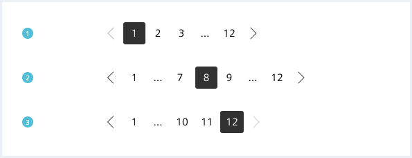
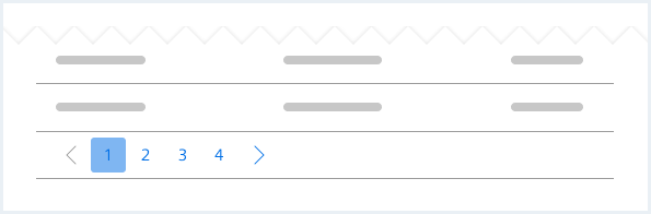
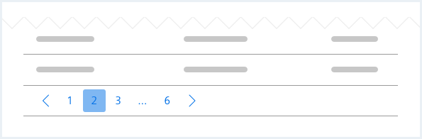
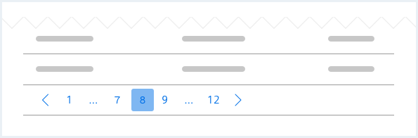
Simple pager
A simple pager consists of the following elements:
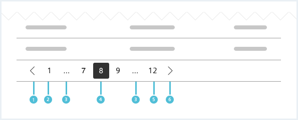
1. Previous page button
- The previous page button is visible if the current page is not the first page.
2. First page button
- The first page button is always visible.
3. Ellipsis
- The ellipsis is visible if there are more than five pages in total.
4. Current page button
- The current page button shows the number of the currently viewed page.
5. Last page button
- The last page button is always visible and shows the total number of pages.
6. Next page button
- The next page button is visible if the current page is not the last page.
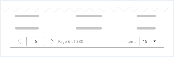
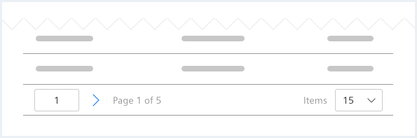
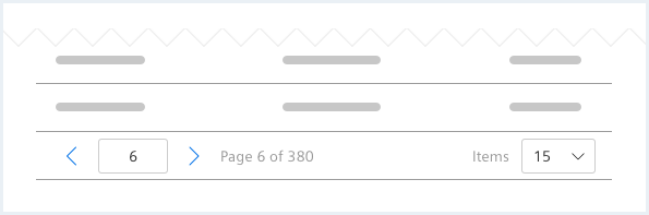
Advanced pager
An advanced pager consists of the following elements:
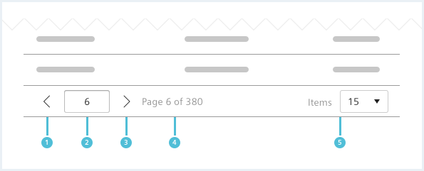
1. Previous page button
- The previous page button is visible if the current page is not the first page.
2. Current page input
- This numeric input shows the current page.
3. Next page button
- The next page button is visible if the current page is not the last page.
4. Page information
- The page information is showing the current and total page number.
5. Items per page
- Consists of a label and a select.
- The select menu contains predefined options for showing different quantities of items per page.
Behavior
Placement
The pager is placed in the main region. It is always positioned below the content it belongs to.
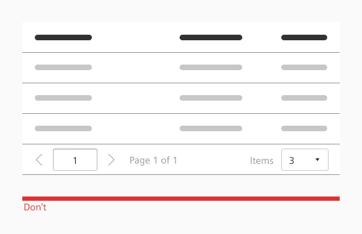
Do’s & Don’ts
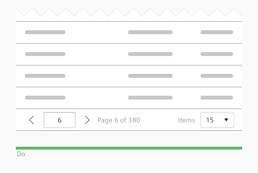
- Use a pager to allow navigation to different pages of a large dataset.
- Don’t use a pager when all data is shown on a single page.
Style
This chapter shows several pager styles in the User Experience Toolkit.
Overview
Typography
The following table gives reference to the different font sizes and weights:
| Name | State | Font-family | Font-size | Line-height | Text-align |
|---|---|---|---|---|---|
| Simple pager – all page numbers, ellipsis | all | Siemens Sans Roman | 14px | 16px | center |
| Advanced pager – Page information | all | Siemens Sans Roman | 14px | 16px | left |
| Advanced pager – Items per page | all | Siemens Sans Roman | 14px | 16px | right |
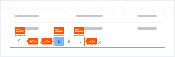
Sizing and spacing
The following measurements show the dimensions for this component:
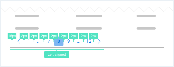
Simple pager
The width of the page buttons is responsive to the button content (minimum 32px).
Advanced pager
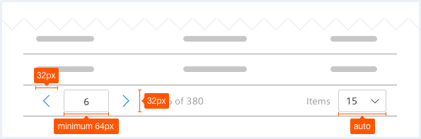
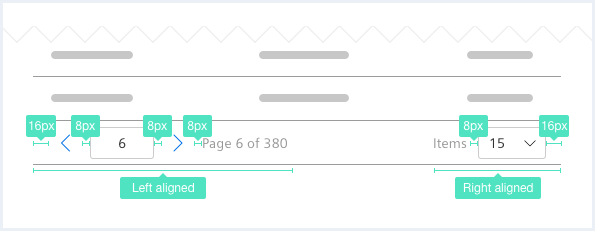
To see a detailed explanation of all existing classes, please refer to the usage table below.
Pager: first page
<div class="pager">
    <ul>
        <li class="pager__page pager__firstPage is-disabled">
            <a href="#">
                <span class="iconUxt arrowSingleLeft"></span>
            </a>
        </li>
        <li class="pager__page is-current">
            <a href="#">1</a>
        </li>
        <li class="pager__page">
            <a href="#">2</a>
        </li>
        <li class="pager__page">
            <a href="#">3</a>
        </li>
        <li class="pager__page">
            <a href="#">...</a>
        </li>
        <li class="pager__page">
            <a href="#">12</a>
        </li>
        <li class="pager__page pager__lastPage">
            <a href="#">
                <span class="iconUxt arrowSingleRight"></span>
            </a>
        </li>
    </ul>
</div>
Pager: middle page
<div class="pager">
    <ul>
        <li class="pager__page pager__firstPage ">
            <a href="#">
                <span class="iconUxt arrowSingleLeft"></span>
            </a>
        </li>
        <li class="pager__page">
            <a href="#">1</a>
        </li>
        <li class="pager__page">
            <a href="#">2</a>
        </li>
        <li class="pager__page is-current">
            <a href="#">3</a>
        </li>
        <li class="pager__page">
            <a href="#">...</a>
        </li>
        <li class="pager__page">
            <a href="#">12</a>
        </li>
        <li class="pager__page pager__lastPage">
            <a href="#">
                <span class="iconUxt arrowSingleRight"></span>
            </a>
        </li>
    </ul>
</div>
Pager: last page
<div class="pager">
    <ul>
        <li class="pager__page pager__firstPage">
            <a href="#">
                <span class="iconUxt arrowSingleLeft"></span>
            </a>
        </li>
        <li class="pager__page">
            <a href="#">1</a>
        </li>
        <li class="pager__page">
            <a href="#">2</a>
        </li>
        <li class="pager__page">
            <a href="#">3</a>
        </li>
        <li class="pager__page">
            <a href="#">4</a>
        </li>
        <li class="pager__page">
            <a href="#">5</a>
        </li>
        <li class="pager__page">
            <a href="#">6</a>
        </li>
        <li class="pager__page">
            <a href="#">7</a>
        </li>
        <li class="pager__page">
            <a href="#">8</a>
        </li>
        <li class="pager__page">
            <a href="#">...</a>
        </li>
        <li class="pager__page is-current">
            <a href="#">12</a>
        </li>
        <li class="pager__page pager__lastPage is-disabled">
            <a href="#">
                <span class="iconUxt arrowSingleRight"></span>
            </a>
        </li>
    </ul>
</div>
Usage
| Element | Class | Description |
|---|---|---|
.pager .pager__page | .is-current | Visually labels the currently selected / active pager item. |
.pager .pager__page | .is-disabled | Disables the pager item. |
.pager | .has-textalign-right | Moves the pager element to the right. |
Advanced pager
<div class="pager pager--advanced">
    <ul>
        <li class="pager__page pager__firstPage">
            <a href="#">
                <span class="iconUxt arrowSingleLeft"></span>
            </a>
        </li>
        <li class="pager__page">
            <div class="inputGroup">
                <input class="inputGroup__textInput" type="number" value="6" id="input-number25" />
            </div>
        </li>
        <li class="pager__page pager__lastPage">
            <a href="#">
                <span class="iconUxt arrowSingleRight"></span>
            </a>
        </li>
        <li class="pager__page pager__pageCounter">
            Page 6 of 380
        </li>
        <li class="pager__page pager__itemPerPage">
            <div class="inputGroup">
                Items
                <div class="selectWrapper">
                    <select id="idol-select25" class="inputGroup__select">
                        <option value="15">15</option>
                        <option value="30">30</option>
                        <option value="50">50</option>
                        <option value="100">100</option>
                    </select>
                </div>
            </div>
        </li>
    </ul>
</div>
Advanced pager with border
<div class="pager pager--advanced pager--withBorder">
    <ul>
        <li class="pager__page pager__firstPage">
            <a href="#">
                <span class="iconUxt arrowSingleLeft"></span>
            </a>
        </li>
        <li class="pager__page">
            <div class="inputGroup">
                <input class="inputGroup__textInput" type="number" value="6" id="input-number26" />
            </div>
        </li>
        <li class="pager__page pager__lastPage">
            <a href="#">
                <span class="iconUxt arrowSingleRight"></span>
            </a>
        </li>
        <li class="pager__page pager__pageCounter">
            Page 2 of 283
        </li>
        <li class="pager__page pager__itemPerPage">
            <div class="inputGroup">
                Items
                <div class="selectWrapper">
                    <select id="idol-select27" class="inputGroup__select">
                        <option value="15">15</option>
                        <option value="30">30</option>
                        <option value="50">50</option>
                        <option value="100">100</option>
                    </select>
                </div>
            </div>
        </li>
    </ul>
</div>
Usage
| Element | Class | Description |
|---|---|---|
.pager | .has-textalign-right | Moves the pager element to the right. |