Infotip
An infotip provides context-related additional information to explain a function or feature.
Usage
When to use
Use an infotip in the following cases:
- To provide auxiliary explanation.
- To explain why a field/element is displayed.
- To explain a feature or function.
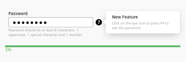
- To draw a users’ attention to a new feature without interrupting their workflow.
Don’t use the infotip to hold information that is vital to complete a task.
General construction
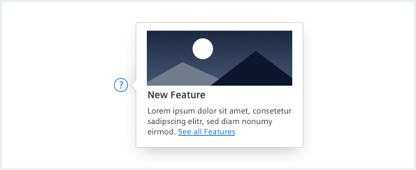
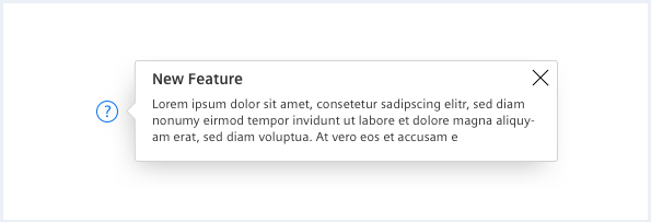
An infotip consists of the following elements:
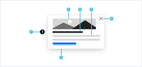
1. Trigger Icon
- Open the infotip by clicking the infotip icon.
- Avoid using text hyperlinks as trigger.
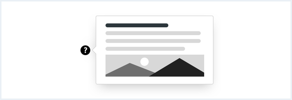
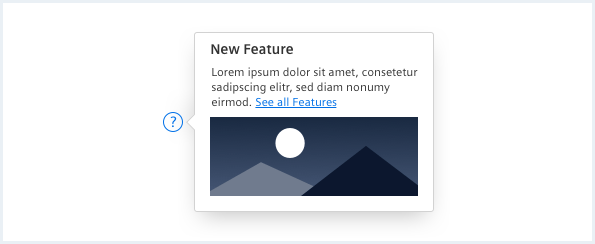
2. Image
- An image is optional.
- An image can be either positioned above the header or under the infotip message.
3. Header
- A header is optional.
4. Info message
- Keep the text short: it is recommended to not use more than three lines of text for easier reading.
- Use links to direct the user to more information.
5. Close
- Use a ‘x’ to close the infotip (optional) or tap/click any area of the screen.
- On mobile screen sizes mainly used for touch interaction it is recommended to always provide a “x” to close the infotip.
6. Background
- Use a Popover
Options
The following infotip options are available:

Behaviour
The infotip can be opened in all 4 directions, depending on the position within the viewport or configuration.
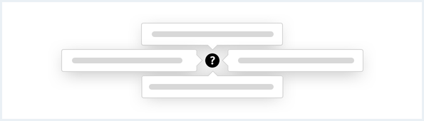
An infotip can be opened by clicking or touching the info icon and closed by interacting with any other element on the screen. Only one infotip is visible at a time.

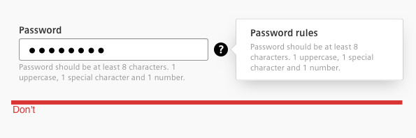
Do’s & Don’ts
Position infotips so they don’t block related content if possible:
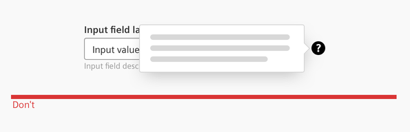
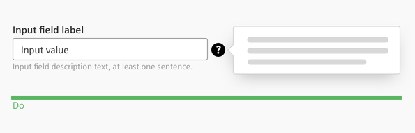
Keep the information brief and only show relevant information. Don’t use long content: An infotip should only be used for microcontent.
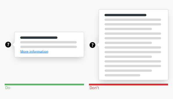
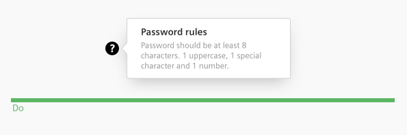
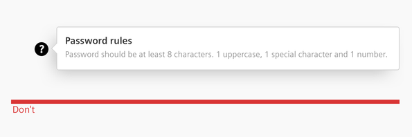
Use an infotip to provide additional information, don’t show redundant information:
Long blocks of text are difficult to read and overwhelming. Format text so that it is much easier to read. Recommended length is 2 - 3 lines.
Style
This chapter shows several infotip styles in the User Experience Toolkit.
Overview

Typography
The following table gives reference to the different font sizes and weights:
| Name | State | Font-family | Font-size | Line-height | Text-align |
|---|---|---|---|---|---|
| Header | all | Siemens Sans Bold | 14px | 16px | left |
| Info message | all | Siemens Sans roman | 12px | 15px | left |
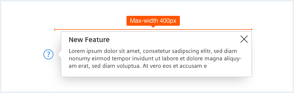
Sizing and spacing
The following measurements show the dimensions for infotips:
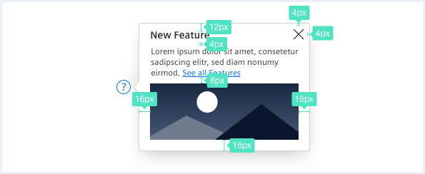
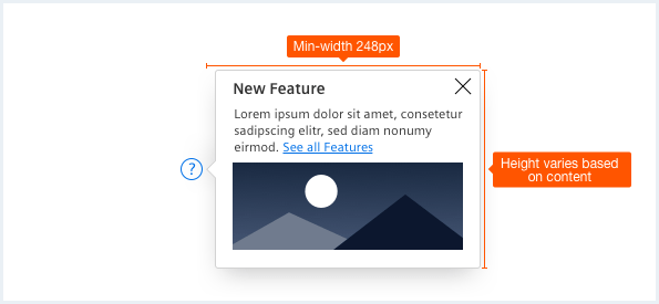
To see a detailed explanation of all existing classes, please refer to the usage table below.
Infotip
Infotip with microcontent:

Infotip with microcontent and icon weight overridden:
Infotip popover:
<div class="infotip is-shown is-right has-arrow is-center-aligned">
    <button type="button">
        <span aria-hidden='true' class='iconUxt'></span>
    </button>
    <div class="popover__container">
        <div class="popover__content">
            <div class="popover__close"></div>
            <div class="popover__title">
                New Feature
            </div>
            Donec id elit non mi porta <a rel="noopener noreferrer" target="_blank" href="https://www.mindsphere.io/design">gravida at eget metus</a>. Duis mollis, est non commodo luctus.
        </div>
    </div>
</div>

Infotip with microcontent:
<div class="infotip is-right has-arrow is-center-aligned">
    <button type="button">
        <span aria-hidden='true' class='iconUxt'></span>
    </button>
    <div class="popover__container">
        <div class="popover__content">
            <div class="popover__close"></div>
            <div class="popover__title">
                New Feature
            </div>
            Donec id elit non mi porta <a rel="noopener noreferrer" target="_blank" href="https://www.mindsphere.io/design">gravida at eget metus</a>. Duis mollis, est non commodo luctus.
            <img src="assets/images/image.png" alt="image placeholder">
        </div>
    </div>
</div>

Infotip with microcontent and icon weight overridden:
<div class="infotip is-right has-arrow is-center-aligned">
    <button type="button">
        <span aria-hidden='true' class='iconUxt question filled'></span>
    </button>
    <div class="popover__container">
        <div class="popover__content">
            <img src="assets/images/image.png" alt="image placeholder">
            <div class="popover__title">
                New Feature
            </div>
            Donec id elit non mi porta <a rel="noopener noreferrer" target="_blank" href="https://www.mindsphere.io/design">gravida at eget metus</a>. Duis mollis, est non commodo luctus.
        </div>
    </div>
</div>
Infotip autohide
Infotip popover autohide with microcontent:
Infotip popover autohide:
<div class="infotip infotip--autohide has-arrow is-right is-center-aligned">
    <button type="button">
        <span aria-hidden='true' class='iconUxt'></span>
    </button>
    <div class="popover__container">
        <div class="popover__content">
            <div class="popover__close"></div>
            <div class="popover__title">
                New Feature
            </div>
            Donec id elit non mi porta <a rel="noopener noreferrer" target="_blank" href="https://www.mindsphere.io/design">gravida at eget metus</a>. Duis mollis, est non commodo luctus.
        </div>
    </div>
</div>

Infotip popover autohide with microcontent:
<div class="infotip infotip--autohide has-arrow is-right is-center-aligned">
    <button type="button">
        <span aria-hidden='true' class='iconUxt'></span>
    </button>
    <div class="popover__container">
        <div class="popover__content">
            <div class="popover__close"></div>
            <div class="popover__title">
                New Feature
            </div>
            Donec id elit non mi porta <a rel="noopener noreferrer" target="_blank" href="https://www.mindsphere.io/design">gravida at eget metus</a>. Duis mollis, est non commodo luctus.
            <img src="assets/images/image.png" alt="image placeholder">
        </div>
    </div>
</div>
Wide infotip, icon weight overridden
Infotip popover autohide with microcontent and icon weight overridden:
Infotip wide: <div class="infotip has-arrow is-wide">
    <button type="button">
        <span aria-hidden='true' class='iconUxt'></span>
    </button>
    <div class="popover__container">
        <div class="popover__content">
            <img src="assets/images/image.png" alt="image placeholder">
            <div class="popover__title">
                New Feature
            </div>
            Donec id elit non mi porta <a rel="noopener noreferrer" target="_blank" href="https://www.mindsphere.io/design">gravida at eget metus</a>. Duis mollis, est non commodo luctus.
        </div>
    </div>
</div>

Infotip popover autohide with microcontent and icon weight overridden:
<div class="infotip infotip--autohide has-arrow">
    <button type="button">
        <span aria-hidden='true' class='iconUxt question filled'></span>
    </button>
    <div class="popover__container">
        <div class="popover__content">
            <img src="assets/images/image.png" alt="image placeholder">
            <div class="popover__title">
                New Feature
            </div>
            Donec id elit non mi porta <a rel="noopener noreferrer" target="_blank" href="https://www.mindsphere.io/design">gravida at eget metus</a>. Duis mollis, est non commodo luctus.
        </div>
    </div>
</div>
Infotip opening in 4 different directions
Infotip popover autohide above:
Infotip popover autohide below:
Infotip popover autohide on left side:
Infotip popover autohide on right side:
<div class="infotip  has-arrow infotip--autohide">
    <button type="button">
        <span aria-hidden='true' class='iconUxt'></span>
    </button>
    <div class="popover__container">
        <div class="popover__content">
            <div class="popover__close"></div>
            <div class="popover__title">
                New Feature
            </div>
            Donec id elit non mi porta <a rel="noopener noreferrer" target="_blank" href="https://www.mindsphere.io/design">gravida at eget metus</a>. Duis mollis, est non commodo luctus.
        </div>
    </div>
</div>

Infotip popover autohide above:
<div class="infotip is-top is-center-aligned has-arrow infotip--autohide">
    <button type="button">
        <span aria-hidden='true' class='iconUxt'></span>
    </button>
    <div class="popover__container">
        <div class="popover__content">
            <div class="popover__close"></div>
            <div class="popover__title">
                New Feature
            </div>
            Donec id elit non mi porta <a rel="noopener noreferrer" target="_blank" href="https://www.mindsphere.io/design">gravida at eget metus</a>. Duis mollis, est non commodo luctus.
        </div>
    </div>
</div>

Infotip popover autohide below:
<div class="infotip is-bottom is-center-aligned has-arrow infotip--autohide">
    <button type="button">
        <span aria-hidden='true' class='iconUxt'></span>
    </button>
    <div class="popover__container">
        <div class="popover__content">
            <div class="popover__close"></div>
            <div class="popover__title">
                New Feature
            </div>
            Donec id elit non mi porta <a rel="noopener noreferrer" target="_blank" href="https://www.mindsphere.io/design">gravida at eget metus</a>. Duis mollis, est non commodo luctus.
        </div>
    </div>
</div>

Infotip popover autohide on left side:
<div class="infotip is-left is-center-aligned has-arrow infotip--autohide">
    <button type="button">
        <span aria-hidden='true' class='iconUxt'></span>
    </button>
    <div class="popover__container">
        <div class="popover__content">
            <div class="popover__close"></div>
            <div class="popover__title">
                New Feature
            </div>
            Donec id elit non mi porta <a rel="noopener noreferrer" target="_blank" href="https://www.mindsphere.io/design">gravida at eget metus</a>. Duis mollis, est non commodo luctus.
        </div>
    </div>
</div>
Usage
| Element | Class | Description |
|---|---|---|
.infotip | .is-shown | Opens an infotip, for closing this class has to be removed again. |
.infotip | .infotip--autohide | Opens and closes infotips by setting focus on the infotip button. This way an infotip is automatically closed by clicking anywhere else outside the infotip, however this does not work on Mac OS with Firefox and Safari. These browsers don't support setting focus on button elements. For Mobile Safari the infotip button has to be pressed (touched) in order to show the infotip automatically. |
.infotip | .is-wide | Sets the total width for the infotip to the wide variant. |
.infotip | .is-top .is-bottom .is-left .is-right | Sets the direction in which the infotip opens, relatively from the infotip icon. Right (from infotip icon) is default. For more information about the popover component look at Popover. |
.infotip | .is-center-aligned .is-bottom-aligned .is-right-aligned | In combination with the orientation classes, the alignment can be defined with these classes. Right and centered are default and don't require a class. |
.infotip | .has-arrow | Adds an arrow to the popover. |
.infotip button .iconUxt | .question.filled | Allows to override the infotip icon with an e.g. filled version of the question mark. Don't use any/arbitrary icons for the infotip, this is only meant to use different icon weights. |