Form validation
Form validation gives feedback about invalid user input when the user submits a form.
Usage
When to use
Use a form validation in the following cases:
- When there are required input controls.
- When there is user input that carries a risk for invalid input.
- When a form contains dependencies between input controls.
Types
The type of form validation depends on the choice of the input component. There are the following form validation types:
Standard validation
A validation can occur when for example:
- The datatype isn’t correct.
- The entered data has too many or not enough characters.
- No data has been entered in a required field.

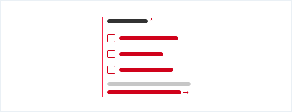
Selection group validation
A validation text can occur when for example:
- Nothing has been selected.
- Too much has been selected.
- Not enough has been selected.
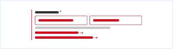
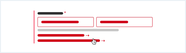
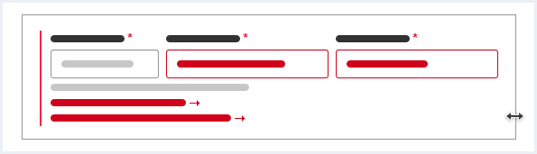
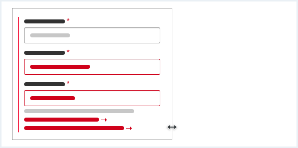
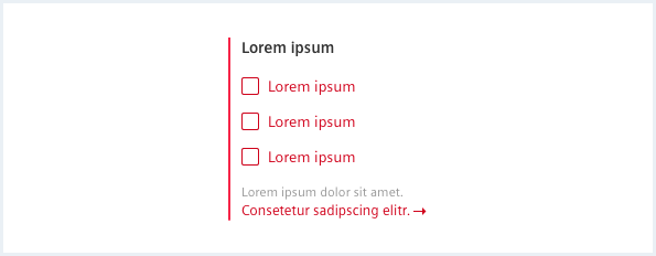
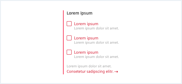
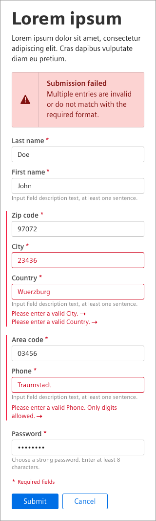
General construction
A form validation consists of the following elements:
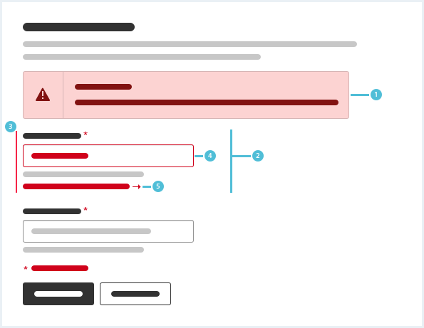
1. Message
- An error message is displayed above the form and below the content header.
- For more information on messages, see chapter Message.
2. Inline validation
- An inline validation informs the user about errors relevant to a specific user input.
- An inline validation consists of the elements 3. – 5. listed below.
3. Indicator line
- The indicator line visually highlights an inline validation.
4. User input
- The user input is in the validation state.
5. Validation text
- A validation text contains an explanation how to resolve the error.
- The validation text and the arrow icon are an anchor link to the corresponding input field.
Behavior
When to validate
There are two possibilities for when a form element can be validated:
- after typing (“while typing”), meaning after each keystroke
- after leaving a form field (“on blur”), meaning after clicking elsewhere in the form or leaving parts of a form by navigating through tabs.
The first type of validation should be used whenever an input value must not e.g. contain certain characters or must not exceed a certain length. The second type of validation should be used when an input value as a whole should be validated for compliance, e.g. an email address or a credit card number.
This way we dont expose the user to unnecessary validation errors and show him as few validation errors as needed.
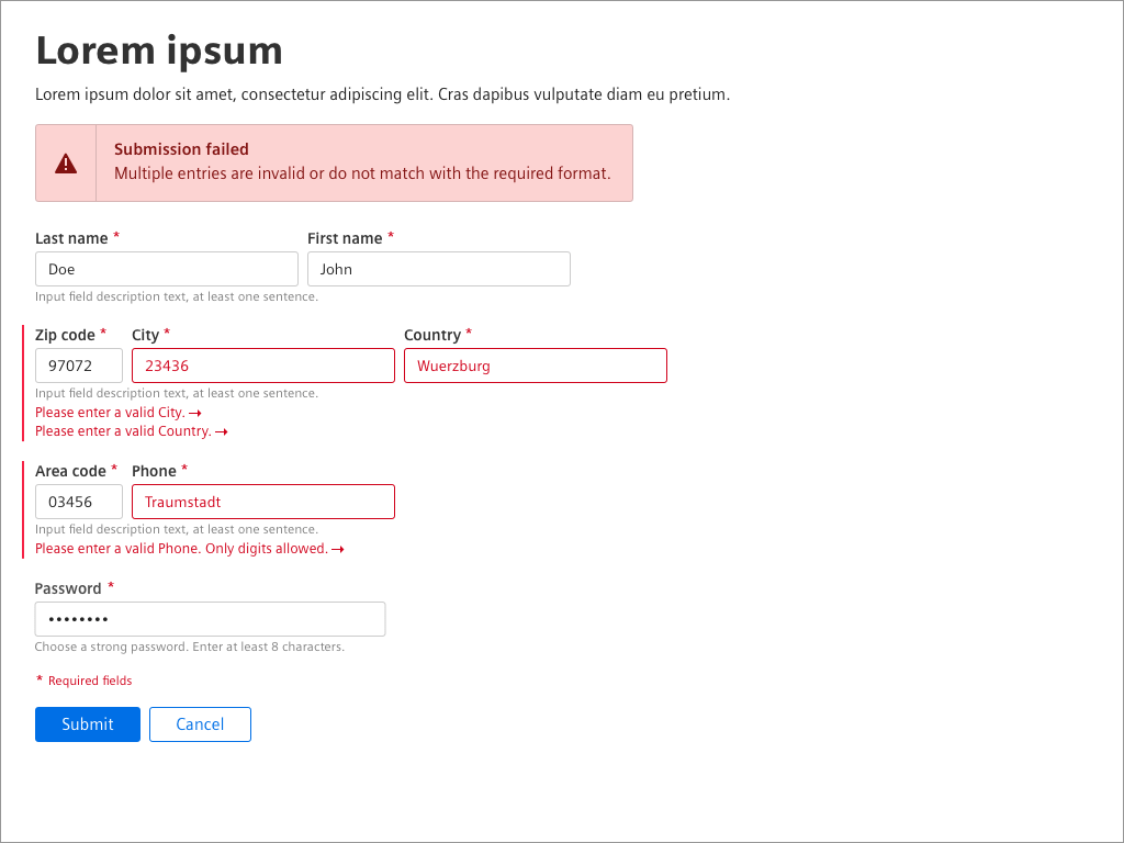
Validation after (re)load
After the user submits a form the page reloads and the viewport jumps to the top. If there is an error, a message appears above the form. This message states a general problem or summarizes multiple errors. The message is persistent until the form is resubmitted without rejection.
The validation text and the arrow icon are clickable. They link to the corresponding field and on click the related input control is selected.
If controls have a description, the description text is not highlighted.
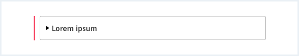
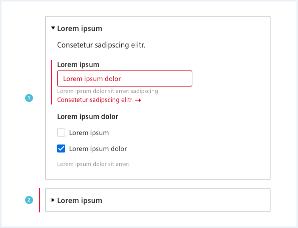
Fieldset
A fieldset containing an error, expands after validation of the form.
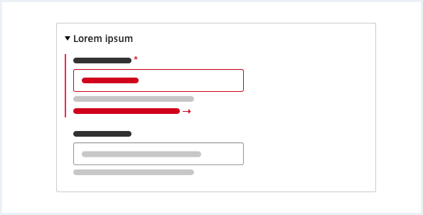
If the user collapses a fieldset with an error, an indicator line appears.
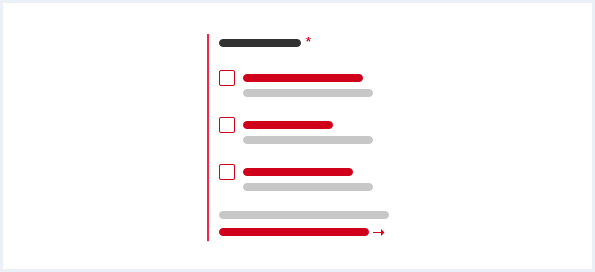
Form group responsive behavior
A form group has one common description. All validation texts are listed below the description.
When scaling down the viewport all form elements of a group take on the same width and order vertically below each other. The common description and all validation texts are listed below the last form element.
Do’s & Don’ts
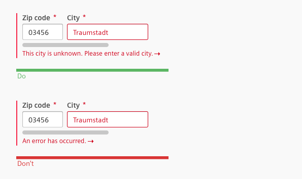
- Use a validation text to tell the user what went wrong and why it went wrong.
- Don’t make the user guess why the error occurred.
Style
This chapter shows several form validation styles in the User Experience Toolkit.
Overview
Examples


Descriptions
Fieldset
Responsive behavior
Typography
The following table gives reference to the different font sizes and weights:
| Name | State | Font-family | Font-size | Line-height | Text-align |
|---|---|---|---|---|---|
| Validation text | error | Siemens Sans Roman | 13px | 17px | left |
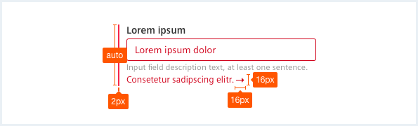
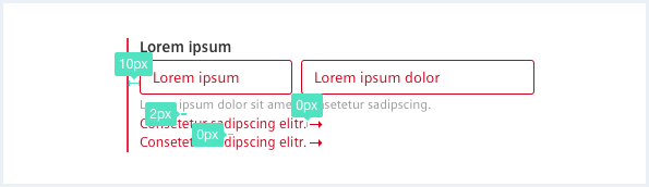
Sizing and spacing
The following measurements show the dimensions for this component:
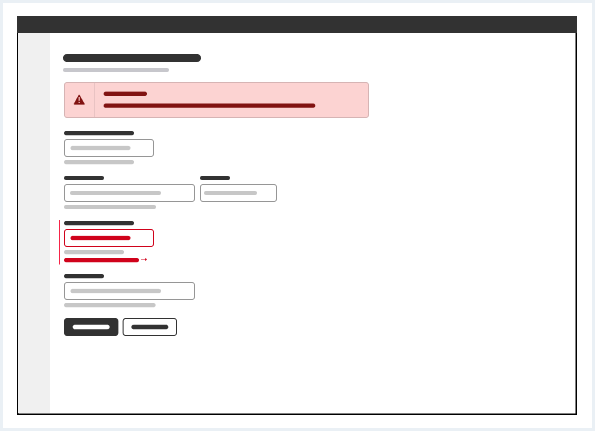
Form validation
<form novalidate="" autocomplete="off" class="form">
    <h2>Form validation title</h2>
    <p>This is an example explanation for form validation.</p>

    <div class="messageWrapper">
        <div class="message is-alert message--withIcon">
            <h1 class="message__headline">Validation</h1>
            <div>
                There are some problems with your input. Please correct them below.
            </div>
        </div>
    </div>

    <fieldset>
        <legend></legend>
        <div class="form__formGroup has-error">
            <div class="inputGroup inputGroup--mediumlarge is-invalid">
                <label class="inputGroup__label is-required"  for="input-name">
                    Name
                </label>
                <input class="inputGroup__textInput" type="text" placeholder="Name" id="input-name" />
                <div class="inputGroup__description">
                    Enter at least 8 characters.
                </div>
            </div>

            <div class="form__lineBreak">
                <label class="inputGroup--error" for="input-name">
                    Please enter a valid name.
                </label>
            </div>
        </div>

        <div class="form__formGroup">
            <div class="inputGroup inputGroup--mediumlarge">
                <label class="inputGroup__label"  for="input-secondname">
                    Second Name
                </label>
                <input class="inputGroup__textInput" type="text" placeholder="Name" id="input-secondname" />
                <div class="inputGroup__description">
                    Enter at least 8 characters.
                </div>
            </div>
        </div>
    </fieldset>

    <fieldset>
        <legend></legend>
        <div class="form__formGroup has-error">
            <div class="inputGroup inputGroup--xsmall is-invalid">
                <label class="inputGroup__label is-required"  for="input-zipcode">
                    ZIP code
                </label>
                <input class="inputGroup__textInput"  type="text" placeholder="ZIP code" id="input-zipcode" />
                <div class="inputGroup__description">
                    Enter digits.
                </div>
            </div>

            <div class="inputGroup inputGroup--medium">
                <label class="inputGroup__label is-required" for="input-city">
                    City
                </label>
                <input class="inputGroup__textInput" type="text" placeholder="City" id="input-city" value="Germany" />
                <div class="inputGroup__description">
                    Enter at least one character.
                </div>
            </div>

            <div class="inputGroup is-invalid">
                <label class="inputGroup__label is-required" for="select-country">
                    Country
                </label>
                <div class="selectWrapper">
                    <select id="select-country" class="inputGroup__select">
                        <option value="">Please choose a country</option>
                        <option value="alb">Albania</option>
                        <option value="and">Andora</option>
                        <option value="aut">Austria</option>
                        <option value="bel">Belarus</option>
                        <option value="blg">Belgium</option>
                    </select>
                </div>
                <div class="inputGroup__description">
                    Select a country.
                </div>
            </div>

            <div class="form__lineBreak">
                <label class="inputGroup--error" for="input-zipcode">
                    Please enter a valid ZIP code.
                </label>

                <label class="inputGroup--error" for="select-country">
                    Please enter a valid country.
                </label>
            </div>
        </div>
    </fieldset>

    <fieldset>
        <legend></legend>
        <div class="form__formGroup has-error">
            <div class="inputGroup inputGroup--large is-invalid">
                <label class="inputGroup__label is-required" for="input-feedback">
                    Feedback
                </label>
                <textarea class="inputGroup__textarea" spellcheck="false" id="input-feedback" placeholder="Feedback"></textarea>
                <div class="inputGroup__description">
                    Enter at least one sentence.
                </div>
            </div>

            <div class="form__lineBreak">
                <label class="inputGroup--error" for="input-feedback">
                    Please enter a valid feedback.
                </label>
            </div>
        </div>

        <div class="form__formGroup has-error">
            <div class="inputGroup inputGroup--medium is-invalid">
                <label class="inputGroup__label is-required" for="input-female">
                    Gender
                </label>
                <div class="radioButtonWrapper">
                    <input type="radio" class="inputGroup__radioButton" id="input-female" name="input-gender" value="f" />
                    <label for="input-female">Female</label>
                    <label for="input-female" class="radioButton__description">Optional description text for female option.</label>
                </div>
                <div class="radioButtonWrapper">
                    <input type="radio" class="inputGroup__radioButton" id="input-male" name="input-gender" value="m" />
                    <label for="input-male">Male</label>
                    <label for="input-male" class="radioButton__description">Optional description.</label>
                </div>
                <div class="inputGroup__description">
                    Select one option.
                </div>
            </div>

            <div class="inputGroup is-invalid">
                <label class="inputGroup__label is-required" for="input-mindsphere">
                    Register account for
                </label>
                <div class="checkboxWrapper">
                    <input type="checkbox" class="inputGroup__checkbox" id="input-mindsphere" name="input-account" value="mindsphere" />
                    <label for="input-mindsphere">Insights Hub</label>
                    <label for="input-mindsphere" class="checkbox__description">Get access to Insights Hub.</label>
                </div>
                <div class="checkboxWrapper">
                    <input type="checkbox" class="inputGroup__checkbox" id="input-ds" name="input-account" value="ds" />
                    <label for="input-ds">User Experience Toolkit</label>
                    <label for="input-ds" class="checkbox__description">Check for markup and styles.</label>
                </div>
                <div class="checkboxWrapper">
                    <input type="checkbox" class="inputGroup__checkbox" id="input-newsletter" name="input-account" value="newsletter" />
                    <label for="input-newsletter">Newsletter</label>
                    <label for="input-newsletter" class="checkbox__description">Know what's new.</label>
                </div>
                <div class="inputGroup__description">
                    Select at least one option.
                </div>
            </div>

            <div class="form__lineBreak">
                <label class="inputGroup--error" for="input-female">
                    Please choose a gender.
                </label>

                <label class="inputGroup--error" for="input-mindsphere">
                    Please choose at least one register option.
                </label>
            </div>
        </div>
    </fieldset>

    <div class="form__requiredMsg">
        * Required fields
    </div>

    <div class="form__buttons">
        <input class="button--primary" disabled type="submit" value="Submit form" />
        <button class="button--secondary">Cancel</button>
    </div>
</form>
Usage
| Element | Class | Description |
|---|---|---|
.form__formGroup | .has-error | Marks the form group with a red indicator line on the left. |
.form__formGroup.has-error .inputGroup | .is-invalid | Marks the erroneous form element with a red text color and/or a red border. |
.inputGroup__label.is-required | Marks the form element as a required field with a red asterisk after the label. |