Button
Buttons allow users to interact with your system.
Usage
When to use
Use a button in the following cases:
- In situations where the user needs to trigger an immediate action, for example:
- Submission of a form.
- Initiation of a new task or process step.
- Display information that was hidden before.
- If the action is to forward the user to another page, you should not use a button. Use a hyperlink instead.
Types
There are the following button types:
Primary button
- Use a primary button to attract attention for the most important action on the screen.
- Use a primary button sparingly on the screen.
- It usually contains a label, sometimes also an icon and never an icon without a label.
- The button’s background is filled to attract attention.
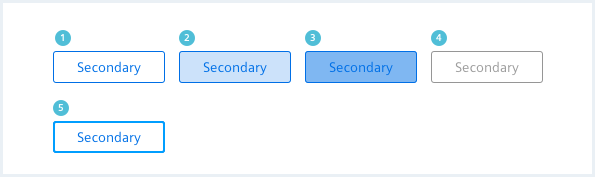
Secondary button
- A secondary button is used for regular, non-primary actions and it can be placed multiple times on one screen.
- It is the most commonly used button.
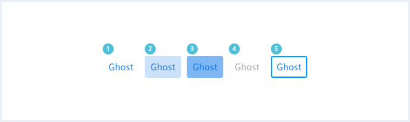
Ghost button
- A ghost button is used for less substantial actions that do not need to attract the user’s attention.
- It is recommended to use a label and an icon for a ghost button to make the button easier to detect.
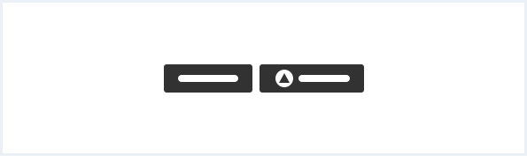
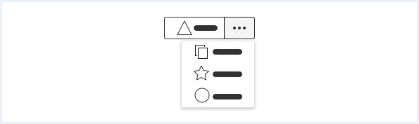
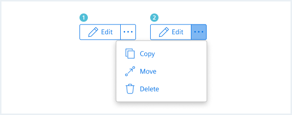
Split button
With a split button the user can either trigger the button’s default action or open a drop-down list for more actions of which the user can select one.
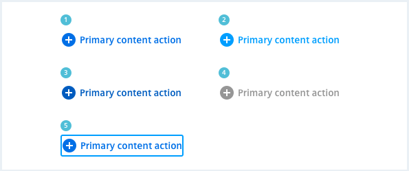
Primary content action
- Primary content actions are used for main actions that affect the content on the current page.
- The changes made by primary content actions are usually contextual, such as adding a row to a table or adding an item to a list.
- A primary content action always consists of a solid icon and a bold label.
- Use a primary content action sparingly on the screen.
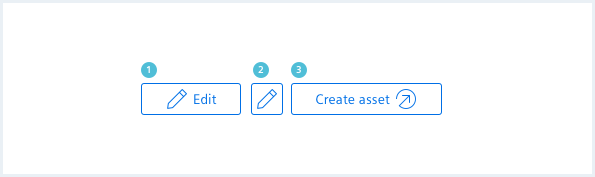
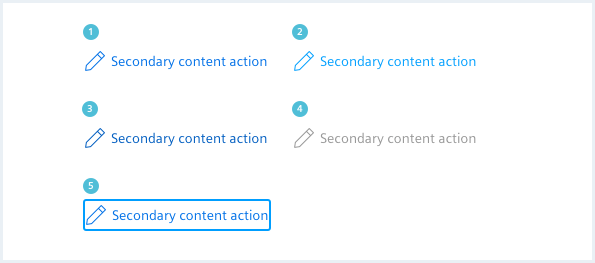
Secondary content action
- Use a secondary content action to add a common action that affects the content of the current page.
- It always consists of an icon and a label.
- A secondary content action can be used more frequently than a primary content action.
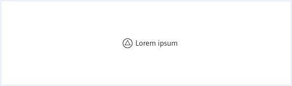
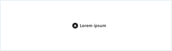
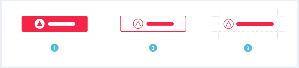
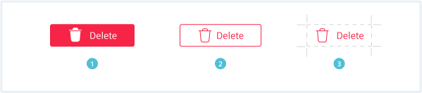
Danger button
Use a danger button for actions that have a destructive effect like deleting or removing data.
There are three kinds of danger buttons:
General construction
A button consists of the following elements:
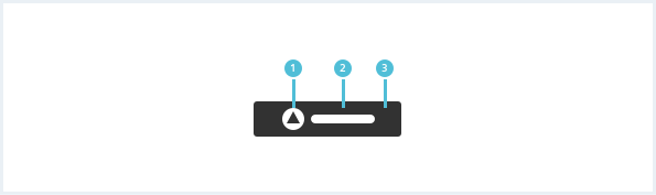
1. Icon
- Icon and action should have a direct relation to each other.
- An icon can be used in addition to a label to increase the recall value of the button.
- Exclude the label in situations with limited screen space for common actions, as “Download” or “Edit”.
- The Icon should generally appear to the left of a label.
2. Label
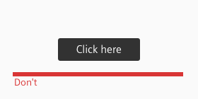
- Labels should inform the user about what action he / she can expect.
- Be precise. Try not to use more than three words for a label.
- Describe the respective action with verbs and use title case for capitalization.
3. Background
- The background of a button should not contain more than one solid color.
- The background can either be filled, transparent or outlined.
- The correct selection, labeling and placement of buttons is essential for error prevention and a smooth user experience. When in doubt test your design with potential users beforehand.
- When arranging buttons be consistent with your choice of only showing labels, icons or both.
Behavior
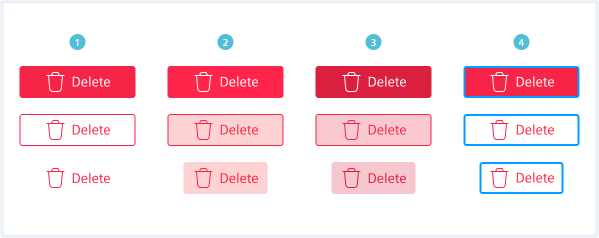
High severity
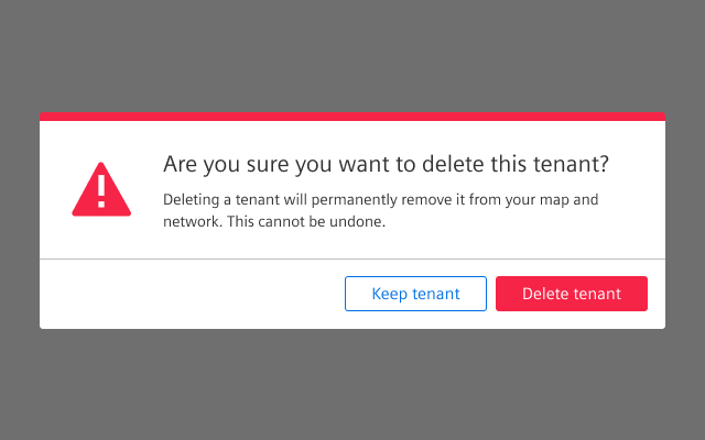
If a destructive action is difficult/impossible to undo and data may be permanently lost, use a confirm dialog that questions the action or directs the user to an alternative solution.
Medium severity
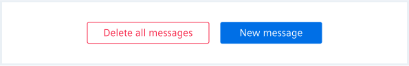
Use a secondary danger button for medium-severity destructive actions outside of a confirm dialog.
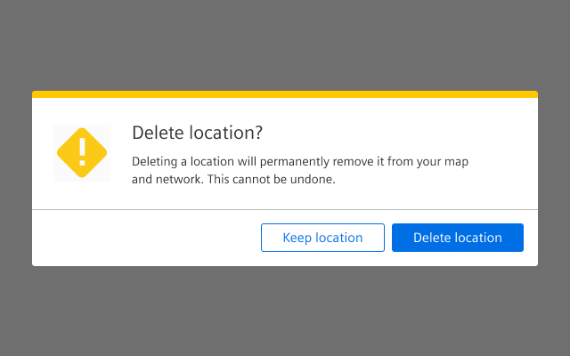
Destructive actions can be frustrating for a user if they are performed unintentionally. Recovering from these actions is difficult, therefore consider using a warning confirm dialog without danger button to prevent a user from accidentally performing a medium-severity destructive action.
Low severity
Low severity, destructive actions can be easily undone. No data is permanently lost or its lost has no further implications.
Do’s & Don’ts
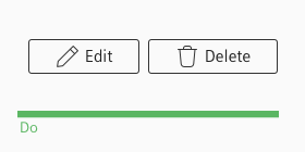
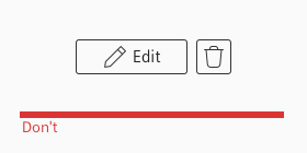
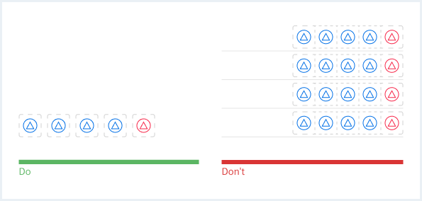
- Be consistent in the way you show buttons.
- Don’t mix up different kinds of button visualization.
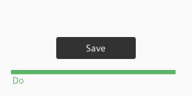
- Label buttons according to their action.
- Don’t use labels that don’t tell the user the action they trigger by clicking the button or even mislead him.
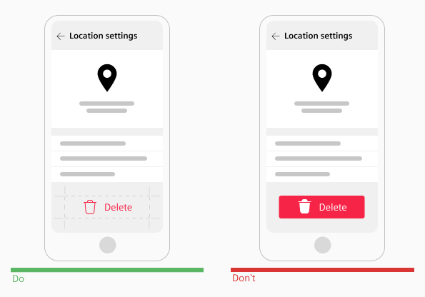
Don’t use a primary danger button if the destructive action is not used in a confirmation dialog. A primary button will tempt the user to press the button even though they do not intend to perform a destructive action.
If the users intention is to delete an item, and the destructive action has a medium severity use a warning confirm dialog.
When the system does not recommend the destructive action use an alert confirm dialog with danger button for the destructive action.
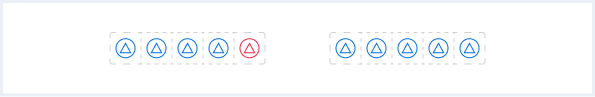
In places where a destructive action must be performed in bulk, rather use the default ghost type and not a danger button to avoid a cluttered UI.
Style
This chapter shows several button styles in the User Experience Toolkit.
Overview
Primary button
Secondary button
Ghost button
Primary content action
Secondary content action
Danger button
Split button
Button group
Typography
The following table gives reference to the different font sizes and weights:
| Name | State | Font-family | Font-size | Line-height | Text-align |
|---|---|---|---|---|---|
| Primary button | all | Siemens Sans Roman | 14px | 16px | center, left |
| Secondary button | all | Siemens Sans Roman | 14px | 16px | center, left |
| Ghost button | all | Siemens Sans Roman | 14px | 16px | center, left |
| Split button | all | Siemens Sans Roman | 14px | 16px | center, left |
| Primary content action | all | Siemens Sans Bold | 14px | 16px | left |
| Secondary content action | all | Siemens Sans Roman | 14px | 16px | left |
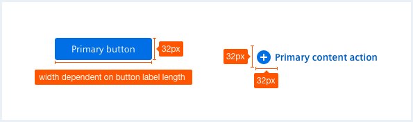
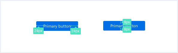
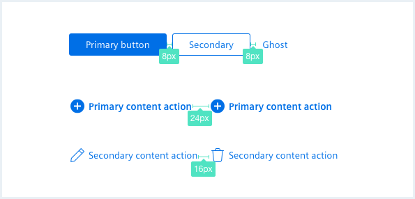
Sizing and spacing
The following measurements show the dimensions for this component:
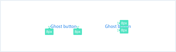
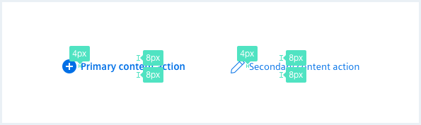
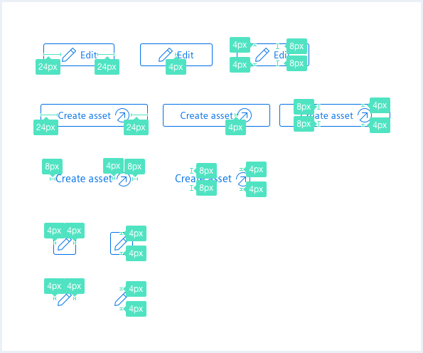
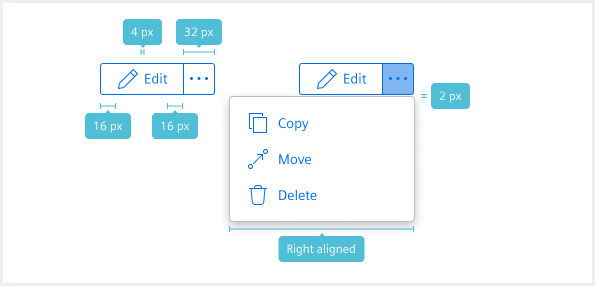
To see a detailed explanation of all existing modifier and state classes, please refer to the usage table below.
Primary button
<input class="button--primary" type="submit" value="Submit input" />

<button class="button--primary">Primary button</button>
<button class="button--primary" disabled>Primary button, disabled w. attribute</button>
<button class="button--primary is-disabled">Primary button, disabled w. class</button>

<button class="button--primary">
    <span class="iconUxt addCircle" aria-hidden="true"></span>Primary icon button
</button>

<button class="button--primary has-icon-right">
    Primary icon button<span class="iconUxt outgoing" aria-hidden="true"></span>
</button>

<button class="button--primary has-icon-only">
    <span class="iconUxt addCircle" aria-hidden="true"></span>
</button>
<a class="button button--primary" href="#">Primary link button</a>
<a class="button button--primary is-disabled" href="#">Primary link button, disabled w. class</a>
Secondary button
<button class="button--secondary">Secondary button</button>
<button class="button--secondary" disabled>Secondary button, disabled</button>
<button class="button--secondary is-disabled">Secondary button, disabled</button>

<button class="button--secondary">
    <span class="iconUxt edit" aria-hidden="true"></span>Secondary icon button
</button>

<button class="button--secondary has-icon-right">
    Secondary icon button<span class="iconUxt outgoing" aria-hidden="true"></span>
</button>

<button class="button--secondary has-icon-only">
    <span class="iconUxt edit" aria-hidden="true"></span>
</button>
<a class="button button--secondary" href="#">Secondary link button</a>
<a class="button button--secondary is-disabled" href="#">Secondary link button, disabled</a>
Ghost button
<button class="button--ghost">Ghost button</button>
<button class="button--ghost" disabled>Ghost button, disabled</button>
<button class="button--ghost is-disabled">Ghost button, disabled</button>

<button class="button--ghost">
    <span class="iconUxt edit" aria-hidden="true"></span>Ghost icon button
</button>

<button class="button--ghost has-icon-right">
    Ghost icon button<span class="iconUxt outgoing" aria-hidden="true"></span>
</button>

<button class="button--ghost has-icon-only">
    <span class="iconUxt edit" aria-hidden="true"></span>
</button>
<a class="button button--ghost" href="#">Ghost link button</a>
<a class="button button--ghost is-disabled" href="#">Ghost link button, disabled</a>
Danger button
<a class="button button--primary is-dangerButton" href="#">Primary link danger button</a>

<a class="button button--secondary is-dangerButton" href="#">Secondary link danger button</a>

<a class="button button--ghost is-dangerButton" href="#">Ghost link button</a>
Split button
Faucibus vitae aliquet nec ullamcorper sit amet risus.
In vitae turpis massa sed elementum tempus egestas sed.
Dolor sed viverra ipsum nunc aliquet bibendum enim facilisis.
Eu augue ut lectus arcu bibendum.
Sed posuere consectetur est at lobortis. Morbi leo risus, porta ac consectetur ac, vestibulum at eros.
<div class="buttonSplitWrapper">
    <div class="buttonGroup">
        <button class="button--secondary">
            <span class="iconUxt edit" aria-hidden="true"></span>
            Edit
        </button>
        <button class="button--secondary has-icon-only">
            <span class="iconUxt more filled" aria-hidden="true"></span>
        </button>
    </div>
    <div class="popover__container">
        <button class="popover__item">
            <span class="iconUxt duplicate" aria-hidden="true"></span>
            Copy
        </button>
        <button class="popover__item">
            <span class="iconUxt move" aria-hidden="true"></span>
            Move
        </button>
        <button class="popover__item">
            <span class="iconUxt delete" aria-hidden="true"></span>
            Delete
        </button>
    </div>
</div>

<div class="buttonSplitWrapper is-shown">
    <div class="buttonGroup">
        <button class="button--secondary">
            <span class="iconUxt edit" aria-hidden="true"></span>
            Edit
        </button>
        <button class="button--secondary has-icon-only is-activated">
            <span class="iconUxt more filled" aria-hidden="true"></span>
        </button>
    </div>
    <div class="popover__container">
        <button class="popover__item">
            <span class="iconUxt duplicate" aria-hidden="true"></span>
            Copy
        </button>
        <button class="popover__item">
            <span class="iconUxt move" aria-hidden="true"></span>
            Move
        </button>
        <button class="popover__item">
            <span class="iconUxt delete" aria-hidden="true"></span>
            Delete
        </button>
    </div>
</div>

<!-- placeholder text / paragraph -->
<p>
    Faucibus vitae aliquet nec ullamcorper sit amet risus. <br />In vitae turpis massa sed elementum tempus egestas sed. <br />Dolor sed viverra ipsum nunc aliquet bibendum enim facilisis. <br />Eu augue ut lectus arcu bibendum.<br />Sed posuere consectetur est at lobortis. Morbi leo risus, porta ac consectetur ac, vestibulum at eros.
</p>
Split button small
Faucibus vitae aliquet nec ullamcorper sit amet risus.
In vitae turpis massa sed elementum tempus egestas sed.
Dolor sed viverra ipsum nunc aliquet bibendum enim facilisis.
Eu augue ut lectus arcu bibendum.
Sed posuere consectetur est at lobortis. Morbi leo risus, porta ac consectetur ac, vestibulum at eros.
<div class="buttonSplitWrapper buttonSplitWrapper--small">
    <div class="buttonGroup">
        <button class="button--secondary">
            <span class="iconUxt edit" aria-hidden="true"></span>
            Edit
        </button>
        <button class="button--secondary has-icon-only">
            <span class="iconUxt more filled" aria-hidden="true"></span>
        </button>
    </div>
    <div class="popover__container">
        <button class="popover__item">
            <span class="iconUxt duplicate" aria-hidden="true"></span>
            Copy
        </button>
        <button class="popover__item">
            <span class="iconUxt move" aria-hidden="true"></span>
            Move
        </button>
        <button class="popover__item">
            <span class="iconUxt delete" aria-hidden="true"></span>
            Delete
        </button>
    </div>
</div>

<div class="buttonSplitWrapper is-shown is-bottom is-right-aligned buttonSplitWrapper--small">
    <div class="buttonGroup">
        <button class="button--secondary">
            <span class="iconUxt edit" aria-hidden="true"></span>
            Edit
        </button>
        <button class="button--secondary has-icon-only is-activated">
            <span class="iconUxt more filled" aria-hidden="true"></span>
        </button>
    </div>
    <div class="popover__container">
        <button class="popover__item">
            <span class="iconUxt duplicate" aria-hidden="true"></span>
            Copy
        </button>
        <button class="popover__item">
            <span class="iconUxt move" aria-hidden="true"></span>
            Move
        </button>
        <button class="popover__item">
            <span class="iconUxt delete" aria-hidden="true"></span>
            Delete
        </button>
    </div>
</div>

<!-- placeholder text / paragraph -->
<p>
    Faucibus vitae aliquet nec ullamcorper sit amet risus. <br />In vitae turpis massa sed elementum tempus egestas sed. <br />Dolor sed viverra ipsum nunc aliquet bibendum enim facilisis. <br />Eu augue ut lectus arcu bibendum.<br />Sed posuere consectetur est at lobortis. Morbi leo risus, porta ac consectetur ac, vestibulum at eros.
</p>
Split button, bottom aligned
Faucibucus vitae aliquet nec ullamcorper sit amet risus.
In vitae turpis massa sed elementum tempus egestas sed.
Dolor sed viverra ipsum nunc aliquet bibendum enim facilisis.
Eu augue ut lectus arcu bibendum.
Sed posuere consectetur est at lobortis. Morbi leo risus, porta ac consectetur ac, vestibulum at erostis.
<!-- placeholder text / paragraph -->
<p>
    Faucibucus vitae aliquet nec ullamcorper sit amet risus. <br />In vitae turpis massa sed elementum tempus egestas sed. <br />Dolor sed viverra ipsum nunc aliquet bibendum enim facilisis. <br />Eu augue ut lectus arcu bibendum.<br />Sed posuere consectetur est at lobortis. Morbi leo risus, porta ac consectetur ac, vestibulum at erostis.
</p>

<div class="buttonSplitWrapper is-shown is-top is-right-aligned">
    <div class="buttonGroup">
        <button class="button--secondary">
            <span class="iconUxt edit" aria-hidden="true"></span>
            Edit bottom
        </button>
        <button class="button--secondary has-icon-only is-activated">
            <span class="iconUxt more filled" aria-hidden="true"></span>
        </button>
    </div>
    <div class="popover__container">
        <button class="popover__item">
            <span class="iconUxt duplicate" aria-hidden="true"></span>
            Copy
        </button>
        <button class="popover__item">
            <span class="iconUxt move" aria-hidden="true"></span>
            Move
        </button>
        <button class="popover__item">
            <span class="iconUxt delete" aria-hidden="true"></span>
            Delete
        </button>
    </div>
</div>
Split button, left aligned
Faucibucus vitae aliquet nec ullamcorper sit amet risus.
In vitae turpis massa sed elementum tempus egestas sed.
Dolor sed viverra ipsum nunc aliquet bibendum enim facilisis.
Eu augue ut lectus arcu bibendum.
Sed posuere consectetur est at lobortis. Morbi leo risus, porta ac consectetur ac, vestibulum at erostis.
<div class="buttonSplitWrapper is-bottom is-left-aligned is-shown">
    <div class="buttonGroup">
        <button class="button--secondary">
            <span class="iconUxt edit" aria-hidden="true"></span>
            Edit left
        </button>
        <button class="button--secondary has-icon-only is-activated">
            <span class="iconUxt more filled" aria-hidden="true"></span>
        </button>
    </div>
    <div class="popover__container">
        <button class="popover__item">
            <span class="iconUxt duplicate" aria-hidden="true"></span>
            Copy
        </button>
        <button class="popover__item">
            <span class="iconUxt move" aria-hidden="true"></span>
            Move
        </button>
        <button class="popover__item">
            <span class="iconUxt delete" aria-hidden="true"></span>
            Delete
        </button>
    </div>
</div>

<!-- placeholder text / paragraph -->
<p>
    Faucibucus vitae aliquet nec ullamcorper sit amet risus. <br />In vitae turpis massa sed elementum tempus egestas sed. <br />Dolor sed viverra ipsum nunc aliquet bibendum enim facilisis. <br />Eu augue ut lectus arcu bibendum.<br />Sed posuere consectetur est at lobortis. Morbi leo risus, porta ac consectetur ac, vestibulum at erostis.
</p>
Split button, bottom left aligned
Faucibucus vitae aliquet nec ullamcorper sit amet risus.
In vitae turpis massa sed elementum tempus egestas sed.
Dolor sed viverra ipsum nunc aliquet bibendum enim facilisis.
Eu augue ut lectus arcu bibendum.
Sed posuere consectetur est at lobortis. Morbi leo risus, porta ac consectetur ac, vestibulum at erostis.
<!-- placeholder text / paragraph -->
<p>
    Faucibucus vitae aliquet nec ullamcorper sit amet risus. <br />In vitae turpis massa sed elementum tempus egestas sed. <br />Dolor sed viverra ipsum nunc aliquet bibendum enim facilisis. <br />Eu augue ut lectus arcu bibendum.<br />Sed posuere consectetur est at lobortis. Morbi leo risus, porta ac consectetur ac, vestibulum at erostis.
</p>

<div class="buttonSplitWrapper is-shown is-top is-left-aligned">
    <div class="buttonGroup">
        <button class="button--secondary">
            <span class="iconUxt edit" aria-hidden="true"></span>
            Edit bottom left
        </button>
        <button class="button--secondary has-icon-only is-activated">
            <span class="iconUxt more filled" aria-hidden="true"></span>
        </button>
    </div>
    <div class="popover__container">
        <button class="popover__item">
            <span class="iconUxt duplicate" aria-hidden="true"></span>
            Copy
        </button>
        <button class="popover__item">
            <span class="iconUxt move" aria-hidden="true"></span>
            Move
        </button>
        <button class="popover__item">
            <span class="iconUxt delete" aria-hidden="true"></span>
            Delete
        </button>
    </div>
</div>
Primary content action
<button class="button--primaryContentAction">
    <span class="iconUxt addCircle filled"></span>Primary content action
</button>

<a class="button button--primaryContentAction" href="#">
    <span class="iconUxt addCircle filled"></span>Primary content action link
</a>

<button class="button--primaryContentAction is-disabled">
    <span class="iconUxt addCircle filled"></span>Primary content action, disabled
</button>

<a class="button button--primaryContentAction is-disabled" href="#">
    <span class="iconUxt share filled"></span>Primary content action link, disabled
</a>

<button class="button--primaryContentAction has-icon-right">
    Primary content action w. icon right<span class="iconUxt share filled"></span>
</button>
Secondary content action
<button class="button--secondaryContentAction">
    <span class="iconUxt addCircle"></span>Secondary content action
</button>

<a class="button button--secondaryContentAction" href="#">
    <span class="iconUxt addCircle"></span>Secondary content action link
</a>

<button class="button--secondaryContentAction is-disabled">
    <span class="iconUxt addCircle"></span>Secondary content action, disabled
</button>

<a class="button button--secondaryContentAction is-disabled" href="#">
    <span class="iconUxt addCircle"></span>Secondary content action link, disabled
</a>

<button class="button--secondaryContentAction has-icon-right">
    Secondary content action w. icon right<span class="iconUxt outgoingExtSmall"></span>
</button>
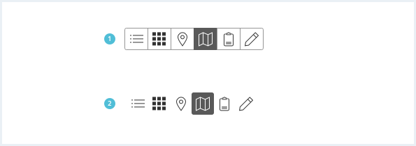
Button group
<div class="buttonGroup">
    <button class="button--secondary has-icon-only">
        <span class="iconUxt listBullet" aria-hidden="true"></span>
    </button>

    <button class="button--secondary has-icon-only is-disabled">
        <span class="iconUxt apps filled" aria-hidden="true"></span>
    </button>

    <button class="button--secondary has-icon-only">
        <span class="iconUxt locationMarker" aria-hidden="true"></span>
    </button>

    <button class="button--secondary has-icon-only">
        <span class="iconUxt map" aria-hidden="true"></span>
    </button>

    <button class="button--secondary has-icon-only">
        <span class="iconUxt clipboard" aria-hidden="true"></span>
    </button>

    <button class="button--secondary has-icon-only">
        <span class="iconUxt edit" aria-hidden="true"></span>
    </button>
</div>

<div class="buttonGroup">
    <button class="button--secondary has-icon-only">
        <span class="iconUxt listBullet" aria-hidden="true"></span>
    </button>

    <button class="button--secondary has-icon-only is-disabled">
        <span class="iconUxt apps filled" aria-hidden="true"></span>
    </button>

    <button class="button--secondary has-icon-only">
        <span class="iconUxt locationMarker" aria-hidden="true"></span>
    </button>

    <button class="button--secondary has-icon-only is-activated">
        <span class="iconUxt map" aria-hidden="true"></span>
    </button>

    <button class="button--secondary has-icon-only">
        <span class="iconUxt clipboard" aria-hidden="true"></span>
    </button>

    <button class="button--secondary has-icon-only">
        <span class="iconUxt edit" aria-hidden="true"></span>
    </button>
</div>
<div class="buttonGroup">
    <a class="button button--secondary has-icon-only">
        <span class="iconUxt listBullet" aria-hidden="true"></span>
    </a>

    <a class="button button--secondary has-icon-only is-disabled">
        <span class="iconUxt apps filled" aria-hidden="true"></span>
    </a>

    <a class="button button--secondary">
        Some other title
    </a>

    <a class="button button--secondary is-activated">
        Some title
    </a>

    <a class="button button--secondary has-icon-only">
        <span class="iconUxt edit" aria-hidden="true"></span>
    </a>

    <a class="button button--secondary has-icon-only">
        <span class="iconUxt locationMarker" aria-hidden="true"></span>
    </a>

    <a class="button button--secondary has-icon-only">
        <span class="iconUxt linkDissolve" aria-hidden="true"></span>
    </a>
</div>
Button group ghost
<div class="buttonGroup">
    <button class="button--ghost has-icon-only">
        <span class="iconUxt listBullet" aria-hidden="true"></span>
    </button>

    <button class="button--ghost has-icon-only is-disabled">
        <span class="iconUxt apps filled" aria-hidden="true"></span>
    </button>

    <button class="button--ghost has-icon-only">
        <span class="iconUxt locationMarker" aria-hidden="true"></span>
    </button>

    <button class="button--ghost has-icon-only">
        <span class="iconUxt map" aria-hidden="true"></span>
    </button>

    <button class="button--ghost has-icon-only">
        <span class="iconUxt clipboard" aria-hidden="true"></span>
    </button>

    <button class="button--ghost has-icon-only">
        <span class="iconUxt duplicate" aria-hidden="true"></span>
    </button>
</div>

<div class="buttonGroup">
    <button class="button--ghost has-icon-only">
        <span class="iconUxt listBullet" aria-hidden="true"></span>
    </button>

    <button class="button--ghost has-icon-only is-disabled">
        <span class="iconUxt apps filled" aria-hidden="true"></span>
    </button>

    <button class="button--ghost has-icon-only is-activated">
        <span class="iconUxt locationMarker" aria-hidden="true"></span>
    </button>

    <button class="button--ghost has-icon-only">
        <span class="iconUxt map" aria-hidden="true"></span>
    </button>

    <button class="button--ghost has-icon-only">
        <span class="iconUxt duplicate" aria-hidden="true"></span>
    </button>

    <button class="button--ghost has-icon-only">
        <span class="iconUxt clipboard" aria-hidden="true"></span>
    </button>
</div>
<div class="buttonGroup">
    <a class="button button--ghost has-icon-only">
        <span class="iconUxt listBullet" aria-hidden="true"></span>
    </a>

    <a class="button button--ghost has-icon-only is-disabled">
        <span class="iconUxt apps filled" aria-hidden="true"></span>
    </a>

    <a class="button button--ghost">
        Some other title
    </a>

    <a class="button button--ghost is-activated">
        Some title
    </a>
</div>
Usage
| Element | Class | Description |
|---|---|---|
button, a.button | .is-disabled | Visually disables all kind of buttons, the 'disabled' attribute functionally disables the button. |
button, a.button | .has-icon-right | Indicates that the button has an icon on the right side of the text. |
button, a.button | .has-icon-only | Indicates that the button contains only an icon. |
.button--primary .button--secondary .button--ghost | .is-dangerButton | Changed the appearance to a red danger button. |
.buttonSplitWrapper button.has-icon-only | .is-activated | Visually indicates the icon button that the menu with the additional list of actions is open. |
.buttonSplitWrapper .buttonSplit | .is-activated | Displays the menu with the additional list of actions. Make sure that ther is more than 1 button. |
.buttonSplitWrapper .buttonSplit | .is-top .is-right-aligned | Aligns the popover relatively to the split button. It is aligned to bottom and right by default, these classes can be added (individually or in combination) to align the content in a different direction. For more information about the popover component look at Popover. |
.button-group button, .button-group a.button | .is-activated | Visually labels the currently active button of a button group. |
.buttonSplitWrapper | .buttonSplitWrapper--small | Removes the text label of a split button for small devices or where screen space is limited. |